Background
The British Eating Disorder Society is a new organisation aiming to improve awareness of eating disorders, and the care and treatment of people with eating disorders and their families. The society is a body representing people working in the field of eating disorders across the United Kingdom with the intension to host conferences and meetings, as well as elevate their form, to create a well-supported of professionals. Their main aims are to promote communication, collaboration and consensus amongst people in the field of eating disorders, especially disciplines, professions, academic and clinical settings and sector. BrEDS will represent the views of people working with these people to the media, the public, businesses, government and relevant bodies. Simon Chapman, the main point of contact, is a Paediatrician at King’s College Hospital and specialising in Eating Disorders, as well as working with obese patients. He is part of the Child and Adolescent Mental Health Clinical Academic Group.
Restated Brief
BrEDS would like a clear brand identity, specifically starting with their logo design, to be applied across their website as well as using the logo on social media. The image and feel needs to appeal to professional and hold authority in the field, whilst still being sensitive and subtle with the subject matter of the cause.
The main points of focus are:
- To create a simple, clear yet impacting logo that communicates with their audience and the wider public. This will need to convey their main aims of working with professionals to improve awareness and care of people with eating disorders. The Society intends to be far reaching and influential with government and media.
- To re-structure and apply the logo and secondary branding to the website
- To present a positive/collaborative view of the disorder: it is about recovery, restoration of health, food as medicine and essential to physical and emotional wellbeing. It is also about communication.
The client has not set strict guidelines or preferences for the style or approach for the deliverables. The items should however explore their initial idea of wheat and be sensitive to the subject matter and their audience. The basis of the deliverables and necessary to carry through to the other items is the logo design.
The key deliverables are:
- Design the logo for BrEDS, to be used on website and social media.
- Assist with brand guidelines and website recommendations for a coherent and consistent brand identity. This will include providing a brand guideline document as a PDF
- Design a one-sided business card
- The later request for an A1 poster was added two weeks before the final deadline
Process
Initial contact with the client
Despite being my first real job, I was feeling comfortable with working with an external client having experience as a freelance designer. With a personal investment in the cause I was eager to build a strong and trusting rapport with my client from the very beginning and showed willingness and enthusiasm in my initial correspondence. I was privileged enough to be a part of the BrEDS committee skype meetings, held every two months, from the very beginning of the process, giving me a well-rounded perspective of the whole organisations and the different voices beyond just my main client. The first skype session coincided with the start of my project and I was able to gather the key points that were the basis for my research and design ideas moving forward:
- Remember that BrEDS is a professional body
- There needs to be a balance between medical and emotional in the overall visual identity of the charity.
- It is important that there are no religious connotations, trees or apples
- The preference is to take a more simple approach, with inspiration such as NEDA and AED for their logos.
- Charities show the positive so remember this within the approach to any visuals
- It would be good to have a subtly of the overall intention of BrEDS, which aims to connect with lots of different professionals who deal with treating eating disorders to work as a stronger body of people.
Research
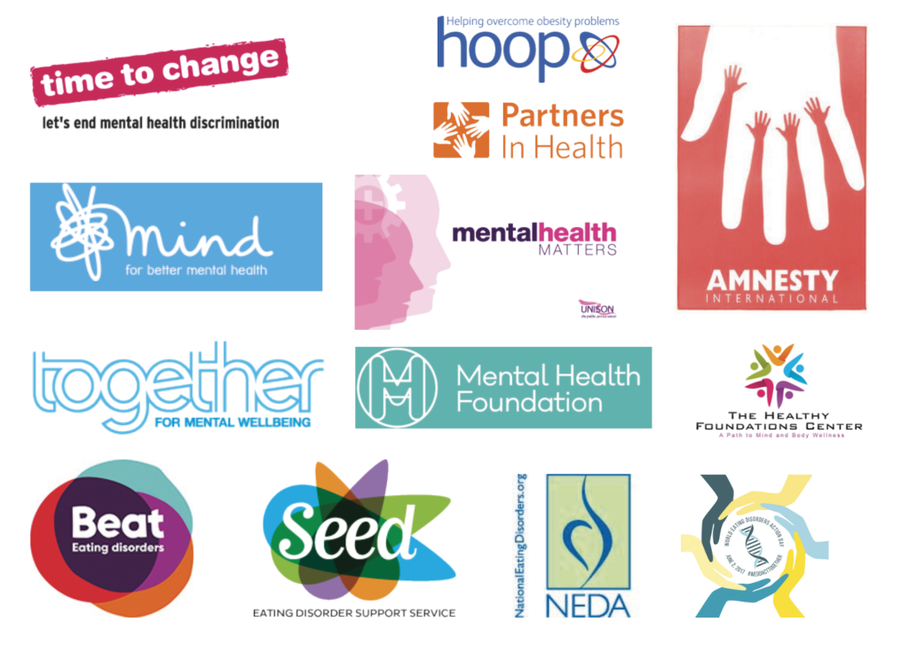
In order to inform my design stage I spent time researching a range of logos, from mental health charities, wellbeing logos and more generally medical branding and logo designs. I look specifically at logos of those mentioned by the client to ensure I was keeping in line with their preferences, as well as trying to form a wider understanding of potential directions that the logo design could go. The research was valuable in showing attention to colour palettes and how these can help create a medical identity without obviously having imagery of something more specific to the cause. Blues and purples appeared to be popular in medical branding.
Sketches and initial ideas
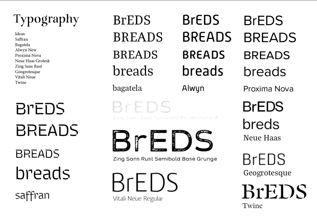
From the research done, I created mood boards for presentation, which included ideas for secondary branding and tag lines. As part of the presentation document I became to sketch 10 ideas to show the client as the first stage of the job. Consideration the a predominately illustrative or typographic logo was key and understanding how the graphic style of the illustration or typeface personality needs to be appropriate for both the eating disorder subject and the charity as a professional body of health care experts and doctors. I used Illustrator to both digitalise hand-drawn sketches as well as outline typefaces for greater flexibility and ease of modifying positioning and scale.
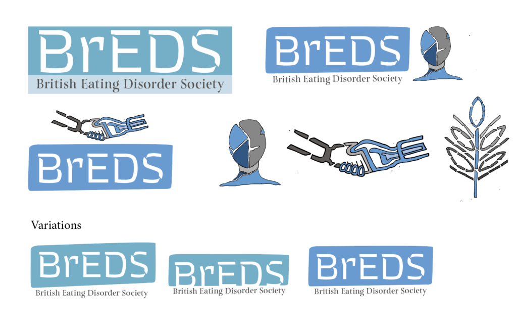
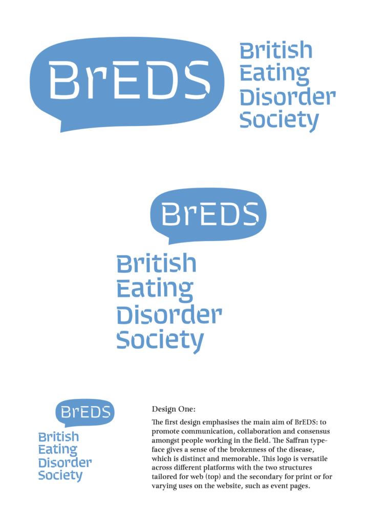
In response to feedback I refined three ideas to take forward to show the client and wider committee. Through this I learnt the attention to detail for how best to present the concepts on the page, drawing on information design, to ensure I kept the description of the idea in the same place on each page as well as keeping the description away from the graphics. Including a short description of the concept and design outline for the designs was a good exercise to consider a concise and professional tone to present my designs to the client and committee. This was a helpful aid for the those considering the designs and the client provided thorough feedback and opinions from the committee that brought together the general consensus in favour of one design. The client also provided a new focus to consider in moving forward with ideas: the group’s wish to focus on integration/collaboration – I would echo this: BrEDS seeks to represent some very different professional groups all of whom work with adults and children with eating disorders. Similarly, another member of the committee emphasised that “For what it’s worth re: logos – I agree with others. Need something more rounded, and welcoming than the fractured images. It’s about bring together. And should be aspirational, and warm.”
“Thank you Philippa for all your work on this – some imaginative and beautiful designs.”
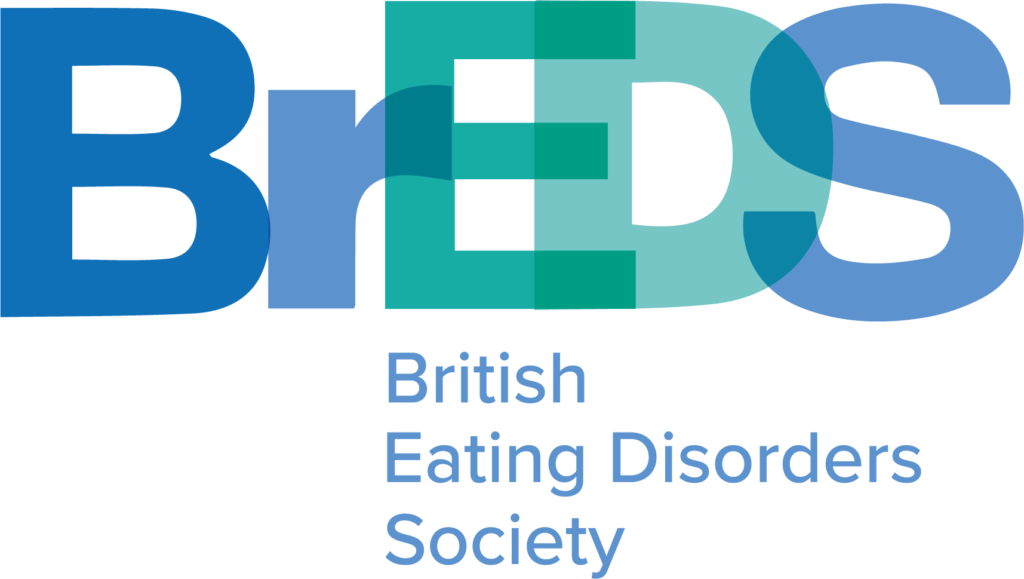
At this point in the job it was clear that the design store would not be working as systematically as I had hope. Attention to adding new concepts and designs to present to the client I learnt how to adapt and evaluate where further designs and concepts needed to be explored rather than pushing on with my own expected deadlines and refinement of one idea. Still considering the preferred design by the client and committee I created two variations of that design whilst presenting two new designs. I spent time digesting the comprehensive feedback I had received to focus more on the togetherness of the charity itself and how differing professionals are coming together under one cause. The new designs were presented in a similar way but it was of benefit to join another skype meeting which fell at the same time as sending through the designs. Before the meeting it was interesting to consider with my supervisor the expectation of the design they would prefer. Up until this point the job had taken a natural course, with there being a general development of one idea leading to the next more refined concept. It was therefore surprising to receive, for what seemed to me, a complete change in direction as the committee all unanimously agreed on a new approach to the brief, overlapping letters, with differing colours to show how differing voices and professionals are coming together to make up BrEDS. This new innovative design was, from my perspective and shared by the committee and client, a fitting direction for the charity and when put against other similar charities. Unfortunately, however as it had been viewed as an alternative approach that would not be chosen the design was very much a draft design, with the overlapping letterforms in need of attention to create a clean and precise composition that would be successful at both a small and large scale. The typeface itself had some awkward curves and inconsistent characteristics that meant that the general appearance was not as crisp as it could be. Whilst this would be expected to go through two stages of refinement to get to the final design there was a turn of events that meant that the committee was now in need of the designs within a week of the skype meeting. The short deadline meant that it was agreed that the design presented would be used as an interim in order to have an identity for the conference. This was a real challenge for me as I did not want the charity to define a visual identity that then may change, even if in a small way, but with such a tight deadline this was necessary. It taught me how as a designer it is important to still maintain a level of refinement of visuals through every stage as people are susceptible to getting attached to ideas and designs. Once sent to them it was hard to retract or modify the designs within my own bounds as a designer which has been an important lesson for me to consider for future jobs in my career.
Final stages
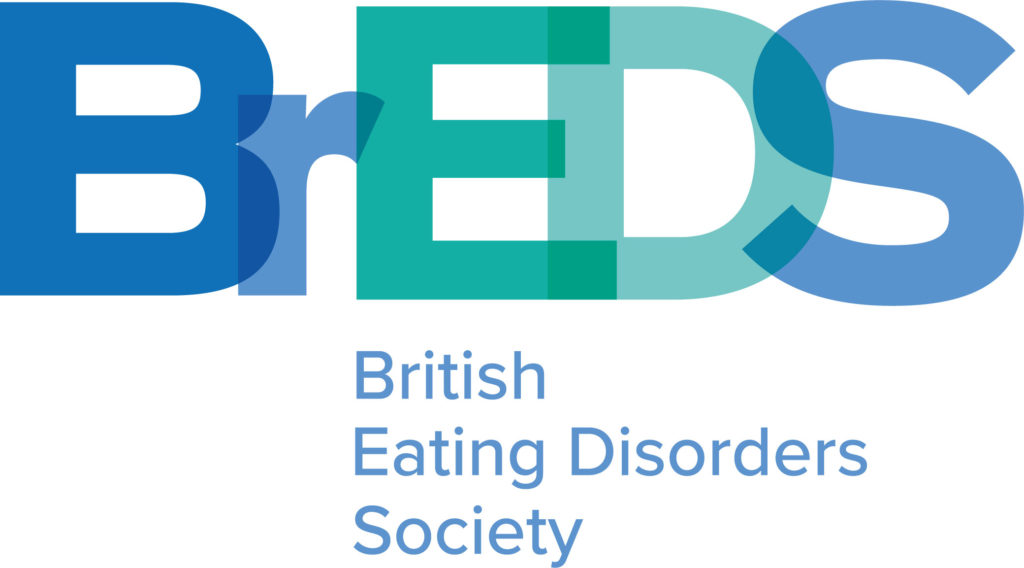
Following on from this the final stages of the job was about creating a more refined identity for the charity within a need deadline. Despite presenting a more visually dynamic and balanced design it was clear that the committee favoured as little variation as possible from the interim design. With this in mind I chose a more structured and uniform typeface that was stronger in overlapping the typeforms to create a clean and crisp logo. Understanding the large and small scale of the logo was crucial as the colours used at times meant that letters got lost at a smaller scale, at times it meant that BEDS or even BS stood out more than the full BrEDS, an issue that needed resolving. In solving these conflicts and balancing the typeforms and points of overlap the final design was approved. In using this and the composition of BrEDS alongside its full name I provided the client with the small scale and large scale variations. Following this I create business cards and posters that used a clearly defined colour palette and drew on the visual identity of overlapping colours, particularly seen in the poster designs.
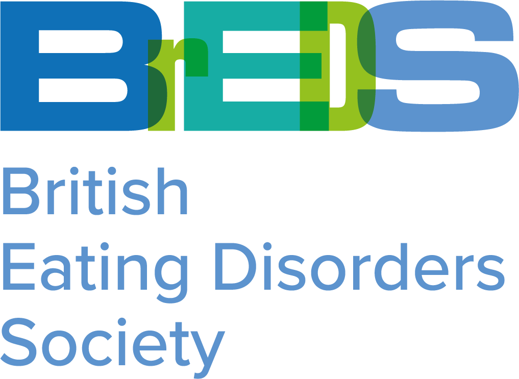
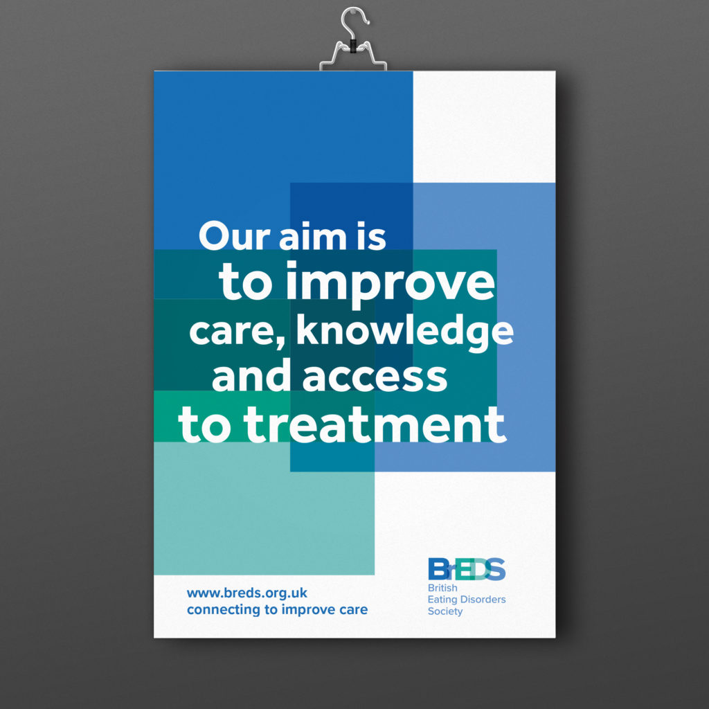
Final design
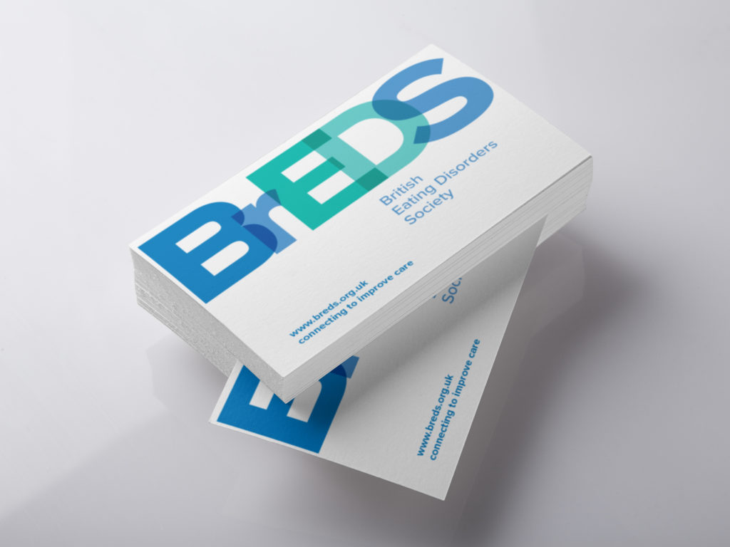
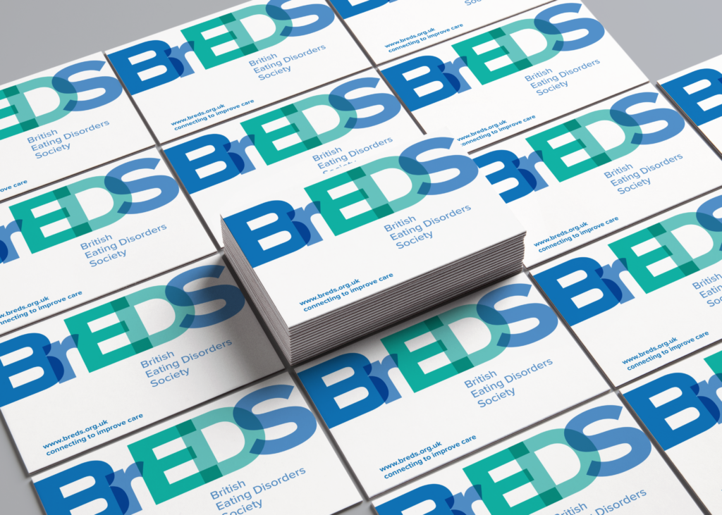
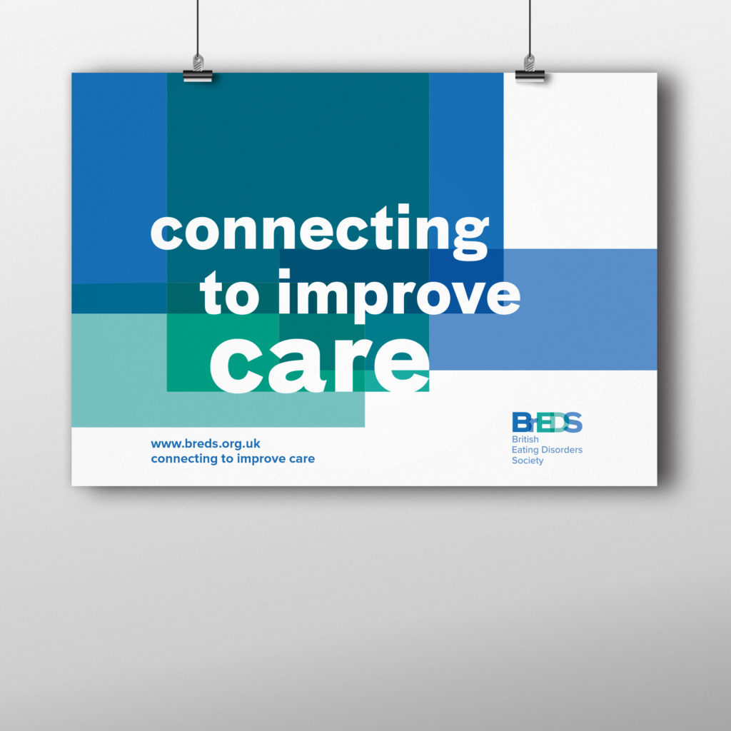
The final designs of the logo incorporates overlapping letters to create a typographic identity. The blue and green colour palette clearly defined the logo as a medical charity and the differing colours of the letters is indented to reflect the joining of different voices under one charity. The refinement of positioning of the overlap ensures the logo is success at different scale. Creating a variation in composition allowed the client to use a stacked or more horizontal position in accordance to the overall design that it might be featured on. The business cards play to the striking nature of the logo, with a more simple and clean approach to the design. The geometric Proxima Nova typeface is used for the website and slogan to balance the dynamic typographic logo. The poster plays to the logo and uses blocks of colour, in line with the colour palette, to create a strong visual identity of the overlapping colours. Ensuring the type sits and interacts with these blocks in a crisp and uniform way the posters maintain a medical professionalism whilst ensuring that there is a bold and eye-catching poster for the committee to use.
