
The brief
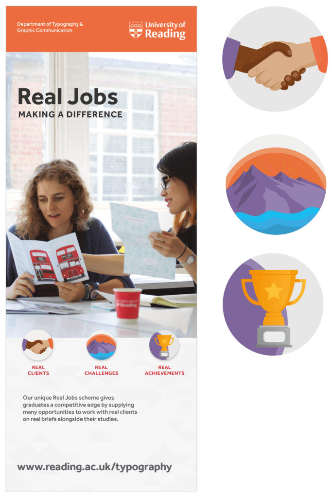
The department of Typography & Graphic Communication asked for two banners that will identify key areas of the department. The topics for the banners are Inclusive Design, and the Real Jobs scheme.
Each banner needs a striking headline along with a short piece of informative and engaging text. The objective was to appeal to prospective Graphic Communication students, but also their parents. They need to be memorable, inspiring, and interesting enough to spark conversations, inviting our visitors to learn more about what we can achieve. These banners would then be displayed in the Department for visitors to view during Open Days and portfolio review days.
Research and ideation
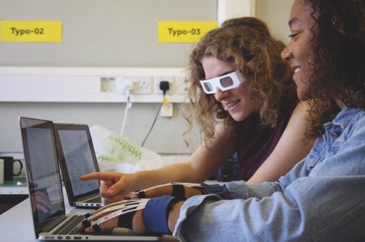
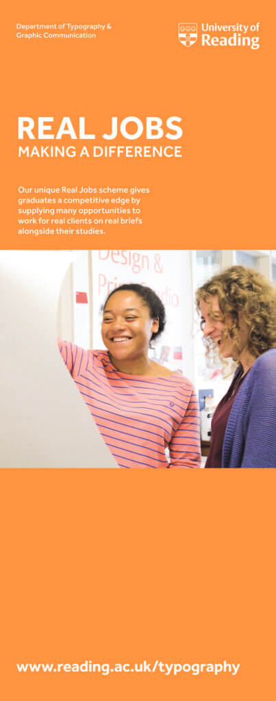
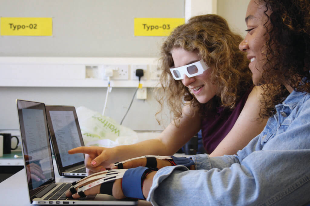
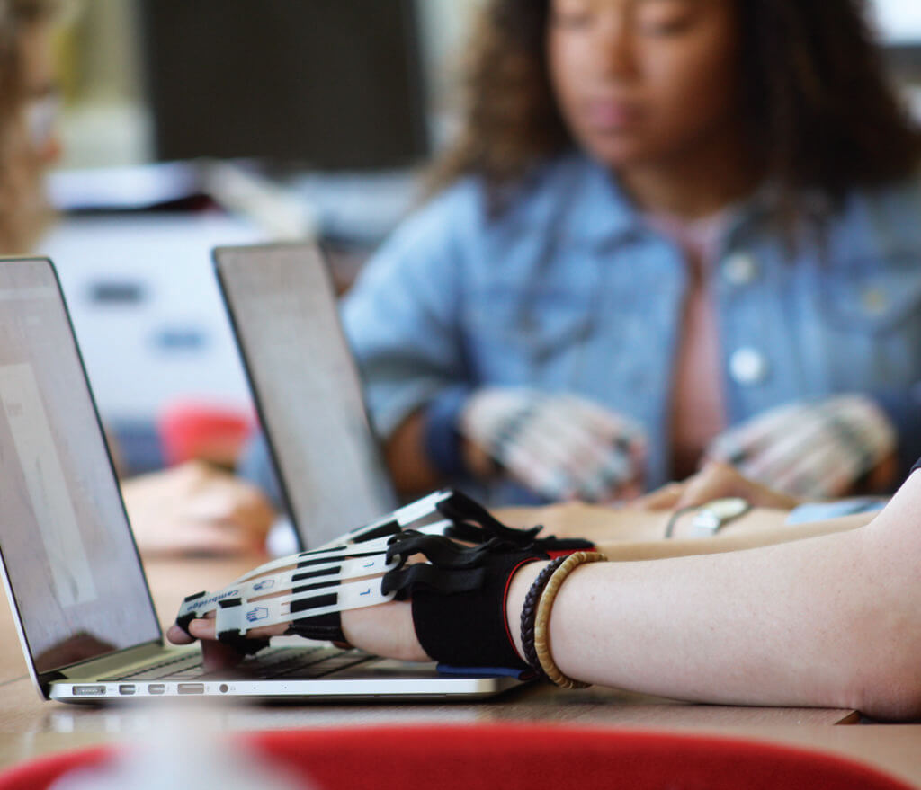
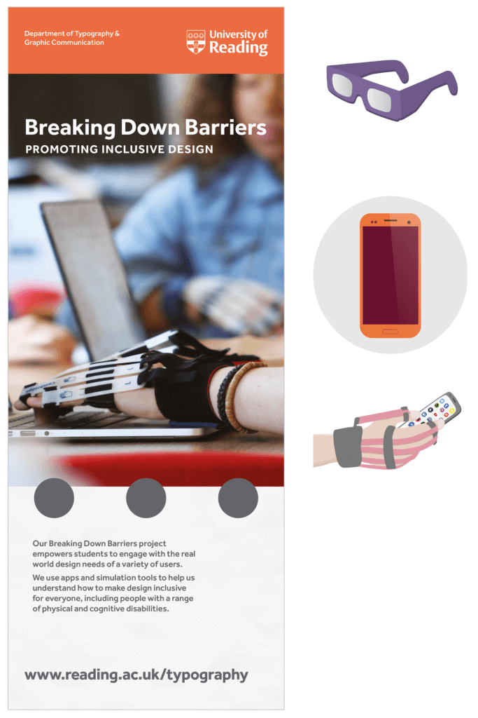
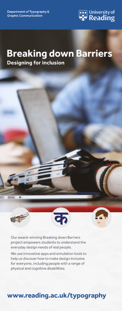
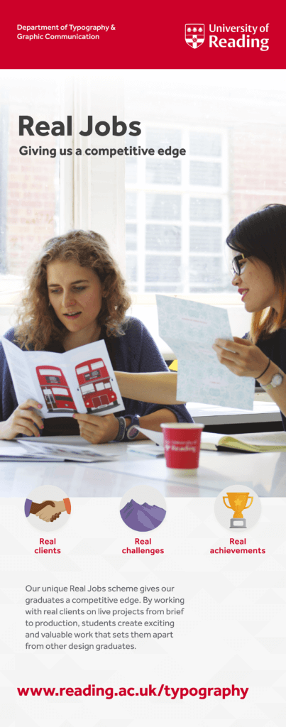
I started by sketching ideas then transferred them into digital mockups. These designs were intended to be fun, simple portrayals of the Real Jobs and Inclusive Design schemes. My client, after reviewing these designs, suggested that we use photography for the banners. Her ideas for the Real Jobs banner were fairly flexible; mainly just asking that I include real examples of students’ work from the scheme in the photographs. For the Inclusive Design banner, my client asked that I included photographs of students wearing simulation glasses and gloves – accessories used to imitate what it’s like to live with visual impairments or arthritis. She initially sent me some pictures that she had taken of students interacting with these items, however they seemed a little out of focus and not quite right to be blown up to such a huge scale. We would therefore need photoshoots for both Real Jobs and Inclusive Design shots.
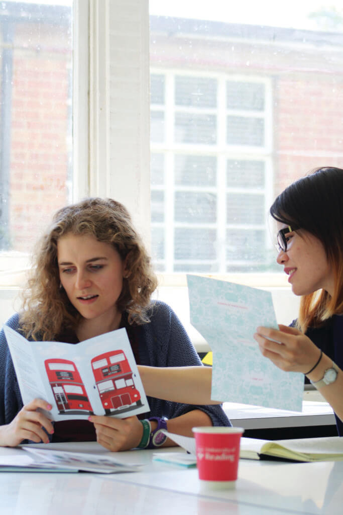
We set up a photoshoot trying to get images of students acting out meetings that could be used for the Real Jobs banner. At that time, we didn’t have the simulation gloves or glasses, so just took pictures for Real Jobs. I mocked up a few designs using the photographs we took. The client said that the photos didn’t really portray the scheme enough, and there wasn’t enough emphasis on the work, so we had to do another photo shoot. She also mentioned that, while the University brand guidelines should be adhered to, we could use them more flexibly than I was currently using them in order to fit the needs of advertising a Graphic Communication course (stressing that the banners should look creative). At first this feedback was slightly confusing to me, as I wasn’t sure where the line was on how creative to be whilst still sticking to the strict guidelines of the University’s banners templates, but I gained clarity after asking for more specific guidance.
In this initial stage I also contacted DPS, who would be printing the banners, and got quotes for how much these would cost to print. This needed to be factored in as the Head of Department would have to consider the costing when approving the job for print.
Design development
Photography
We did another set of photoshoots – now including the simulation glasses and gloves. The results were much better than before, as I used a zoom lens this time which created a greater depth of field, helping the photographs to look more dynamic and pull the viewer in. In this photoshoot I took more control, having a clearer vision and therefore knowing the types of photographs we could get and how to achieve this. I had a lot of fun conducting these photoshoots and this is something I have realised I would like to continue with more somehow in the future. My client was very satisfied with these new photographs.
Illustrations
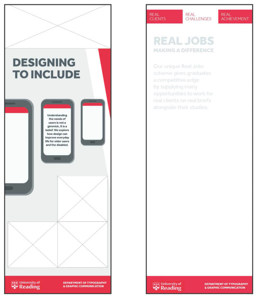
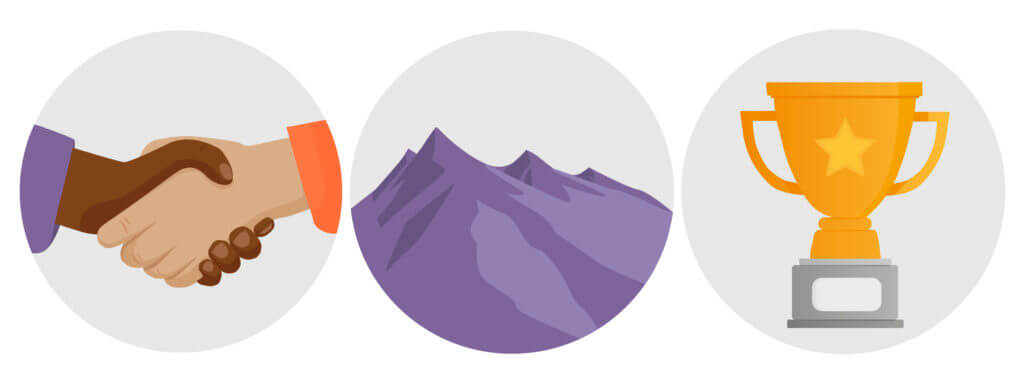
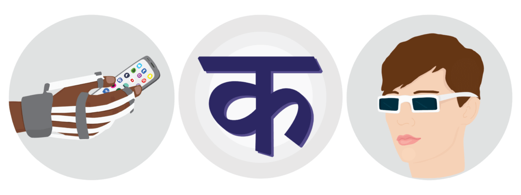
After brainstorming on how to make the banners look more representative of a creative course, I proposed to my client that we include three icon-style illustrations in circles at the base of the photograph, which she responded enthusiastically to. This was in-keeping with the University’s design rule of ‘threes’ (separating banners into three columns and three rows), and worked nicely with the first bit of copy given to me for the Real Jobs banner (‘Real clients, real challenges, real achievements’).
Creating the illustrations was by far the hardest part of this job. I am by no means a strong illustrator, and found it difficult to create a consistent style which managed to both get the message of each illustration across clearly, and use the same or similar colour palettes as much as possible. In addition, my client and I struggled to come up with ideas for the Inclusive Design banner as easily as we did for the Real Jobs banner. These were concepts that were more difficult to portray to people unfamiliar with the subject.
For Real Jobs, I proposed that I illustrate a handshake for ‘Real clients’, a mountain to illustrate ‘real challenges’, and a trophy for ‘real achievements’; all fairly straightforward concepts. My client, after seeing them, felt that the mountain was too metaphorical, and not quite representative enough from a design perspective. We agreed that perhaps a graph would be a better solution. However, after creating this illustration, I felt that the mountain was the better option; it shouldn’t matter much that it doesn’t directly represent ‘design’, because it is still a designed icon that represents challenges, and does so more universally than a graph might.
For the Inclusive Design banner, there was a lot of back-and-forth about what the illustrations should involve. We knew from early on that we wanted to include the gloves and glasses, but struggled on what the third icon could be, and what it could represent. We suggested a representation of hearing impairments, like illustrating braille or a hearing aid, or a guide dog to represent visually impaired people, or a mobile phone showing large text. Eventually we decided to include a non-latin character, as this would reflect the Department’s focus on typography and specialist research into non-latin typefaces.
Final designs
Reflection
This was probably the most challenging Real Job for me. There came a lot of moments during it where I felt like I wasn’t the right person for the job (particularly with the illustrations), and that it would have been better executed by someone else. I think this also was largely to do with the fact that the banners were intended to represent the Department, and that brought with it a lot of pressure to do it ‘right’ – even more so than most other design jobs I have completed. I felt throughout that the job would have been more efficiently fulfilled if it was a collaborative effort – I felt strong and capable with the photography, format, and typography, but believed the illustrations should have been created by someone more comfortable with creating groups of icons. I mentioned this to my client, but in hindsight I should have tried harder to communicate what I thought, and then made more of an effort to find a suitable illustrator to help out.
That being said, I have learnt a lot from this job, including how to conduct and take charge of a photoshoot, to be assertive in the decisions that I feel passionate about, and that communication and honesty with the client really is key to producing the best possible outcome.