
RJ00227 London International Development Centre (LIDC) rebrand
Designers: Fabio Rahmani and Orla O’Connell
This London International Development Centre Real Job project was assigned to Fabio during the Christmas break period, and began with initial back and forth emails with the client to discover what work needed to be done. It was decided that a re-brand was required which included work for the social media presence of the organisation, a re-designed website to improve the user experience and a new logo.
Initial meeting
For the initial meeting, Fabio travelled to London to the office of LIDC to meet with the managing director to get a better understanding of the requirements of the project and the direction that the new director had envisioned for the organisation to go towards. Fabio prepared multiple questions to gain a better understanding of the organisation and their budget. Budget turned out to not be a huge factor, although it was constantly considered within every stage of the design. Through this meeting, Fabio also found that the client wanted to approach the rebrand in a way which would portray a modern and approachable identity towards the clients target audience.
Logo
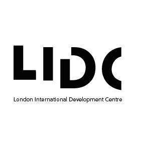
The design process of the logo involved analysing competitors brand identities, which allowed us to highlight that key features such as approachability and community. We showed the client 12 initial sketches and they decided on the fractured letters that spelled out LIDC, but also made some suggestions for changes that they would like to see. We then went on to make the changes, and add another set of variations of that logo to allow the client to decide on which style they preferred. Once the logo had been finalised, we went on to add the colours and created variations with the colours to show the client. Below shows the finalised logo design, as chosen by the client.
Communication
For a few weeks after the initial meeting, there was a lack of response from the clients end, and when a response was sent it was often not relevant to the question asked which made progressing a little difficult. This may have been due to the client not knowing exactly what they wanted. Due to the lack of communication in this time, Fabio began designing the new website with existing content on their current website due to not being supplied with a new site map or content for the new website. Through the lack of responses Fabio learned that he should not always rely on emails but should instead use phone calls to get an instant response when it’s needed.
Second meeting & Communication workshop
After a long period of silence, Fabio received an email stating that LIDC had hired a communication manager to truly find out what direction the organisation should head towards with the re-brand. The new communications manager invited Fabio to attend a workshop that she was hosting to get all the members of LIDC to voice their opinions about the way in which the brand should progress. Fabio also showcased the first iteration of the website whilst at the workshop, explaining the key features and explaining whether some ideas were feasible from a web development standpoint. Through this we learned the benefits of hosting a workshop when the client doesn’t know exactly what they want or need and it also allows direct face to face communication which is far more efficient than conversing via email.
Website design
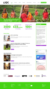
One of the main aims of the website re-design was to cut down on the content, and to create a more concise site map. The old website had a lack of colour and a very outdated theme which meant that one of our main aims was to create a modern design, that also doesn’t detract away from the information that is being displayed. We had to ensure that the design appealed to both potential research students as well as research funders. Through creating clearly labelled calls to action we aimed to allow users of any technical ability to efficiently use the website.
To make the website more friendly and approachable, the use of bright vibrant colours was used in conjunction with the use of colourful photography. We also decided to keep most the background white as it would increase the contrast of the text being set against it, allowing for increased legibility for the users of the website.
An additional Designer
After the long period of a lack of communication, LIDC requested for Fabio to create the mobile version of the website also but due to the way in which the deadline had been pushed back, this was no longer possible for Fabio so Orla was brought on to develop the mobile website following the style guidelines implemented by Fabio. We had 2 weeks to create the web designs for desktop and mobile.
Mobile design
Orla had to adjust the information and the style that Fabio had created to fit the smaller canvas size of a phone. The small size of the mobile screen meant that the information needed to be broken down into smaller sections, to enable the user to read and understand the content with ease.
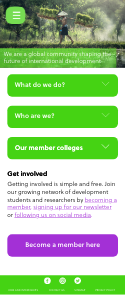
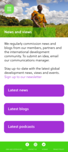
On quite a few of the pages, the information is broken up into different sections within the app, for example shown in the three green boxes below. When the box is clicked, information is revealed, making it less overwhelming for the user, rather than the user having to read all the information in the section in one go.
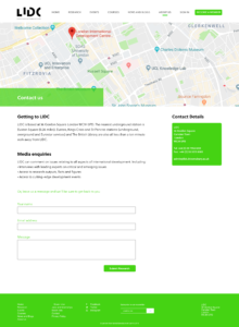
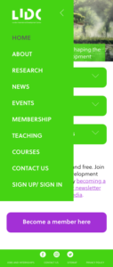
An important part of any design is consistency, the mobile version of the website consistency uses the visual identity of the desktop design. At the top of each mobile screen, there is an image along with the section of the app the user is in, for example ,’About us’, ‘Contact us’ or ‘Teaching’, this helps the user when navigating through the app.
Furthermore, on each of the screens there is a burger menu in the top left corner. Once clicked, this then reveals the menu. Here the user is able to go to different sections of the website.
A second colour is introduced on some of the mobile screens, which is also quite bright and eye catching. The purple is used for buttons that lead to another page. The addition of a second colour adds differentiation to the clickable elements of the screen, the green is mainly for sections of the screen containing information, whereas the purple buttons link to a new section.
It seems that there may have been some misunderstanding that Fabio and Orla were working on the mobile and desktop version of the website separately as the client only responded to Fabio with feedback and corrections. However, Orla was still able to use the feedback given to Fabio to make improvements to her mobile screens. From this real job, Orla learnt how important communication is between designer and client, in order to make sure both parties are on the same page. In addition to this, Orla was able to improve her skills in being able to adapt a design, to work successfully in another format.
To conclude
The new deadline was the same time as 2 other projects and our dissertation which meant that we could not pay complete attention to this project as we had hoped during the 2-week window that we were given to complete the web designs. We were still in the process of refining the designs when we received an email stating that they wanted to take what we had done already to their web developer so he could create the website for a quick launch. They said that they liked our designs and that they would be enough for the developer to create the website from. Due to this we were not able to complete the web designs to a standard that we had hoped to achieve.
In the end, we learned that if the client is not communicating at an reasonable speed, we should do more to go out of our way to get a response such as using phone calls to get the clients attention rather than an email. We also learned about the importance of thinking about the way in which web design functions between various platforms. The workshop was also a good learning experience and is something that we will utilize if we ever have a client that doesn’t quite know what they want.
If we had more time we would have continued to develop both the desktop and mobile designs to a standard we were both happy with. Furthermore, if we were able to work on the majority of the design aspect of the job during term time, instead of the Easter break, we would have made sure to utilise supervisor feedback more effectively. During the time we worked on the brief, we made sure to meet up and discuss our designs regularly, in order to help each other improve. We also made sure to show our peers the designs we were working on, in order to gain additional feedback. Also, if we were to take this project on again we would utilise Trello more effectively as we primarily communicated our designs and process vocally whilst meeting up and showing each other the work we had done, but through using Trello we would have been able to record our progress more effectively and we would be able to refer back to it to effectively back up our design decisions and reference pivotal moments within the design process.