
Brief
The degree show is an annual display of work by the undergraduate and postgraduate students at the Department of Typography & Graphic Communication. Traditionally the MA and BA programmes would send out separate invites. However, this year the brief was to combine the shows. A print invite would be mailed and an email will also be sent out later to remind invitees of the event. Additionally, the degree show required online presence to generate buzz as well as a point of reference for students’ work – this included a website and social media campaign.
Deliverables
- A print invite that is in a format suitable for post and that would give incentive (in terms of content and quality of design) to come to the show
- An email invite created and sent via MailChimp based on the print invite
- A simple visual identity for the degree show, including a name
- A website with information on the event as well as students’ work
- Social media campaign/event
Schedule & Team
The degree show dates were: 7th June 2018 (Private view), 11th – 16th June 2018 (Public view).
A team was formed in early October 2017 comprising of four members: Sigrid, Callum, Emmeline and Caroline. An initial deadline for the print invite was set for end of spring term (23rd March). However, this eventually shifted a month later, to 23rd April 2018. Two weeks later the email invite would follow. The website also needed to be completed before the invites were sent out (around mid-May) and the social media campaign would start around April to build a following and awareness.
Designing
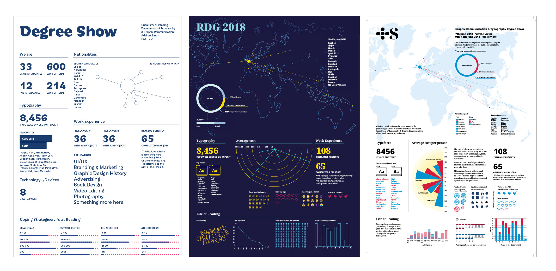
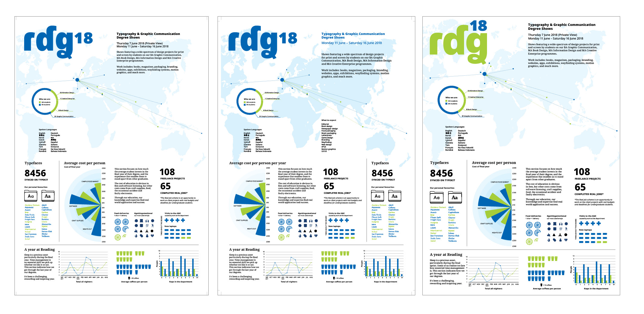
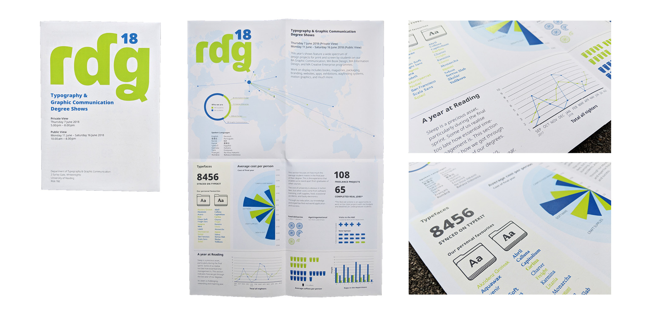
In the beginning of the project, everyone put out potential concepts and ideas for the degree show. Because the degree shows combined the MA and BA programmes (with the exception of MA Type Design), we needed a solution that would allow our work to mingle but simultaneously distinguish the MAs from the BAs. Several approaches were considered for example, typographic, abstract graphic and symbolic (using icons). During this time we also looked into past solutions from the department as well as what students from other colleges/universities had done that we enjoyed. Eventually we decided on an information design approach which would allow the flexibility of distinction between programmes, while presenting the graduating class as greater than the sum of its parts. We also wanted to include a personal quality to the invite, somehow reflecting each person’s experience of the degree, and for it to have a dual-quality of formally inviting people yet being an informal piece of information design.
A3 was the format chosen for the degree show invite as we wanted it to be a poster of reasonable size that we could still mail out. Going into C5 envelopes, the degree show invite would be folded twice into A5. This influenced the design as we had to take into account the fold lines (not putting text along the folds and not using a reversed out design due to cracking ink). The print invite went through several iterations and refinement.
The degree show invite is a representation of the graduating class from the MA Information Design, MA Creative Enterprise, MA Book Design and BA Graphic Communication programmes. We created a survey to gather responses on people’s experience and thoughts on the degree, which would then feed into the design of the invite. We did extensive research on data visualisation techniques as well as approached our tutors and lecturers in the department for feedback and advice.
We also considered using a typeface designed by alumni from the MA Type Design programme in order to further encompass the department’s specialties. However, the incompleteness of the typeface we had access to affected our decisions and we used Googlefont’s Noto Sans for the final design.
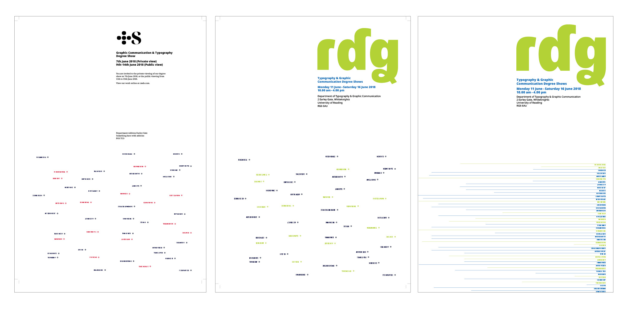
The front of the invite was an opportunity for us to explore interesting reveals with the (un)folding. It was also an opportunity for us to put down the names of the graduating class as information in this space was less crucial than the inside page. We included a map to the department indicating parking availability and instructions for getting permits. This was also redrawn to match the style of the invite overall.
Our colour scheme altered as the project progressed as we moved towards the possibility of spot colour printing. This simplified our colour scheme, stripping it down to three colours – lime green, jean blue and black. Suprisingly this helped the design look more cohesive and worked for the better in the long run.
MailChimp
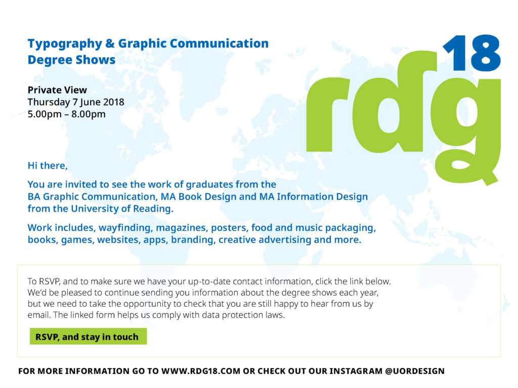
The MailChimp invite had a dual function – to get invitees to opt into being emailed again next year due to a recent change in EU laws regarding information and privacy. This was the primary call to action. The secondary call to action was to RSVP to the show. We combined these call to actions as a single button.
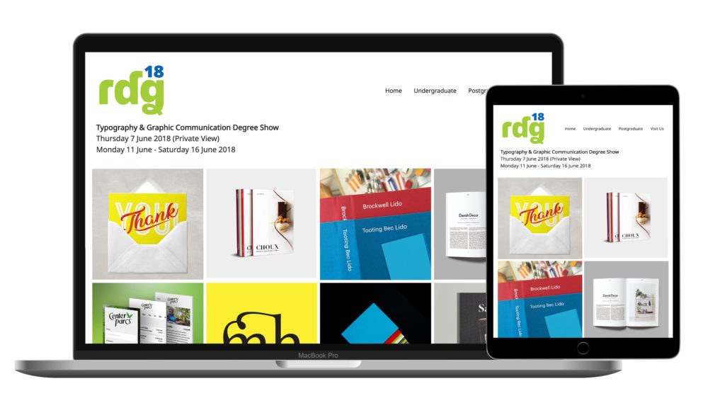
Website
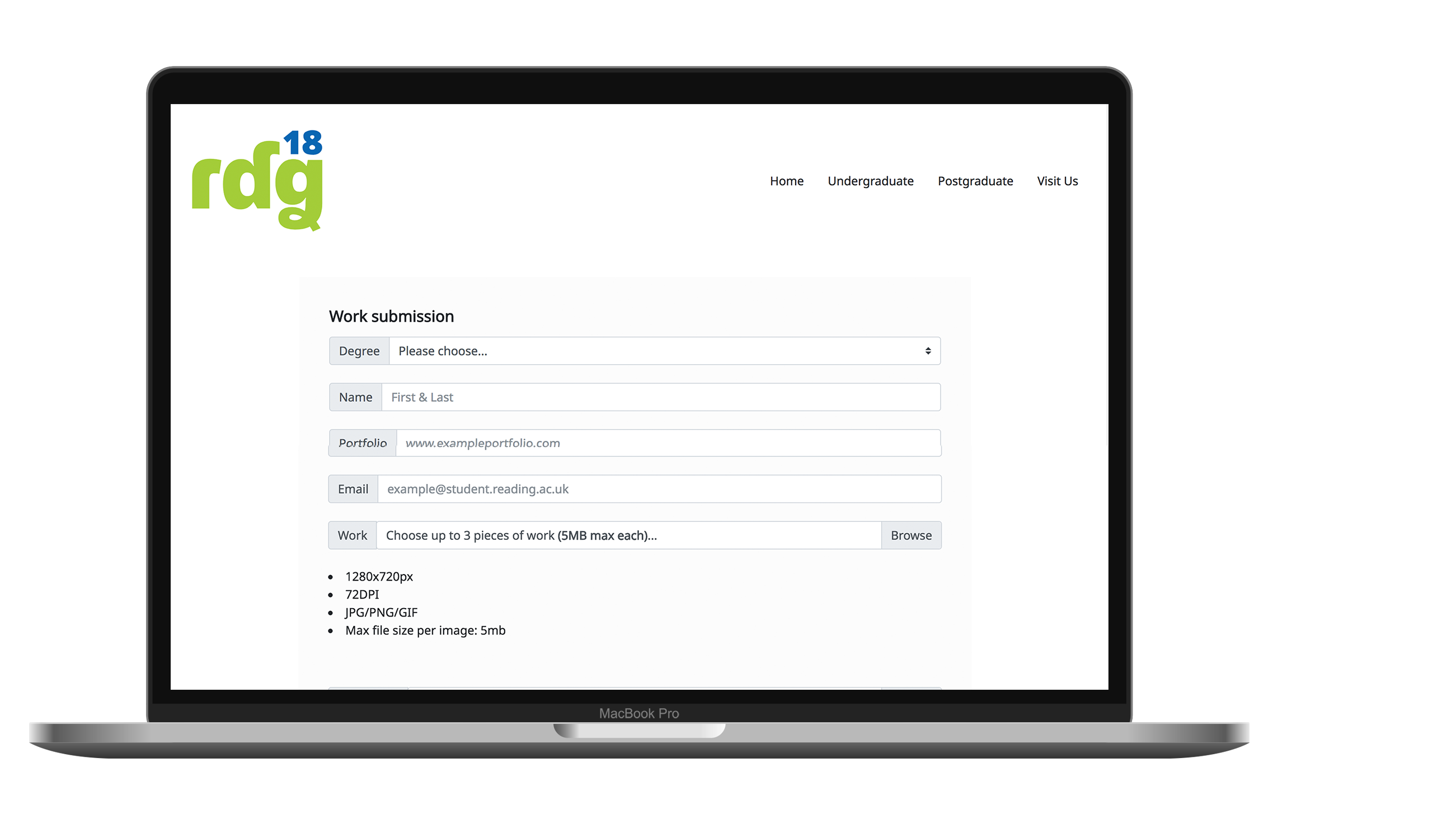
The website uses the Bootstrap framework and is responsive. In keeping with the concept of the print invites, we created a randomised display of people’s works so that no one persons’ work is prioritised.

To collect people’s work, we created a submission point using php that formed a database of people’s work that gets called and displayed according to their names. This eased the process of getting students to upload their work and ensured that communication was as clear as possible between the team and students.
Social Media Campaign
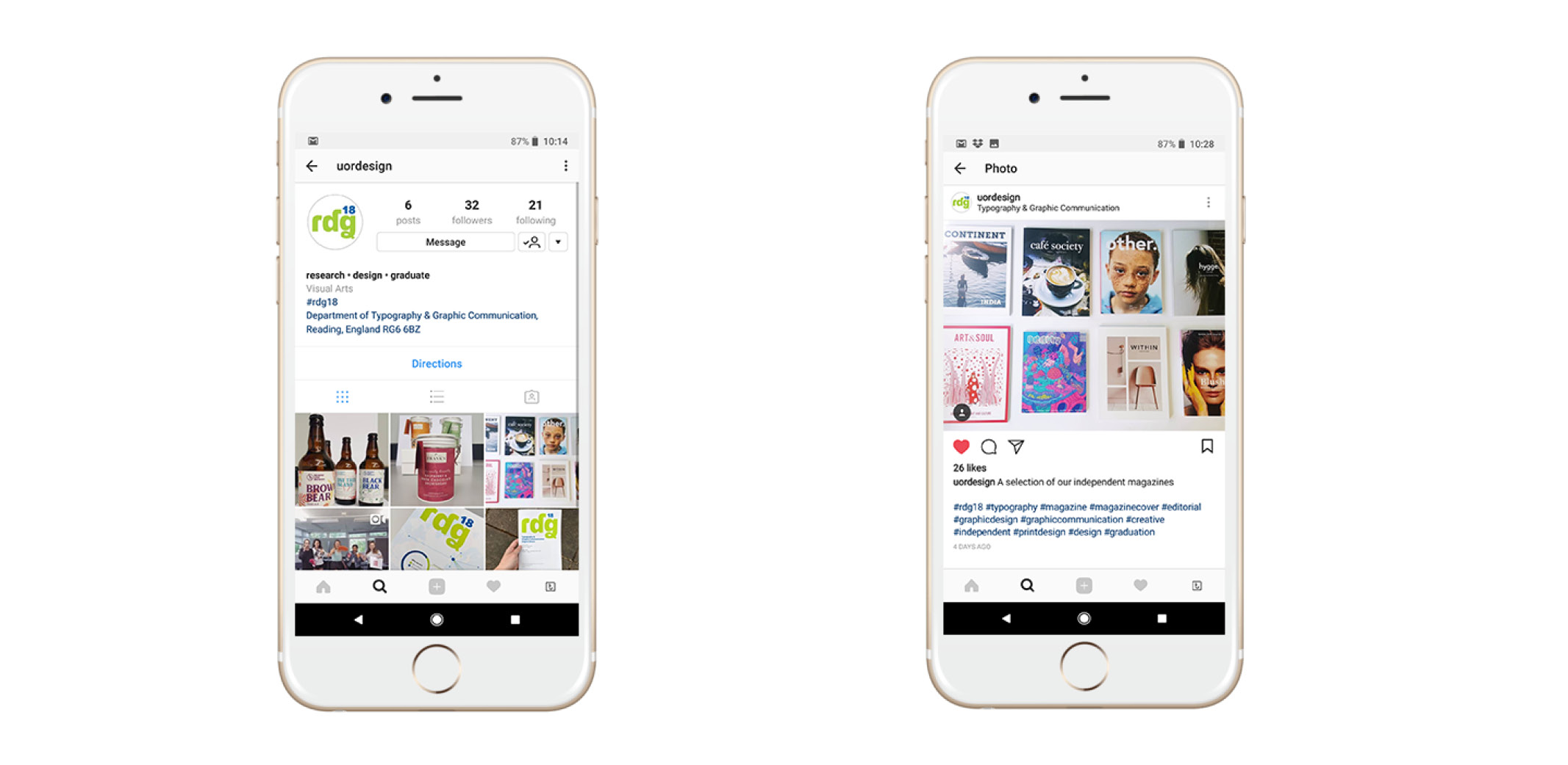
Our Instagram account was created to feature students’ work and process images of the degree show. We wanted the social media to reveal more detail about the work behind the degrees that every student completed and is suitable because of the informal nature of the platform. We also used hashtags to increase our visibility and reach.
Lessons
Through this Real Job, we learned the advantages of working together with team members of different strengths. Having someone on the team dedicated to the website and another person leading the print design allowed the team to focus on each deliverable. Frequent feedback sessions with different members of staff each time also allowed us to push the design further as we would get fresh eyes on the material.
However, a lengthy project that has a similar deadline to our dissertations meant that we lost stamina over the course of the project. If we did this project again, we would have avoided delaying the print job by a month and more fully exploited the possibility of printing in spot colours. This would have contributed to a more vibrant print design that people would be more likely to keep.
On the website, we also learnt that no matter how simple you try to make things, people will still upload things wrong and there needs to be leeway for extra time to fix and edit their mistakes.
Overall, this was an enjoyable project with deliverables that many of the graduating class are eager to keep for themselves. Working in a team also taught us to learn to trust each other and give each other feedback. The reception to the invites have generally been positive from both the graduating class as well as members of staff; we look forward to seeing the fruits of our labour at the final degree show.