Tag: matd

Universities are living things…

A keepsake for the Secretary of State for Education

So starts a quote by this University’s first Vice-Chancellor, selected by the current VC, Sir David Bell KCB. On a very tight deadline, we produced a keepsake (pictured above) to present to the Rt Hon Michael Gove MP, Secretary of State for Education, on the occasion of the launch of the University’s Institute of Education, on 21 June (press release). We wanted something special, that would reflect the breadth of University life.

Rafael Saraiva, a student on the MA Typeface Design programme, did the lettering and designed the typeface in which the text is set in. Darren Lewis, Head of the University’s Design & Print Studio, oversaw the printing on the University’s digital press. Gerry Leonidas, Director of the MA Typeface Design, specified the typography and supervised the project.


MATD project work in Instapaper

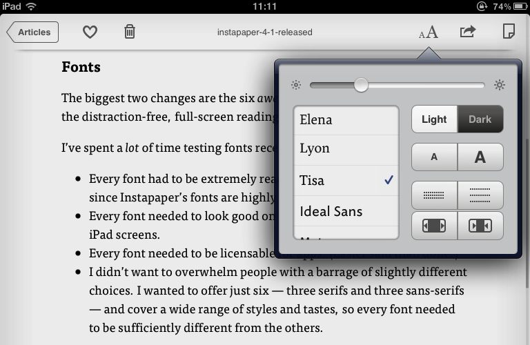
FF Tisa on a first generation iPad

The latest update to Instapaper (AppleStore link) includes six new typefaces, including two that started as MATD student projects: FF Tisa by Mitja Miklavčič (2006) and Elena by Nicole Dotin (2007). Instapaper, a 4+ rated app, allows the user to collect content for reading in a highly user-friendly environment on an iPhone, iPad, or a personal computer.  Extended commentary (and an image of Elena on the iPad) over at Typenotes.

Wednesday seminar: Rob McKaughan

Rob McKaughan is one of those people who can be trusted to come up with an interesting angle on things. Coming to the MATD from software engineering, he researched pattern languages (a methodology created by Christopher Alexander for architecture, which has spread to software and interaction design, amongst other fields) and their application to typeface design. Here’s a good explanation of pattern languages, from Rob’s introduction to his dissertation:

Each pattern in a pattern language is a rule of thumb abstracted from existing proven designs. More specifically, a pattern is a description of a problem and its solution in a particular context. These patterns are not recipes; they balance concrete physical descriptions while abstracting the pattern’s concepts for use in other designs. The patterns focus on the characteristics of the product, and not the process used by the designer.

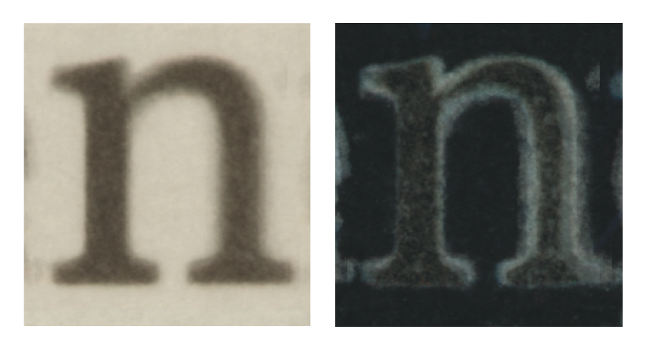
Rob outlined the generation of pattern languages, and gave an illustration of how patterns can be used for typeface design (for his dissertation Rob focused on newspaper typefaces, with interesting observations on small size / low resolution text typefaces in general).

The lively discussion (including my immodest observation that some design courses follow a very similar approach to teaching, bar the nomenclature) touched on exciting topics, not least the relationship of pattern languages to innovation in design – much on the forefront of MA students at the beginning of their year…

Overlayed letters from newspaper typefaces

MA student Joana da Silva at the Encontro Nacional de Tipografia

Joana da Silva, one of our MA Typeface Design students, will be a speaker at the  Encontro Nacional de Tipografia conference, hosted by the Universidade de Aveiro in Portugal, on 30 September. I can’t read Portuguese, but I can just about decipher the “Áreas de interesse”, and it made me think “I wish I could be there”. Good names are already on the speakers’ and organisers’ lists.

My first visit to Portugal (for ATypI 2006, in Lisbon) was an eye opener: there was strong community of designers and teachers in typography and typeface design, but they were not making their presence felt much outside the country. In the last five years this has started to change at an increasing pace. Events like the Encontro help develop a particularly regional take on typography.

The Encontro organisers are keeping the event modest in length, which has to be applauded. As larger typographic gatherings grow in numbers (ATypI, Typecon, TypoBerlin, the new TypoLondon, and others I forget) it is the smaller events, of one or two days at most, with modest registration fees, that become more rewarding to attend. Although the big typo-events are always appealing, it is the smaller events that fit better in a full typographic calendar. (I’m thinking of the many one-day events and one annual two-day conference at St Bride Library, the relatively new TypeTalks, the IDC in Katowice, amongst others.) Who knows? Maybe in a few years the big-ticket events will only be every two or three years, like the bi-annual CIT Valencia and Tipos Latinos, and the tri-annual ICTVC. (Or every ten, like the wonderfully far-sighted ATypI Letter2 event!)

But, hidden in the competition of the growing number of events for our time (and wallet) are two especially good developments: that most of the new events are based in countries that do not have a long tradition of typographic gatherings; and that there are many young speakers who are designers, teachers, and researchers. As typography and typeface design are getting established in ever more schools and universities, we can look forward to more events like the Encontro.


Encontro Nacional de Tipografia