Tag: lettering

A new Papal Inscription in Westminster Cathedral

Finished floor

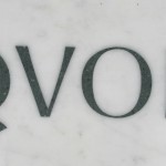
Typography alumna, Caroline Webb, has designed and installed a new Papal inscription for Westminster Cathedral, to commemorate the visit of Pope Benedict in 2010.

The 7 foot long inscription is made of one piece of Carrara Marble inlayed with letters of green and red Porphery and lies in the main entrance to the Cathedral.

The marble inlay was done by Pietra Dura craftsman Thomas Greenaway.The inscription took 2 years to design and produce, and a week to fix in the floor. The commission was technically challenging in every way; Caroline will be writing a full article to document its creation.

Sanguinis 3 lines copy Quod copy  3 copy

Wayne Hart is Golden

Wayne Hart letters

Wayne Hart, a Department alumnus and visiting instructor for letter cutting, has just been awarded Gold Award & Overall Winner and Maker of the Year Award in the annual Craft & Design competition. The specialist media judge, Medeia Cohan-Petrolino, summed up Wayne’s work:

Wayne Hart’s work offers a unique juxtaposition – upholding traditional letter-carving methods while simultaneously being contemporary and innovative. His passion for his craft and meticulous manner come across in every aspect of the work that he produces. Wayne’s craftsmanship and creativity are already at an impressive stage and his plans to continue pushing forward with his practice and technical development will surely make him one to watch.

Wayne has already been awarded a number of prestigious scholarships from the Queen Elizabeth Scholarship Trust, the Worshipful Company of Masons, the National Association of Decorative and Fine Arts Societies, the Finn Family Fund, the Bishop of Norwich and a number of smaller charities. His work is increasingly recognised, and can also be seen in the base of the clock tower in the University’s London Road campus.

Paul Gehl on the calligraphic tradition in Chicago design, 1900–1950

Raymond Daboll lettering

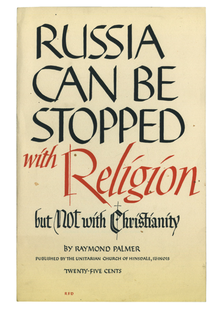
The Department welcomed Paul Gehl to its Wednesday afternoon series of guest lectures. Paul, who is Custodian of John M. Wing Foundation on the History of Printing at The Newberry Library, Chicago, spoke about the calligraphic tradition in Chicago design between 1900 and 1950. He drew our attention to the liberal attitude many Chicago designers had toward calligraphy that enabled them to draw freely on its traditions to arrive at new inventions. The results found wide application in advertising design and gave Chicago work a distinctive regional (some would say provincial) flavour. This later stood in contrast to design in Chicago that was influenced by European modernism, an influence that gained in strength from 1937 when the New Bauhaus was founded in the city. The uneasy relationship between these approaches came to typify Chicago design and was one of Paul’s themes. He also spoke in detail about Raymond DaBoll, a calligraphic designer Paul felt merited new appreciation. DaBoll’s work offers a vibrant counterpart to the lettering and calligraphy of his more famous colleague, Oz Cooper.

Throughout his talk Paul remarked on the rich resources available at The Newberry for scholars working in the fields of printing, lettering, typography and the books arts. You can hear Paul speaking on a related calligraphy topic here.

[Images: book jacket by Raymond DaBoll (above), magazine advertisement by Elmer Jacobs (below); images courtesy of The Newberry Library.]

Elmer Jacobs lettering