Soon after the conclusion of a successful visit by students from CAFA to Typography in 2015, we commenced working on a reciprocal visit to Beijing. As it happened, several strands of activity came together to make this an exceptionally productive visit. A short report follows below; the local organisers, led by CAFA teacher Liu Zhao, recorded all presentations for translation and reposting on the Chinese social networks, and microblogged almost every minute of the trip to a jaw-droppingly numerous online audience.
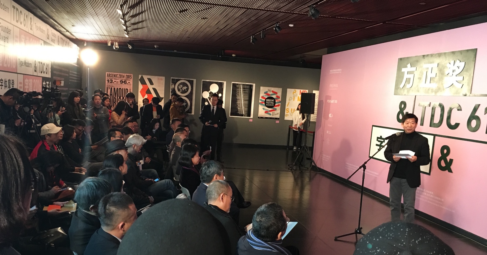
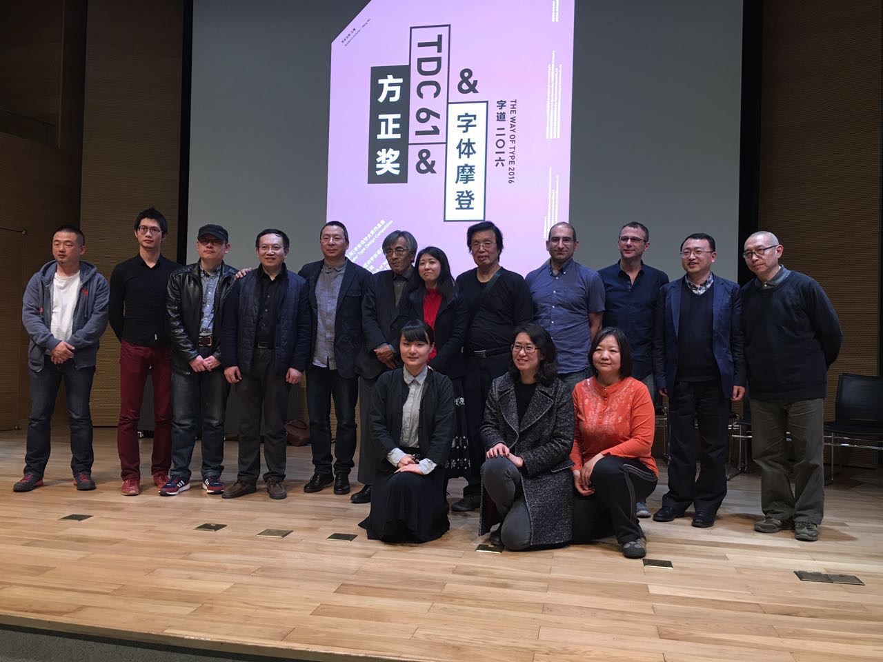
Opening the visit with a more formal occasion, Gerry Leonidas and José Scaglione (Reading alumnus and ATypI president) took part in the judging of the 8th Founder Type Design Competition. The event, held every two years, included for the first time Latin typefaces by Chinese designers. The next day, the winners were announced in the National Centre of the Performing Arts (the “Egg”), together with the opening of the TDC61 exhibition, the Chinese leg of the global tour of the annual design competition; and the opening of the “Chinese Type Modern 1919–1955” exhibition with material from the archives of Founder Electronics on the transition of Chinese type-making across technologies – with clear influence by Reading’s TDi 2015 course, in which Founder staff participated in.
Font Forum conference
The exhibition and competition awards served as the opening events for the two-day Font Forum, a conference on typeface design with speakers from China, Japan, and Europe, to packed auditoria. At the end of each day lively panel discussions demonstrated the interest of the student and professional audience, and the desire for stronger engagement with the international typographic community. (In the sidelines of the conference, plans were hatched to coordinate a BA module on typeface design between Reading and CAFA in 2016–17.)

CAFA workshop
The main part of the visit was taken over by a workshop on typeface design at CAFA. The interest in Latin typeface design is considerable, and the skills of many students impressive. This is a sign of the gradual globalisation of Chinese design education, and the demands by the local professional employers for skills that can serve markets across language and script regions. Although the workshop was primarily focused on typeface design, there was great interest in typographic design, and especially for mobile platforms.
Centre for Chinese Font Design and Research
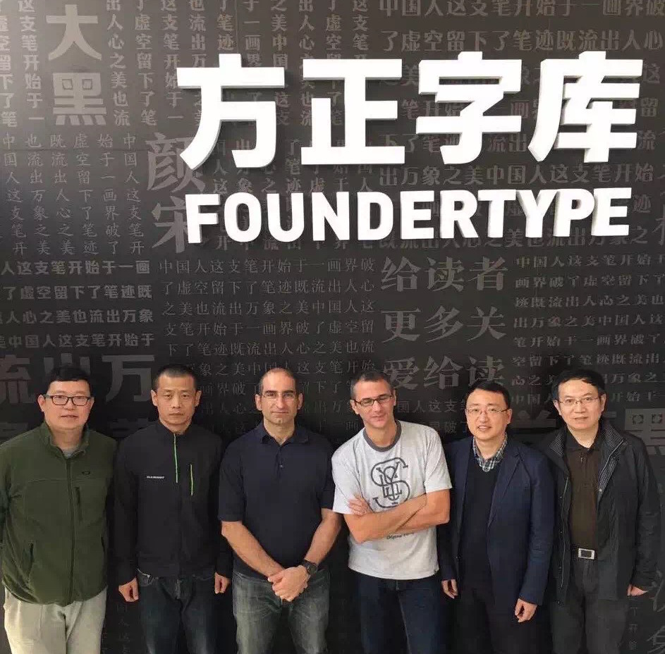
Two visits at the Centre for Chinese Font Design and Research, hosted in the offices of Founder Electronics, focused on design issues in fonts for Chinese, design tools and processes, and professional training for multi-script design. The second of the visits had very concrete aims, with Gerry orchestrating the localisation of Glyphs (the key font design application) into Simplified Chinese, to enable designers in China to experiment with new workflows.
CITIC publisher agreement
Starting in TDi 2015, Gerry Leonidas guided Liu Zhao to compile a list of books on typography and typeface design in English to be translated into Chinese by CITIC, one of the most prominent publishers in the country. The project is progressing well with many rights already secured, and schedules for the translations and launches in place. Gerry’s involvement in the curation of the series provides the opportunity for the University’s approach to typographic scholarship to be transplanted in a new market in a unique manner. This is part of a wider collaboration between the University, CITIC, and CAFA, with the aim of building up typeface design education in China.

Dongdao Design
Despite the timing on a Sunday evening, over 140 designers from Dongdao, one of the largest design agencies in China, turned up to listen to José and Gerry talk about typeface design solutions and studies. The presentations were followed by Q&A sessions and interviews, which will be posted on Chinese social media with subtitles.
p.s. ATypI in Beijing?
Seeing in person the typographically maturing environment in Beijing and particularly the concretely supportive attitude in CAFA convinced José and Gerry (president and vice-president of ATypI respectively) of the importance and timeliness of bringing the annual conference of the type design community to mainland China. They outlined the key parameters of a proposal with Dean Wang Min and Liu Zhao, and explored timing options. Look for announcements through ATypI!