Damien’s Ideal Gift – Tiger Trophy with other statues

Set of statues and trophies for different aspects and interests of Damien.

I wanted the main gift to be a trophy to celebrate his 5 years of playing ice hockey. The jersey has his team number (13), and one of his favourite animals is a tiger, hence the combination. The sketching began with a simple silhouette of a tiger standing up and then was decorated to fit the colours of Damien’s team.

The other animals are decorations for Damien’s room, as he could use some more. He told me he likes reptiles and small animals, and so I drew a chameleon and a chinchilla. My random words to incorporate were umbrella and magazine, so I gave the chameleon a little umbrella, and the chinchilla is holding Damien’s magazine called Tag, that he worked on a couple of years ago.

Set of statues and trophies for different aspects and interests of Damien.


Labyrinth

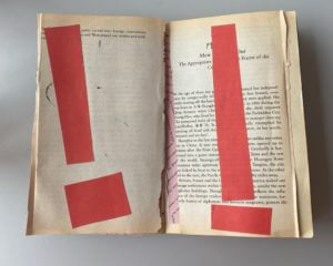
I interpreted my prompt as a family who move into a new house and get stuck trying to navigate their way through to the ending. As you go through the book the pages get darker and more creepy, and eventually it ends with the family finding the unknown victims that came before them. It starts off innocent (as seen in second part) but there are warning signals all around them.

The book has doorways cutout to get through the story but they get progressively more unusual and abnormal for the family to get through. Without time constraints, the goal would be to finish each room in the house and develop the backstory. I would have explored more ways to display the sense of despair in the family’s house and shown that through different means of paper craft, like cutting holes into each page to mimic the feeling of being sucked in.

The brief with the backstory was a great way to practice my physical design.It had little purpose, but a lot of meaning that could be inferred through artistic methods, something I thoroughly enjoy about design.


The warning before the end.

OK Design Logo

70s furniture inspo

Attached is some research that I compiled into moodboards before starting my logo design task. I wanted to draw inspiration from the 70s aesthetic of smooth curves and very colourful palettes. The warm tones of orange and yellow are prevalent, and typography was also very colourful, with accents of blues being popular too.

I started by sketching out some motifs and patterns that could aid my design process: IMG_0060.HEIC  IMG_0061.HEIC
In these sketches, the model of a “K” became the focal point and I developed it into a vector on Illustrator, which was then matched with an “O” I drew. The counter of the “O” was comprised of the flower motif I drew as a response to the research and my own personal knowledge of the decade. 70s retro logo

I laid out the business card in a few configurations to see how text-heavy I wanted it to be. The final design contained my name, my email, and my logo design. The design behind it was a simple wavy design in 3 different colours to match the colour story from my inspiration.

Colour in the Wild

For my research, I went around campus looking for colourful type/signs that either catches your attention immediately, or blends into the background and go unnoticed. I found the main use of colour was for warning and informational signs, something to be expected when it is more likely to draw the eye to it.

This was an interesting task because signs are utilised by most members of society,  but they are very easily overlooked when overwhelmed with other signs. For example, there was a construction site on campus that had a sign board with many different signs that were all competing with each other. The use of the board isn’t to guide the general public, but its still an insight into how design aids attention to important messages and notices.

Great Gatsby Rendition David Pearson

We were tasked a recreation of the iconic designs of Penguin book covers to develop our skills in InDesign. This project was not only really fun to create, but also very insightful on how to create stylesheets and format a book cover correctly.

Alongside this recreation, we were asked to make another cover for a different book title. I chose to recreate the cover of The Curious Incident of the Dog in the Night-time by Mark Haddon.