I have recreated the classic Penguin cover, using InDesign, to practice my skills and gain some new ones by learning to draw different shapes as well as adjusting the leading, tracking and kerning of characters to reflect the original. I like the overall outcome, however if I had more time, I would redraw the cartouche shape to be more accurate and seamless.
Plane Ticket to Mexico
I created the ideal gift with the given information of my classmate liking to travel, being half Mexican as well as loving the chocolate Kinder Bueno. I also found out some significant dates in her life as well as favourite letters (J, D, S), colours (pink and black) and numbers (4) to create a personal plane ticket to her hometown in Mexico from her current home in the UK on her 20th birthday, designed on a Kinder Bueno shape.
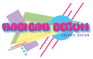
Logo – 90’s Theme


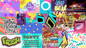
I created a logo on Adobe Illustrator for my own brand in the style of my chosen theme of Urban 90’s. First, i created a mood board on Powerpoint which was easily accessible as I was designing, to put all my ideas and inspirations in one. I gathered my favourite pictures and analysed what was common throughout to create my logo. I then began using regular shapes to compliment the lines and squiggles seen throughout the 90’s patterns as well as the font reflecting ‘The Fresh Prince of Bel-Air’ which went well with my theme. I then aligned a sans serif font to balance the logo as the next hierarchy of text to result in my finished logo. I like how this clearly reflects the theme, however some of the colours could be altered to adjust the readability.
