Author: gerryleonidas

Wednesday seminar: Will Holder

Typographer Will Holder once read that oral tradition would lead us out of the post-modern condition and has since become preoccupied with ‘publishing’. More often than not, the publications do not take the form of ink and paper, and a large part of the preoccupation is spent in finding suitable ‘forms’ for transmission. He sees conversation as a tool and a model for a mutual and improvised set of production conditions, where design is a responsive moment rather than a desired end. This approach has resulted in working relationships and continued conversations whereby the usual roles of commissioner, author, subject, editor, and designer are improvised and shared, as opposed to assigned and pre-determined.

Will Holder is editor of F.R.DAVID, a journal concerned with reading and writing in the arts, published by de Appel, Amsterdam. In May 2009, he curated ‘Talk Show’ (with Richard Birkett) at the ICA, London — an exhibition and season of events concerning speech and accountability. Holder is currently editing and designing a biography of American composer Robert Ashley in the form of operatic notation (together with Alex Waterman), and rewriting William Morris’s News from Nowhere: An epoch of rest (1876) into a guide for design education and practice set in 2135.

Wednesday 30 November 2011
Nike theatre, Agriculture | 2–2.50 pm

External links: Will Holder at the ICA; at Frieze magazine

Art/Typography talks …

… is a cross-Departmental programme of speakers whose research &/or practice engages with the intersections between Art and Typographic design. The programme was started in 2010 with a talk by Stuart Bailey of Dexter Sinister and will continue this year with talks by Will Holder (autumn term 2011); Sara De Bondt & Antony Hudek of Occasional Papers (spring term 2012); and Rathna Ramanathan (spring term 2012). The talks are open to all students from the Department of Art and the Department of Typography & Graphic Communication.

(Image: Past Imperfect, 2005, compiled & edited by Bik Van der Pol and Lisette Smits. Design: Will Holder)

Paul Gehl on the calligraphic tradition in Chicago design, 1900–1950

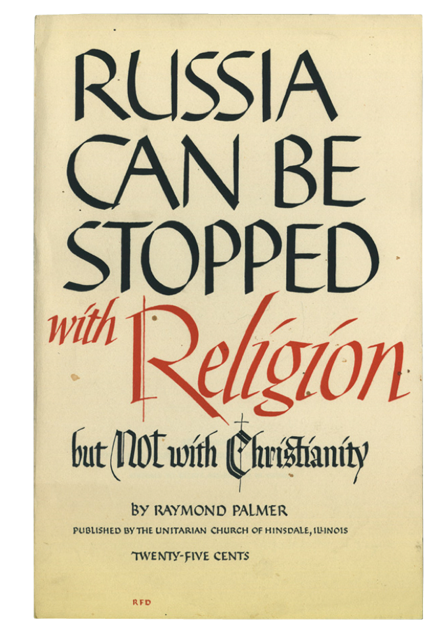
Raymond Daboll lettering

The Department welcomed Paul Gehl to its Wednesday afternoon series of guest lectures. Paul, who is Custodian of John M. Wing Foundation on the History of Printing at The Newberry Library, Chicago, spoke about the calligraphic tradition in Chicago design between 1900 and 1950. He drew our attention to the liberal attitude many Chicago designers had toward calligraphy that enabled them to draw freely on its traditions to arrive at new inventions. The results found wide application in advertising design and gave Chicago work a distinctive regional (some would say provincial) flavour. This later stood in contrast to design in Chicago that was influenced by European modernism, an influence that gained in strength from 1937 when the New Bauhaus was founded in the city. The uneasy relationship between these approaches came to typify Chicago design and was one of Paul’s themes. He also spoke in detail about Raymond DaBoll, a calligraphic designer Paul felt merited new appreciation. DaBoll’s work offers a vibrant counterpart to the lettering and calligraphy of his more famous colleague, Oz Cooper.

Throughout his talk Paul remarked on the rich resources available at The Newberry for scholars working in the fields of printing, lettering, typography and the books arts. You can hear Paul speaking on a related calligraphy topic here.

[Images: book jacket by Raymond DaBoll (above), magazine advertisement by Elmer Jacobs (below); images courtesy of The Newberry Library.]

Elmer Jacobs lettering

Wednesday seminar: Rob McKaughan

Rob McKaughan is one of those people who can be trusted to come up with an interesting angle on things. Coming to the MATD from software engineering, he researched pattern languages (a methodology created by Christopher Alexander for architecture, which has spread to software and interaction design, amongst other fields) and their application to typeface design. Here’s a good explanation of pattern languages, from Rob’s introduction to his dissertation:

Each pattern in a pattern language is a rule of thumb abstracted from existing proven designs. More specifically, a pattern is a description of a problem and its solution in a particular context. These patterns are not recipes; they balance concrete physical descriptions while abstracting the pattern’s concepts for use in other designs. The patterns focus on the characteristics of the product, and not the process used by the designer.

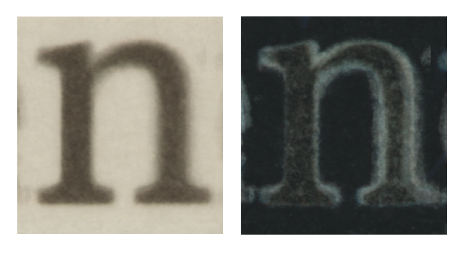
Rob outlined the generation of pattern languages, and gave an illustration of how patterns can be used for typeface design (for his dissertation Rob focused on newspaper typefaces, with interesting observations on small size / low resolution text typefaces in general).

The lively discussion (including my immodest observation that some design courses follow a very similar approach to teaching, bar the nomenclature) touched on exciting topics, not least the relationship of pattern languages to innovation in design – much on the forefront of MA students at the beginning of their year…

Overlayed letters from newspaper typefaces

A career in design: advice from industry experts

‘What to do with a degree in design studies?’ was the question posed by The Guardian’s Career Blog today. Among the industry panellists answering the question were Will Nice of Goosebumps Brand Consultancy, Simon Manchipp of SomeOne, Robin Levien, and Rob Ball and Greg Quinton of The Partners. On the education side, Paul Luna was joined by Stephen Westland from Leeds, Nicola Francis from Nottingham Trent, Helen McCarron from Lincoln, Andy Edwards from Leeds Metropolitan, and Jamie Dobson from Surrey. Rhiannon James gave the D&AD point of view.

Topics covered included getting the best from an internship, getting a job in a different field from your degree, and the benefits of taking an MA. The panellists also gave advice on networking, portfolio building, presenting yourself to potential employers, how to overcome nerves in stressful situations, and how to cope with the current state of the job market.

More from Buenos Aires

Here’s the team of jurors from the Letter.2 event: (from left) Rubén Fontana, visiting graphic designer Miguel Catopodis, Gerry Leonidas, Patricio Gatti (in whose workshop the judging took place), Fiona Ross, John Hudson, Lucie Lacava, Peter Bil’ak, Akira Kobayashi, and chairman José Scaglione. For a video of Gerry in action, see here.

Picturing social facts: Neurath workshop proceedings published

During the Isotype Revisited project, Christopher Burke and Eric Kindel contributed to a workshop, ‘Picturing social facts: on Neurath’s visual language’, delivering papers alongside Friedrich Stadler, Elisabeth Nemeth, Sybilla Nikolow, Sophie Hochhäusl, Hadwig Kraeutler, Karl H. Müller & Armin Reautschnig, and Bart Lootsma. This was part of the 33rd International Ludwig Wittgenstein Symposium, held in Kirchberg am Wechsel, Austria, in August 2010.

The second volume of the symposium Proceedings have now been published, containing the workshop papers, as well as a series of papers on the theory and history of diagrams. Christopher Burke’s paper is titled ‘The linguistic status of Isotype’, and Eric Kindel’s ‘Reaching the people: Isotype beyond the West’. The volume, edited Richard Heinrich, Elisabeth Nemeth, Wolfram Pichler and David Wagner, can be previewed and purchased here.