Author: Emily Nash

Fast turnaround logo design project 2021

Brief:

The brief for this project was a bit different from the ones I have previously worked on; this was a two-week turnaround project to create two sets of simple logo guidelines. These guidelines were to be used by part 1 students in their TY1INT mobile design module, and so we had to consider usability for a less experienced group, and how they would go about using these guidelines.

The two brands I would be designing for were ReadiFood (Reading food bank) and Mobility Trust.


Organisation background:

ReadiFood is Reading’s food bank, run by Faith Christian Group. They provide emergency food parcels, sent in crates, to rough sleepers, and others who have been referred (referral only service). 

They have schools, and donators who contribute to the parcels; tins, biscuits, and teabags are some of the most commonly given items, but there are also some toiletries available upon request.

“Urgent Food needs are; Tinned vegetables, tinned fruit, tinned potatoes, packets of biscuits and packs of teabags (80s’ & 160s’), Tinned meat meals (mince& onions, hotdogs, meat pies etc.)”ReadiFood website.

ReadiFood is a member of the Independent Food Aid Network and not affiliated to the Trussell Trust.

People that use the organisation are rough sleepers / homeless people in terms of the receiving side, and then donators and schools will use the service for donating and aiding those in need. 


Mobility Trust provides wheelchairs and scooters to those in need, who may not have the funding.

“Mobility Trust provides powered wheelchairs and scooters for UK residents who have severe disabilities and who cannot obtain such equipment through other means. We aim to reach and help people who, quite simply, have nowhere else to turn. We are the only UK charity that provides such broad support, regardless of age or cause of disabilities.”Mobility Trust website.


Initial Ideas:

With this being a very short project, the initial ideas stage was important in being concise and straight to the point; having a solid starting place for these logo designs would be beneficial in moving forwards at a good pace. I tend to do my drafts/form ideas digitally, as opposed to on paper, as it allows me to copy elements across and re-use them in different ways easily.
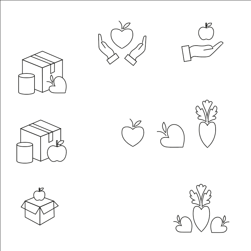
 

ReadiFood drafts
Figure 1: ReadiFood initial drafts, icons and line drawings
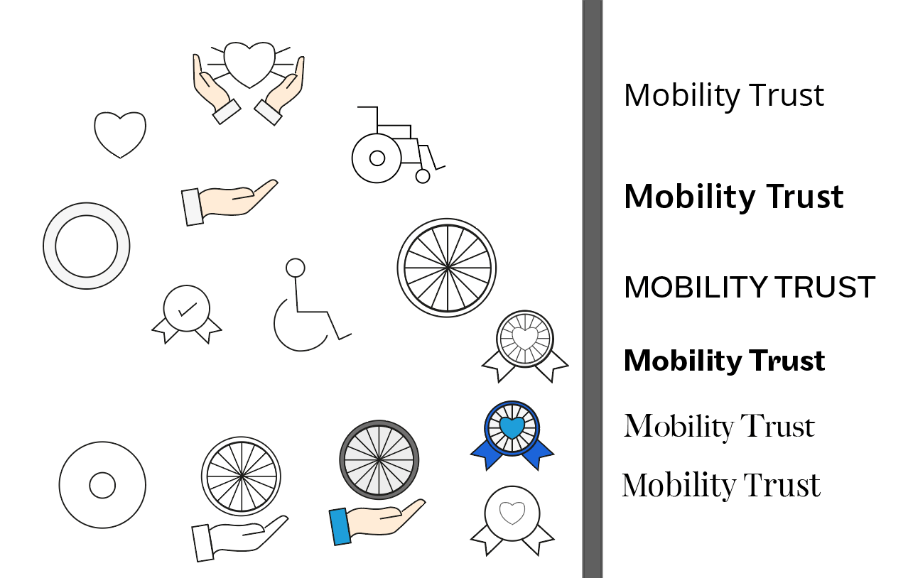
Mobility Trust drafts
Figure 2: Mobility Trust initial drafts; imagery and type


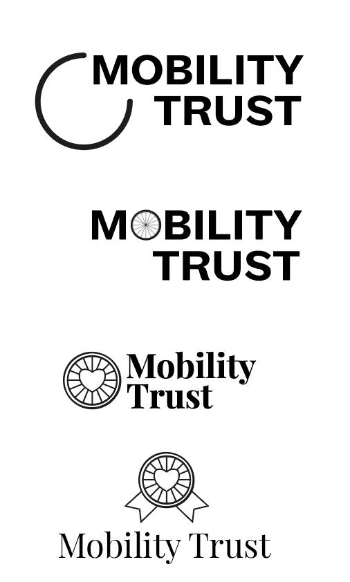
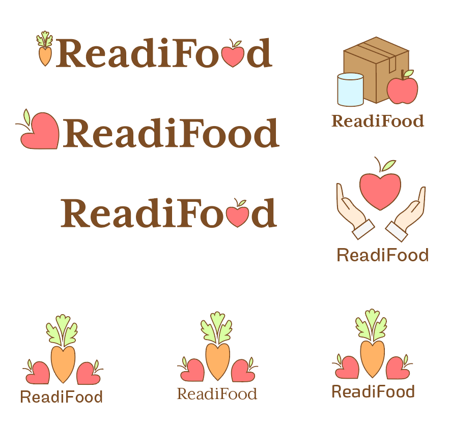
Initially, I was more comfortable designing for ReadiFood, as I had a strong concept of the food being heart-shaped, really obviously a charity, or having an apple icon as it was defined, recognizable, and legible. Mobility Trust, I felt should be more type-based due to the lack of imagery involved with inclusivity and the general topic of the charity. I had general ideas (fig 2) like the wheelchair, the wheelchair’s wheel, and a ‘badge’ style design to link closely to the “trust” aspect.


Development of ideas:
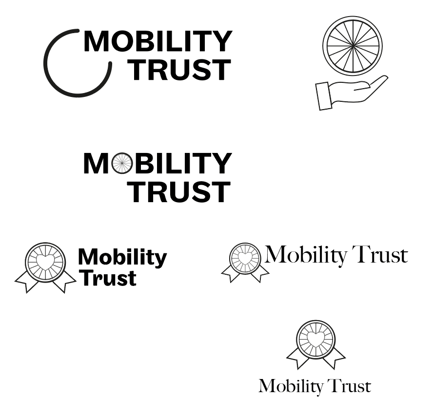
Figure 3: Mobility Trust development


Clearly, Mobility Trust was not in a good position, however, I needed to make rapid decisions in order to get the deliverables finished in time. I combined the type and the imagery together (fig 3), to try and form some designs which could be used as logos, with potential stand-alone logos within.
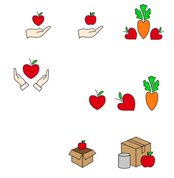
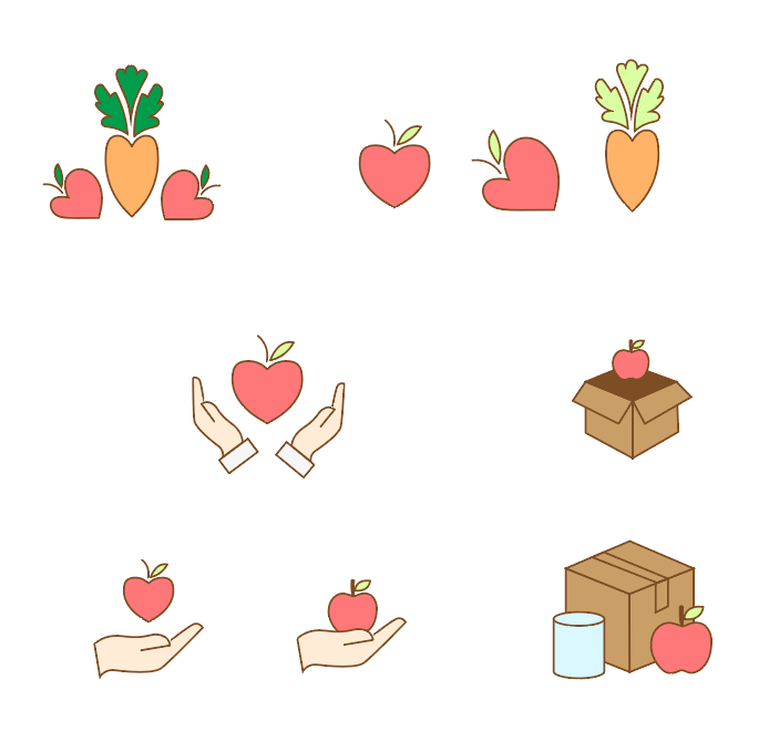
Figure 4, 5, 6: ReadiFood in ‘strong’ colours, ReadiFood in ‘soft’ colours, ReadiFood in ‘soft’ colours combined with type


Figure 7: ReadiFood logo to develop


Feedback at this stage for ReadiFood, my supervisor selected one of my logos to go forwards with (fig 7), and gave the following points:

“In the timeframe, I think this idea has the most potential. I suggest you work on:

1 – typeface choice (something that suits the illustration style)

2 – strengthen the outlines used in the illustration

3 – consider colour palette, is the brown the most suitable?”


Figure 8: Mobility Trust logo to develop

And for Mobility Trust, my supervisor done the same, and selected a logo with the most potential (fig 8):

“I think this has the most potential. Consider the following:

1 – typeface choice to suit the wheel, which is currently a solid line of the same thickness, the current typeface has slight contrast between thick and think strokes

2 – detail on the wheel, consider how small this logo might need to be and, therefore, the loss of detail in the wheel spokes. You may need to reduce the number (making sure it is still recognisable as a wheel)”


Improving developed logos:

The three things to change up with ReadiFood are the typeface, the outline of the illustration, and consideration for the colour palette. Therefore, I brainstormed with a wide range of typefaces (fig 9) in combination with the illustration (which was altered to have a thicker outline), and came up with a colour scheme which could be used. From here, I picked which I thought the strongest choices were for the typeface (fig 10), and pitched them to my client/supervisor.
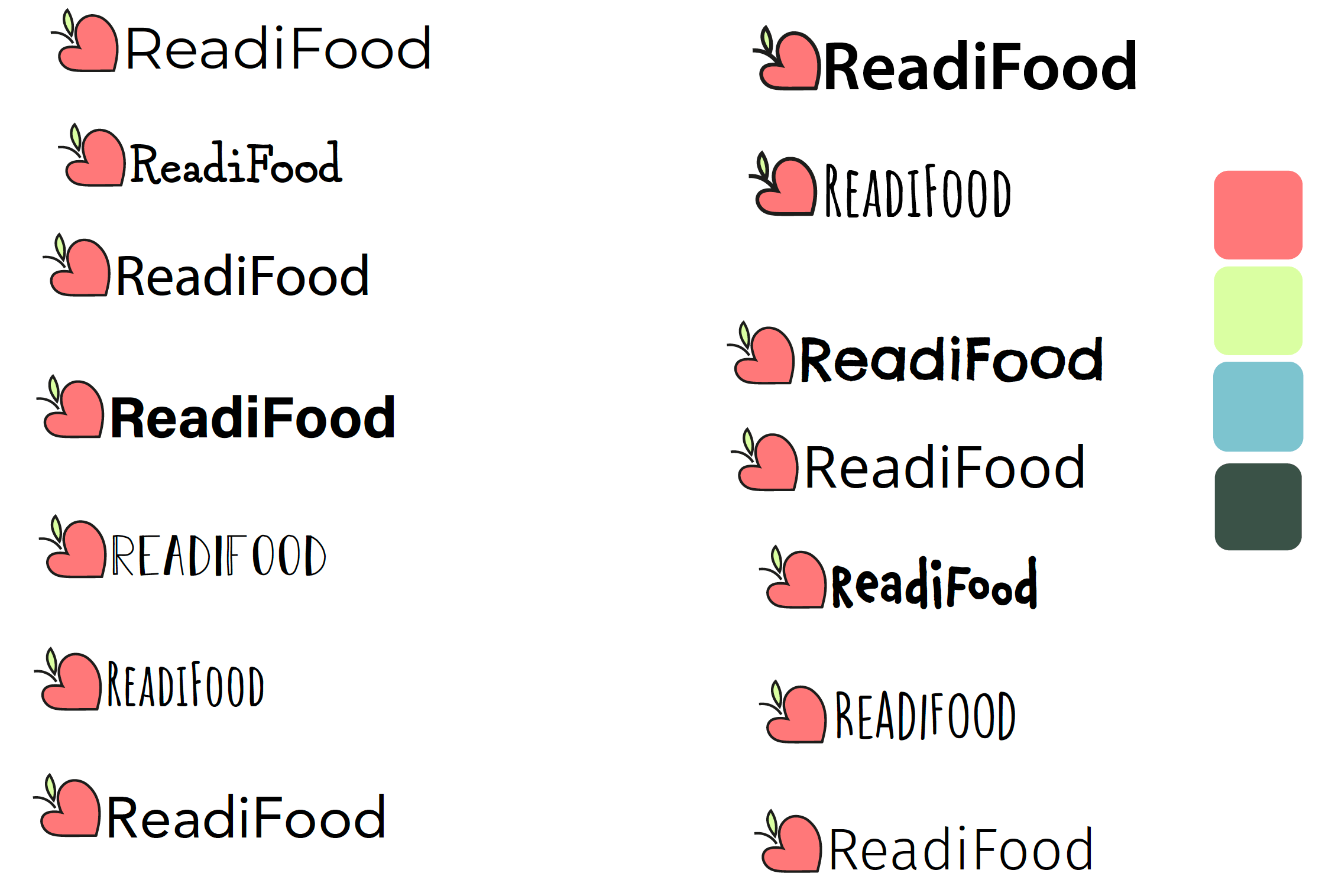
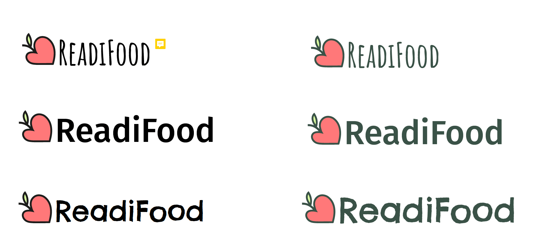
Figure 9: ReadiFood development, illustration and range of typefaces


Figure 10: Refinement of ReadiFood logo


Feedback at this stage:

“all the colours need to have the same strength. At the moment the lime green needs slightly more strength (probably some black) so that it holds up against the other colours,” and there was a reference for the top left typeface (Amatic), which has a comment icon attached in figure 10. And the selected logo “demonstrates a good choice of typeface to accompany the illustration”


For Mobility Trust, the typeface was also a problem that needed refining, and the detail of the wheel needed exploring. Therefore, I added swatches of two separate monoline typefaces (fig 11) in different weights (Avenir and Futura), in an attempt to match the typeface to the illustration style. Also, I experimented with different levels of detail in the wheel illustration, as well as trying to put together a cohesive and appropriate colour scheme.
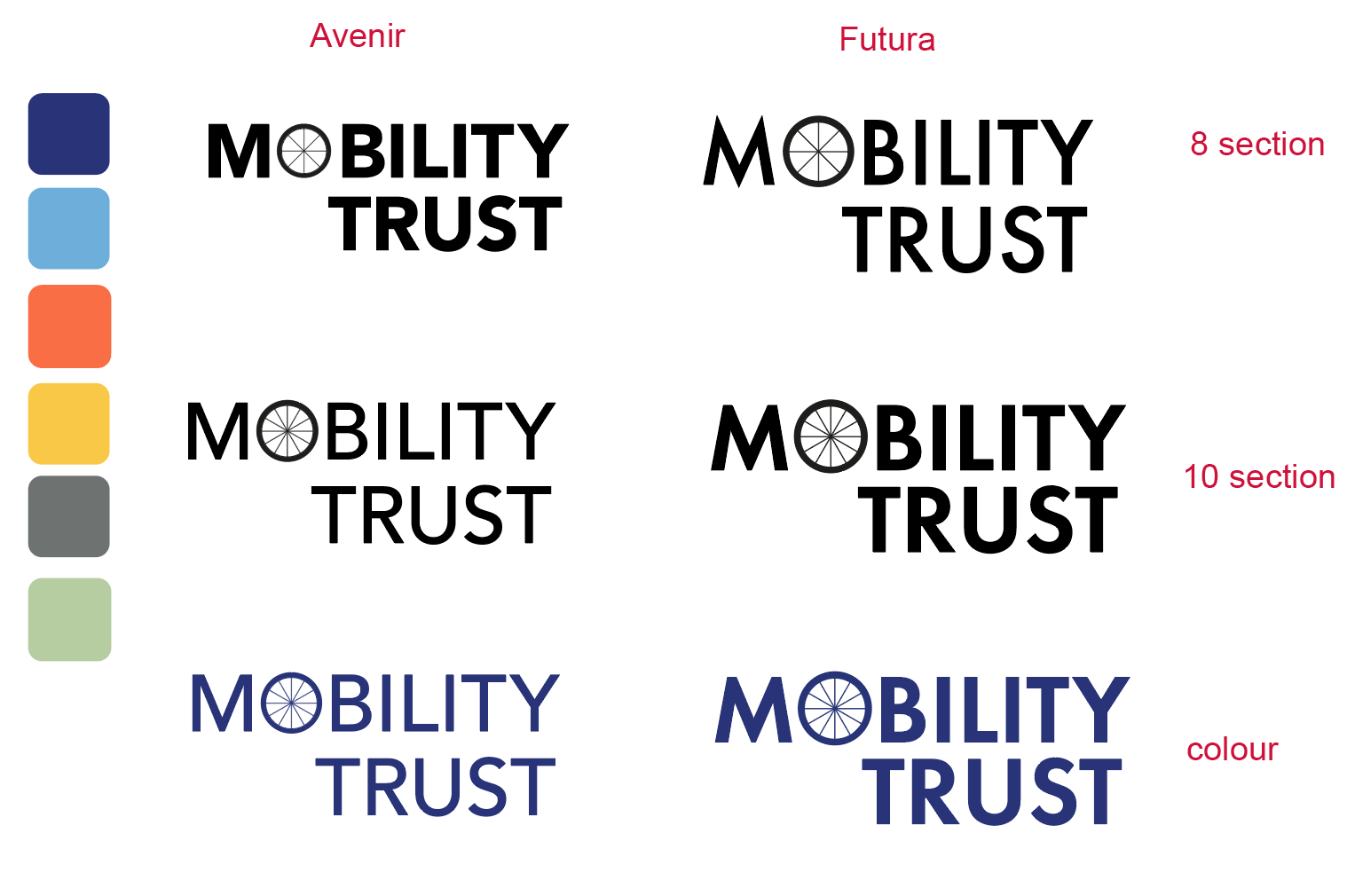
Figure 11: Refinement of Mobility Trust logo


Feedback at this stage:

I expressed a preference for the coloured, 10 section Futura swatch, which my supervisor agreed with:

“Agree, this is the stronger idea. Suggest increasing the weight of the lines on the wheel spokes to strengthen these.”

And regarding the colour palette, minus the green swatch, “These seem a strong set to me. They have equal prominence in terms of their brightness, and similar salience (which you want in a colour palette where colours may need to work together and alone).”


Working with guidelines

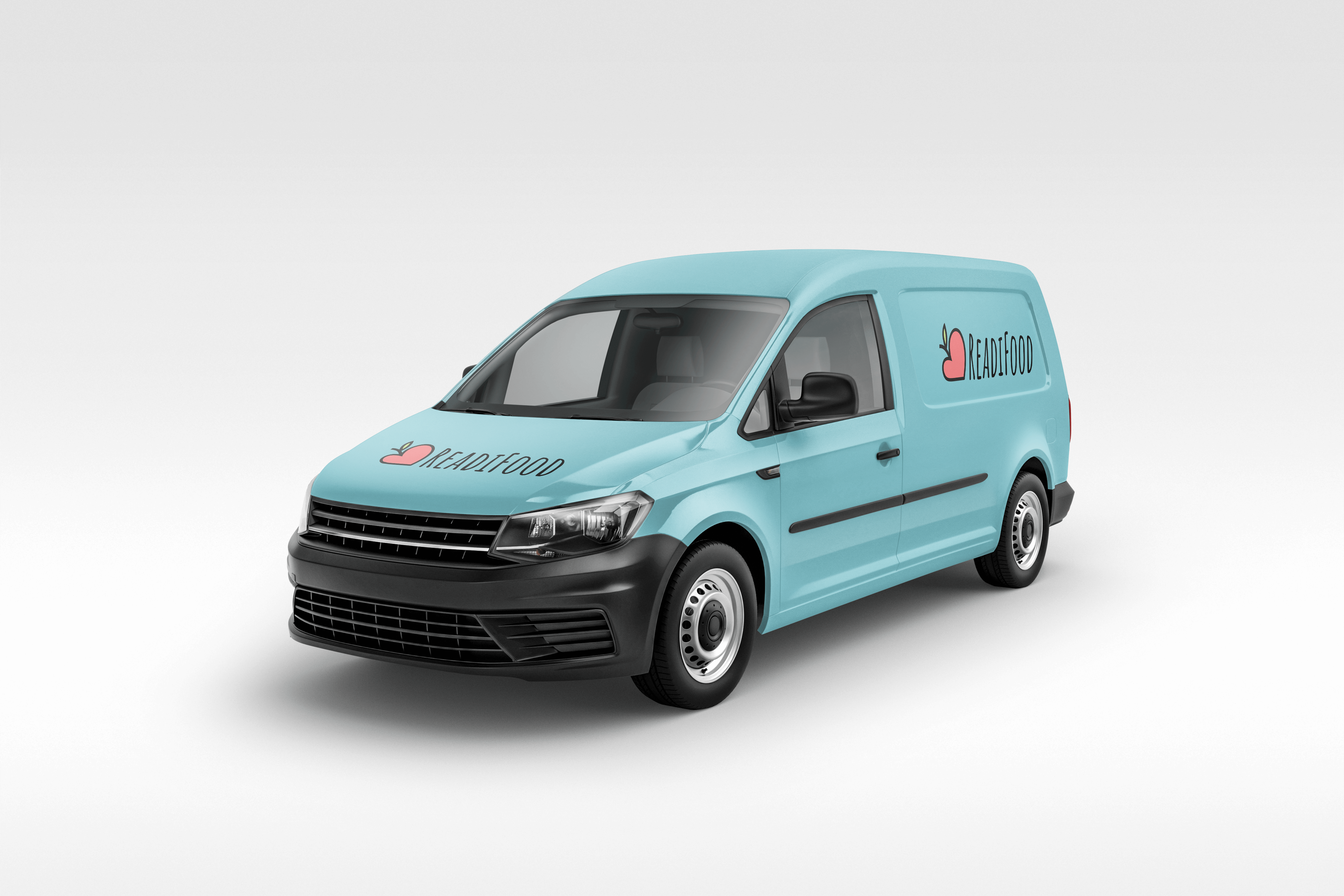
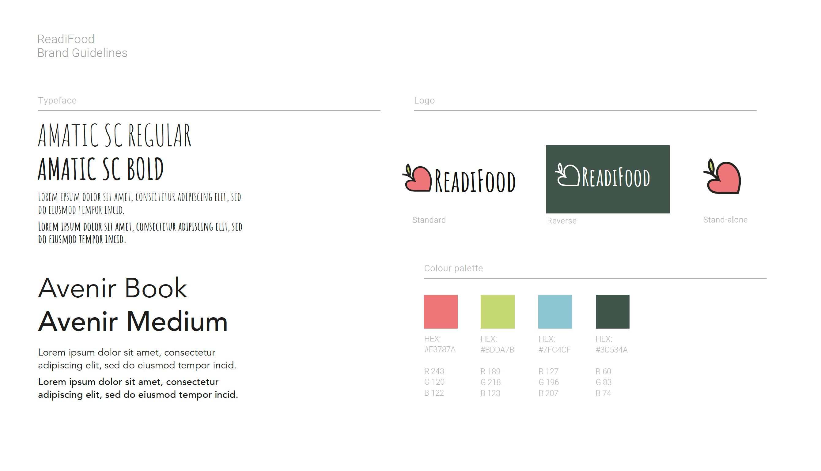
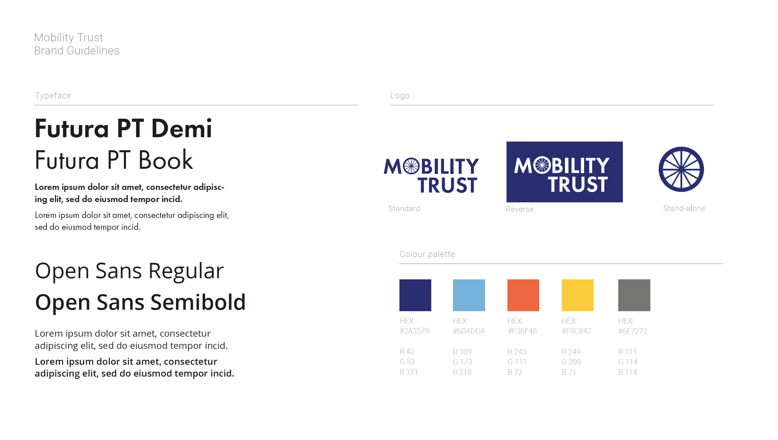
The sample set of guidelines was provided, so it was a case of changing images and typefaces, and colours, whilst keeping the same standard framework. The following images are the guidelines I submitted, and the guidelines which the part 1 students would be required to choose from (amongst others).
 

Final feedback from client(s):

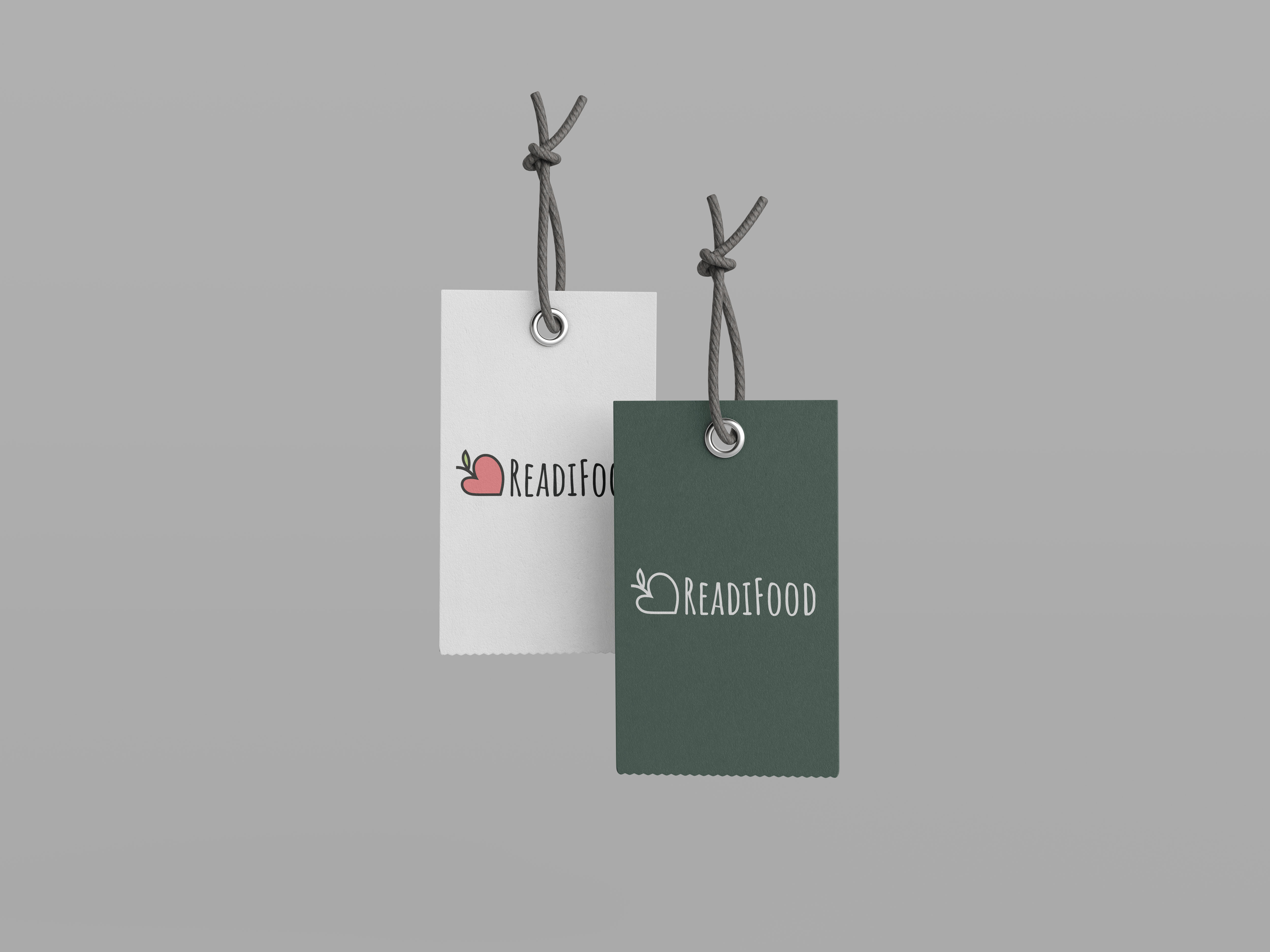
“The Readifood one is great. It’s a heart, it’s an apple, it’s a friendly font, its format means it works well in a mobile website header area.”

“I find the Mobility Trust work a bit cold and hard. The wheel looks like a wagon wheel or something from the industrial revolution, and the use of Futura is again rather mechanistic. The overall impression is more machine than human, which is obviously problematic. So do try to ensure that you map out any sensitivities among your stakeholders carefully, and don’t fall into obvious traps.”

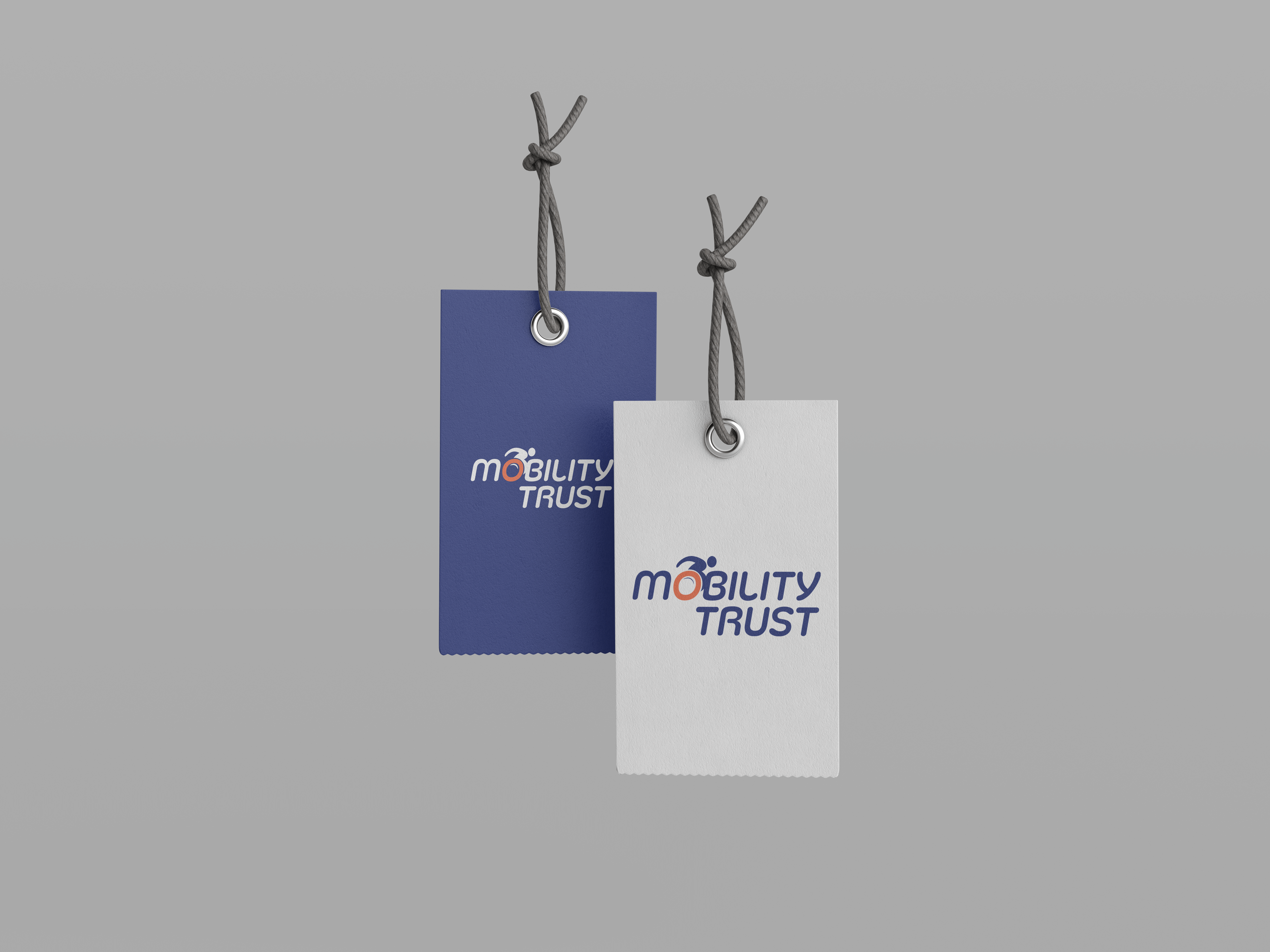
From reviewing my work based on these comments, I also felt that the Mobility Trust logo lacked the charity aspect which ReadiFood has, and should have more movement. I aim to progress further on this logo and create something more usable for the charity when I come to submitting my work.


Feedback from Part 1 student/guidelines in use:

As the Part 1 students hadn’t done anything like this before, I was interested to see how they would have used the guidelines which were provided. I contacted 10 part 1 students, 1 of which had used my ReadiFood guidelines.

The questions I asked all students were:

  • Which set of guidelines did you use? And why did you choose those over the others?
  • Did you have any issues with using the guidelines? e.g any colour matchups, live type, etc.,
  • When choosing colours from the palette, did you find yourself having to add more, or struggle to use the colours provided?

One part 1 student, Naomi, came back to me with the following:

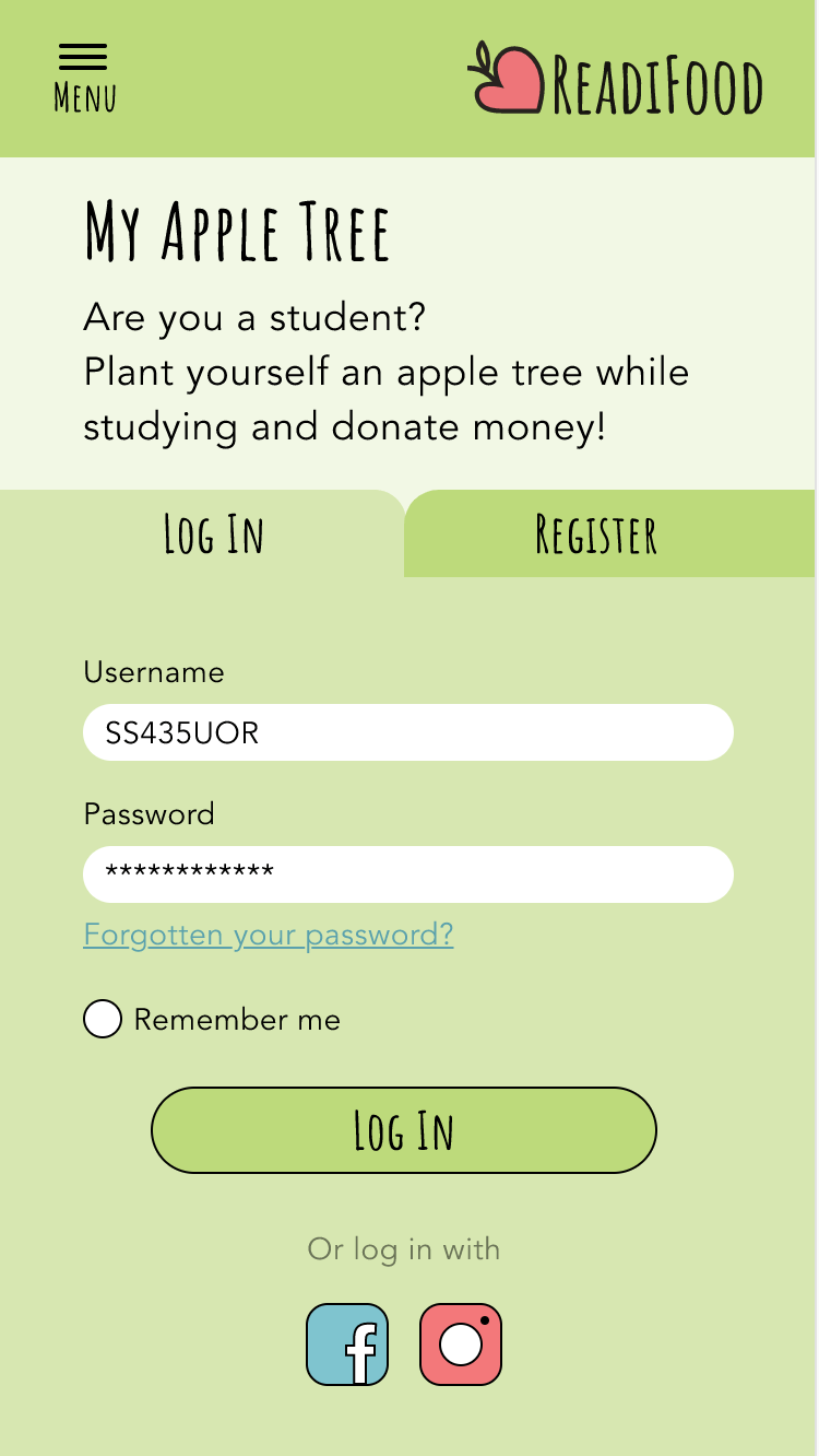
I am using the ReadiFood one. Your design attracted me the most at the very first sight haha maybe that’s because of my personal preference, but I really like how simple the logo is and also I think the Amatic font also matches with the logo style. Another point is the heart shape of the logo represents the image of a food bank in my opinion.  As a food bank is a charitable organisation, what they are aimed to do is kinda like ‘spreading love to the people who are in need’. I found your logo is comparatively meaningful so I chose to use it in my prototype.
The guideline is pretty clear, at least I did not struggle with any confusion when using it. About the colour palette,
I think I did add a few more shades when using it, but I am not too sure which colour I added. Maybe I can go and check my file later and see if I can screenshot the palette to you, if that can help with your report! Apart from that, I think I struggled with the font more than the colour. Amatic font has pretty thin strokes. I nearly made all Amatic font in bold to make the text legible enough. Overall, I think you design has a really nice branding for ReadiFood and I enjoyed using it a lot:))
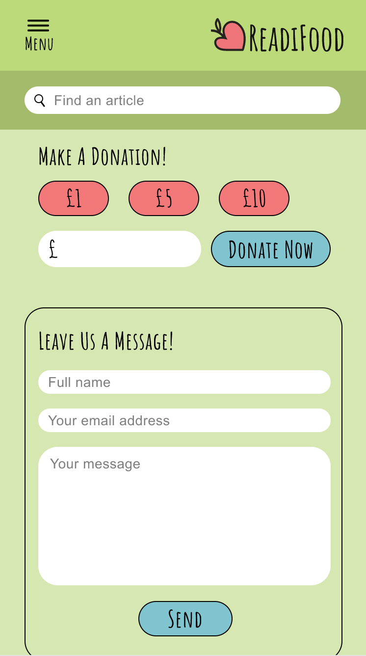
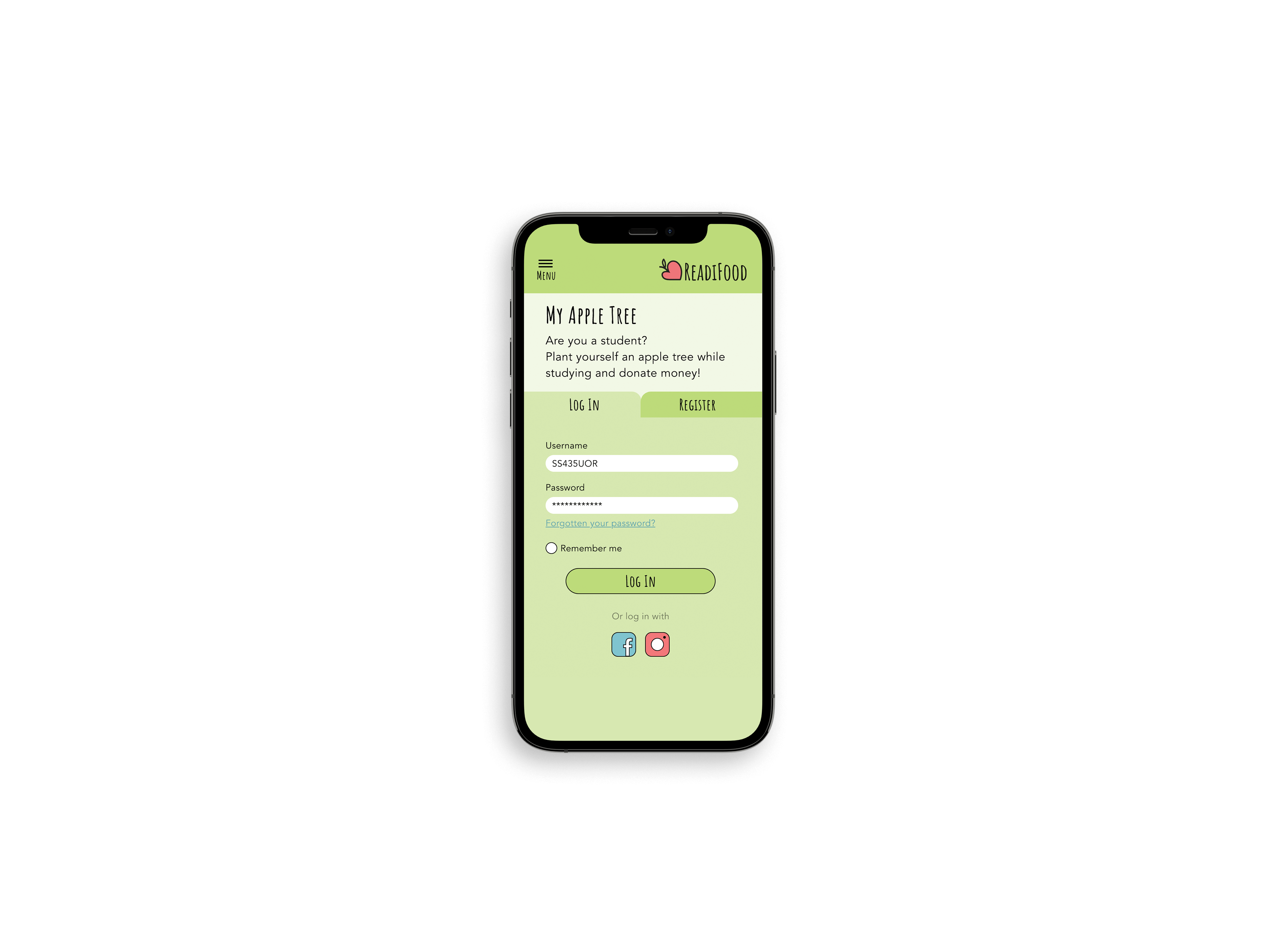
Naomi also attached her prototype and has given me permission to use it here.
It was really helpful to get feedback from someone who used my guidelines, and how I could improve in the future. From looking over the prototype provided, I saw the added swatches which Naomi had put in; all of which were different opacities of the existing swatches, or some which complimented the palette.
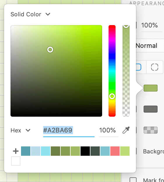
I was very pleased to see that Naomi had no issues when implementing the guidelines, and used the colours as intended. I added the blue swatch to act as an action colour, which is how she used it, and the lime green was meant for the background (which was altered to create hierarchy throughout the site). Off the back of this, I probably would have added another green swatch into the palette, as the user had to do this themselves.
Furthermore, Naomi managed to use the typefaces in the way that I intended; with Amatic for the headings, although, she said that she didn’t tend to use the regular weight, so in theory it could be removed from the guidelines. Overall, I am very pleased with how my guidelines were used, and think that this demonstration by Naomi really shows that they were easy to use and implement.
           

Reworking Mobility Trust:

I was unhappy with how Mobility Trust turned out, and so I chose to re-do my design as if I had more time. Notably, a lot of the issues which cropped up were because not enough thought had gone into the user and their needs, as well as the small time frame we were working in.

The main things to address were the overall feel of the logo; it was too rigid and mechanical before, and it should be full of life and movement. To do this, I had ideas of implementing a wheelchair and the acts of movement through italics.

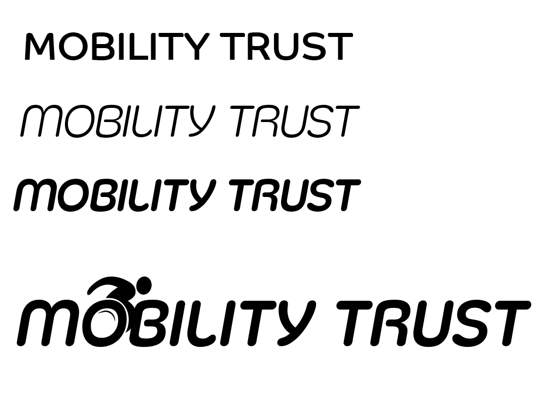
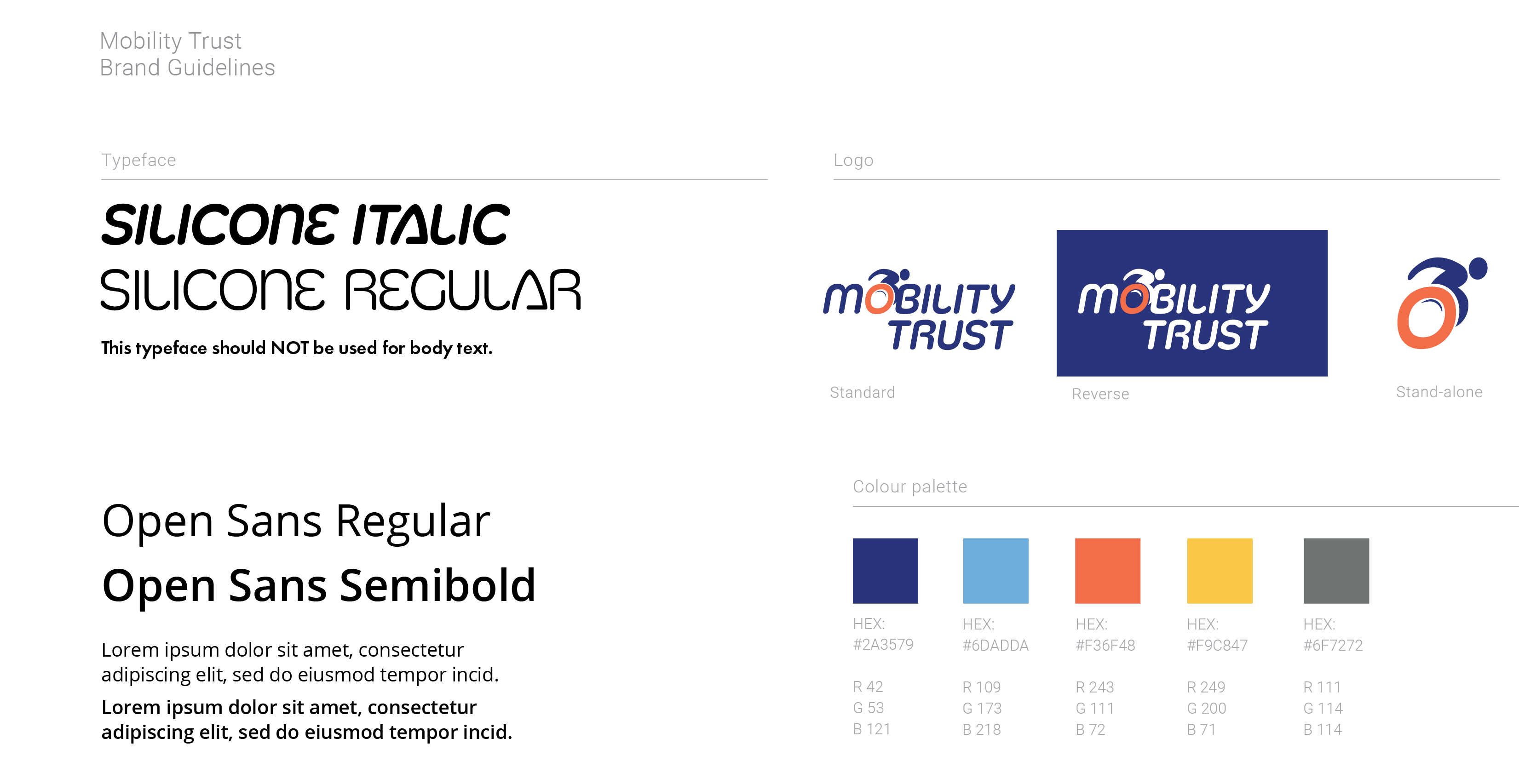
Looking at the typefaces Co Headline (top) and Silicone (regular in centre, bold at the bottom), I liked how they were more rounded and had that movement which Futura does not. I wanted to combine this with a form of illustration, and revisited an earlier idea to have the wheelchair implemented.  I like that Silicone is more friendly and is still equally weighted throughout to emphasize the consistency and trust in the organisation. The colours previously were working well, and so they stayed the same in these reworked ideas.
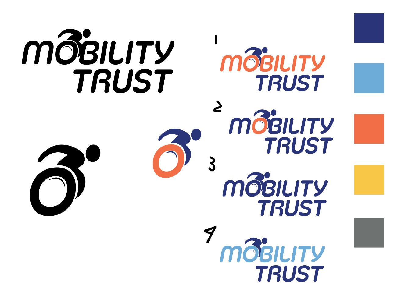


These logos of fluidity and movement, as well as a friendly and uplifting nature which Mobility Trust requires. When testing this on a sample of 10 people from different backgrounds, 100% of them recognised this as a wheelchair-orientated charity. And with that, I present my refined guidelines for Mobility Trust.


Showcase
     

Summary

This Real Job was challenging due to the time constraints, but I had a lot of fun doing something I was familiar with doing. It was really rewarding to see my guidelines in use by another student and get their opinions on the work I had done.

 

Arcade Game Typography Event Promotion (RJ00389)

‘Ideas, materials, social media and activities in support of an evening of Typography-themed video-gaming in the Department, centred on Arcade Game Typography: The Art of Pixel Type by Toshi Omagari’.


Overview and Aims

This real job is designed to support and promote Toshi Omagari, graduate of the University of Reading’s Typeface Design masters’ course, and his book  Arcade Game Typography: The Art of Pixel Type’. In order to do this, an evening of typography themed videogames will be played in the department and activities will be carried out during the day. 

The main aim is to promote and celebrate Toshi Omagari and his book of arcade game typography, however, we also want to educate and challenge the knowledge that everyone has on the creation of arcade game typography.


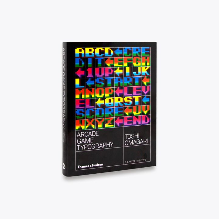
Figure 1: ‘Arcade Game Typography’, written by Toshi Omagari


Planning

The main deliverable for this project was the event itself, and so planning what we wanted to do on the actual day was critical. Some ideas that came out of planning were:

  • Letterpress pixel fonts on 8×8, with overprinting – run it like a lego mosaic building workshop?
  • Output a set of prints for Toshi?
  • Screensaver for the video game screens
  • Use pixel fonts masks in front of demo videos
  • Demo vids could be blown up big
  • Controller key guide for controlling MAME
  • Mint some coins to use use as ‘I got next?
  • Google sheet-based comments (UG column, PG column)
  • Some way of customising the book with our outputs?
  • Some way of hosting a digital record of the event and of our thoughts on the fonts?
  • Live stream?
  • Book signing / selling?

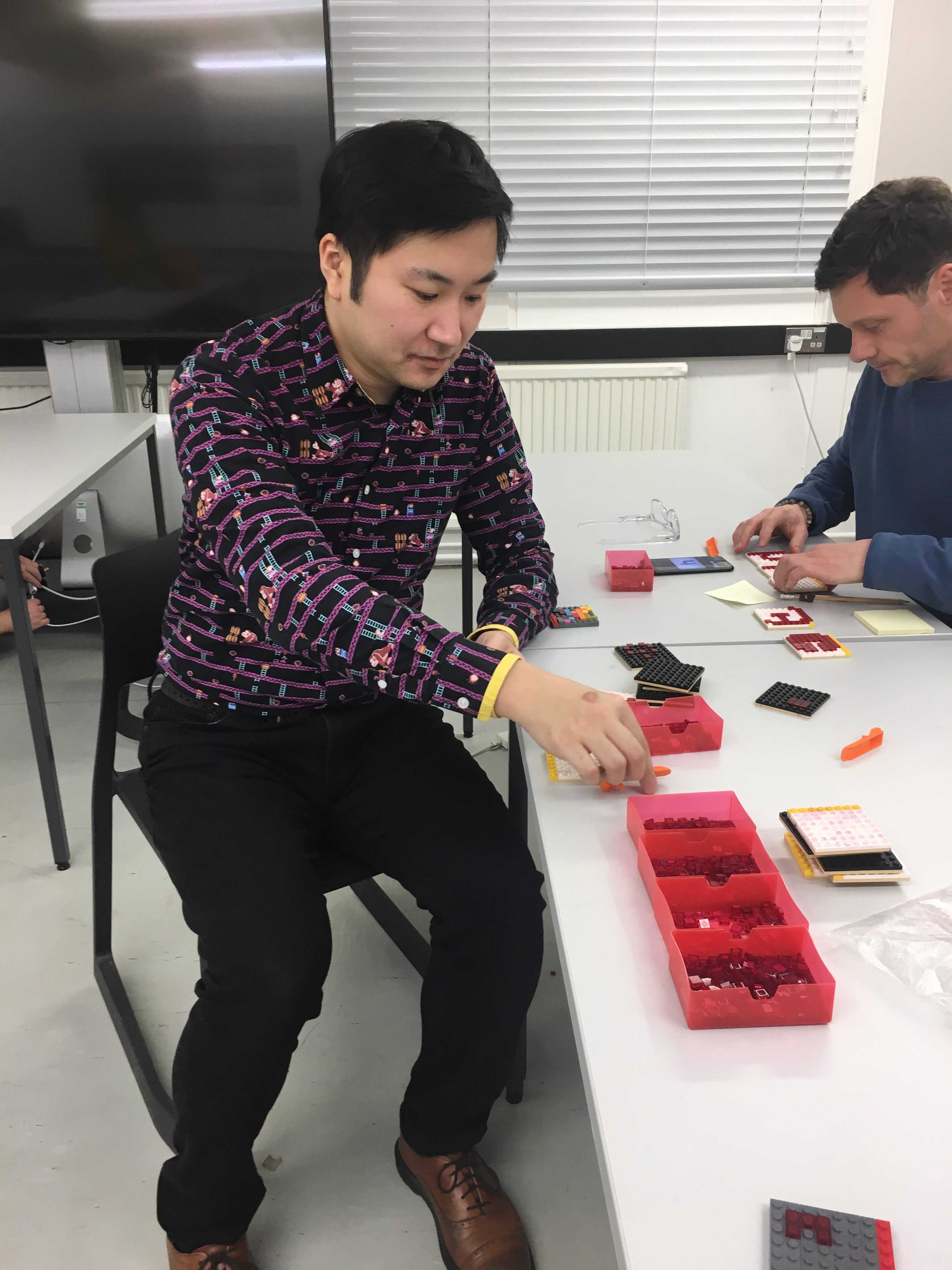
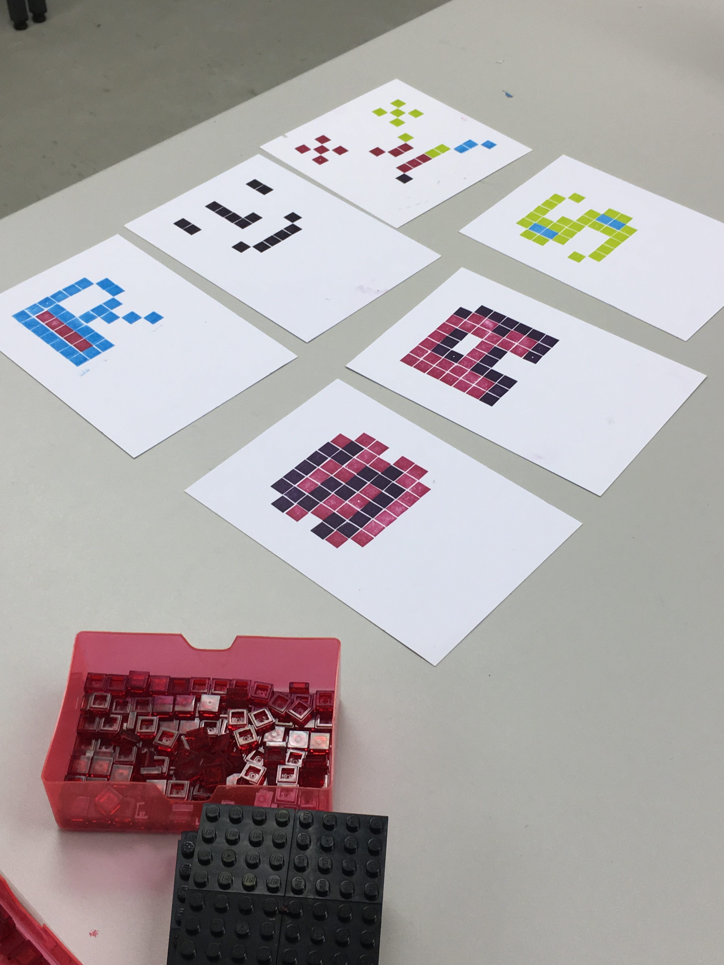
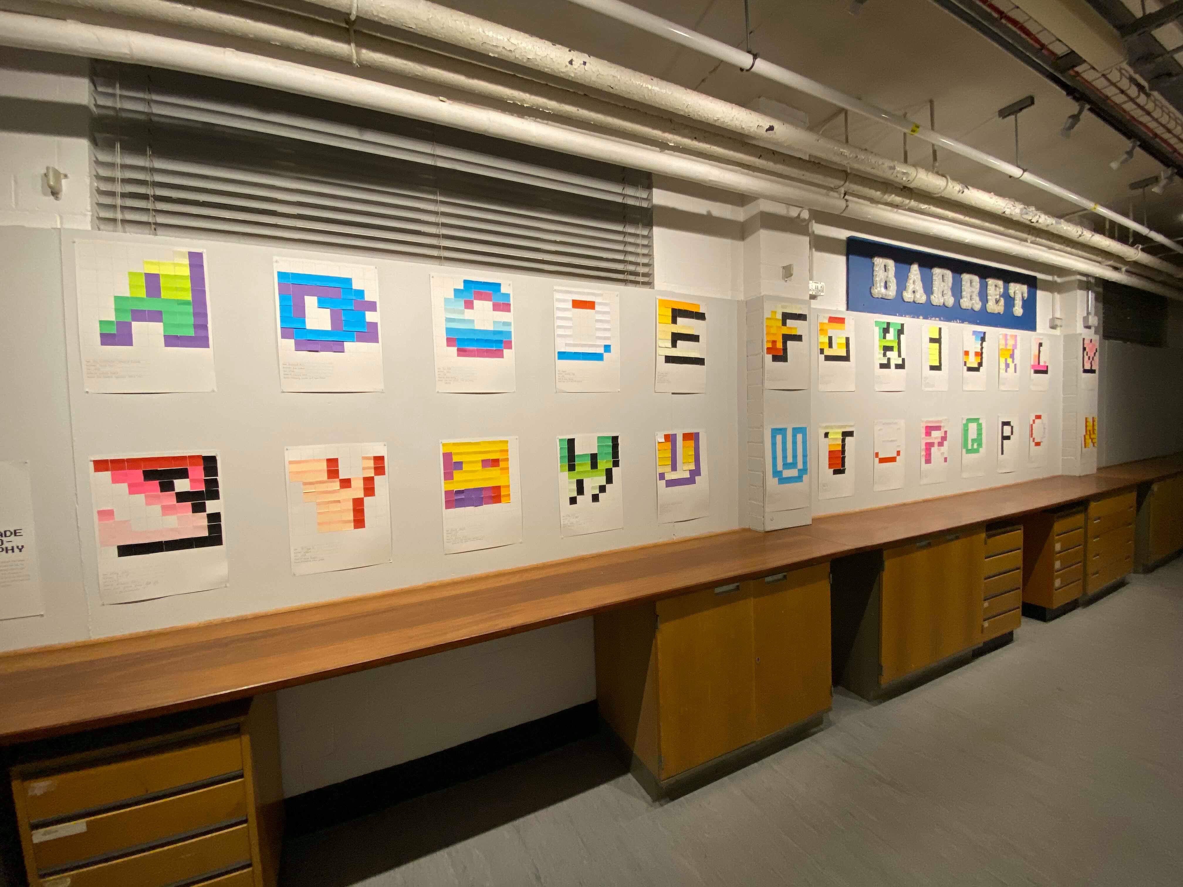
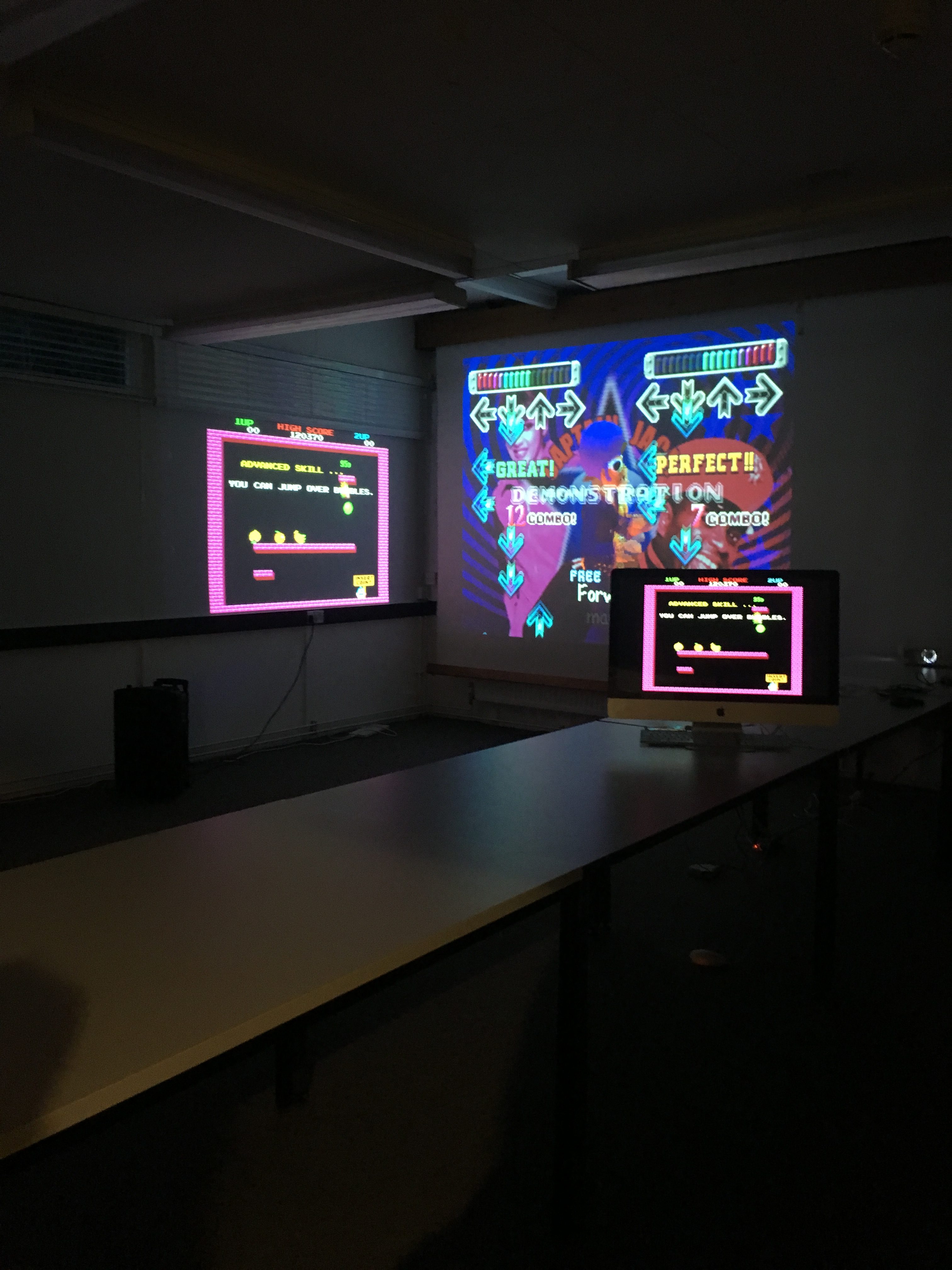
Whilst sifting through these ideas, the activities that were decided upon were to have a LEGO letterpress workshop, where students would create their own 8×8 pixel fonts, later to be joined by a similar workshop involving post-it-notes, where students would fill in an 8×8 grid using post-it-notes with their favourite designs from the book. Book signing and selling was something which commenced after Toshi’s fantastic baseline shift talk.

‘Whether you have grown up with video games or not, whether you are familiar with letterforms or not, I think there is something for anyone to enjoy in these pixel fonts. I also encourage you to make a colourful one yourself; you will appreciate the subtlety and craftsmanship of the art even more!’ – Toshi Omagari


Deliverables

As well as planning the event itself, I also had the challenge of creating all the promotional material that went along with it. Thankfully, I signed up to a Real Job I knew I would love designing for, and so thoroughly enjoyed the design process of all the following deliverables:

  • Event itself; planning and catering
  • Promotional poster(s)
  • Instruction manual for controller
  • Display screen advert
  • Promotional videos: one for instagram, one to promote letterpress, and one for the department main entrance screen
  • Instruction sheet for ‘hi-score’ Bubble Bobble game

Whilst trying to stick to this guide of deliverables, I ended up making a couple of extra bits for the event and modifying ones we already had in mind.


Skills

With the idea of having promotional videos, I knew that that meant I would have to learn some animation. I had never looked into animation before, but it’s something I’ve always been interested in learning, and so this was the perfect time to do so. The videos / gifs I made were done solely in Photoshop with the timeline feature, and I decided that I would ‘learn on the job’. Despite this, I’m incredibly proud of how these videos turned out, and I genuinely shocked myself with how quickly I picked up all the skills needed.

Another main skill I needed to focus on developing was solely planning an event. I had never planned an event before, and so learning how to best promote the event and go about catering for it was incredibly important. The success of the event determined how well I had promoted it, and essentially sold it to the students.

Figure 2: First Promotional Video made for Arcade Typography Event

Video Advertisements

As well as the video seen above, in figure 2, I also created three other short videos for the promotion of the event, and for the night itself. Figure 3 shows the video made for the entrance screen, which would promote the event during the week. Figure 4 displays the promotion for the letterpress workshop, in order to promote the places left on the workshop list. Finally, figure 5 shows the video which was displayed on the entrance board on the night of the event, to act as a signpost.


Poster Design

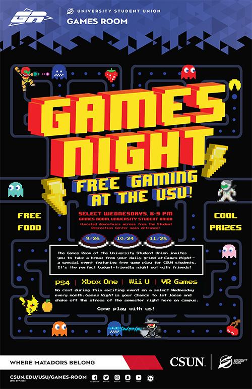
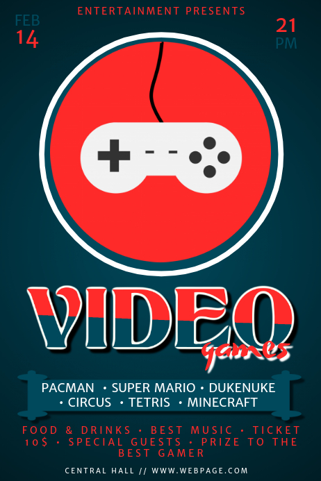
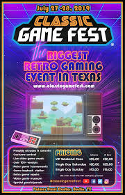
For the poster design, I took inspiration from a couple of other ‘games night’ posters in order to get a grasp of the kind of atmosphere and feel I wanted my poster and branding to have.

Figure 6: Poster Inspiration, this poster was my favourite I found, I think that the dark background works really well.
Figure 7: Post inspiration, I like how simple this poster is, the use of block colours, the red really pops.
Figure 8: Poster Inspiration, this poster was very different compared to the others I saw; I don’t think this is a very retro, arcade looking poster.


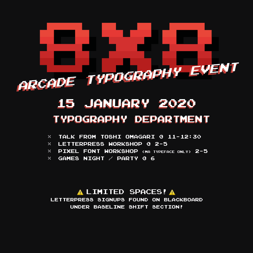
Figure 9: First draft of poster


Figure 10: Approved poster design

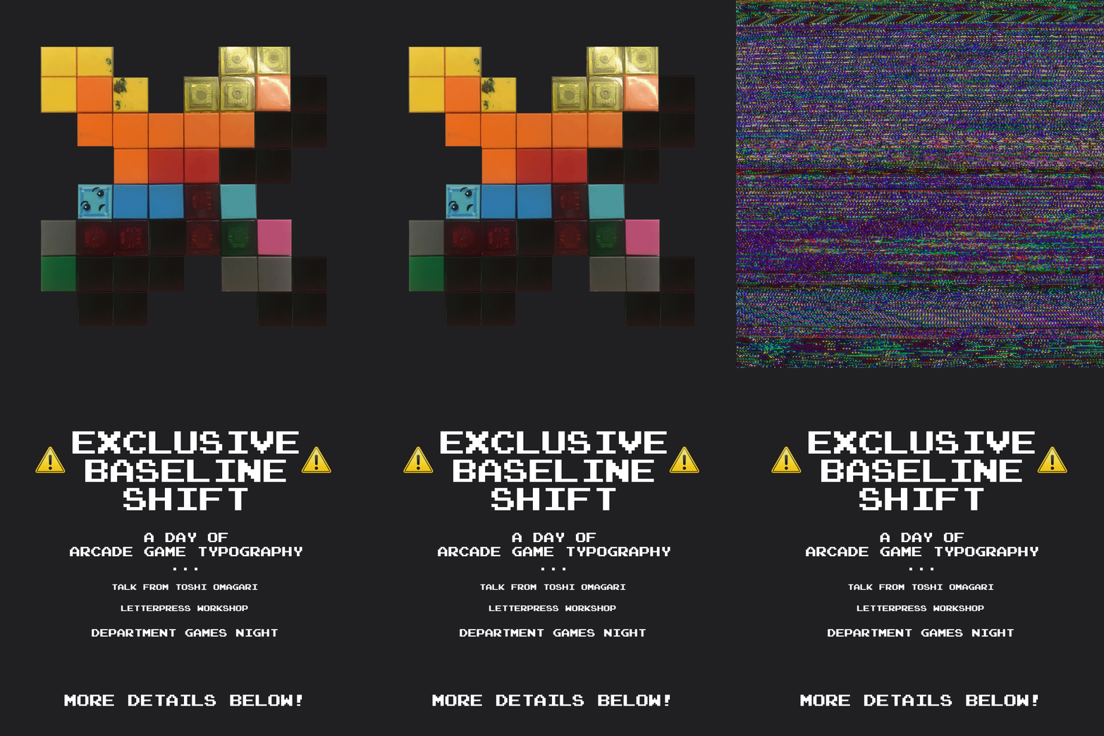
Figure 9 shows the first draft of my poster, which saw me take inspiration from figure 6 and 7, with the dark background and the pops of red. The logo is also seen here (8×8) and is seen in all publications whether this colour or recoloured (as seen in figure 10). The final, approved poster design was a set of four which would be displayed in a long line (see figure 10). The thought behind this was that the 8 X 8 would bring in the attention of the audience, and lead the eye to the final panel with all the information on which was displayed on a bold black background. As the posters were to be displayed around the department, it didn’t matter how much space we took up; there weren’t any constraints.

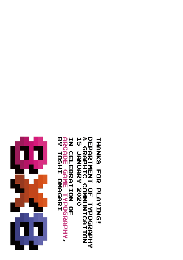
A couple of notes on the logo itself; originally I wanted to create a logo with the entire ‘8×8’ in an 8 pixel grid, and although this taught me a lot about the constraints involved when designing within so few pixels, it didn’t make for a very good logo in the end. Therefore, we scrapped that idea and moved on to creating a single character within the 8×8 grid, which was a lot easier, however there were still a lot of constraints when designing. The process of designing in this small space was so eyeopening, and was really interesting to see just what could be created with 64 pixels. In terms of the logo characters, I based my designs off the Atari typeface (Quiz Show), which is mentioned frequently throughout Toshi’s book.


Controller guide / postcard

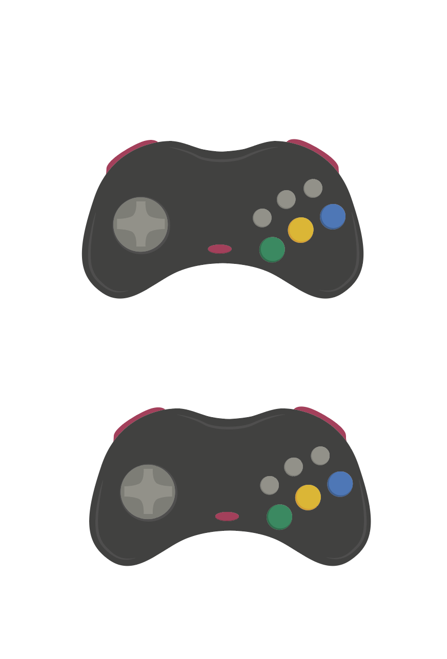
Figure 11: Illustration of Sega Saturn controllers for controller guide

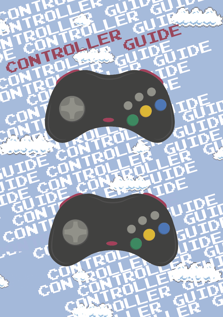
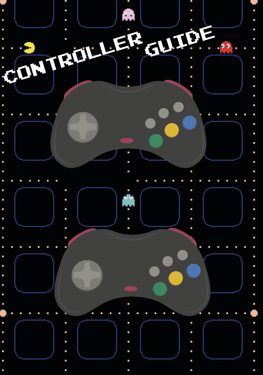
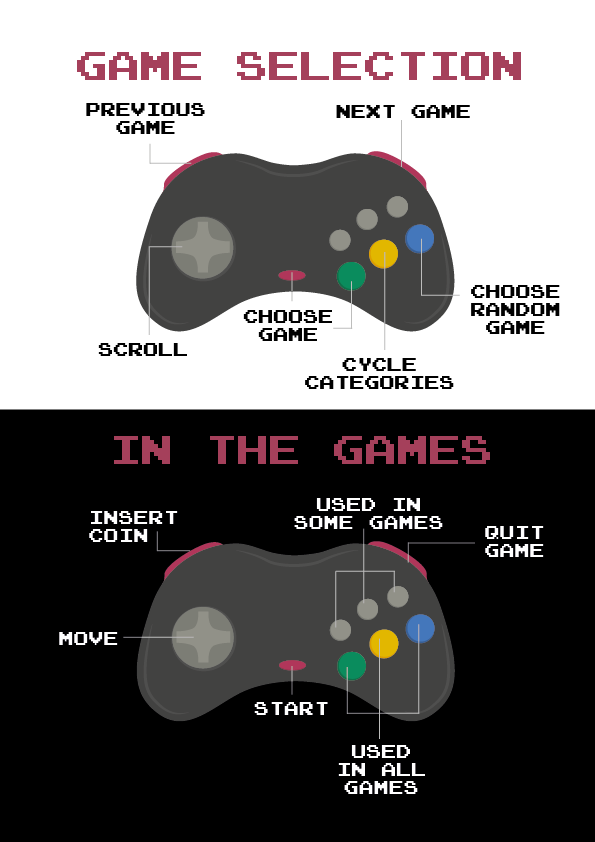
As the SEGA Saturn controller isn’t very commonly used nowadays, it was decided that an instruction guide should be made for students to use when they came to the games night. Figure 11 shows my illustration of the controllers, which would be labelled up as shown below. The images below show a couple of different ideas I had prior to the approved design (Figure 14/15), however, it was decided that the guide should be kept simple and so the separation of black and white on figure 14 shows the division between the two sets of controller buttons. It was later decided that these could be postcard size and taken away from the event as a souvenir, therefore, the back (figure 15) was designed to reflect the format of a postcard, with the intention that students / attendees of the games night would be able to get Toshi to write them a little message on the back.


Technical Skills

Along with all the design work, I helped with typing out all of the text for each game as seen in Toshi’s book, in order to display them on the screen alongside the games on the arcade MAME system.  This was incredibly time consuming, however, it was very rewarding once it was finished and we could see all of the text within the database (see figure 16).

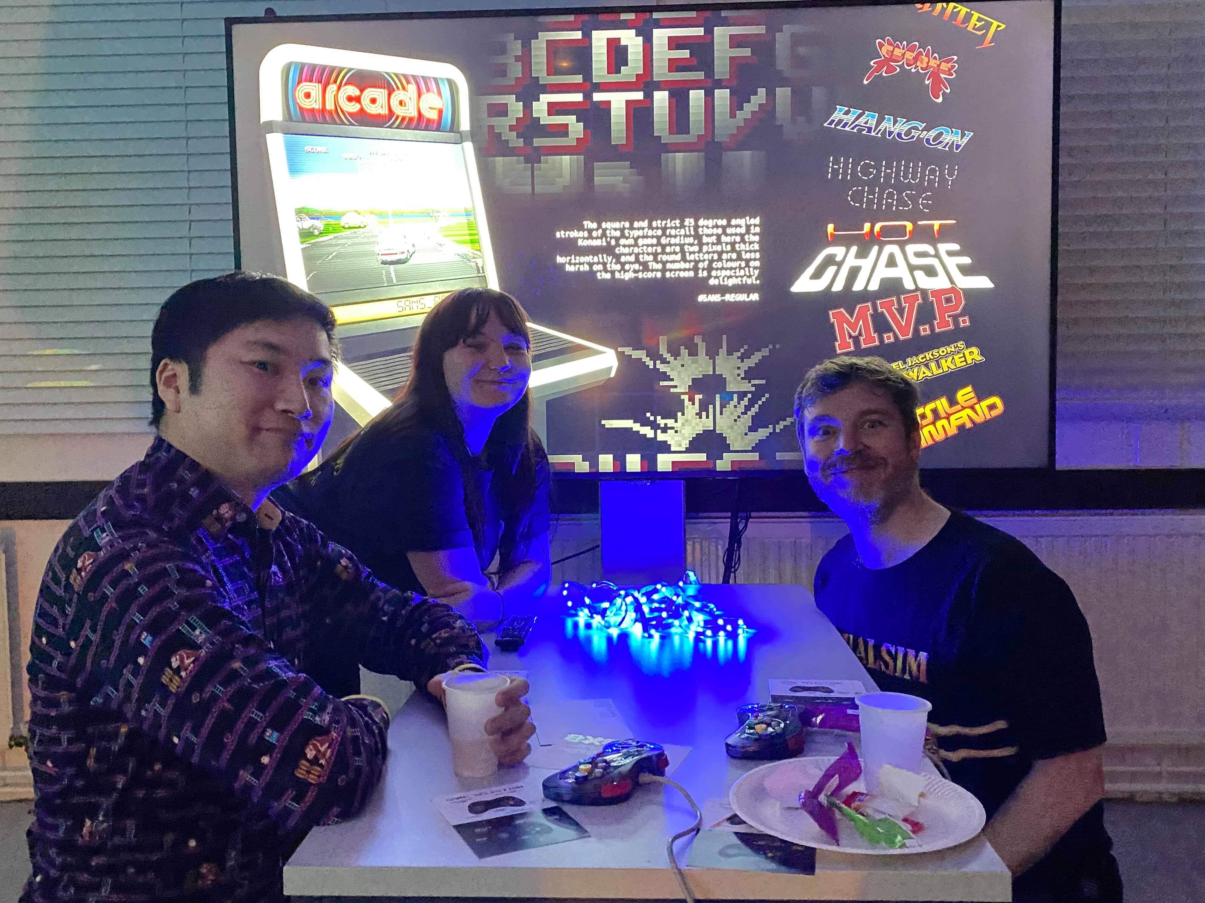
Figure 16: In the background of this image you can see the text formatted into the game. Featuring myself, James Lloyd (supervisor) and Toshi Omagari.


The Event

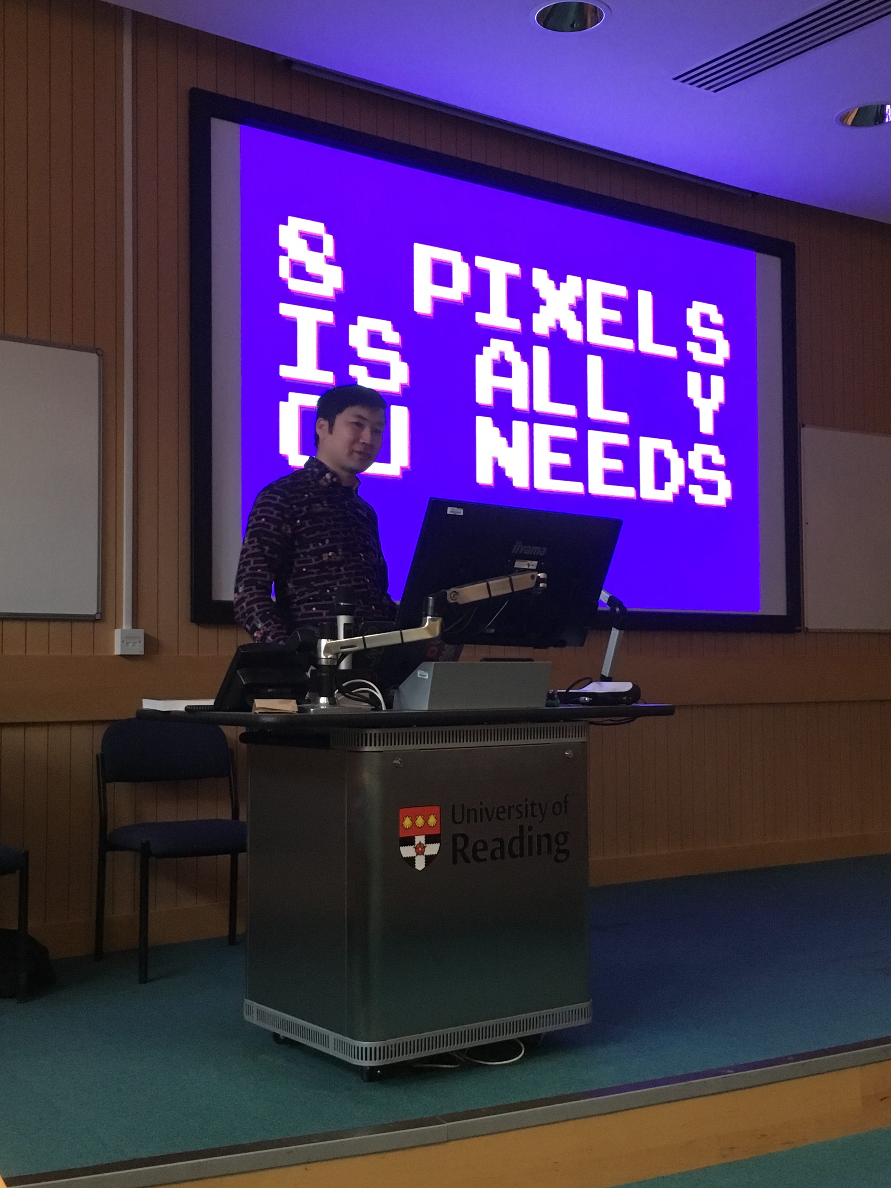
The success of this Real Job was down to the success of the event; if we could create enough hype for the event then it should be a very successful day and evening. We started the day with a talk from Toshi Omagari (figure 17), which was really insightful, especially for students who hadn’t picked up the book before.

‘Really intriguing to see a different side of typeface design compared to the usual serifs and san serifs. Seeing the changes in different pixel typefaces and how they have developed was really interesting’ – Joanne Tunbridge

‘Very interesting and different to all the other Baseline shift talks we’ve attended, would have been even better if I had background knowledge of the original games in the first place!’ – Ruth Bartley

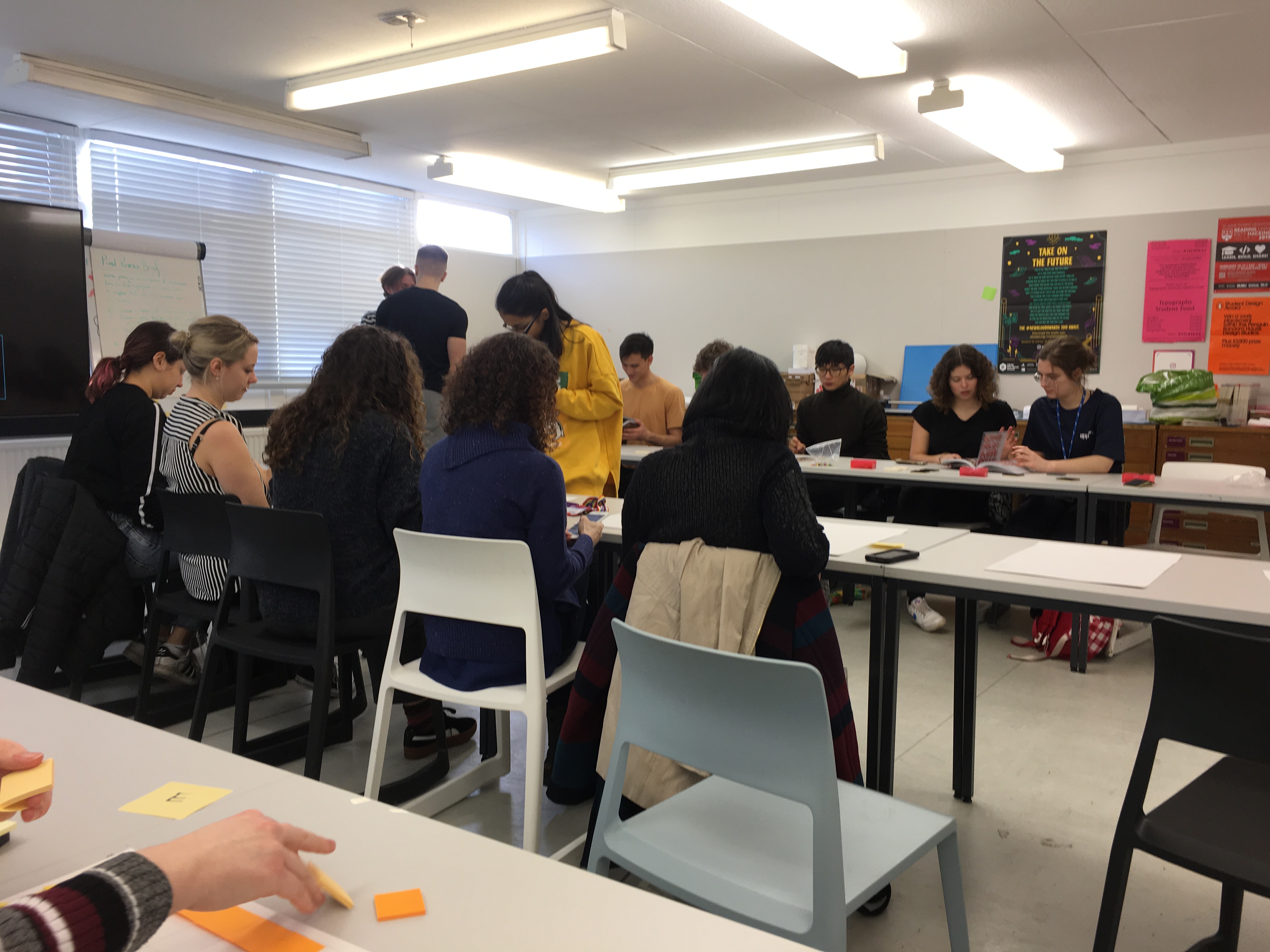
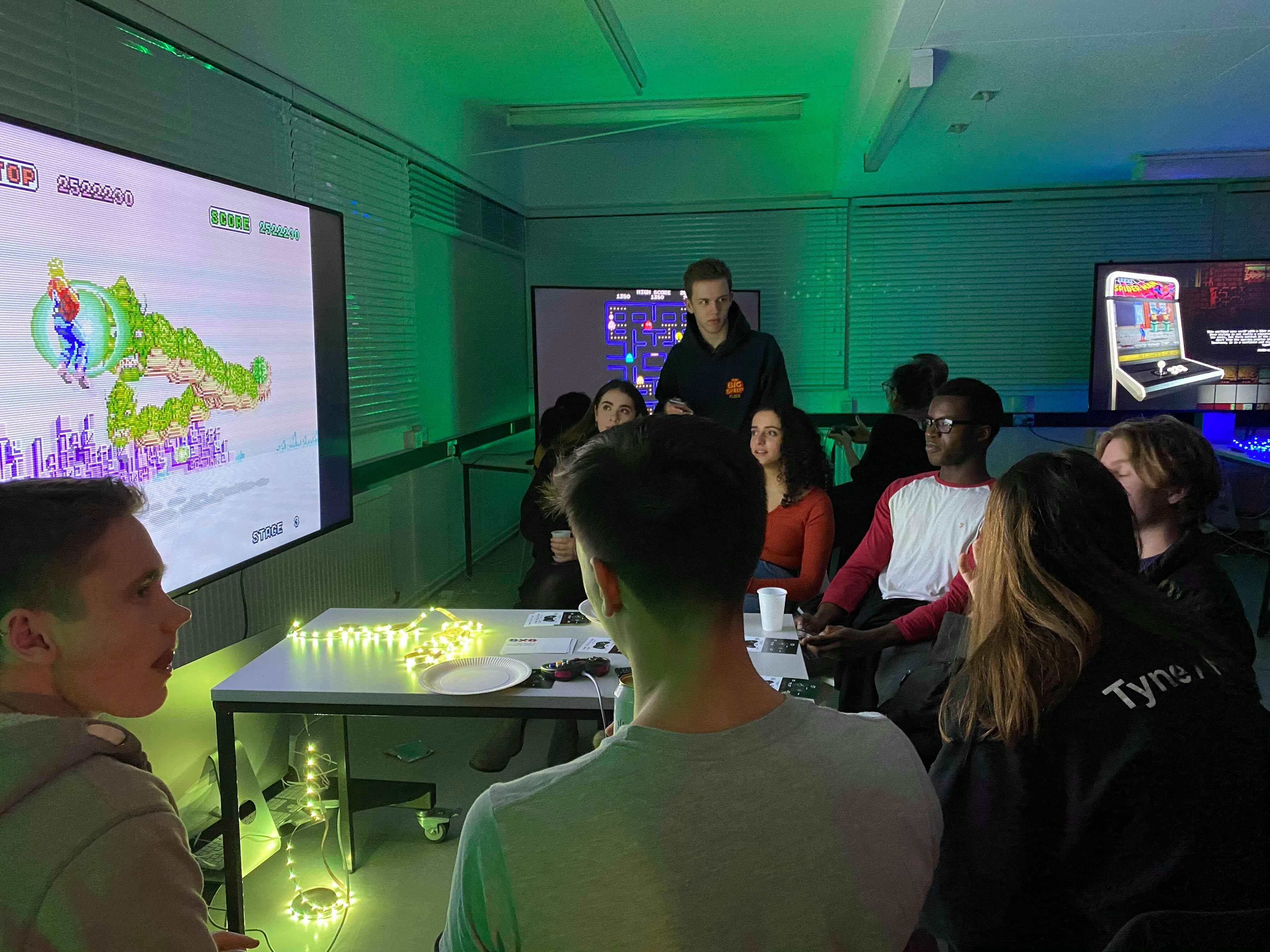
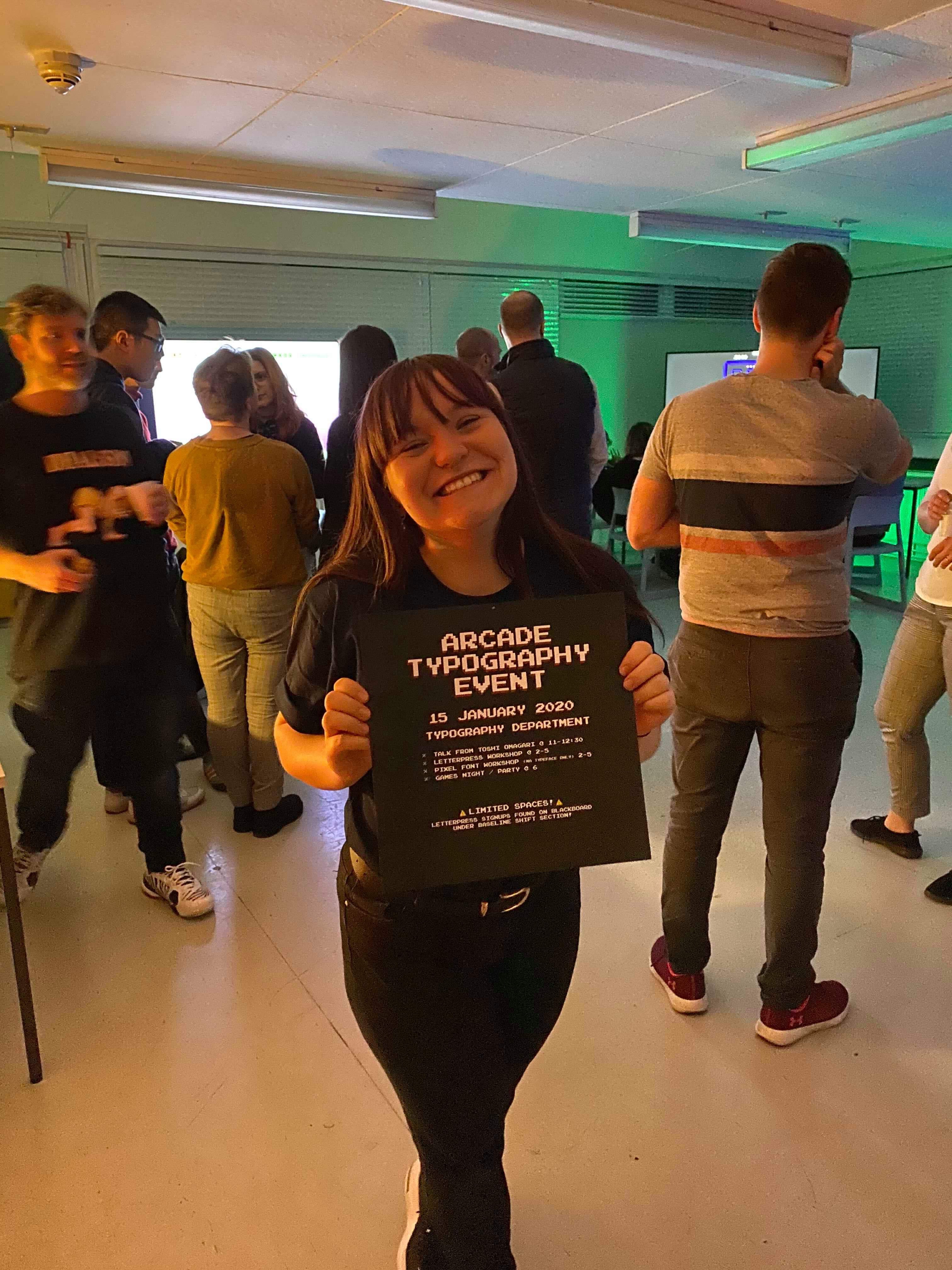
Other activities include the letterpress and the post-it-note workshops, as well as the MA typeface designer workshop run by Toshi himself. We managed to get some fantastic outputs which can be seen around the department, and created a great atmosphere which connected students through all years and staff members. It was truly something to be proud of. The following images were taken on the day of the event, and feature the baseline shift talk, both the letterpress and post-it workshops and the night itself. I think it’s safe to say it was thoroughly enjoyed by all.

Figure 17: Photograph from Toshi’s baseline shift talk


Figure 21: Outputs from the post-it-note workshop, displayed in the department


Reflection

In reflection of the design work, and the event itself, I would say that it was a big success. The aims were all met and I went above and beyond the brief in order to make the day as great as possible. One thing I’d say I could’ve done better was been better in terms of sharing my files with my supervisor; I often didn’t send the files in the right format, however this was resolved after being alerted of my mistakes. I think the process was really eyeopening, and I have learnt so many new skills, as well as a LOT about pixel fonts (that’s what happens when you have to type up the characteristics of 200+ fonts!) ! I’m so glad I got the opportunity to work on this project, and I would love to explore pixel fonts in the future too.


👾GAME OVER 👾