
Background
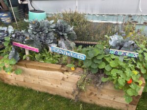
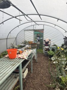
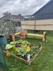
Green Health Thames Valley is a therapeutic gardening charity based in Reading that uses horticulture to support people’s mental and physical health. Their work centres around giving people access to outdoor, hands-on activities as a way to improve their wellbeing – this became clear to us once we actually visited their site. This project was slightly different for us to begin with, as a previous student group had initially worked with Green Health as part of a branding project, producing brand guidelines, audience personas, user journey maps, competitive analysis and brand personality matrix. Rather than starting from scratch, our job was to build on this foundation and take the brand further through a new set of deliverables.
We had an initial meeting with our supervisor to get up to speed on the project history before meeting with the client for the first time. Visiting the charity’s site in Reading was extremely beneficial to us to do early on: seeing the physical space allowed us a better understanding of the organisation’s environment. It is an outdoor, working space that shaped how we made design decisions throughout the rest of the project.
Restated brief
Our first meeting with the client gave us a broad starting point: the initial list of deliverables included a refreshed website, postcards and potential merchandise such as mugs, aprons and t-shirts. From there we worked together to agree on a more defined set of printed outputs: postcards, mugs, aprons, t-shirts, business cards and a calendar.
The brief then shifted again once we factored in budget. Working with a charity is not much room for extras that are not as important, so we had an honest conversation with the client after sending over cost estimates about what would actually be worth producing. We eventually decided on t-shirts, business cards and a calendar for the printed deliverables, alongside the refreshed website – this set of deliverables covered in-person visibility, practical contact information and a digital presence that could support both new members and potential funding investors.
Getting the schedule right was another challenge. Balancing this project alongside our other modules meant we had to be realistic about timelines for both ourselves and the client, and pencil in enough flexibility for feedback and revisions on both sides.
Research & ideation
Our research phase was largely shaped by the work that had already been done by the previous group. They had put together a thorough body of work which meant we had a solid understanding of the organisation and its audience. Rather than duplicating that, we used it as a springboard and focused on our own research to fill in the gaps.
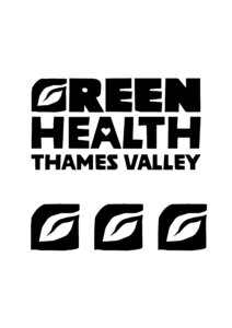
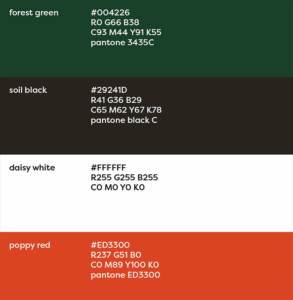
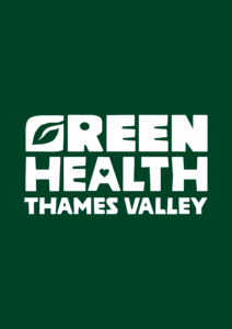
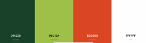
We also spent some time reviewing the existing brand with a fresh perspective, and wanted to refine a few things before we could take it further. We made small adjustments to the shaping of the individual letterforms in the main logo in Illustrator to soften the edges and appeal more to the sense of community and warmth, rather than harsh jagged lines. We also tweaked the colour palette by getting rid of the original dark brown shade, and introducing a lime green shade – alongside the original dark green (primary) and red (accent) – to bring some freshness and contrast.

Design development
Business cards
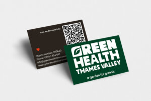
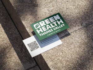
The front of the card stayed fairly consistent across different versions – the dark green background with the logo and tagline was the most effective way to showcase the brand. The main changes happened on the back, where it took a couple iterations to balance the information visually. The first version used a black background on the back with a large QR code to the website and the contact details listed plainly – also with a casual “scan me for more info!” prompt. It worked at a basic level but felt too rough: the black background clashed with the green front and the layout wasn’t very considered.
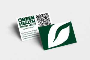
In the second iteration we changed the background to white and introduced the logo and tagline alongside the QR code, with contact details listed below. This felt more branded but was too cluttered for such a small format.
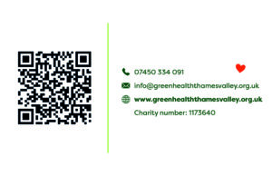
For the final version we used a white background again with a lime green vertical rule dividing the QR code from the contact details – this brought in the secondary green colour in a way that felt more deliberate rather than decorative. Icons were added next to each piece of information to make it quicker to scan, and the red heart from the original branding (with softened edges) sits quietly in the corner as a small but effective detail. The front remained the same: the dark green filling the card, the logo larger and the tagline underneath.
Aprons
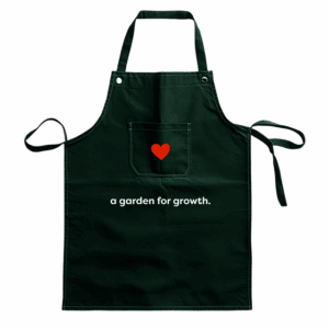
The apron was one of the earlier merchandise options we explored, and while it didn’t make it into the final deliverables, it was a useful exercise in thinking about how the brand translates onto a garment used in an outdoor, practical setting.
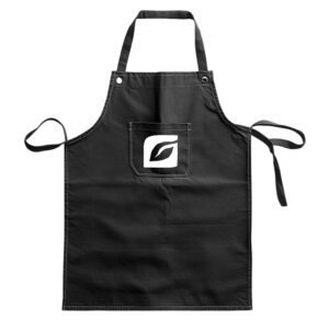
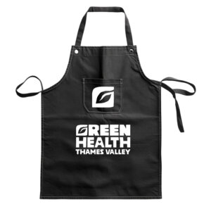
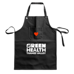
We worked through four options on a black apron to present to the client. The first has just the leaf icon in the pocket area, which was minimal but lost the brand name entirely. The second added the full logotype below, which gave it more presence but felt a bit heavy with both the icon and the wordmark competing for attention. The third swapped the icon for the red heart in the pocket, keeping the logotype below – a warmer feel that leaned more into the brand’s personality. The fourth stripped it back further, replacing the logotype with just the tagline ‘a garden for growth.’ alongside the heart, which felt more considered and less like a uniform.
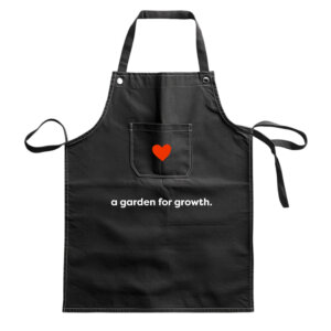
From there we refined the colourway, switching from black to dark green to bring the apron in line with the brand palette. The final version kept the heart in the pocket and the tagline centred below, which was simple, on-brand, and practical enough for a working garden environment. Although this one didn’t go to print, it was good practice for producing mockups and thinking through how brand elements behave at different scales and on different surfaces.
Mugs
The mug went through a similar process: three initial options presented to the client, followed by a more considered refinement. The first placed the full logotype with a small red heart floating above it – straightforward but a bit flat. The second used just the leaf icon at a larger scale, which worked well as a bold, singular graphic but lost the brand name entirely. The third combined the icon with the tagline and heart below it, which felt warmer and more complete without being too busy.
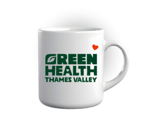
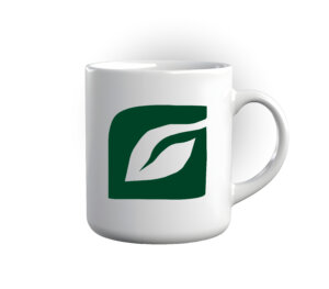
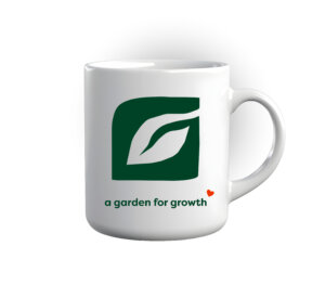
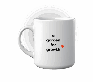
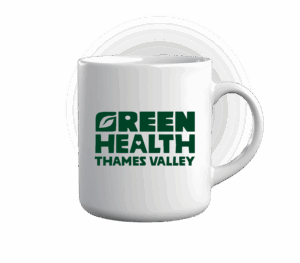
The refined version took a different approach altogether, thinking about the mug as a two-sided object rather than just one face. The front carries the full logotype, and the back has just the tagline ‘a garden for growth’ broken across lines with the red heart: so depending on which way the mug is facing, you get either the brand name or the tagline. It’s a small detail but it makes the design feel more considered, and it was good to think through how branding can work differently on a product that gets picked up and rotated rather than just looked at from one angle. Like the apron, this one didn’t go to print, but working through an unusual format like a curved surface was a useful exercise.
Postcards
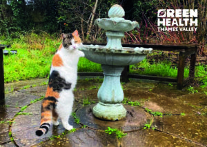
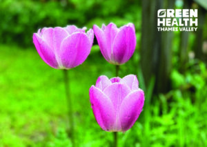
The postcards had a simpler development process because we focused on imagery of the charity’s site for the front designs. We suggested producing four different versions, each using a full-bleed photograph on the front with the white logo sitting in the top right corner. Using photography from the charity’s own website and Facebook page kept things authentic and showed real moments from the garden and the community.
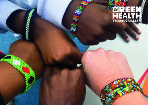
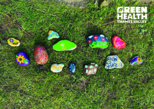
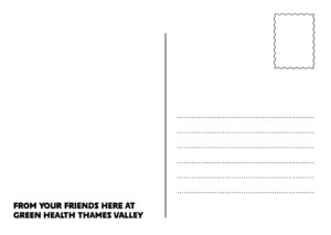
The back uses a simple, consistent template across all four versions. Rather than loading it with information, we kept it minimal and added the line “From your friends here at Green Health Thames Valley”, a small touch that makes the card feel personal. The postcards didn’t make it into the final printed deliverables, but designing them was a useful exercise in thinking about how the brand works with photography rather than just on flat colour.
T-shirts
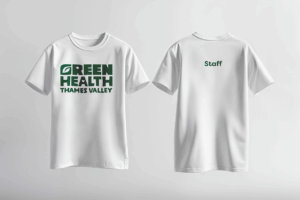
The first four options explored different combinations of colour, layout, and content across green and white, some featuring ‘Staff’ on the back in some form. The client’s main piece of feedback was that the t-shirts were for everyone, not just the team, so that label got dropped.
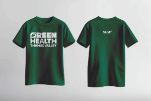
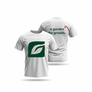
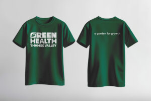
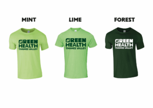
The final design is simpler: full logotype on the front, tagline on the back. From there we put together three colourway options using the actual Fluid Branding catalogue – Mint, Lime, and Forest – so the client could see what each would realistically look like in production. They chose both the lime and the forest, which works well as a pairing across the brand palette.
Calendar
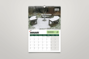
We started with a basic flat calendar: a full-bleed photo at the top, month name, and a date grid below, with placeholder text where the monthly tips would go.
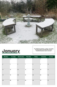
The size changed to A4 once the client confirmed they wanted to print themselves due to budget. The typography developed too, moving to the display type used for the original logo (Poleno), and the red heart was added alongside the month name. The placeholder tips were replaced with actual seasonal gardening content, giving the calendar a practical function beyond the dates.
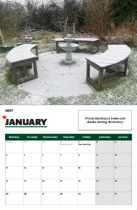
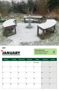
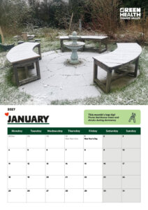
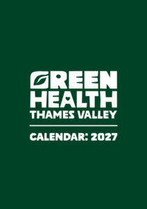
Icons were added in the final version to bring the tip boxes to life and create visual associations with each month’s advice. A cover page was added too: logo on dark green, matching the rest of the brand.
Website
The website refresh is an ongoing element of this project. Due to clashing deadlines, we brought in an additional designer to the team to take the lead on the website build. To ensure continuity for the client, we took on an art direction role – briefing the new designer on the brand, the client’s needs and the design direction established across the other deliverables, so the client wasn’t starting from scratch with someone new.
Final deliverables
Reflection
Rachel
Working with the client was a genuinely enjoyable experience: they were enthusiastic and open to everything we brought to her, which made the project feel collaborative rather than one-sided. If anything, communication could have been more responsive at times, but it’s hard to hold that against someone running a charity largely on their own. Practically, this project improved my skills with making realistic mockups, which became a big part of how we presented ideas to the client. It also gave me a clearer understanding of how budget shapes design decisions in the real world. Reworking the brief multiple times until the deliverables made sense for what the client could actually afford was frustrating at times, but it’s probably the most useful thing I’ll take into professional practice.
Harry
This real job has been an enjoyable and insightful experience that has taught me new skills in teamworking, branding and art-directing. Me and Rachel worked closely as a pair, and would meet frequently with our client which helped create a positive working relationship. In hindsight, the project could have been improved had we been more consistent in sticking to our proposed deadline – which was inevitably extended. I found that managing this Real Job, as well as other concurrent jobs and deadlines was hard and required an extra effort to schedule and manage this project with my other modules and Real Robs. However, working with Rachel, we were able to make a schedule that ensured an effective delivery of deliverables in the latter stages of the project. I believe that I can use these strategies of work scheduling for the future to organise myself for future professional practice. This Real Job gave me a better and clearer idea of working with a client for a branding project – because of this experience, it has inspired me to work on and seek more branding roles and projects after graduating.