Background
Georgina Rivers has been in the nail and beauty industry for over 18 years and is a qualified educator, teaching courses for Cuccio ltd and Sallys. She has recently opened her own training academy here in Reading, Berkshire. She has also created her own brand of nail products called GeorgiaBella nail systems.
Our brief was to create a new visual identity for the client to be incorporated across both a website for the academy, as well as other printed and digital deliverables to aid and boost her business.
Deliverables and responsibilities
Due to this job having a large amount of deliverables (some added later in the design process), we decided, once set on overriding visual guidelines for the project, that it would be best to divide them up so that we could focus well on a few of the deliverables each. This was an instrumental and successful factor to working in a group on this project, we all knew what to focus on and could give each other strong feedback throughout the design process. In this report I will focus on the design process as a whole but with a focus on the deliverables that I worked on which were the Certificates, Business cards and the GeorgiaBella logo.
Primary
- Digital visual identity guidelines (including academy and GeorgiaBella logo)
- Responsive website with additional sections for academy and new aesthetics section
- Social media guidelines / rework (Instagram)
- Social media advert (animation)
- Mail Chimp advert
Secondary
- Business cards (mock up additional)
- Certificates (mock up additional)
- Fliers (mock up additional)
Research and ideation
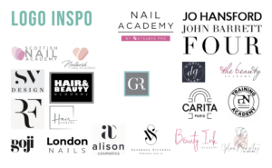
The project began with us all focusing mainly on the web design aspect of the job as this was the main request from the client. We began this project by looking for inspiration through existing nail and beauty web pages, there is a lot of competition within the market for our client so it was important that we understand how to create a unique but successful branding and website for her. One common theme we noticed when carrying out our research was the use of pink within the field (figure 1). The client had requested that she specifically wanted to stay away from pink and wanted to continue using the teal colour she was currently using on her existing website. She also wanted to continue using her existing logo which was a monogram surrounded by a box. As a group we discussed these choices and decided that in order to create a fresh look for the clients new academy site that we would have to make some changes. After carrying out some research and exploration of colour (figure 2) we decided to slightly change the colour scheme by darkening the bright teal colour to a darker one, the client was really happy with this change and felt that it reflected the classiness and professionalism of her brand.
(Figure 1) Logo Moodboard
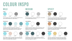
(Figure 2) Colour Exploration
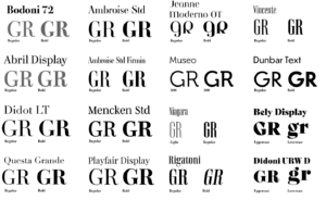
We also brainstormed ideas for how to develop the monogram logo by exploring ‘GR’ in different typefaces. (figure 3). We found the box around the monogram problematic because it did not apply well in situations such as social media profile pictures and banners which was going to be a big aspect of the clients launch of her academy. We therefore decided to remove this box and slightly alter the typeface used with the monogram to create the polished logo. As a group we were keen to explore typefaces in greater detail as we knew the importance of type in reflecting the feel of the brand. The client was hesitant to diverge from the typography she was already using on her existing website but we still wanted to present her with different ideas. It was my task to focus on researching and exploring typography at this stage and I wanted to explore typographic hierarchy to get an idea of how type would function across the different deliverables we were creating (figure 4). One of the members of my group, Alex, suggested that I came up with three levels of varying intensity of typographic suggestions for the client (mild, medium and spicy). This approach was really useful as it allowed me to reassure the client that she still had the option to stick with the typographic branding she was already using but it also allowed me to explore other avenues so that we could decide as a collective which would be the most effective for the new brand. I would definitely use this approach again on other projects, particularly if it involves a rebrand as clients can often feel attached to their old brand and the design features within it so this approach allows you to respect the clients wishes whilst still being able to explore alternatives that the client may end up preferring.
(Figure 3) Monogram exploration
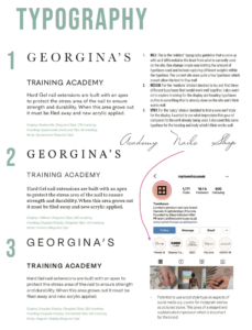
(Figure 4) Typographic exploration
Design development
After making these initial changes with the brand colours and logo we felt, a long with the client, that we had a good starting point to create a new website and other deliverables within the new brand guidelines we had created. Each team member worked on prototyping the new website in Adobe Xd which again helped us to solidify the brand identity. We then began to work separately on our own deliverables.
Business cards
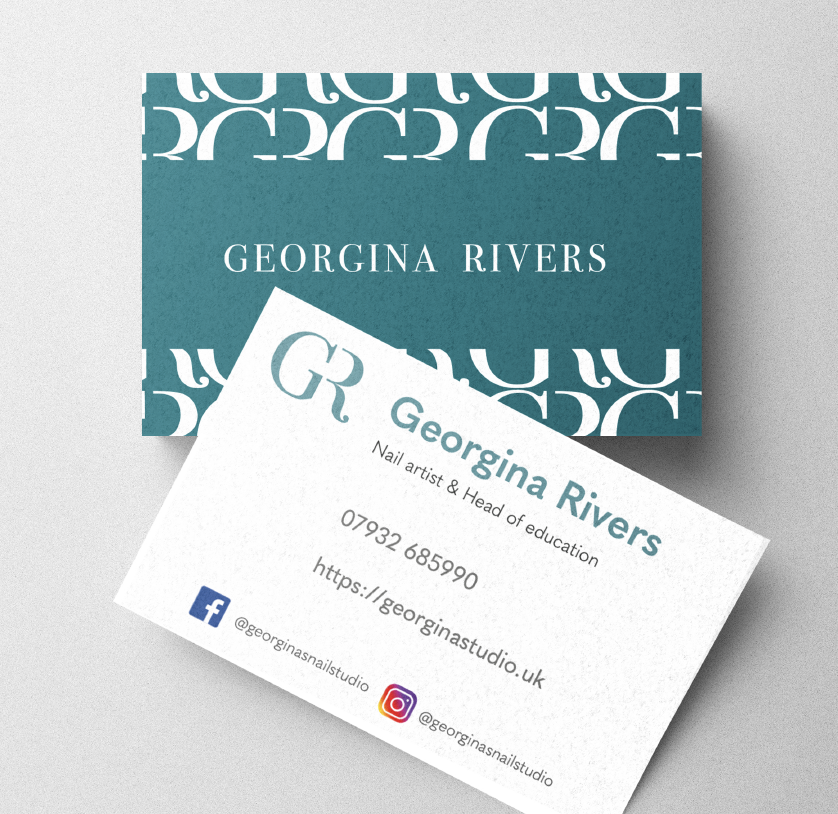
When creating business cards for the client I wanted to ensure that they encapsulated the values of the brand. As done with other luxury/ designer brands I created a pattern out of the monogram which the client was pleased with. Originally we were to have two separate cards for the salon and academy aspects of the business but the together with the client we decided that it would be more effective to have just the one card. The cards feature social media handles alongside the appropriate social media handles. After feedback from our supervisor, I changed the social media icons to be black and white as they were distracting from the Georgina Rivers branding. I was shocked at how much of a difference this made to the overall professionalism of the business cards, this is something I will take forward in future design work that incorporates social media logos.

(figure 5) final business card design
Certificates
Designing certificates for the client was probably the most challenging aspect of this job for me as we struggled to reach a design that the client was pleased with, leading to around sixteen different certificate designs over the course of the job. Due to the pandemic and busy schedules on both our and the clients side it was often difficult to meet in person which lead to a lot of feedback being given over email, this in turn made communication less clear and made it challenging to understand what the client truly wanted for this deliverable. This was definitely a huge learning curve for me and with help from our supervisor I learnt some key skills in communicating with a client. Some key tips from my supervisor were to create a summary after every client meeting of what is expected of me and then to follow this up with the client via email to check that I hadn’t missed anything out and to also give them an opportunity to add any more feedback they had forgotten to mention at the time. This then ensures that the client and the designer are in sync with each other and avoids disappointment or frustration due to miscommunication.
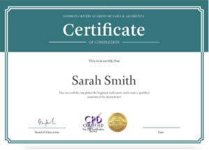
(Figure 6) Final certificate design
Reflection
Overall I learnt a lot over the course of this real job in terms of dealing with clients and working in a design team. There were some challenges a long the way with the main issue probably being communication amongst the group and with the client. This real job taught me how important communication between the client and other designers is. Communication issues across the project (due to various reasons) also lead to issues of time management and frustrations for both the client and the design team. Dealing with these issues as a group with help from our supervisor has now given me some great strategies to prevent this from happening in future jobs. For example when communication was becoming stunted causing our progress on the job to slow, we were advised by our supervisor that we commit to a meeting with the client, the same time each week. Although a simple step, and one not always adhered to, this did have a huge impact on the progress we were making. Having a time slot that everyone expected and could prepare for each week meant we were much more organised as a team and could progress the job with regular feedback.
As a whole this job has been challenging yet fulfilling at the same time. I feel it has improved my ability to work with a client and has taught me new skills I look forward to practicing in future work.

