TY1SK – Submission A Blog post
This is my photoshop work where I completed the task as per the brief in making 3 Podcast Covers.
Design Ideas and Design Process
Idea 3
This was my first design where I wanted to highlight the use of books because of their importance to typography and graphic communication, and what better way to represent th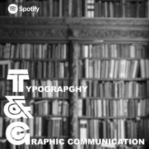 is is using an image of bookshelves. From viewing covers a black and white background with text over the top is an extremely common trend. However, this looked rather busy so I decided to blur the background to put more emphasis on the text but still can tell what the image is.
Idea 2
This is my second design where I wanted to link the topic of the podcast to something that people always look at and relate to. So just li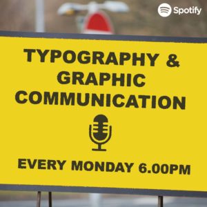 ke the book idea above, I created this idea using road signs. However, with this design I feel like the sign I created does not look weathered enough.
Idea 3 – Final Idea
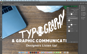
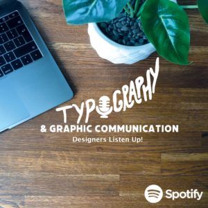 This is my last and final idea and by far my favourite one. Just like the covers above I wanted to make a cover that could relate to a lot of people but because this podcast is of a specific topic, I wanted to really filter down on Designers themselves. So, I decided to take a picture of my desk space because this is where a lot of designers will be sitting to complete their work, even including a MacBook as this is pretty much industry standard. I think by doing this makes listeners more comfortable because it is something they are used to seeing.
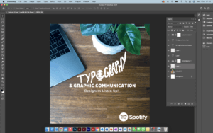
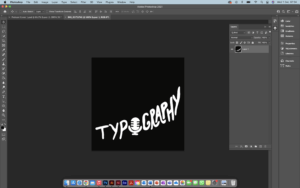
- Working in layers to create suitable Hierarchy
- Cropping & Dragging image across using lasso tool
- Choosing a font to match the same thickness illustration
- Cropping and colour correcting image

Software Tutorials
Because I have some experience in using photoshop, when completing the task, I used existing knowledge of the software and where my knowledge lacked, I would look into alternative means in filling those gaps. I did this mainly by looking at tutorials provided on Blackboard but also venturing through YouTube videos.
The one tutorial I heavily used in one of my podcast covers was because I wanted a desired effect of a weathered or distressed road sign. This was because the text and the boxes used to create the overall cover looked very unnatural to me, so I looked at means to make this more realistic. A lot of the road signs I have seen look weathered, rusty and warn down. This tutorial helped me develop my skills further as it is something used a lot in projects, and it also opened me up to seeing and playing around with filters to change images.
https://www.youtube.com/watch?v=3rGFkOvpPrE
I’d like to improve on cropping and using the likes of the lasso tool to make sections look sharper and crisper. This is because I kept finding additional tags when cropping out images which made the image look blurry and messy. It took multiple attempts for me to be happy with some of my cropping.
Design Resources and Articles
When it came to looking at additional resources around the podcast covers, I mainly looked at various different websites and podcast services/ apps to find what common conventions each cover had. As an avid podcast listener and knowing how to navigate these I found this extremely beneficial as I created a list on what covers had in common. This is the list I created and used throughout my covers:
- Minimal/ simple
- Use of white (either for background or text)
- More illustration than photography or combination of the two
- If photography is used it is very specific
- Mainly use 3 colours
- Square
These really helped me and inspired my designs for my covers.

