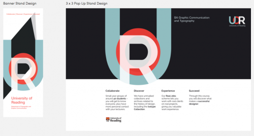
Congratulations to Part 1 student Emmeline Hewstone whose exhibition stand and banner designs won third place in Design Wizard’s 2015/16 competition.
Emmeline’s minimalist design concept was inspired by the Swiss typographic design she studied in our history of graphic communication module. She says:
To appeal to prospective design students, I needed to create a consistent brand. I took inspiration from a design style that I have never experimented with before, but one that I absolutely adore – Swiss typography.
I wanted to represent the historical and educational aspects of the course, having been exposed to Swiss typography and its influential designers through lectures and seminars focusing on the history of graphic communication.
So, feeling inspired particularly by the likes of Josef Müller-Brockmann, I created a minimalist, primarily typographic design following a grid structure which is so commonly seen in Swiss typography.
We look forward to displaying Emmeline’s award-winning banner at our forthcoming open days.

Our latest post: Award-winning student banner design… https://t.co/modSuJGbq8
RT @UniRdg_Typo: Our latest post: Award-winning student banner design… https://t.co/modSuJGbq8