
To wrap up Baseline Shift for 2026, we were very pleased to welcome infographic and visual data designer Valentina D’Efilippo. Working across areas within illustration, UX education and data, Valentina’s discipline is hard to fit just into a singular category. Within the session, she reflected on how she came to understand the language of data, giving it a voice and translating that into visual stories, rather than seeing data as charts or spreadsheets.
Finding a creative voice
Valentina began by explaining the challenge of defining her own practice, which many designers can also relate to. Explaining how her career has never fitted neatly into a one route. She opened up about the struggle to balance parenthood with allowing her career to develop in different directions.
One comment that predominantly stood out was describing design as her ‘superpower’, joking that she’s not saving lives but it’s the power of communication and connecting with people. This approach led her into such a varied career, having co-authored and illustrated books while also creating business intelligence tools for campaigns and apps. Despite how different these products are, they are all connected by her interest in effectively communicating information in the most meaningful way.
Data as a creative material
Early in the talk, Valentina interacted with the audience asking what comes to mind when they hear the word ‘data’. Replies included numbers, categories, analysis and spreadsheets which are all correct, but these were all surface level answers.
Valentina wanted the audience to shift their thinking into something beyond this. Rather than starting with datasets, she often begins with curiosity, asking questions about the world and using data as a way to uncover hidden meanings.
This idea ran throughout the session, that the aim is not about creating another infographic but about transforming information into a design that helps someone understand something they might overlook.
Poppy Field
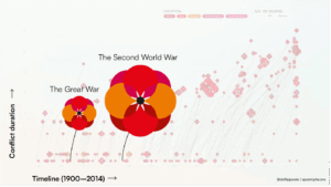
One of the most recognised projects of Valentina’s is Poppy Field. This project looked into reviewing the data on 250 world conflicts that explore factors like cost, time, and location.
The main question for Valentina was how to map out this data effectively for it to be visually producing a message. Initially, Valentina experimented with various traditional mapping techniques, but quickly came to realise that presenting numbers alone wasn’t enough. The aim for her was to make people stop and think about what those numbers represented.
This led her onto the poppy, a recognised symbol of remembrance. Each poppy represents a different conflict, with the length of the stem showing its duration and the size of the flower representing the number of lives lost. What started with a collection of overwhelming statistics then suddenly got transformed into something much more human. Not only is this design showcasing the scale of how many lives were lost but how different conflicts overlapped and continued across the world.
The response from the project prompted worldwide conversations and thousands of people to explore the original data and contribute to discussions around conflict and remembrance. The work has since travelled internationally and been acquired into the permanent collection of the Museum of Ethnology in Vienna.
Designing for understanding
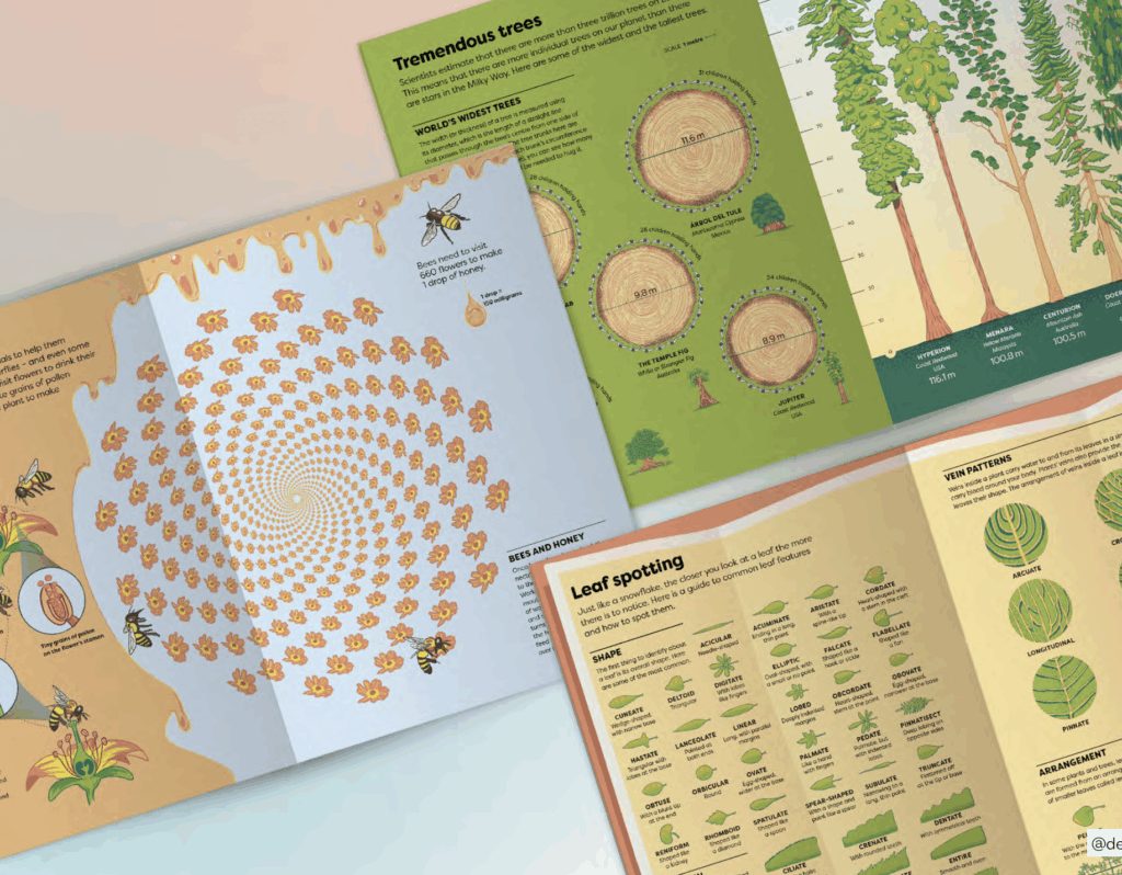
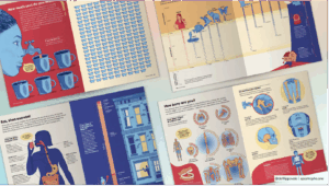
Valentina described one of her most challenging projects was the redesign of infographics in Britannica’s Encyclopedia Infographica, where Valentina worked to make scientific information accessible for younger readers.
Figuring out that measurements would mean so little to a child, she started replacing statistics with relatable experiences, comparisons they can picture. Small animals were compared with bananas, giant trees were measured with how many children it could take to surround the base. Translating the data into these examples shows that making information easier to understand doesn’t always mean simplicity. Sometimes it can be finding a more relatable route.
Design for change
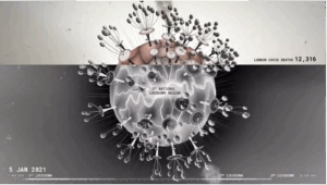
Projects that explored wider social issues were discussed, including an immersive visualisation of how Londoners moved around the city alongside case numbers, deaths and vaccinations. Valentina’s aim within this project wasn’t just to showcase statistics, she described the project as ‘a collective memory’ for the people of London who experienced the effects of lockdowns, restrictions and vaccines.
Using data to question world issues became such a strong interest for Valentina, that she continued to look into recent research of gender bias in healthcare and AI. The interest has been built since her university thesis where gender bias was so prominent. She is now looking into inequalities with medical research and what occurs when these existing biases are used to develop new technologies for datasets.
Finding your own voice
Closing the session, Valentina encouraged students to design for understanding and empathy, rather than aesthetics. She explained that every project starts with a question, allowing research and collaboration to shape the final outcome. She also challenged the pressure to adhere to a recognisable style too early in a career, arguing that a personal voice emerges naturally through curiosity and experimentation. Instead of asking “What should I make?”, she encouraged students to ask, “What do I want to understand?”
Advice for young designers
- Let curiosity guide your creative process.
- Think of data as a record of human experience rather than numbers on a page.
- Embrace not knowing everything.
– Written and edited by Sam Buxton