

Restated brief
Research of speakers
Speaker search
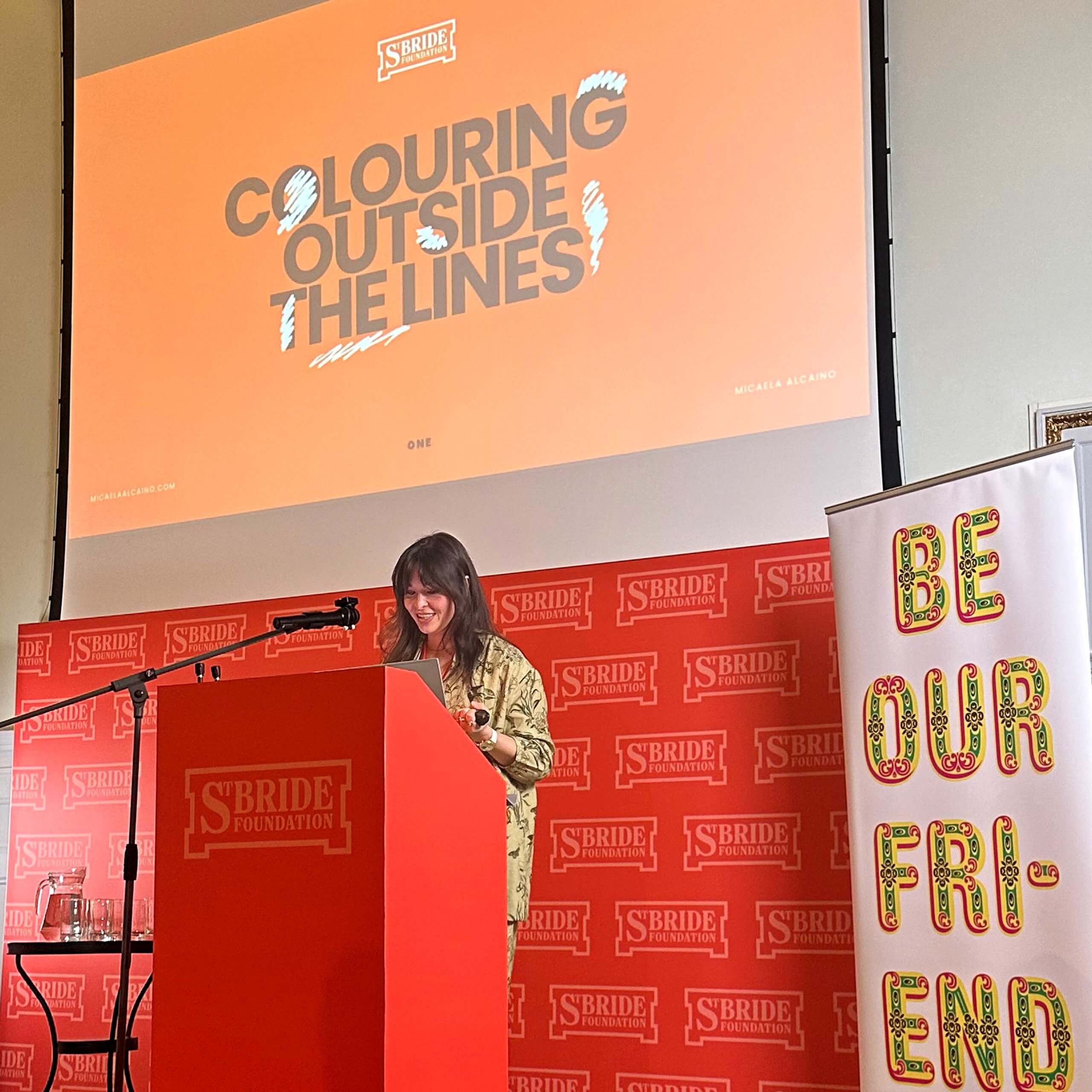
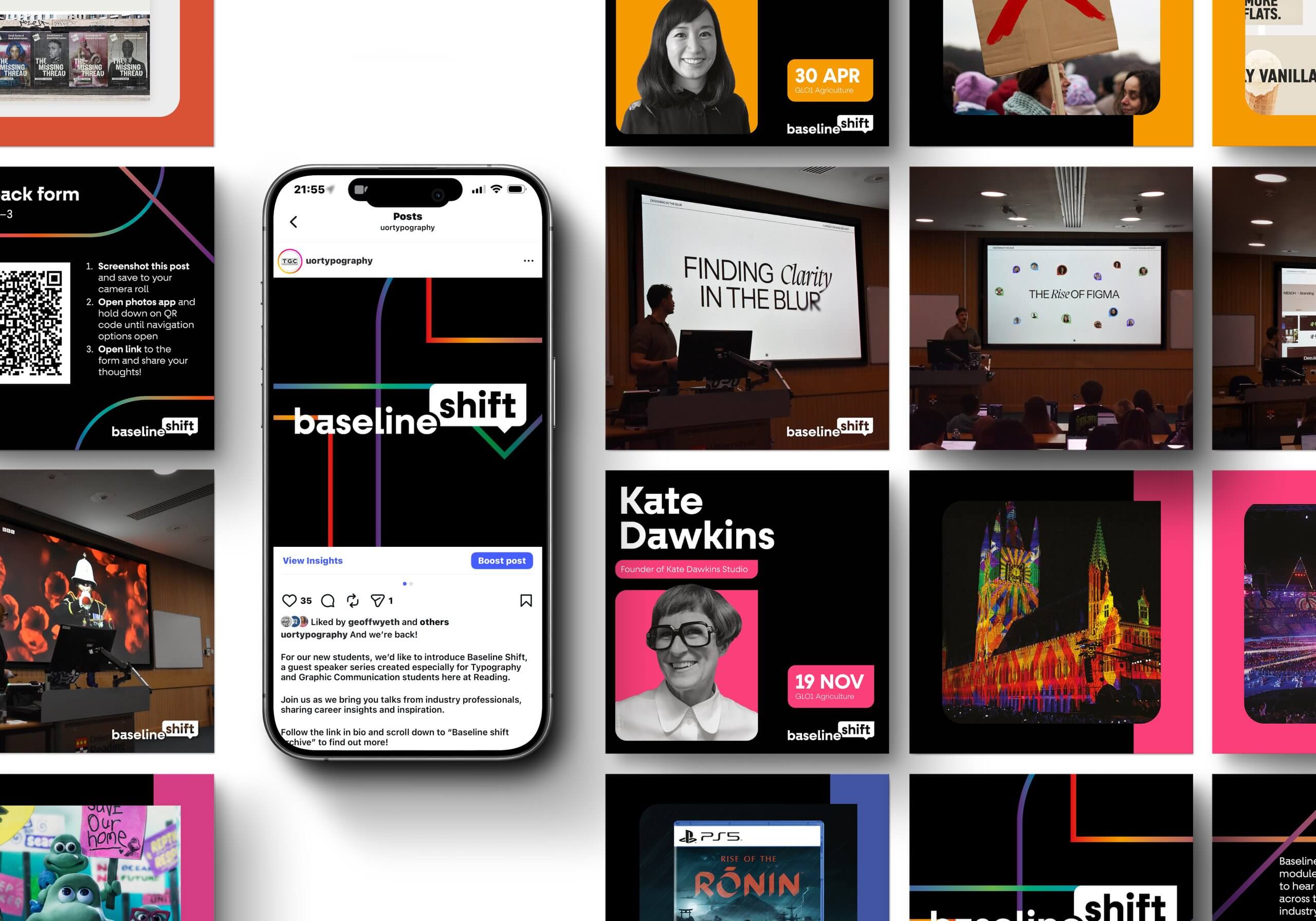
We began our search for speakers by identifying the most effective channels through which to approach and engage them. These included attending external speaker events, exploring professional networks such as LinkedIn, and gathering recommendations from lecturers as well as student suggestion forms. One particularly valuable resource was St Bride’s annual Design Conclave, where we had the opportunity to hear from speakers including Micaela Alcaino, Kate Dawkins, and Carolyne Hill. Inspired by their professional journeys, we approached each of these speakers and invited them to deliver a talk at the University of Reading. LinkedIn also proved to be a useful tool, enabling us to identify connections to the department through mutual contacts. This process was further supported by our supervisor, who helped connect us with alumni and provided strong recommendations.
Speaker communication
Before diving into the rebrand, one of the most important focuses of Baseline Shift was maintaining an exceptionally high standard and consistent communication between the team and speakers. This ranged from tailoring email templates and being immediately available to answer any speaker questions, to organising pre-talk Microsoft Teams calls to personally guide speakers on what to expect. To reinforce this consistency, we introduced a new rule requiring that every email be signed off by at least one team member via an informal group chat before sending. This process supported newer team members, ensured high-quality written communication, reduced errors, while maintaining individual autonomy.
Logo Design
Logo
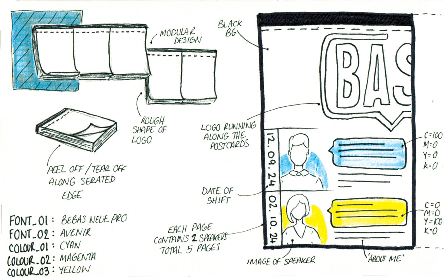
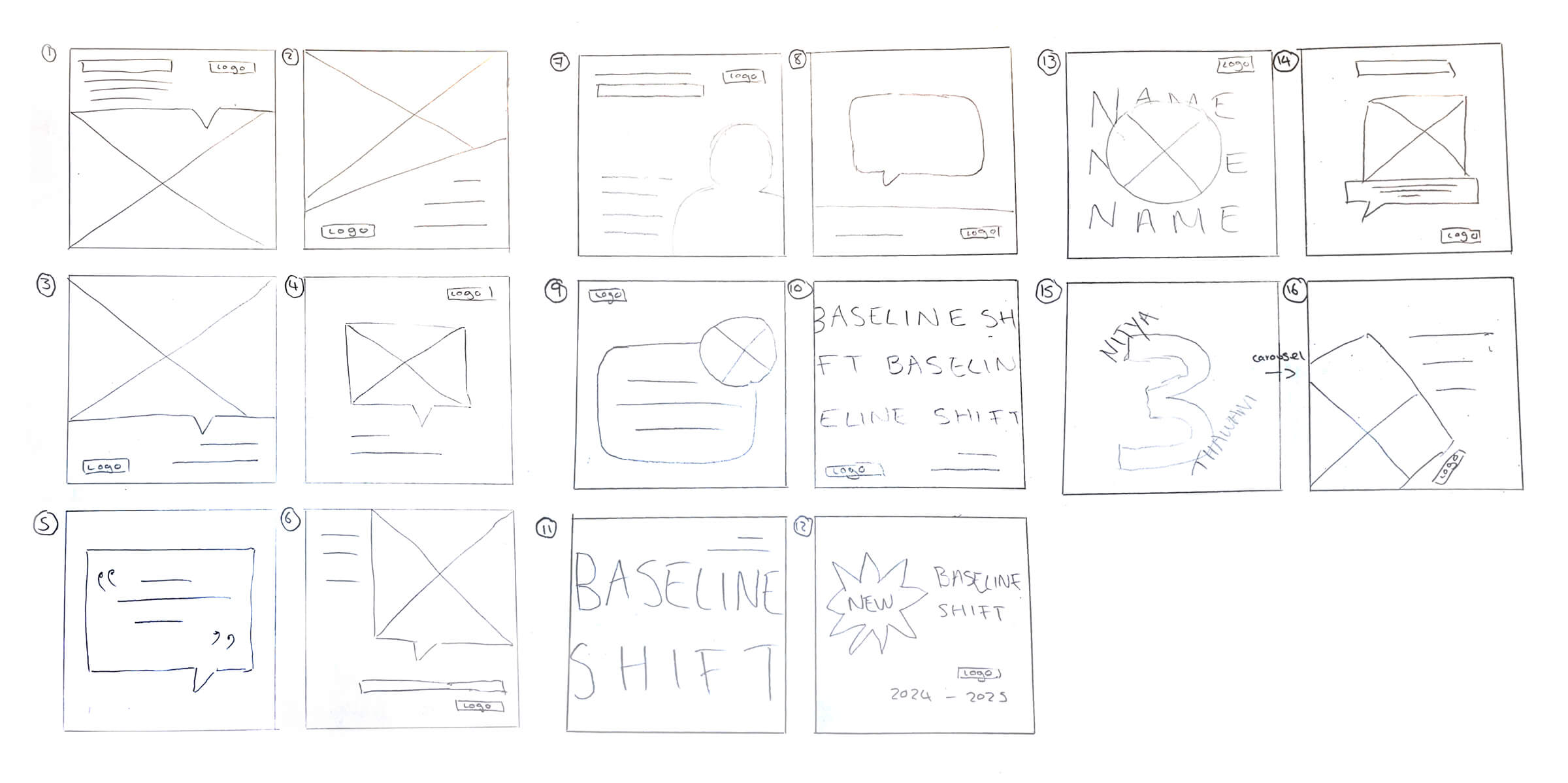
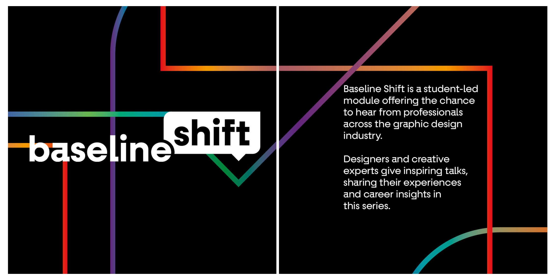
In a departure from the previous year’s logo design that featured a shift key symbol, the 2024–25 team began individually sketching new, more appropriate concepts, developing the logo gradually with each round of iterations. One early sketch (marked with a red dot in the image below) represented the idea of ‘baseline shift’ in its most literal form, achieved by shifting the baseline itself. This concept was then developed further, with the underlining rule evolving into the outline of a speech bubble in order to more clearly communicate the event’s focus on speakers. A summarised overview of the development process, from this iteration through to the final design, is shown below.
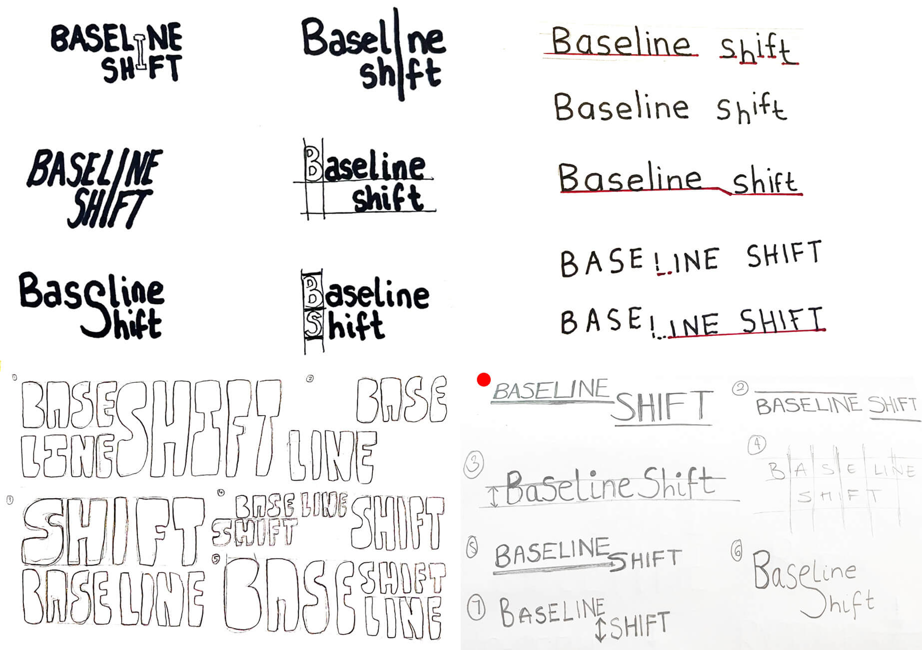
In our search for a typeface with a strong sense of personality, we selected Fractul Variable, which became the first step in establishing the brand identity. The typeface informed the development of a speech-bubble motif featuring a sharp top-right corner, reflecting the letterform of the ‘a’ in the Fractul typeface.

Logo in context
The logo was designed for use across multiple contexts, including an email signature developed and implemented for the 2025–2026 season. As communication with speakers is a key part of Baseline Shift, this application helps establish a sense of professionalism, cohesion, and trust for potential speakers.
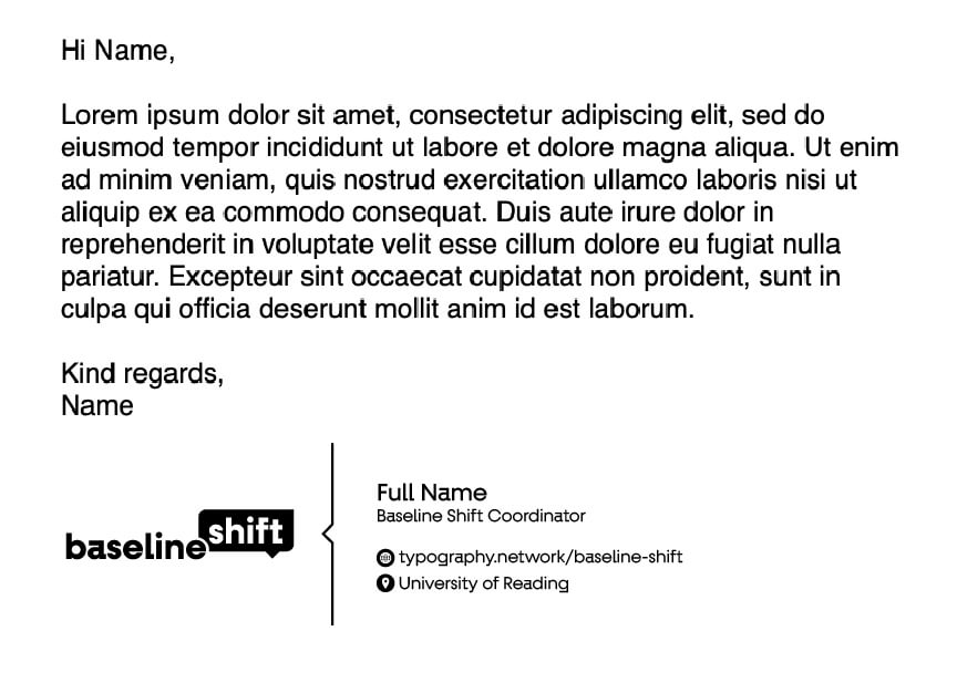
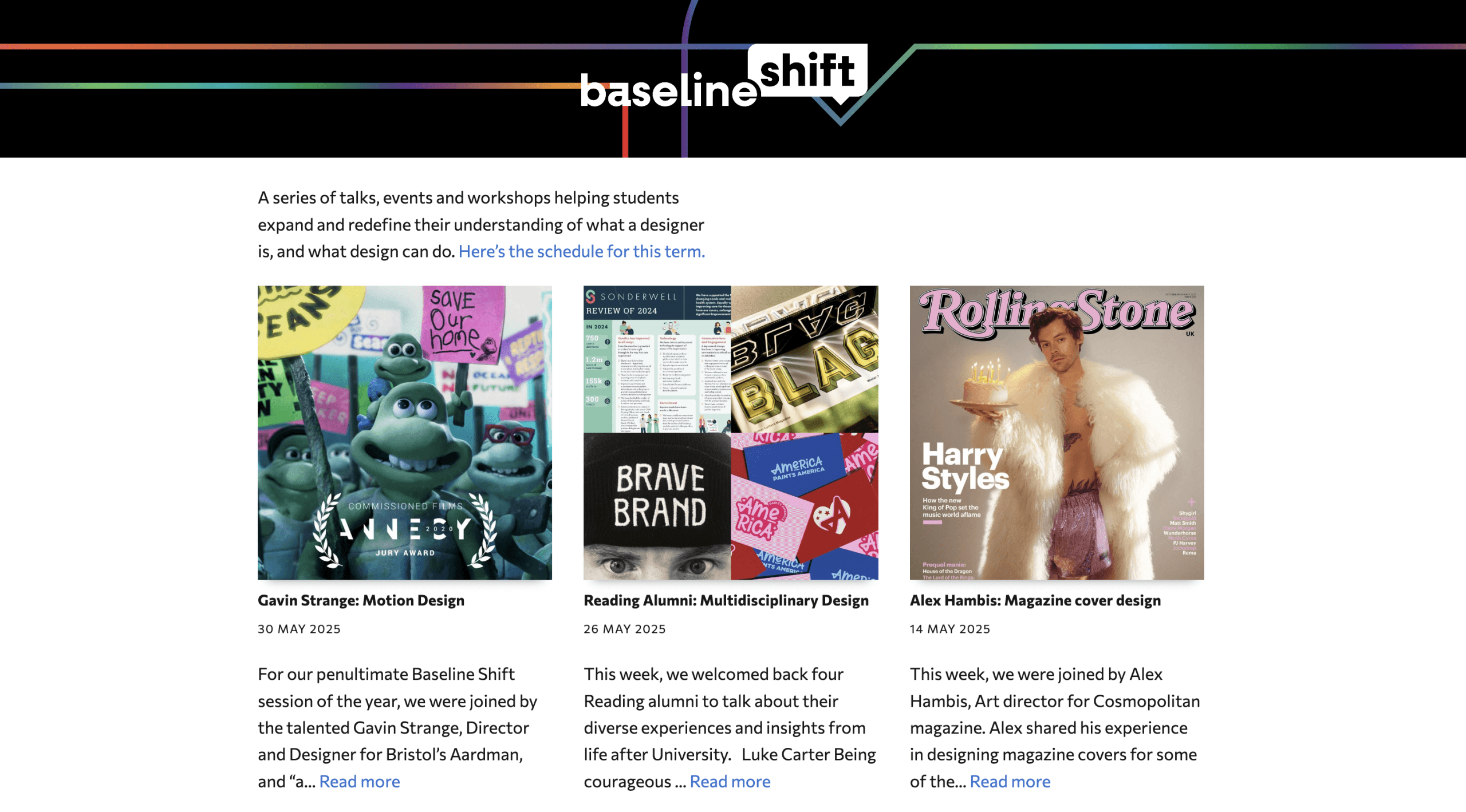
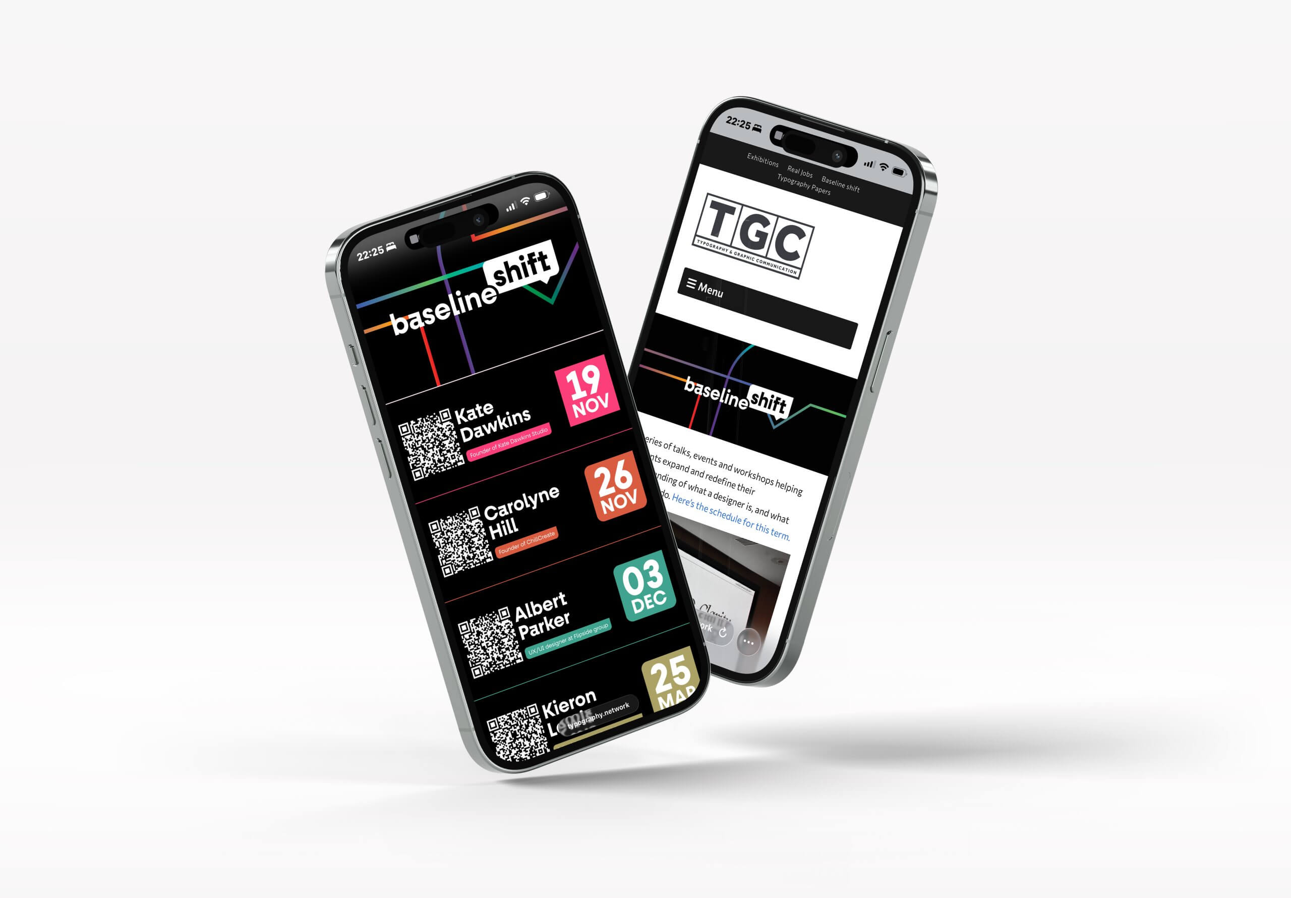
Another example of the logo in context can be found in the header on the Baseline Shift page hosted on typography.network (which the clickable email signature links to). This page houses the Baseline Shift blog posts as well as the digital timetable.
Poster Design
Ideation
When researching previous Baseline Shift posters, we found that the most successful and engaging designs tended to use atypical layouts. In response, several of the concepts we developed explored the idea of a modular poster system, which would allow for easy editing to accommodate the inevitable changes that occur within a guest speaker series.
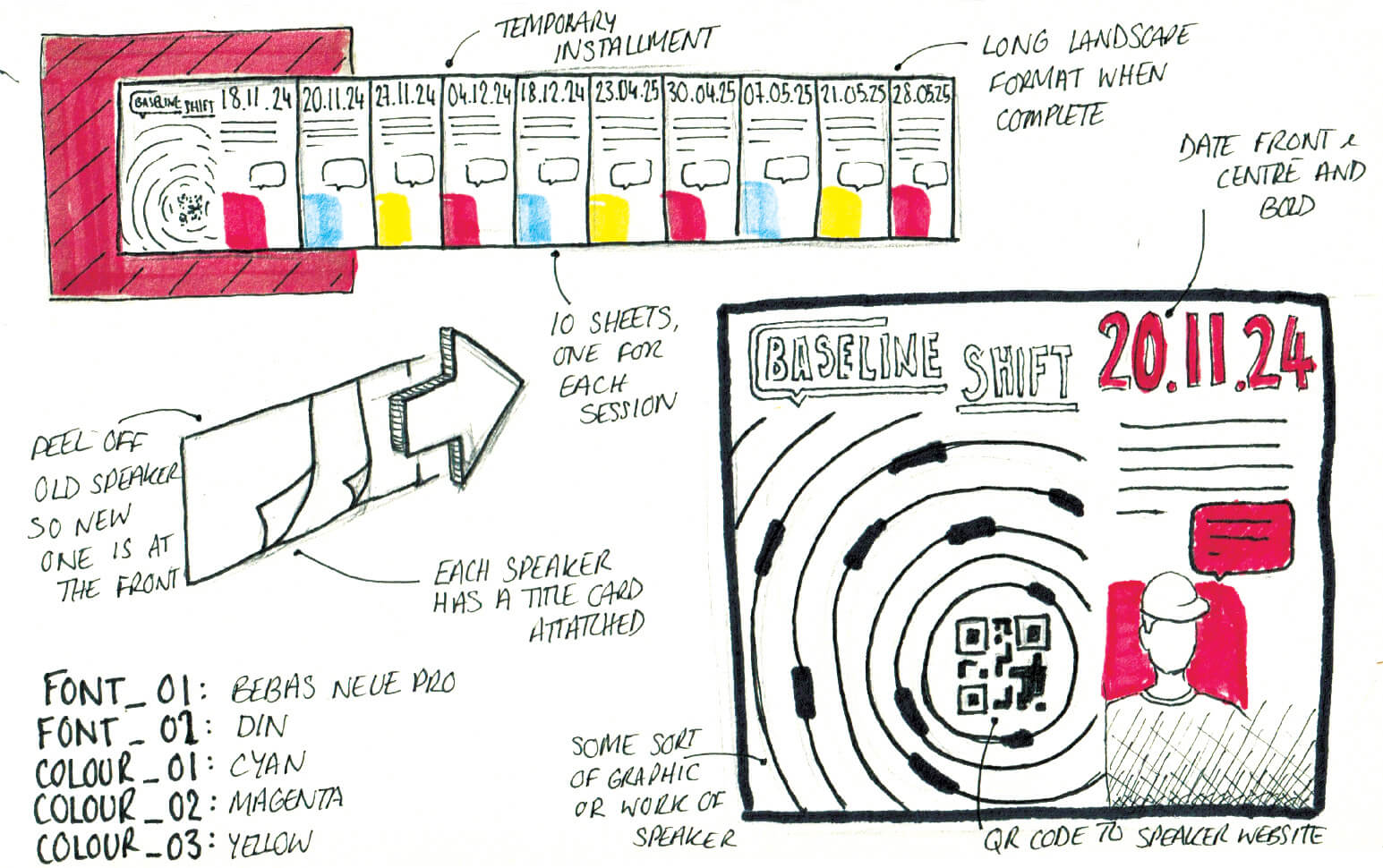
One proposed design, shown below, featured each speaker presented on an individual title card, with the cards overlapping to form a cohesive series. Each week, the previous speaker’s card would be removed, revealing the upcoming speaker at the forefront of the poster. While this concept initially appeared effective, feedback from our supervisor highlighted that physically removing the cards was a destructive design approach and resulted in the loss of an archive documenting that year’s speakers.
In response, the concept was further developed into a system in which the speaker cards were mounted on runners, allowing them to slide past one another. This iteration retained the intended ‘reveal’ interaction while also preserving a complete archive of the speakers throughout the series.
Digital ideation
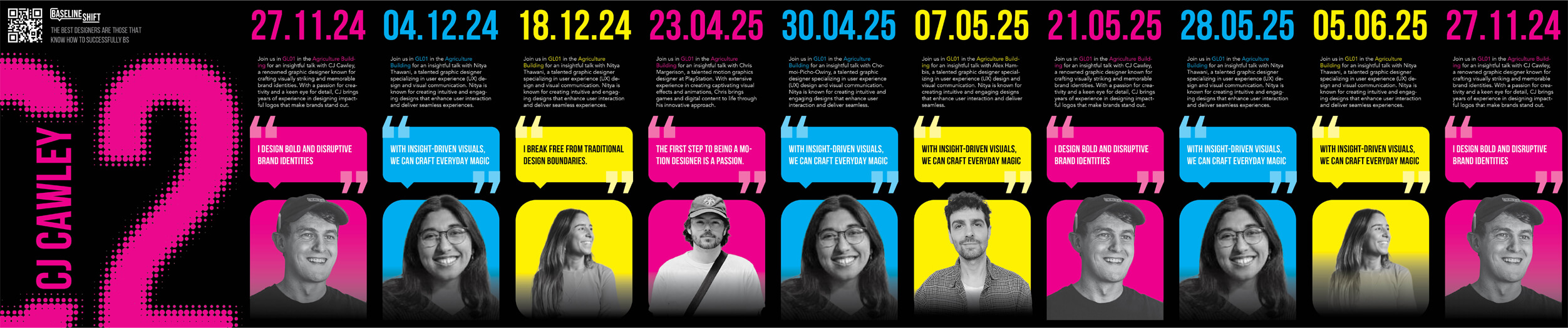
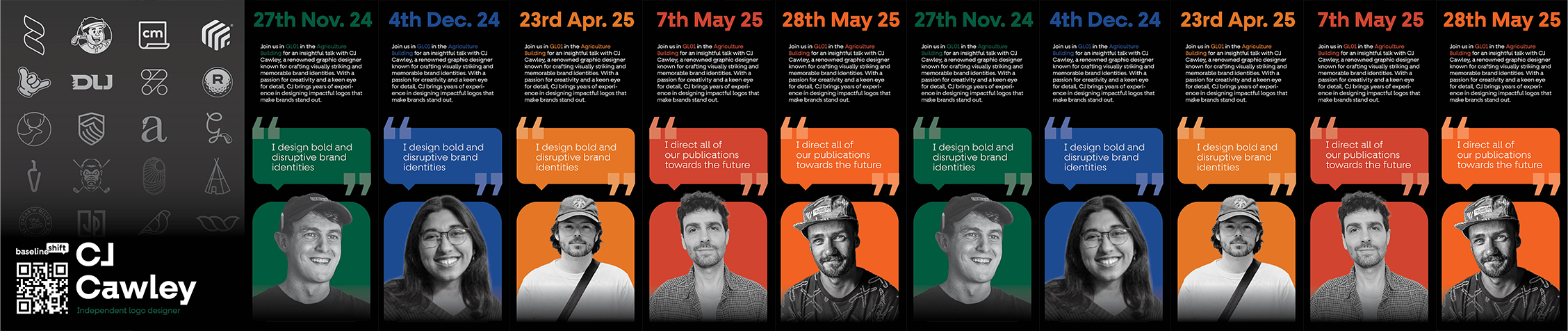
With the modular poster system established, the design was developed in InDesign to explore initial visual layouts. The first concept used the four CMYK colours and emphasised the event date, speaker image, and a quote; however, this approach was later identified as clichéd. During the week of each talk, the relevant speaker card would be spotlighted, initially revealing the session number with the speaker’s name integrated into the numeral. Through iterative feedback and refinement, the information hierarchy was simplified to better serve user needs, leading to the relocation of the speaker’s name to the speaker card and the removal of elements such as quotes and descriptions. A key functional change was rethinking the reveal mechanism: rather than exposing the already apparent session number, the final design reveals a piece of the speaker’s work, resulting in a stronger pay-off for the user. Some early poster concepts, as well as the final digital designs for both years can be seen below.

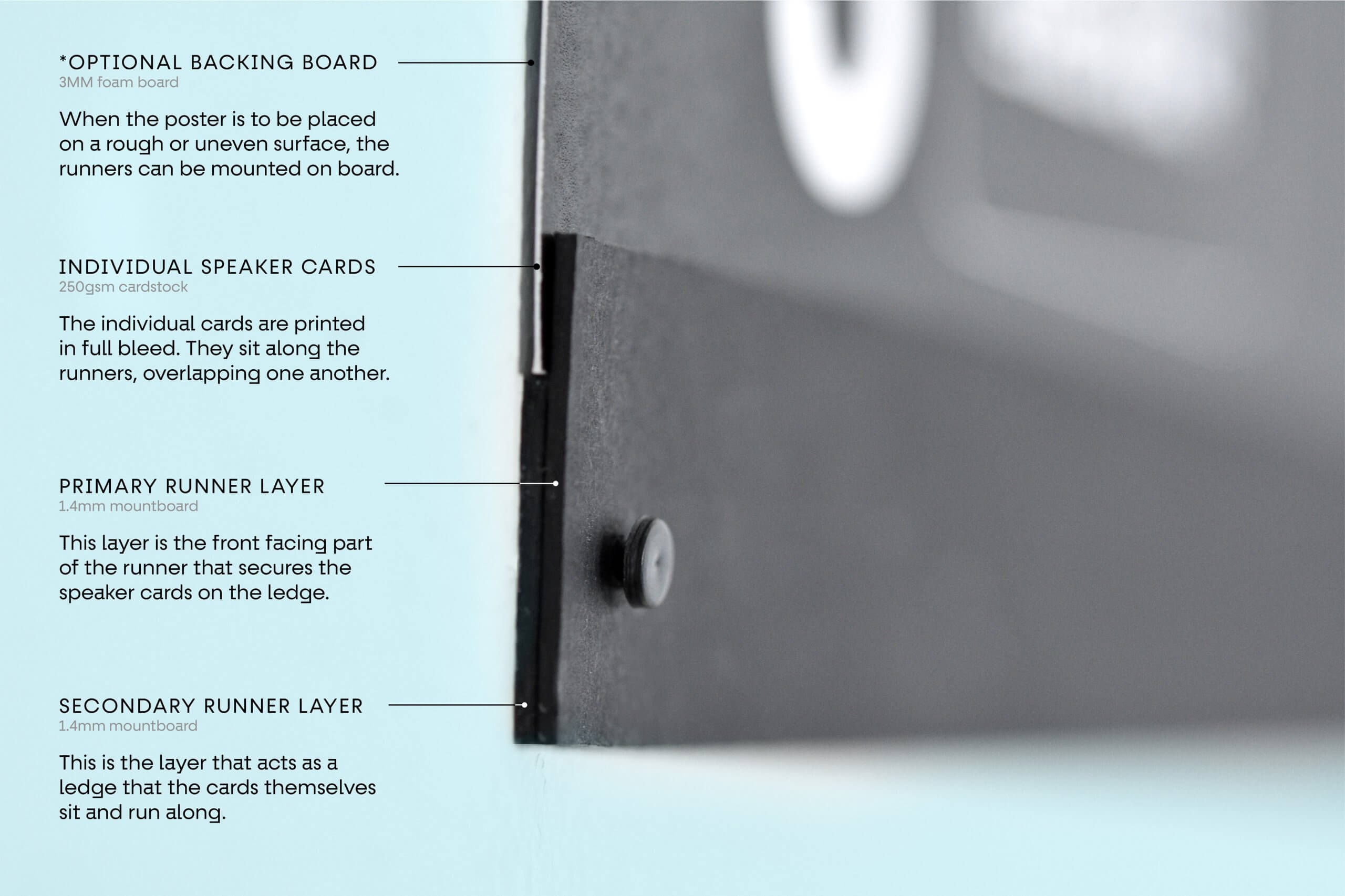
Materiality
Before printing and crafting these modular posters, a (slightly rudimentary) small-scale prototype was created to check that the idea was feasible and that the individual cards worked together as a series.
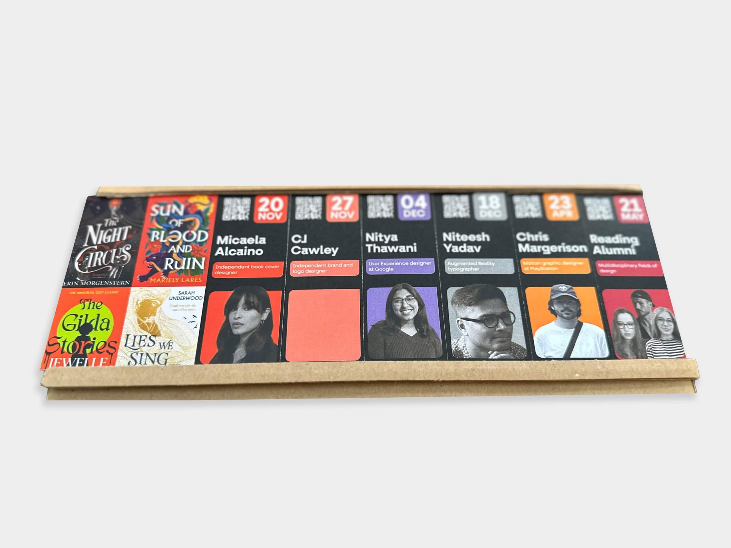
Considering the materiality of the posters was very important for a printed item that needs to be both durable and functional, as well as sleek and portable. After experimenting with several material options, we decided on a backing of 3mm foamboard, mountboard for the runners, and 250gsm cardstock for the speaker cards. The final crafted poster proved to be effective, and very user-friendly when it came to moving and replacing speaker cards after each Baseline Shift talk.
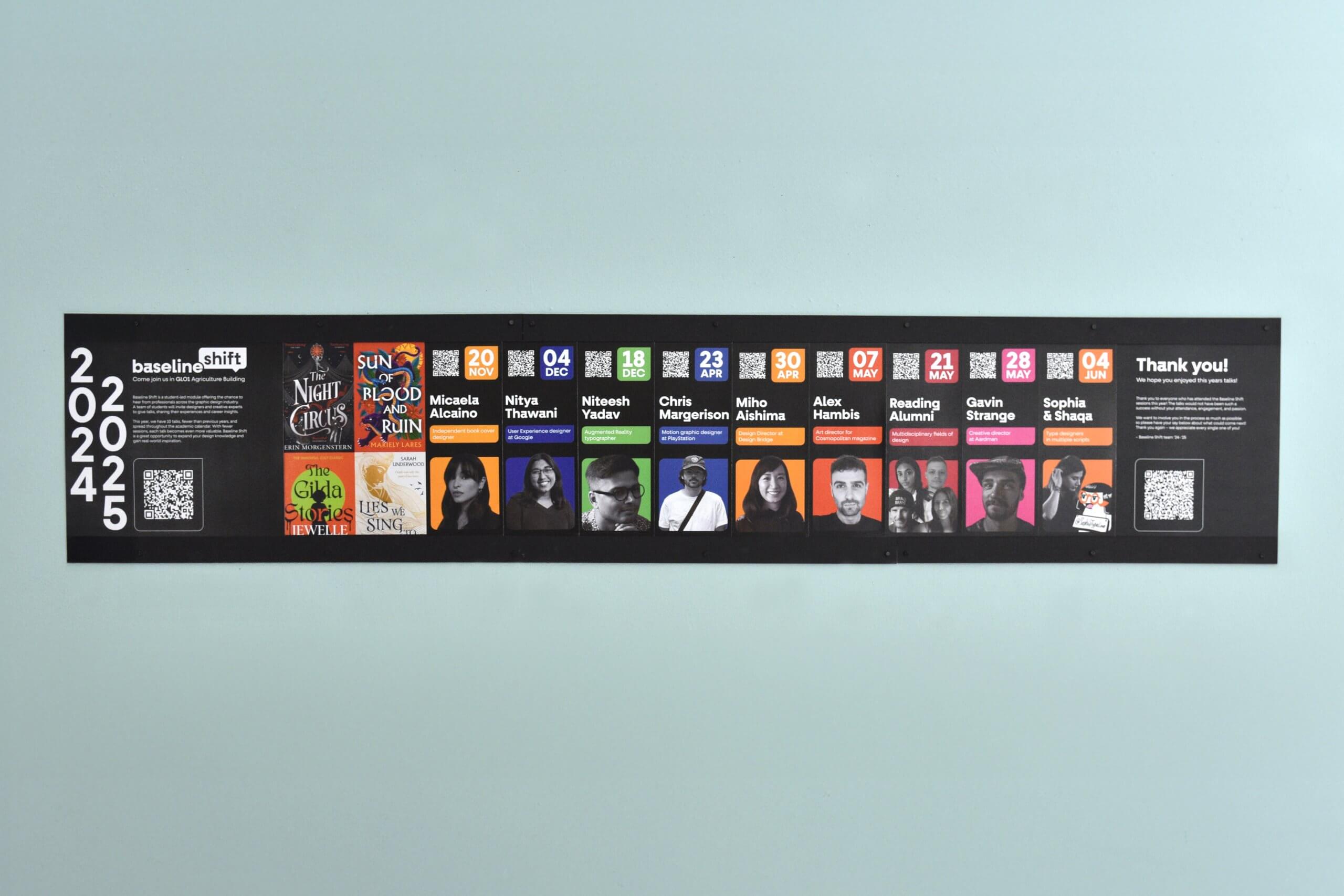
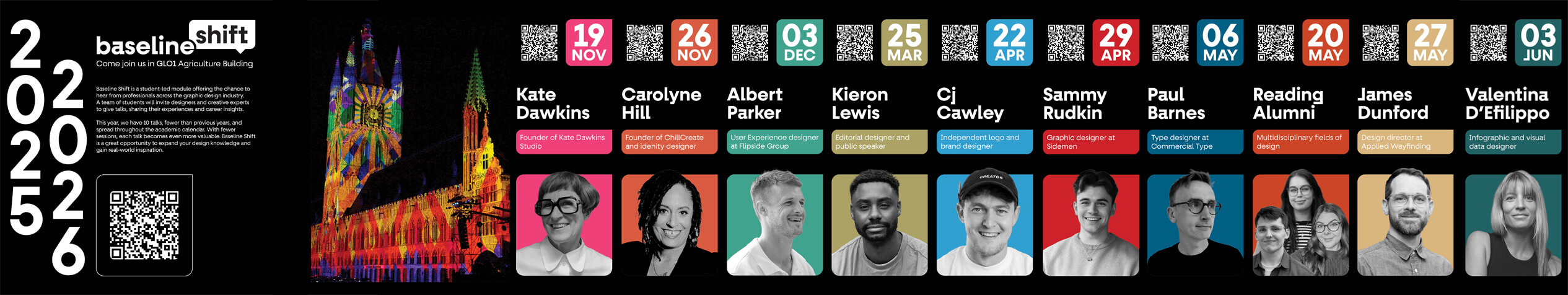
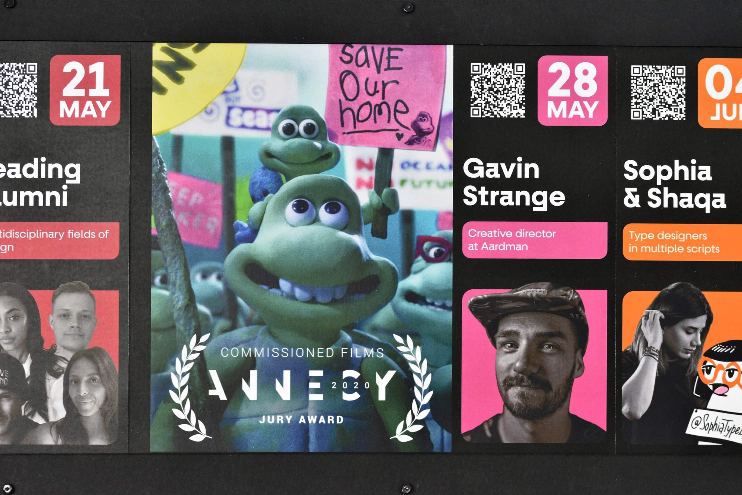
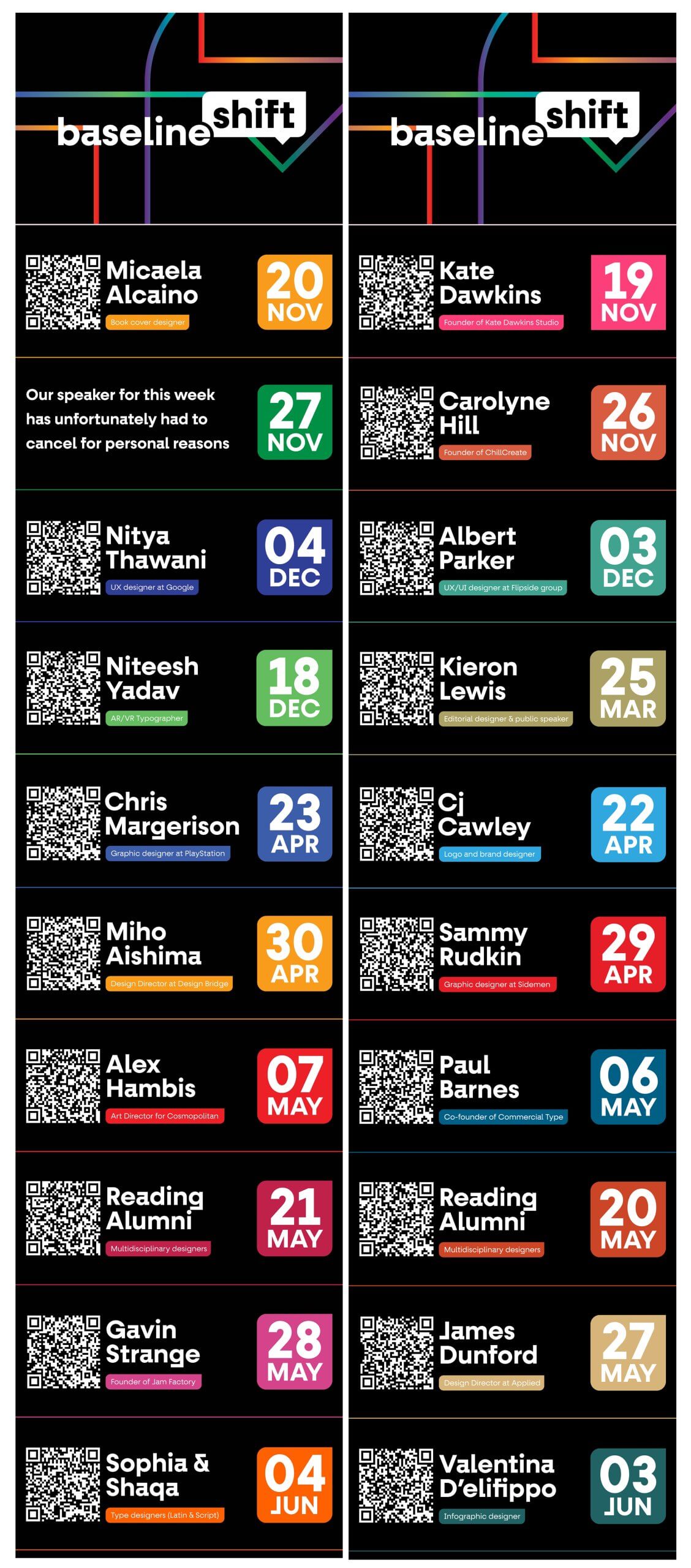
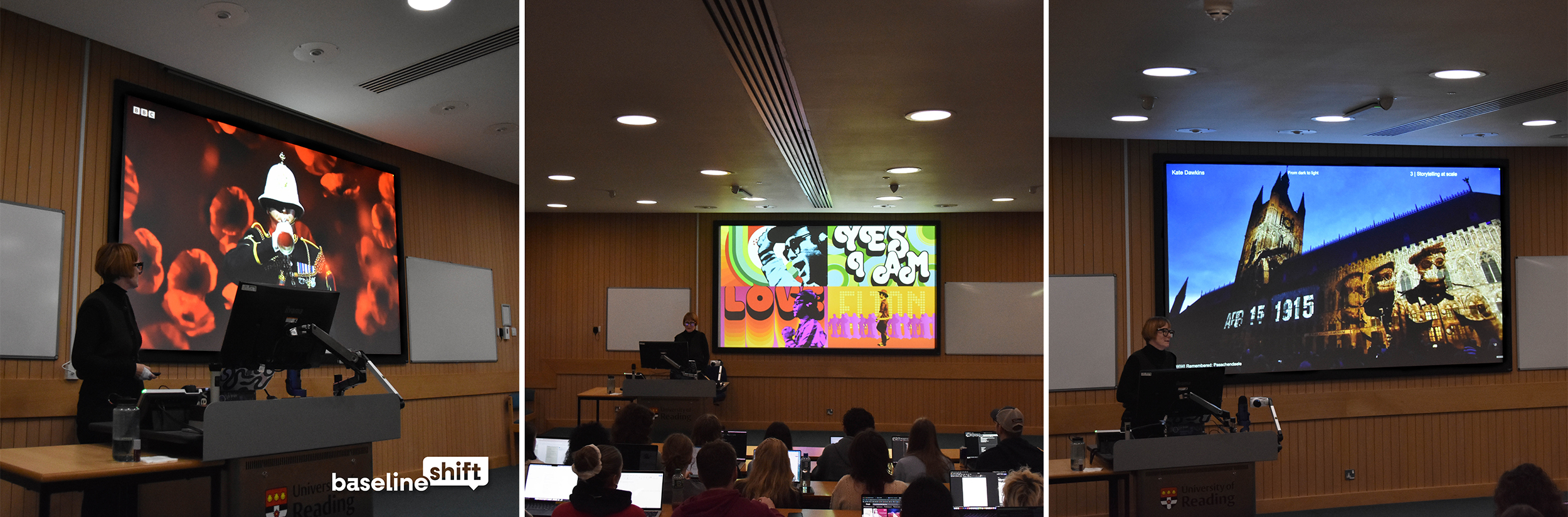
The vibrant choice of colours against the sleek black frame of the posters meant that it was difficult for students to walk through the corridor of the department without stopping to look, and the tactile nature on top of the abundance of scannable elements on the poster encouraged a lot of interaction from curious students. To explain a few of those elements further, the QR codes that feature on each speaker card direct the user to a live webpage featuring links to the speaker’s portfolio before their talk, and a written blog post after their talk. The vibrant colours assigned to each speaker were picked in reference to the speaker’s image of their work, and once chosen, these colours became an important part of the branding.
Business Card & Timetable Design
Business cards
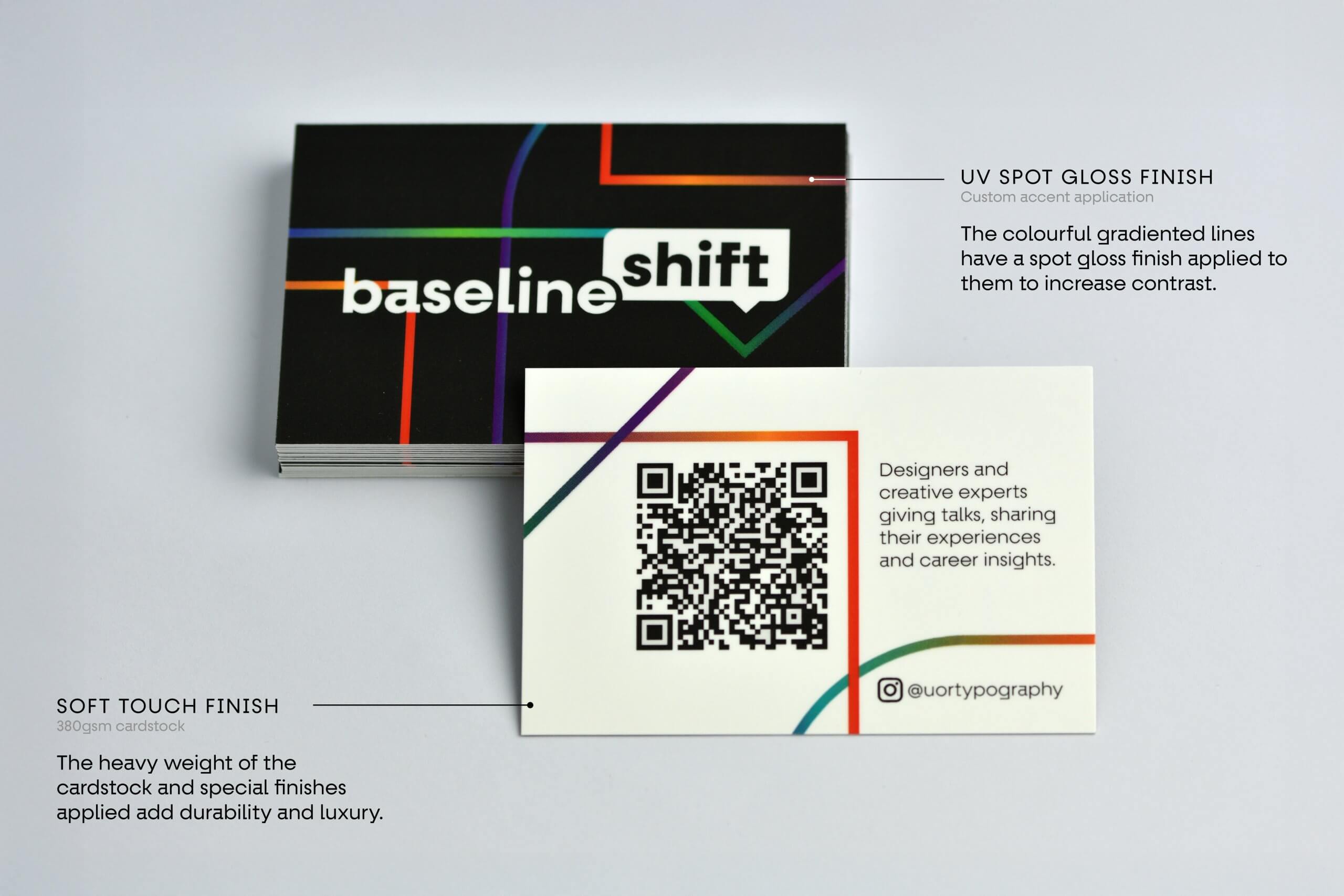
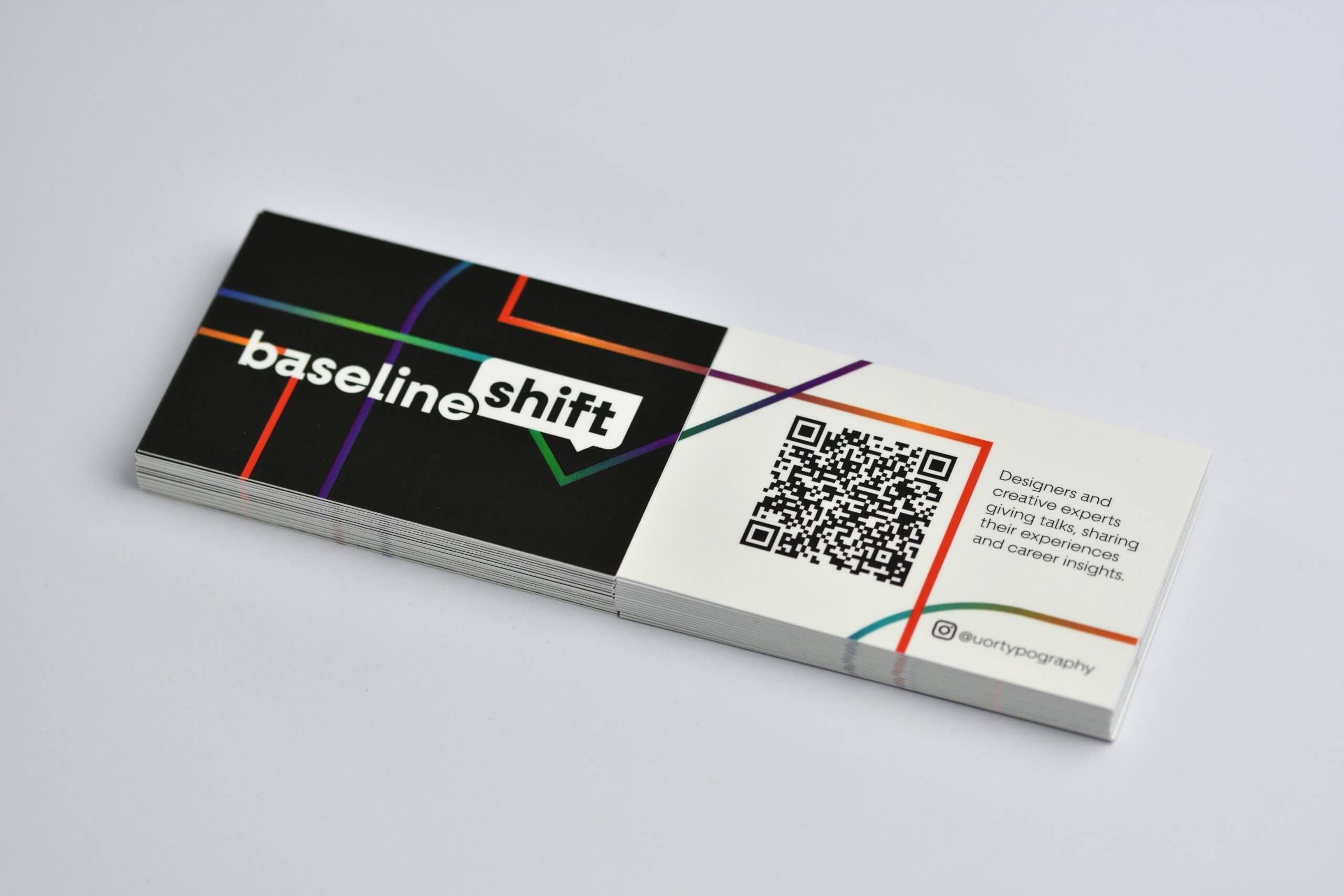
To accommodate changes to the Baseline Shift lineup and timetable, the physical, printed timetables used in previous years were replaced with an editable, digitally hosted PDF. To ensure easy access for students, we designed a business card featuring a QR code that links directly to the digital timetable. Many ideas were considered before landing at the final concept for the business card.
It was important that this was a well-considered deliverable as the user is a design-orientated student familiar with printed artefacts and trained to analyse and critique designs they are presented with. With this in mind, alignment was carefully considered, and the final concept ensured that the design of the front lines-up with the design on the back when flipped horizontally or placed side by side. The elements that are lining up are blown-up outlines of the speech bubble shape with a gradient applied. The gradient is made up of the colours that were assigned to the individual speakers, representing a culmination of speakers, industries, and backgrounds, which is the core essence of Baseline Shift.
Business card prototypes
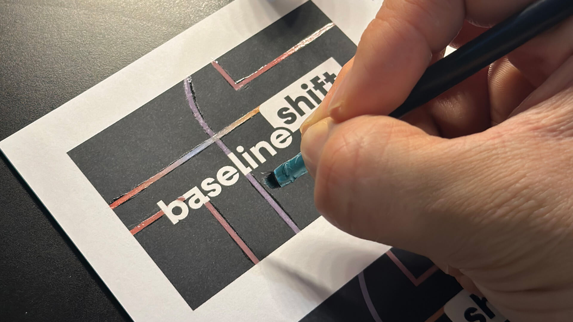
Before getting these sent off to print with soft-touch laminate and UV-varnish finishes applied, we needed to test where best to apply the UV-coating, so we developed a crude but workable prototype, painting clear nail varnish over a printed version of the business card.
Distribution of business cards
The distribution of the business cards was vitally important to making this brand successful as we wanted students to appreciate the quality and craft of the cards themselves. We achieved this by personally handing each student a card and allowing them a few moments to observe the special finishes applied and scan the printed QR code to browse the timetable. This year’s rebrand was about so much more than just the deliverables, but also about ‘shifting’ the mindset of the students.
Digital timetable
The design of the digital timetable also required careful thought, considering how much and in what way the information is presented. After a short ideation process, a tall, scrollable design was decided on with interactive elements, directing users to the same web page that the posters link to, where the speaker blog posts are posted.
Social Media Design
Ideation
Upon deciding on the design for our poster and printed assets, we came up with ideas on how to structure our social media templates in the style of our poster design to ensure consistency across deliverables. To maintain a regular social media presence and keep students updated during the Baseline Shift seasons, we proposed five templated posts:
- Introductory post
- Pre-talk speaker carousel
- Post-talk speaker carousel
- Pre-talk story
- Feedback post
We began by sketching ideas for posts and arranged group feedback to decide on which designs work well and which are less successful.
Introductory post
We created the initial introductory post not only to introduce Baseline Shift to new first year students who were previously unaware of the module, but also to highlight to existing students that baseline shift was back in their schedules. Again, as our users are design-minded and design-trained individuals, it was important that every small detail was considered, including a seamless carousel transition.
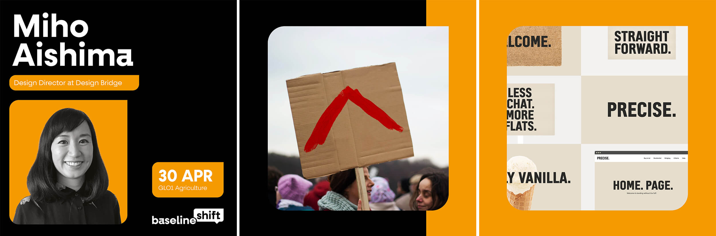
Pre-talk speaker carousel
The main purpose of the carousel posted before a speaker’s talk is to promote and inform. Expanding on the assets used in the poster, this template finds the right balance between displaying enough information, giving the audience enough of a peek into the designer’s work and career, while also leaving enough mystery for them to look forward to the talk. To connect the last two slides of the carousel, the speaker’s assigned colour was used as a block-colour background, adding an on-brand pop of colour as the user swipes the post.
Post-talk speaker carousel
To allow for a focus on the photography as well as a summary celebrating the speaker’s talk, the post-talk carousels could be less designed and use far fewer assets. We deemed it appropriate, to let the photography speak for itself and stripped back the carousel to just the three images, placing the Baseline Shift logo in the bottom of the post to tie back into our branding.
Pre-talk story
The story posts followed a similar format to the pre-speaker carousel, however, to differentiate these from the speaker’s posts we made sure to schedule these a day before the talk as these have a time limit as to when the posts expire. The purpose of this templated post is to act as a reminder for students, that the talk was taking place the next day. We also decided to include a further piece of the designer’s work to give some context to who the students will be listening to. This idea of drip-feeding images of designer’s work across different platforms (poster, main-feed posts, story posts, etc.), keeps content relevant and new and gives students a reason to stay tuned.

Feedback post
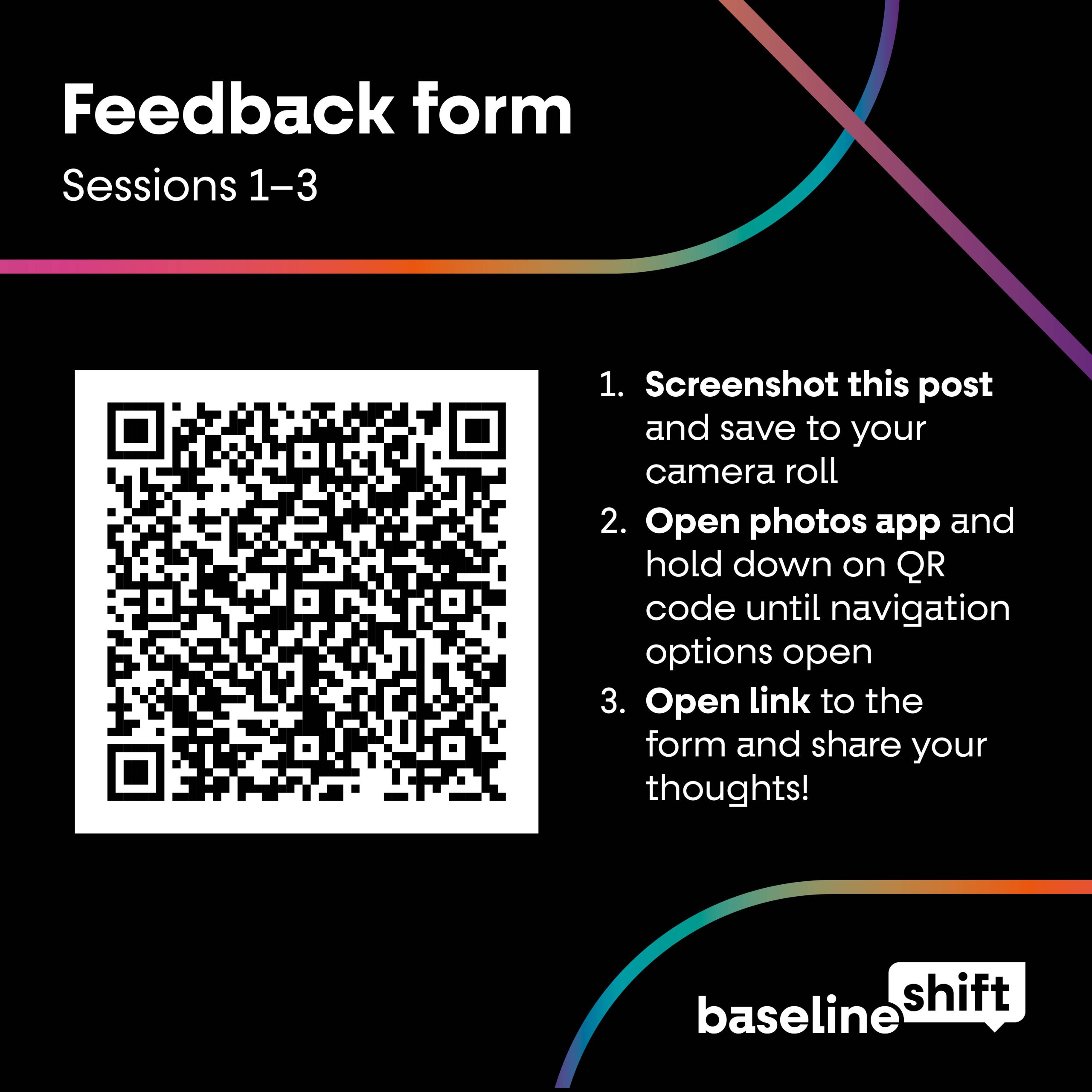
The final template that we designed for the Baseline Shift socials was for regular feedback posts. Students were presented with a QR code directing them to the feedback form on the big screen at the end of every third speaker session. In case they missed this, or simply wanted to access it later, this post acted as a reminder for students to provide feedback. It also served as a step-by-step guide on how to access the form when presented with a QR code via a main-feed Instagram post.
Posting consistently
To ensure a regular social media presence and avoid conflicts with the T&GC department’s existing schedule, we liaised with the department’s social media team to establish agreed-upon posting days. As part of the handover of responsibilities to newer team members, we refined existing templates and developed tutorials, alongside collaborative training sessions, to clearly outline expectations around content, tone, and posting timelines.
In line with our email review process, we also implemented a sign-off system requiring at least one additional team member to approve each post prior to publication, ensuring consistency, strong execution, and a high standard of grammar across all content.
Animation
For the 2025–2026 season, we set a task for the future Baseline Shift leaders to create an animation to display both on the screen in the department and across social media. Due to time constraints and limited knowledge of software, after storyboarding their ideas they were only able to execute the introduction, and we happily stepped in to assist with finishing it off. We wanted the team dynamic to have clear roles and responsibilities, while also acknowledging that if something was ever beyond anyone’s capabilities at the time, there were always other team members to reach out to for support.
The following animation was designed with sound in mind, to be posted on social media:
While the next animation was designed to be played without sound on the promo screen in the department entrance (with the difference between the two animations being in the smoothness of the introduction) :
Blog posts
Writing about our speakers
For this season of Baseline Shift we focused on improving and maintaining the consistency and quality of our blog posts celebrating each speaker. To achieve this, we ensured that for every session, all team members had clear responsibilities: one person taking notes, another capturing photos, another setting up the tech and another introducing the speaker. This preparation meant that when it came time to write the posts, we already had all the content and assets we needed. Each blog was either written or edited by one of us two, ensuring a consistent style and high standard of writing across the series. Our blog posts can be read here.
Outcome
The 2024–2025 Baseline Shift sessions have been a great success, seeing a skyrocket in attendance and an overwhelming amount of positive feedback from students, staff, and speakers alike.
We are both incredibly proud of what has been achieved, and are so committed to the future of Baseline Shift that we have agreed to continue our involvement beyond the completion of the Real Job itself. Our hope is to carry forward the legacy of Baseline Shift and to keep delivering outstanding industry talks for students of the Typography & Graphic Communication course.
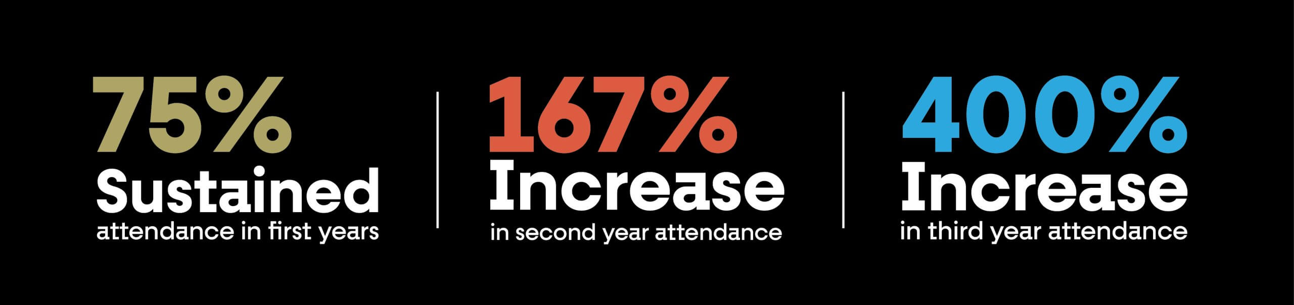
Baseline Shift’s increase in attendance since we stepped up to co-lead the team in 2024 has been visualised below, (it must be stated that these increases are also impacted by first and second years being required to write learning journals on the sessions, however, there are no other causal factors for the increase in third year attendance other than our drive for promo and devotion to the project).
Feedback
Client feedback
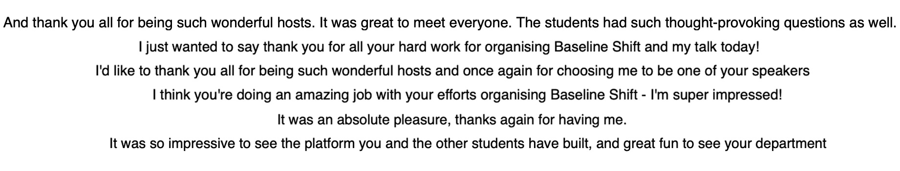
“I don’t think I have ever seen such a successful example of a student team in action. Through thick and thin (a lot of stuff happens in a year) they have supported each other and made the whole Department proud. I now have a new baseline of excellence in how these things should work. And my teaching observation is that I can’t really take the credit for that. Instead, it comes the fact that every year – somehow – tremendously able young people find our course in BA Graphic Communication and sign up (not quite knowing, I think, what to expect). When the most able among that group then feel ready to take on the biggest challenges, I think maybe the best I can do is get out of their way, and just be there when they need to talk.”
– James Lloyd
Reflection
Baseline Shift has exceeded the regular boundaries of a Real Job and has become a passion project that the two of us have devoted hours, weeks, and months of our lives to. We have nurtured it into something that we are deeply proud of and excited to pass on, hopefully continuing the legacy and the bar we have raised it to. There have been challenges throughout the project, often regarding how to work on such an involved project fairly as a team of students with varying levels of time and commitment. We overcame this by considering everybody’s individual needs and adjusting the workload accordingly. We didn’t want to design deliverables that would only be successful for one season, instead, by designing a system, an identity and template after template, we created a well-structured framework, that can easily be handed over to the next generation of students – that to us, is a new legacy for Baseline Shift.
– Written by Amirah Yasin and Tommy Molnar