
Overview
Each year the department of Typography and Graphic Communication hosts a graduation show to celebrate the work the graduating students have made during their time on the course. The branding and design of this show is vital, as it sets initial expectations of the show for visitors and reflects the ethos of our course and students. Through developing a strong brand identity, we aim to draw in potential employers for the graduates and create a memorable experience for all attendees.
We began the project by identifying team member’s strengths and areas for development, to ensure we all got the most out of this project whilst producing a strong design. The roles we established were (but not limited to):
- Jony Hodgson: Team Leader
- Celeste Clift: Social Media manager
- Finn Lewis: Lead UX designer
- Aaron James: Creative Director
- Ben Sturgis: Graphic Designer
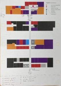
To identify the key deliverables, we held meetings with our supervisor/client. This included open discussions, as well as reviewing the work produced for past years shows. As a team, we physically mapped out the exhibition space and reviewed what areas we could expand into, including those that previous years had not. The final list included:
- Physical Invites
- Digital Invites
- Entrance panel
- Interactive Stamp Panel
- Rubber stamps
- Window decals
- Table marquees
- A-boards
- Wayfinding signage
- Exhibition panels
- Social media
- Website
Theme
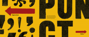
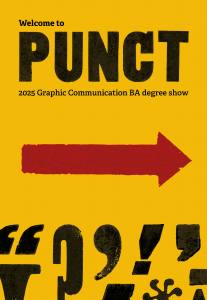
We explored a range of options for the theme of our degree show before settling on ‘Punct’. The basis of our theme is a combination of the Punk design style and the use of punctuation, which reflects the typographic focus of our course. We developed a mission statement to explain our theme, which we used across our assets:
‘Punct is the 2025 BA Graphic Communication degree show — punctuation + punk inspired graphic design. Work on show will demonstrate how specialist typographic skills can be applied to the turbulent world of graphic design, in which we seek to be catalysts for change.’
Research
The research we conducted for this exhibition covered many bases as we wanted to ensure we fully understood the parameters of hosting an exhibition before we began designing.
In the summer the team attended a few design shows to explore how other exhibitions utilised space and wayfinding symbols, as well as getting inspiration from the branding and advertising. These shows included the New Designers London 2024 Exhibition, UWE Bristol graphic design degree show, Curtin University graphic design degree show, as well as full team attendance at the UoR Emergence 2024 degree show.
Following the previous year’s exhibition, we published a survey asking attendees for feedback on their experience of the show. We received useful insights, such as the rooms being too small/cramped. Primarily attendees had a ‘good’ experience (average response score was a 3.5/5 star experience), however they would have liked a more spacious area to better show students work and feel more communal. We attempted to rectify this by reserving extra exhibition space and moving our branding elements into the hallways. This makes the show feel more connected, rather than the branded bar being outside and then the students work all the way in T3 and T4. Whilst students work had to remain in T3/4, we could encourage people to spend time in communal areas and engage with our designs to give the feeling of extra space.
We held team meetings looking at the archives of previous year’s exhibition deliverables. This enabled us to establish exactly what we needed to create, as well as identifying what was successful, and where we could improve.
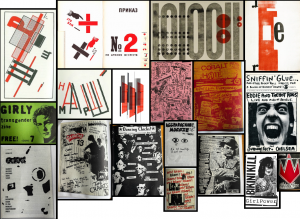
Once the theme of punctation and punk inspired graphic design had been identified, we looked at several sources of visual styles. A key source of punk graphic design used was Fanzines: the DIY revolution, a book that contained an extensive collection of punk style graphic design in rebellious magazines. We also looked at modernist design from the 20th century. While modernist design is not inherently punk, it uses colour and simple elements very effectively to create impactful visuals, we hope that in combination the two styles will achieve a visual style that is both punk and highly impactful.
Design Process
Branding
Establishing the brand identity began with a theme and a name for the show. Our idea originated from focusing on micro typography and punctation, celebrating the departments significant contributions on research in the field typography, as well as typography being a key skill of the department’s graduates. Focusing in on punctation, shortened the word to ‘Punct’, a play on words which nods towards punk inspired graphic design.
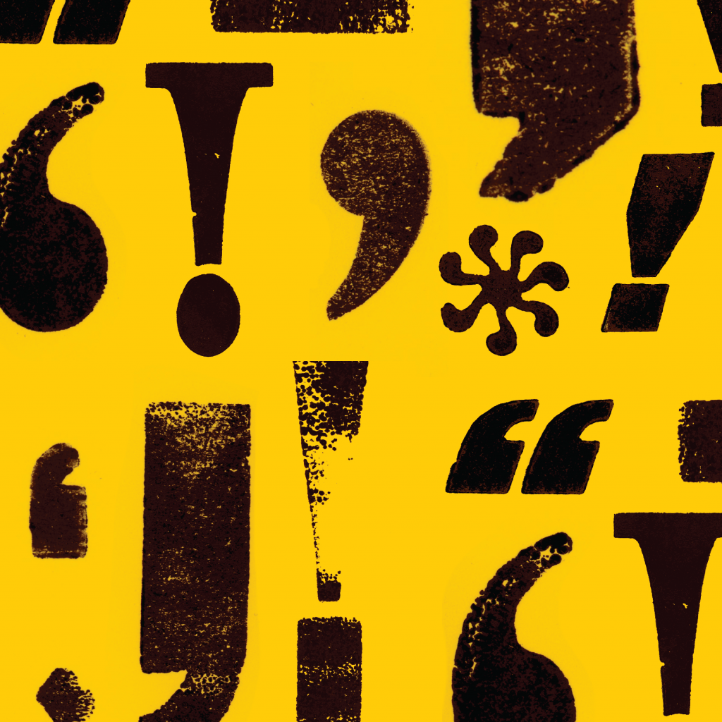
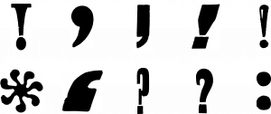
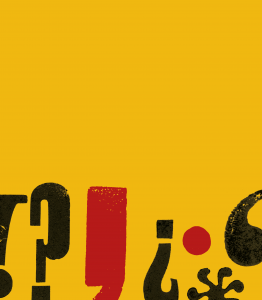
As a visual brand we decided we didn’t want to establish one particular logo, and instead we set out to create a highly impactful and recognisable visual style. This visual style combined scanned in punctation marks from letter pressed wood blocks, and impactful colours. These scanned prints created texture reflective of a grungy punk style, and the punctation marks showcasing the theme of punctation.
Establishing a strong colour scheme was key to creating an impactful and memorable brand identity. We explored many colours, starting with the cliché punk pink and yellow, infamous from the Sex Pistols ‘Nevermind the Bollocks’ album cover, however, while this reflected punk graphic design, it did not feel like our course. Instead, we found yellow, black, and red to be a suitable decision. This restraint colour palette follows the visuals from our research and produced a memorable element to our brand further than the scanned in punctation, contributing to our string brand identity. This colour pallet also balances our theme of punk inspired graphic design with a striking yellow, while maintaining a seriousness and clarity reflective of the work produced by the department.
Following these decisions, we created a concise set of brand guidelines, ensuring our assets remain consistent across channels.
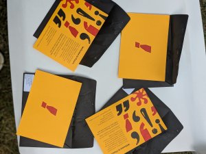
Physical Invites
A vital part of our visual identity was the use of punctation marks. We wanted a way to elevate this visually, and using the letterpress to create authentic texture was a great way of reflecting the punk theme, while also representing a core part of our course teachings, highlighting the focus of historical and physical printing. Scanning these prints in allowed us to replicate the texture on our digital assets.
When designing the physical invites we focused on the user experience. We wanted there to be impact when opening the design, as this invite is one of the first branded elements that our invitees would see. We discussed stock options with the printers, choosing GF Smith Colourplan ‘Citrine’, on 350gsm, a heavy stock which colour matched our brand. We made the design A6, ensuring the physical invite was concise and, in combination with the heavy card stock, it had a solid feel. We ordered black envelopes, as this stood out as a more significant letter than that of regular white envelopes. This black also highly contrasted the Citrine stock, complementing our design.
On the opening side of the invite there is a single red exclamation point, which aimed to create intrigue and excitement when the user takes the invite out of the envelope. The back of the invite included a pattern design of punctuation marks and a short entry of text inviting the user. Designing the physical invite forced us to explore all aspects of the process, even ones we hadn’t considered before this project. For example, we chose to order peel and seal envelopes, hugely speeding up the packaging of envelopes so we the team could send them to our invitees by the deadline.
Email invites
As per the brief, email invitations needed to be designed and sent. The main challenge for this task was learning the software Mailchimp. This included learning the technical limitations of Mailchimp and working around these to best display our branding.
The team reviewed email campaigns from previous years teams to clarify tone and key information to be included. Reviewing these campaigns also helped us identify the previous teams’ shortcomings. For example, many teams sent emails too late, not allowing for multiple chances for recipients to update their details. We combatted this by staggering the releases of our emails, so recipients would not be flooded with emails right before the show.
Another challenge was the scale of the email invites. Sending a design to over 1,500 recipients felt intimidating for the team, adding pressure which heightened our attention to detail, as well as highlighting the importance of sending each other test emails.
Social Media
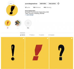
The main purposes of the Punct Instagram page (@punctdegreeshow) is to build excitement for the show, share key information and promote the student’s work.
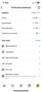
We began by researching the main ‘rules’ of Instagram, as none of us had experience in running a professional account. We learnt the importance of posting consistently, something we have done throughout the project timeline (and continue to do) with our posting schedule keeping us accountable to this. We also utilised Instagram tools such as countdowns, polls, collaborative posts and hashtags to increase engagement and help Instagram users who may be interested in our show find the account. These techniques proved effective, and our account had a high level of engagement which can be seen through the account insights.
One of the challenges was balancing how much to share – we wanted to build excitement and show off the fun things we had planned, however we had to make sure we didn’t give too much away. To resolve this, we posted story posts of a sneak peak of the invites being sealed, but waited until all recipients would have received them to post a reel of the full invite design. Through these posts we built excitement for our show, but also promoted a link for users to receive a physical invite next year.
We circulated a OneDrive link amongst our classmates to gather mock-ups and images of their work for the Instagram teasers. In our initial research, we evaluated the previous year’s Instagram pages and decided that the 3 posts format was effective for this. To carry the brand style into these, we chose to introduce our recognisable yellow with the addition of our letter press typography. Showing the students’ name on their portraits was a change we made from the other years, as it allows followers to identify each student immediately. Another difference in our Instagram was allowing the students to ‘collaborate’ on the post, sharing it to their Instagram page too. This was popular, with most students accepting it, as it helps to build their personal design Instagram and promotes their participation in the show to their own followers.
We also posted 3 main information posts, sharing the location, date and time details and explaining our theme. We pinned these to the top of the page, meaning they are easy to find and do not get lost amongst the student work.
We are continuing to consistently post student’s work 3 times a day until 11 June. We also plan to post any stories necessary on the day of the degree show, such as reposting key information. At the degree show we will ensure that we take images and videos to post in the following days to celebrate the graduating class and thank visitors for coming.
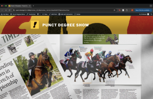
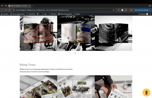
Website
The website shall serve as a virtual exhibition space, intended for users that could not attend the show, or visitors of the show that want to look again at student work/ find contact details.
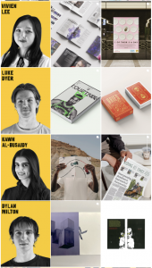
The main page of the site showcases a piece of work from each student, each of these works have been chosen by us, the team, to best represent our course. Across the selection of works we aim to showcase works from all projects as evenly as possible, with the inclusion of magazines, packaging, UX, editorial, word and image, and typeface design. Upon clicking these selected works the user is taken to page of the respective student.
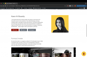
Each student page includes their name, portrait photo, an introduction about themselves and where applicable a link to each of the following: portfolio website, LinkedIn profile, and Instagram profile, as well as their work.
The website is still in the production stage, whereas other deliverables needed to be done weeks in advance before the show, so that we could post out physical invites, announce the show across emails and social media, this really doesn’t want to go live until the day of the show. By delaying the publishing of the full site until the day of the show, it ensures that people font see the work in advance and choose to no longer attend.
Below you can see the current design for each student works page, we intend to bring more of the Punct branding to these pages, as currently it solely has small heading banner of our brand, and little else.
Exhibition Materials
Entrance and Stamp Panels
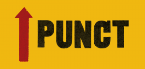
The entrance panel functions as a welcome point, providing information about the degree show and essential directions. The panel needs to quickly communicate directions for new visitors unfamiliar with the space. It highlights the show name, key branding and includes key information for visitors such as toilet directions. One challenge in the design of this entrance panel was ensuring that the type size used could be read comfortably from varying distances. We did multiple print tests at full scale to trial type size as well as effective resolution of our scanned in prints. Doing these tests allowed us to realise our initial letterpress scans were not high enough quality, allowing us to rescan them at 10,800 dpi.
The ‘stamp’ panel introduced a more experimental concept. It shall allow attendees to engage with the show by stamping a panel with a mark of our brand, as well as writing personal messages. This aims to create an interactive element engaging visitors and improving their experience.
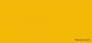

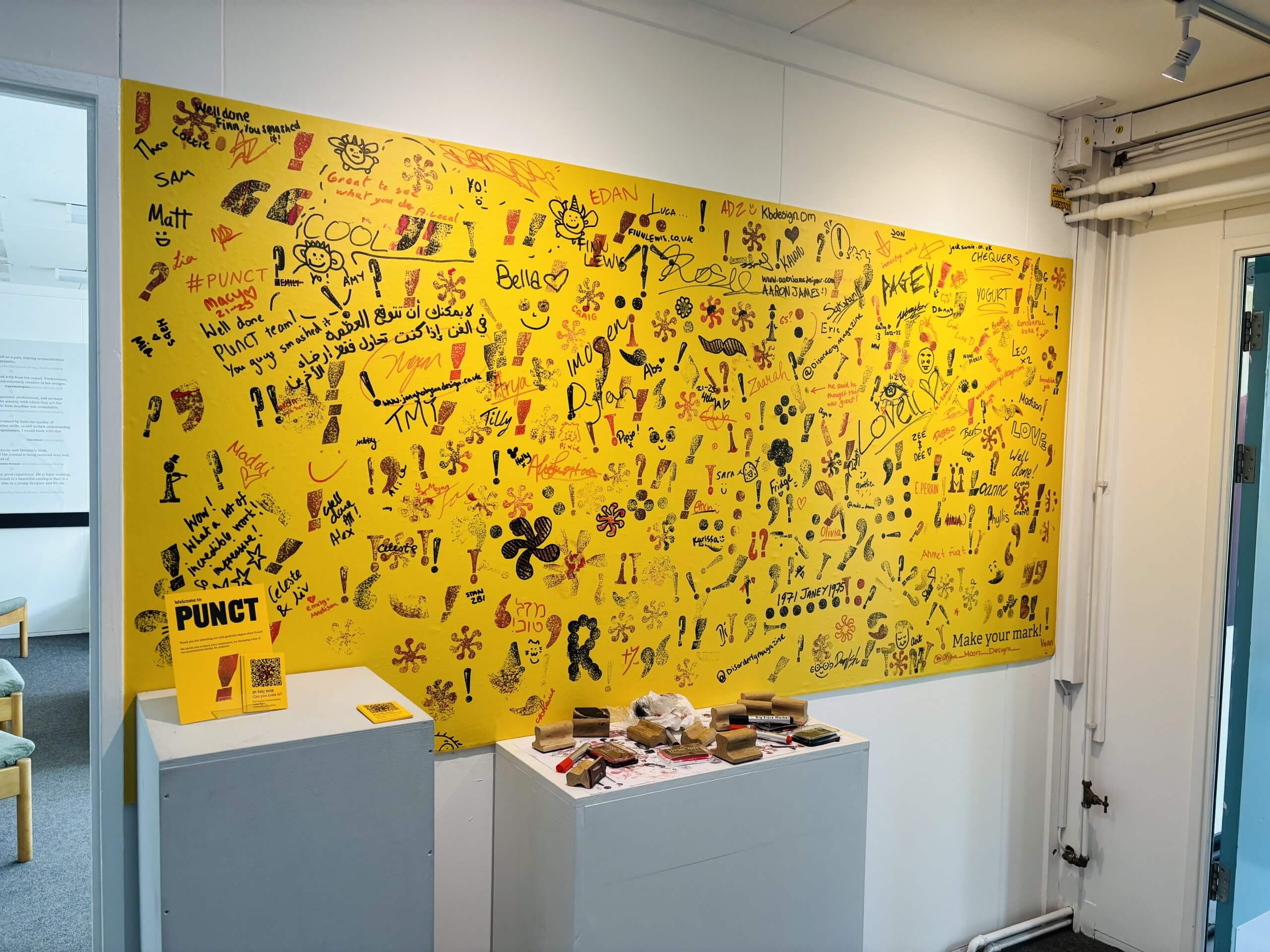
It is important that this interaction doesn’t interrupt the flow of the exhibition but rather adds to it. To avoid unnecessary congestion around the student work areas, we have placed this panel away from the work. We made sure the design was unintrusive, with a simple instruction ‘Make your mark!’ on the bottom right, leaving the emphasis on the printed marks. We also decided that as students we should start the process of writing and stamping the board, which would act as a guide and encouragement for attendees.
We chose to make ten different 3x3inch stamps that the attendees could use on the ‘stamp’ panel. This is to maintain a good variety of messaging and design throughout the show while also not straying away from our Punct branding which includes letterpress type throughout its identity.
The arrow posed a vital element in not only our main entrance panel to guide people to the degree show, but also other facilities around the building. To highlight key points of the panel we used red, creating effective wayfinding.
Window Decals
The window decals were highly visual assets marking the entrance to the show. The decals used scanned punctuation marks cut as a negative from a yellow block colour. We decided to make these punctation marks as cutouts as we wanted the light to shine through the yellow background and the cutout shape, hoping to create interesting shadows in the main entrance hallway. We ensured these decals reflected our brand, but didn’t include any direct brand references like the name of the show, which will allow these graphics to stay up after the show had finished, continuing to be complimentary elements to the department.

Table Marquees
The table marquees shall help to create a continuous branded experience from the exterior of the building into the show, bringing branding to the outside bar. These designs remained relatively plain, being primarily yellow with a punctuation pattern running along the bottom. The table top is plain yellow because it will have a lot of distracting physical objects on it like cups and drinks.
A-boards
The A-boards were designed to be complimentary branding assets and wayfinding materials. We intend to place them as confirmation the attendees have arrived in the right place, and as wayfinding to our main, and accessible entrances. These designs use the same pattern for both entrances, with the larger A-board being used at the back entrance as that needs more visual confirmation than the main entrance.
Hanging Sign
We made a hanging sign to direct attendees down the hallway if they entered through the back entrance. This used our wayfinding arrow and the letter scans, directing attendees up the hallway toward the main entrance
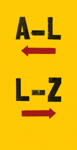
A–Z signage
Finally, outside the two exhibition rooms, there is signage for the two rooms. This signage indicates that both rooms are being used as exhibition spaces, and shows which students are in each room.
Conclusion
To conclude, the team is very happy with the direction of this project. We feel that the show’s core branding elements reflect the course and our graduating year, both as designers and in the skills we have learnt.
We look forward to seeing the show in action. Upon reflection, this project has expanded our knowledge beyond regular submissions, as we found we had to consider many unknown aspects of designing for physical spaces and building up a brand whilst slowly revealing it, all whilst remaining fully engaged with the production process.
———————————————————————————————————————–
If you would like to view the 2025 degree show, visit our website Typography Degree Site 2025 or check us out on Instagram @punctdegreeshow