WHO ARE SMRN
The Synthetic Media Research Network is a community of researchers dedicated to discovery within the area of synthetic media. They focus on the social, legal, and political challenges regarding upcoming deepfake technology, as well as prototyping “AI-generated photo-realistic synthetic media in areas such as film and screen, healthcare, and education”.
BRIEF RESTATED
DELIVERABLES
Brand guidelines for how to use the logo.
Logo suite (vector, bitmap)
Pull banner (W 850mm x H 2150mm)
Extra proposal – leaflet/programme (2-fold A3, double sided = 4 pages A4)
Extra proposal – foamboard placard with logo printed (W 630mm x H 300mm)
The logo was used on a banner, leaflet and foamboard and will be used in many future documents.
RESEARCH
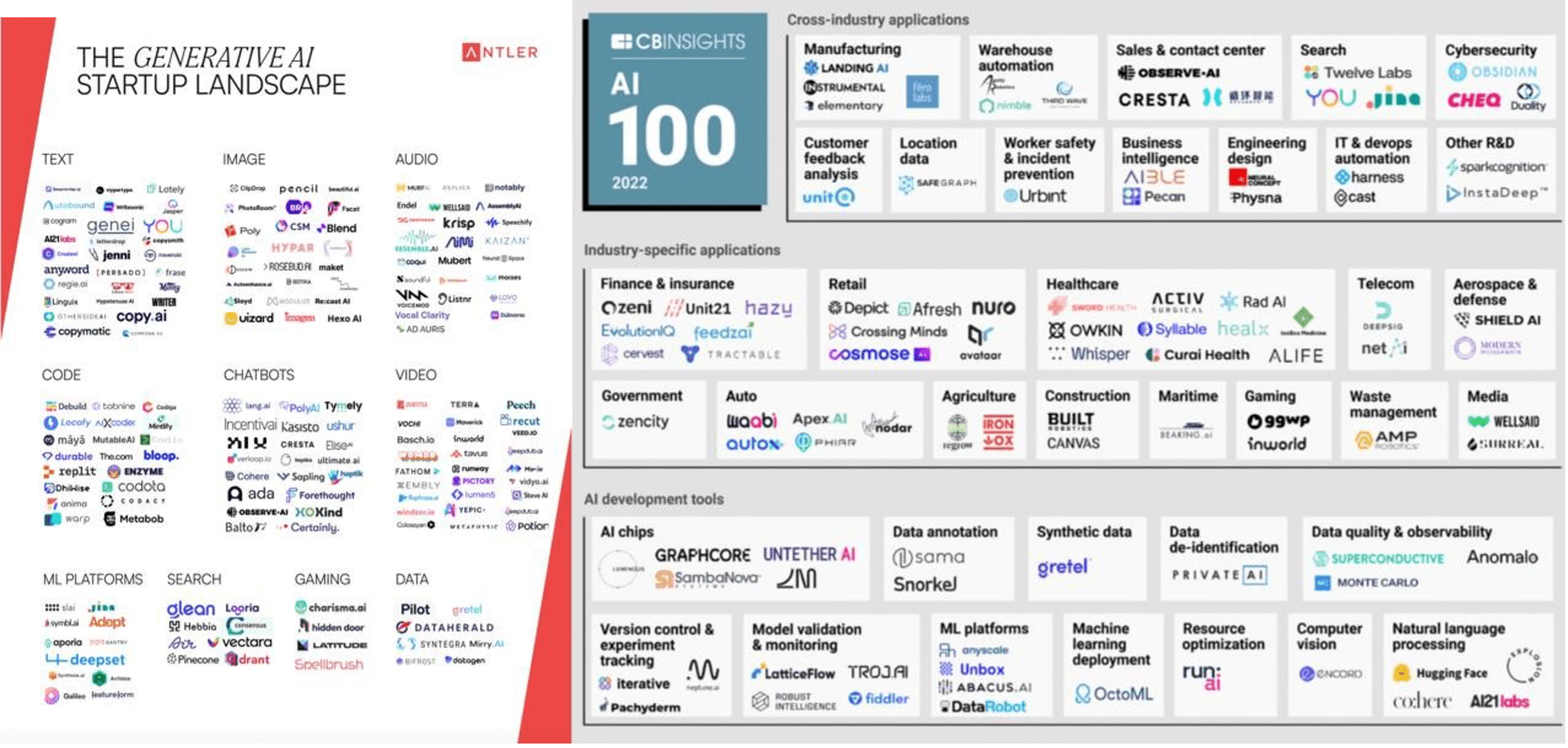 Figure 1: Logo Research 1
The design process began with research into the area of logo design within the AI industry (fig 1). From this research, you can see how the majority of these logos use abstract shapes, repeating patterns, geometric shapes and typefaces. The issue regarding the abstract shapes was the lack of relevancy to the field of AI. In addition to this, the scalability of certain logos was unsuitable for screen due to their light typefaces.
Further research into logo design was utilised to discover various ways of stacking logos that we may need when creating a logo suite (fig 2).
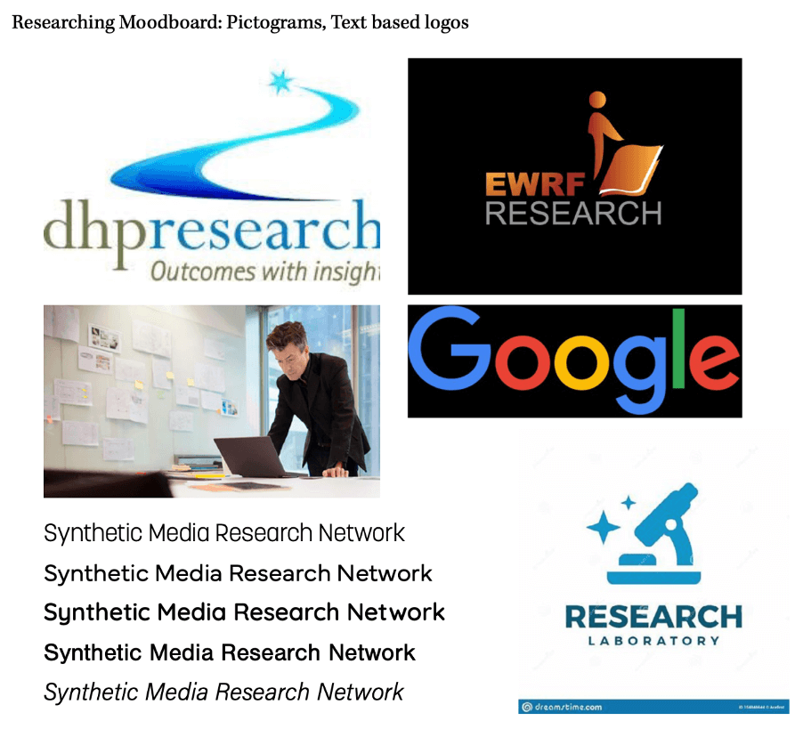 Figure 2: Logo Research 2
Research was undertaken around colour psychology, discovering that the two main colours you see within AI organisations logo design are red and blue as seen in figure 1. However, after research we decided blue was the most appropriate colour as it represents areas such as technology and innovation.
Finally, research was conducted into the target audience of the symposium and who the members of the research network may be. From this, personas of the intended audience were formed in order to understand what their personalities and brand values are (fig 3).
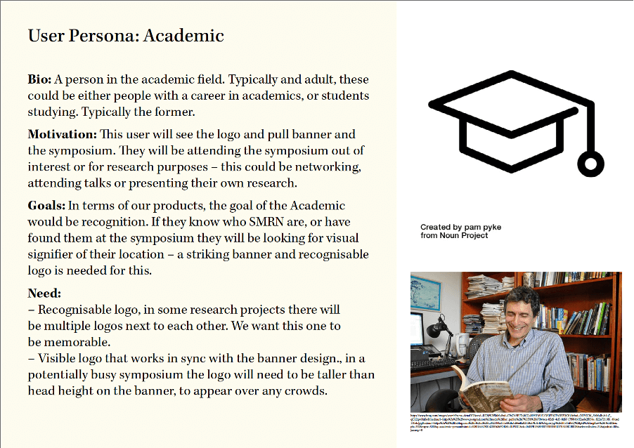

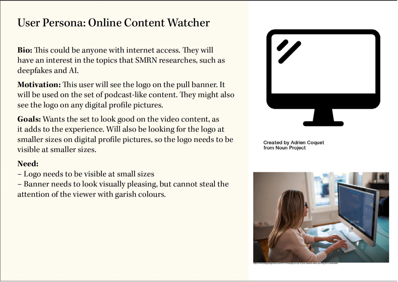 Figure 3: User Personas
UNDERSTANDING THE CLIENT
In order for the team to begin ideation, understanding the client was essential, therefore a meeting took place to discuss the values, ideas, and purpose of the brand. On top of this, it was essential to understand how the brand will operate and under what circumstances our designs might be used. The client pointed us towards a web page that was under development which described the organisation, and the client highlighted the situations our designs will be used in. For example, originally it was thought that the banner would be only used in the upcoming symposium, however we were informed it will also be used as decoration in the backdrop of a podcast.
DESIGN
LOGO
The next step in the design process, was to undertake icon ideation. The reason an icon logo was used rather than a wordmark logo was that the client specified a preference for icon logos. To begin, a mind map was used to explore areas of AI and synthetic media, from which icons could be developed (fig 4 and 5).
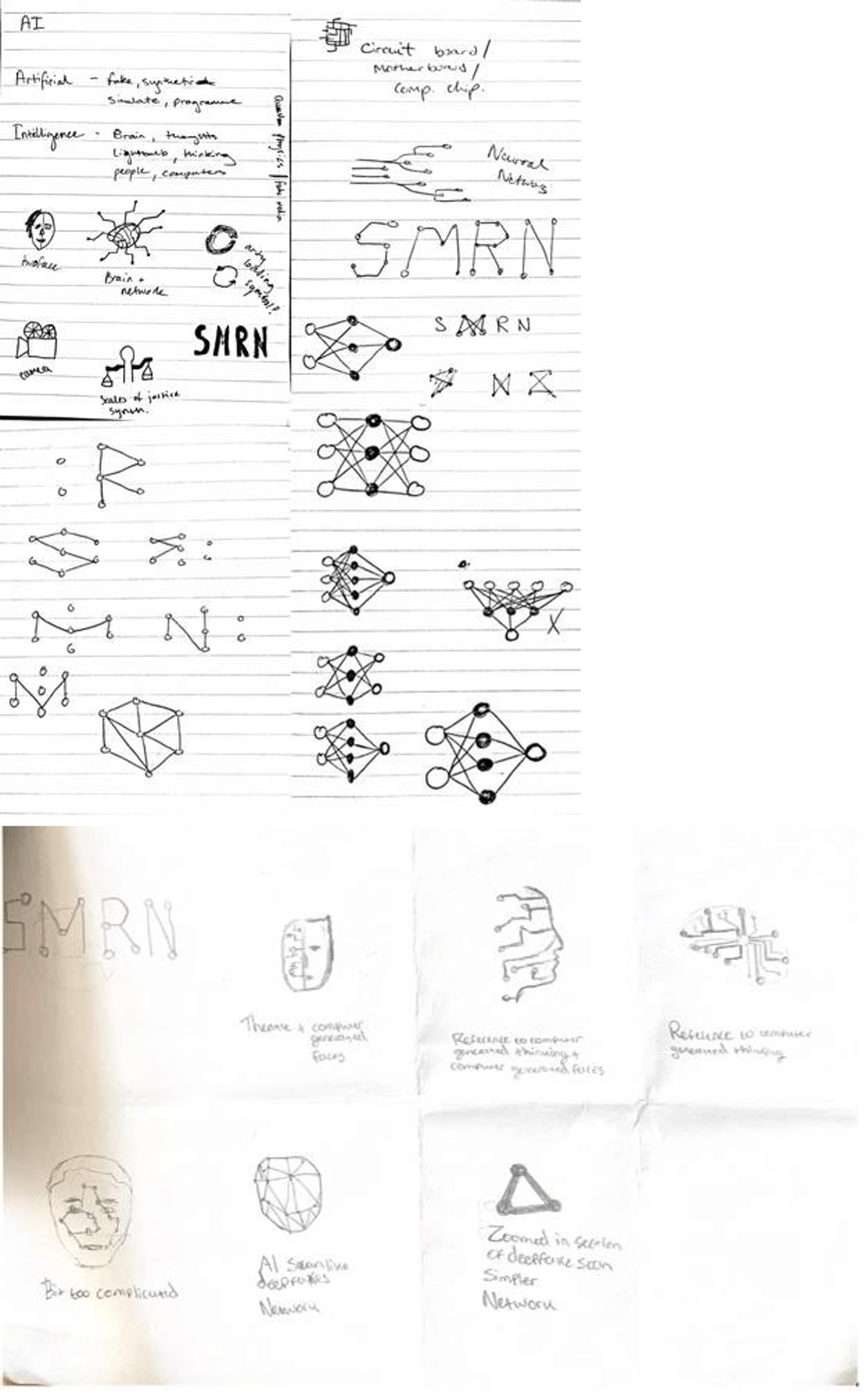 Figure 4: Initial Sketches 1(top) Figure 5: Initial Sketches 2 (bottom)
After copious options had been explored and both supervisor and client input were taken into consideration, five concepts were developed further (fig 6). These icons, once completed, were paired alongside various typefaces that were chosen based on client’s preference, alongside our knowledge and research into how typeface personality can affect a reader’s perception (fig 7).
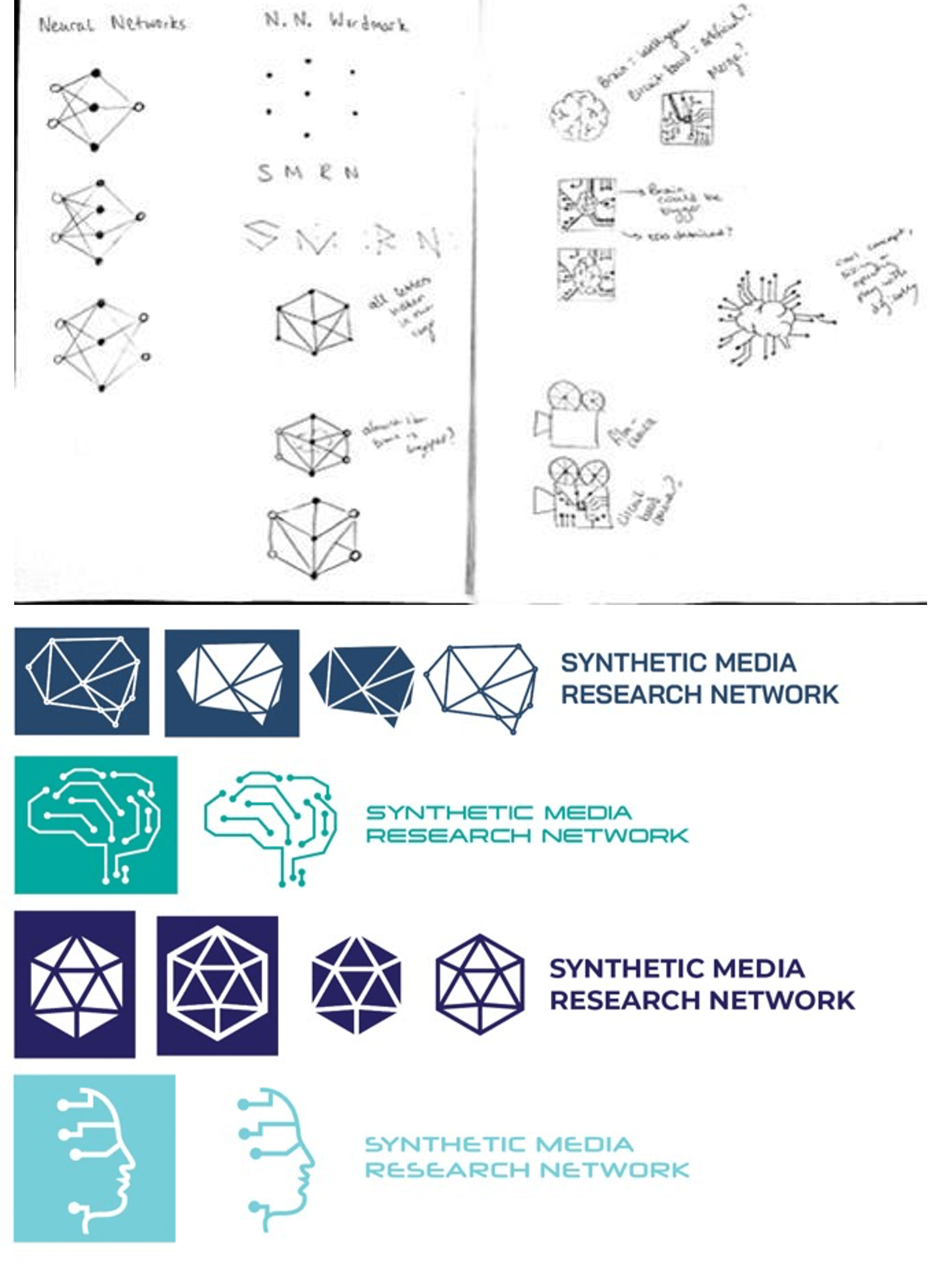 Figure 6: Further Sketches (top)
Figure 7: Typeface Pairings (bottom)
After meeting with both client and supervisor, a decision was made regarding the icon and typeface choice. The chosen icon represented the ‘Neural Network’, a key symbol within the community of Artificial Intelligence researchers (fig 8). This symbol represents “a type of machine learning process, called deep learning, that uses interconnected nodes or neurons in a layered structure that resembles the human brain. It creates an adaptive system that computers use to learn from their mistakes and improve continuously” (Amazon, 1978). The client liked this iconography as it was a recognisable shape to anyone in the industry, so they would be aware of what it meant.
Figure 8: Neural Network Symbol
The typeface chosen was “Halyard Display”. Originally, the title of the organisation “Synthetic Media Research Network” was kept under the same weight (fig 9). However, after multiple iterations whilst working on the layout of the paired icon and text, the symmetry within the name was noticed. Synthetic Media and Research Network, although being a part of a whole title, shared different levels of hierarchy alongside being a pair of separate titles. Therefore, after experimentation regarding the correct weights to use (regarding scalability and hierarchy), it was decided that medium would be used for Synthetic Media and book would be used for Research Network (fig 10).
 Figure 9: Typeface Experimentation
Figure 10: Chosen Text Halyard Display
The finalised colour, blue, was tied into the concept another way. The varying shades of blue (fig 11) represent direction and progression which ties into the icon itself as well as the organisations goals. The team also showed the client the logos on black and white backgrounds which sparked a debate about which they preferred and what might be appropriate in many situations. As the client preferred the design on the black background, we decided to finalise those designs. However, the team advised the client that the logo on a white background was essential, and we would also provide him with those files.
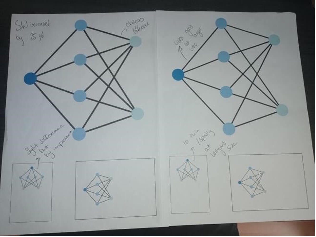 Figure 11: Icon Experimentation
Finally, after meetings with both our client and the University of Reading Marketing Department regarding layout and scaling, our logo design was complete. Two logos were created in both landscape and square formats (fig 12) and were exported into a logo suite with both EPS and PNG files.
Figure 12: Finalised landscape and portrait logos
BANNER
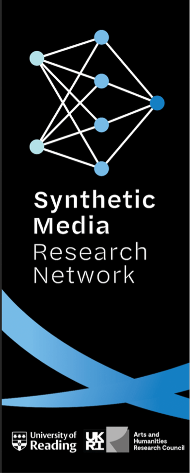
Once the logo had been completed, work on the other deliverables began. The client has informed us that the banner would be both used in the backing of the upcoming symposium as well as in the setting of a podcast studio. Furthermore, the banner would need to include the logos of both the University of Reading and the AHRC (Arts & Humanities Research Council).
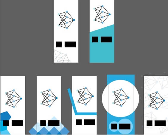
The process began with a meeting. The client had a preference for a pattern on the banner, as the banner had a relatively low amount of content on it. The patterns needed to both fit the visual style of the logo and allow for possible branding applications (fig 13).
Figure 13: Banner Experimentation
After multiple variations were shown, the client preference was for a brush stroke pattern. This pattern was based on expression of the creative side of Synthetic Media and AI (figure 14).
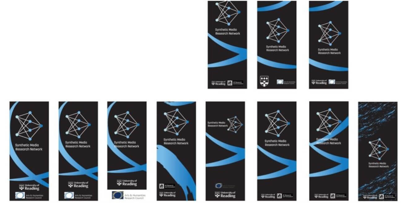 Figure 14: Brush stroke pattern banners
Due to the logos being on both black and white backgrounds, the client thought it appropriate to have two banners on black and white. However, as the
design variations continued, the client chose the banner on a black background and decided that the team should only take that forward.
After testing variations (fig 15), we found the differentiation used in the typographic element of the logo was applicable for use on the title of the banner, creating a stacked effect (fig 16). The stacked title was used to allow the text to be as large as possible. This was essential as the text would need to be visible in the back of a podcast that may be watched on a phone/smaller screen.
Figure 15: Banner text variation
Figure 16: Final banner text
Finally, a meeting with the University of Reading Marketing Department took place. Here, both teams and the client discussed layout and the necessary sizes for the UoR and AHRC logos. The SMRN logo on the banner was placed high, so it could be above head height during the symposium. This caused the logos for UoR and AHRC to be placed on the bottom of the page next to each other, allowing for equal hierarchy (fig 17).
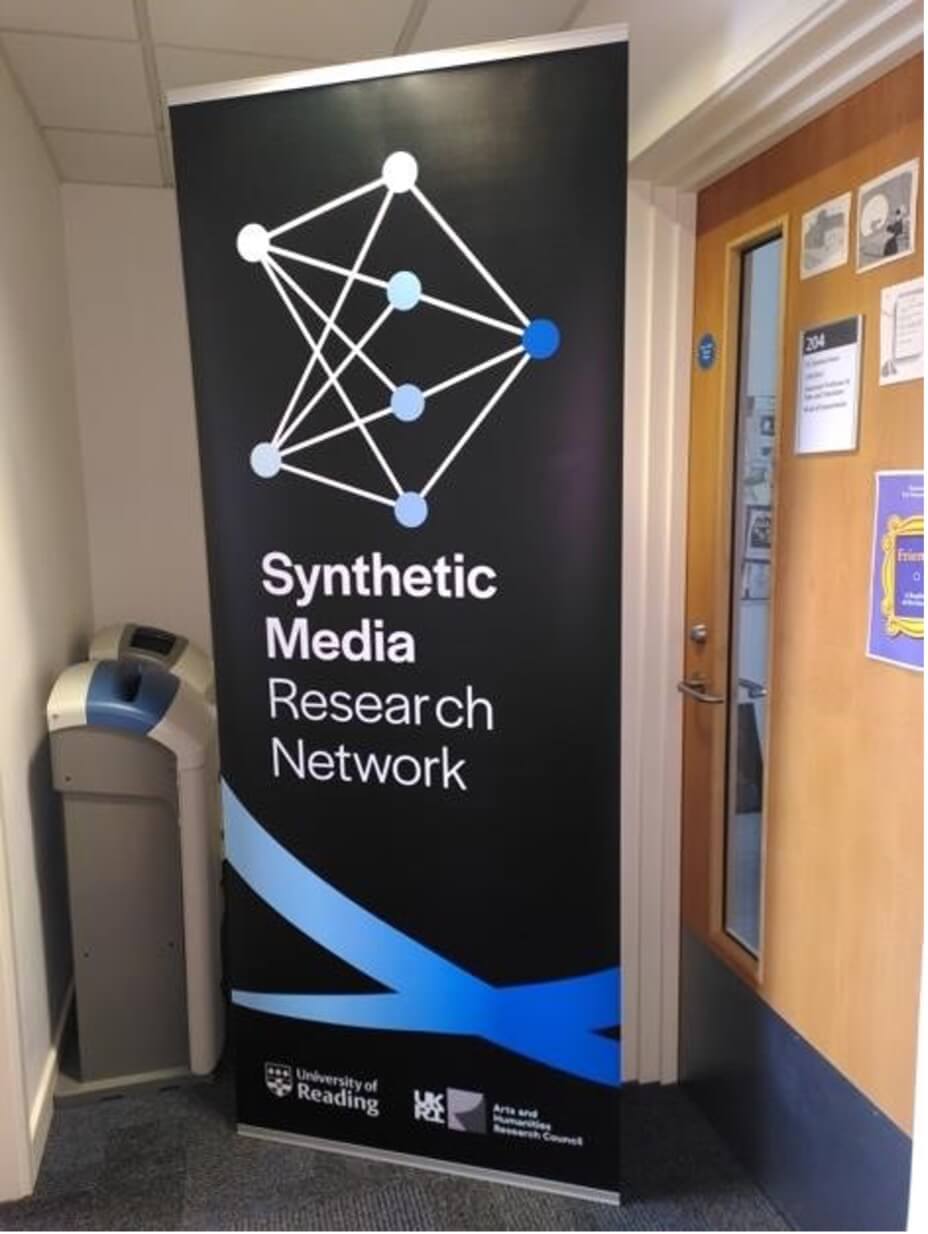 Figure 17: Final banner
PROGRAMME
As the project continued, another deliverable was introduced. The client required a 4-page A4 programme that would be provided to attendees of the symposium. This programme would include information about the genesis of the research network, the schedule for the symposium, and introductions for each of the guest speakers that would be attending the symposium. During a meeting with the client, the team discussed ways in which the schedule could be used. We suggested removing the schedule from the programme, to allow for more space on the pages. After discussion, the client insisted that the schedule should be on the programme as every attendee would be given one. For this to happen, he agreed to compromise and shorten the body copy to allow everything to fit.
As the programme would be used in the same event as the banner, the team and client both expressed that the same brush stroke decoration should be used. However, due to the large amount of content within the programme, designs in which used copious brush strokes were inappropriate. Also due to the content size, the programme could not have a typical ‘cover page’. A 6-page booklet was suggested, however due to the ease of printing a 4-page spread the client was reluctant.
During the design process for the programme, several meetings with the client aided in informing us of our direction. The design needed to be clean and concise, as well as effectively highlight key pieces of information relevant to the upcoming symposium. These two key pieces of advice from client and tutor encouraged a large shift regarding how space and hierarchy was utilised within the design. The front page (figure 18) was changed massively due to this feedback. Thanks to the client’s willingness to allow the introductory paragraph further space and reduce their own, we were able to effectively balance the paragraphs of text on the page.
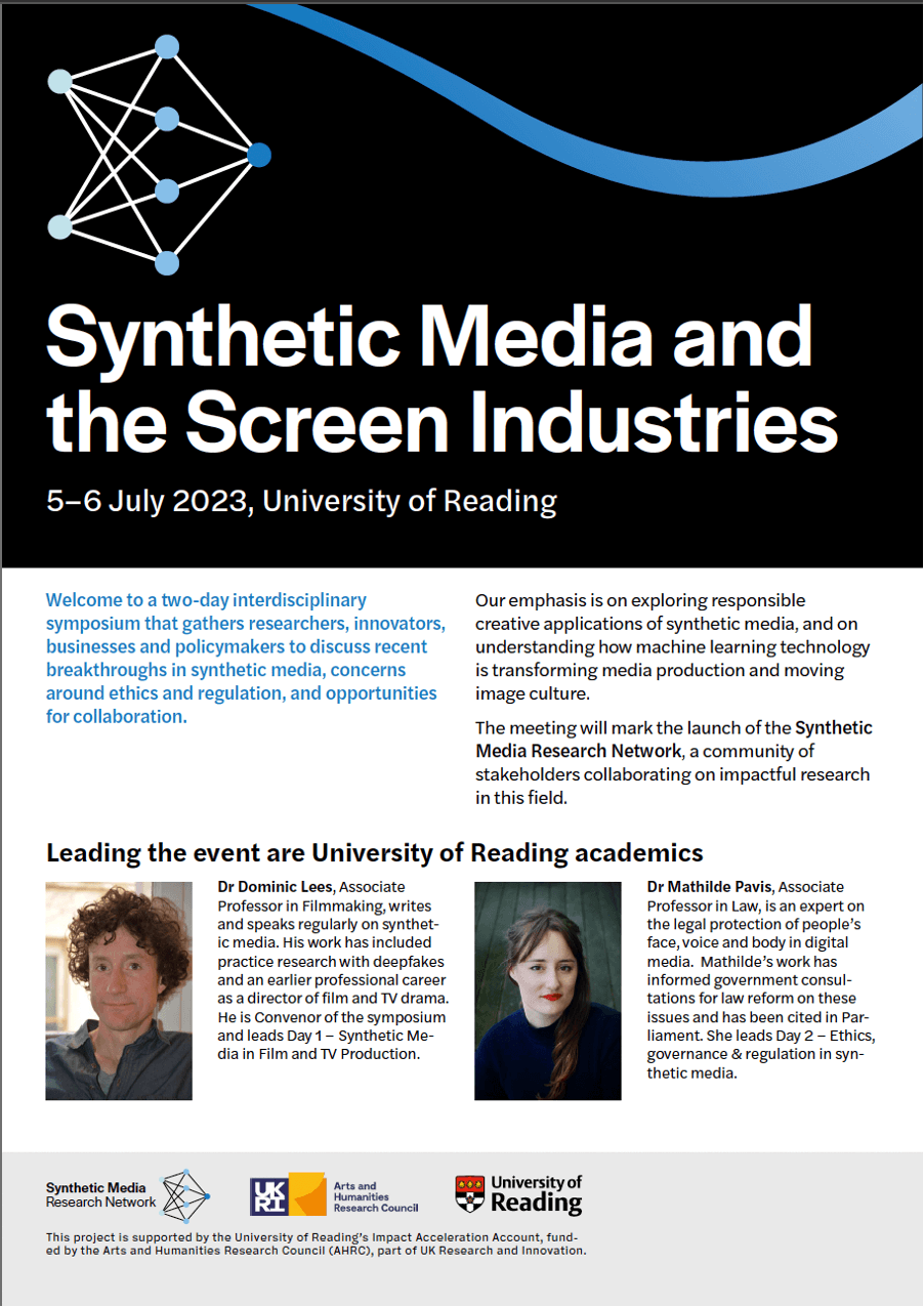 Figure 18: Programme front page
The inside pages (figure 19) consisted of the schedule. Paragraph rules, colour, alignment, and use of space allowed for the design, which initially was overpopulated and cramped, to become clearer and more legible.
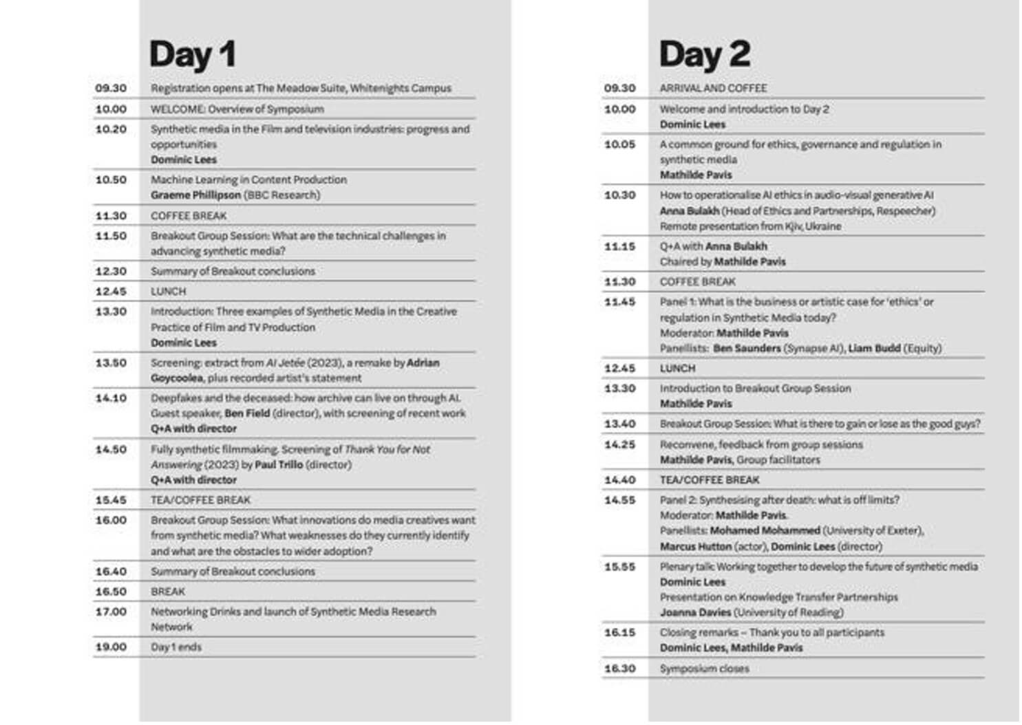 Figure 19: Programme inside pages
Finally, the back page (figure 20) included the guest speakers. Again, colour and space is used to effectively separate the speakers. On top of this, appropriate and consistent formatting is used.
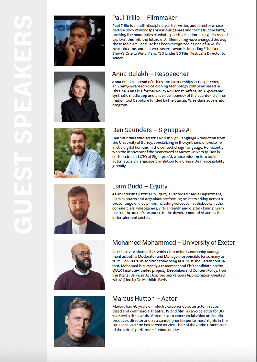 Figure 20: Programme back page
FOAMBOARD
The final deliverable was introduced late into the project by the client. They required a 300mm 630mm foamboard that would be used on the front facing side of a lectern during the upcoming symposium. This project proved to be simple as the client had expressed his vision for this board clearly. The client simply required the landscape black and white logo for the brand, centred on the board (fig 21). After formatting the design for print as well as final meetings with the client, the final deliverable for the project was completed.
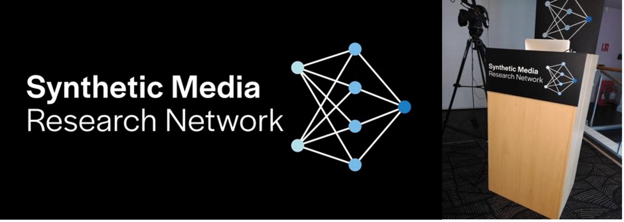 Figure 21: Final foamboard
REFLECTION
This was our first Real Jobs Project, and the experience was both educational and challenging. Despite the various complications such as timescale, illness, and inexperience, we believe we handled this project with both professionalism and skill. Unfortunately, our supervisor was unwell in the early stages of the project, and this caused us to work more independently than is normally expected. We contacted an alternative Real Jobs supervisor when we encountered obstacles during the process. They were able to help us work through problems until our supervisor returned. We believe we came to the correct conclusions in terms of creating effective designs during this period, and when our supervisor was back we updated her with all work and progress made. Furthermore, our consistent planning and communication with the client allowed for us to keep their input relevant in all scenarios, therefore ensuring the client is happy with all work created.
This project’s timescale meant that certain sections of this project we would have liked to complete in a more professional manner. For example, whilst only being able to create small presentations for our design proposals, we would have preferred to create intricate proposals which could include mock-ups and inspiration. This would have aided us in keeping the client meetings cleaner and more efficient. On the other hand, we feel we were very organised during a hectic period, and kept to a timetable well even when the client was expanding the brief.
Aaron
“I have thoroughly enjoyed this project, as not only has it leant into my areas of interest within graphic design, but it has also given me an insight into how the industry operates. I have gained experience in client-facing situations alongside design skills. This project has made me eager to pursue further real jobs in this area of design, and push for more client-facing/management roles.”
Jony
“This job provided a unique set of challenges for us. Working with the team and the client to overcome these and produce finalised deliverables was very rewarding and satisfying. This was a great job to complete and have under my belt, as I feel the experience I obtained from this Real Job will help me excel in future Real Jobs.”

