

From: jobycarter.com/
Overview
This Real Job was a unique one, as it was set in the form of a contest among the students who decided to participate. Joby Carter, the owner and organiser of Carter’s Steam fair, along with staff of the department, created this competition which honoured both the Steam fair, and Joby’s passion and talent for signwriting. The traditional travelling funfair showcases Joby’s work beautifully throughout, and so provides inspiration wherever you look. Signwriting, especially within funfairs is a very distinctive and unique skill, which presented an exciting opportunity to learn a new skill while having a bit of fun with rebranding. The exploration into the way fairground fonts could be used in a range of contexts is an extensive one that sounds like an amazing way to experiment with type. To me, fairgrounds are somewhat magical; they have such a great atmosphere and tons of amazing memories are made at them. Fairground fonts in turn, now have these sorts of connotations attached to them. Finding ways to incorporate this into the real world where you would least expect then is a rather amusing thought and I really wanted to have a go at this concept.
Brief
The brief set to us was as follows:
“Fairground fonts were designed to be persuasive, to get people to take action but in a fun and eye-catching way. They also have their roots in pop art and popular culture of the era.
Taking inspiration from the fonts you see at the fair, how would you re-imagine a different business with a fairground font? It can be as mundane as possible or an everyday item – from selling shoes to selling a service. Or perhaps you can reimagine a modern-day brand with a fairground font.
In your chosen medium, whether that’s a sketch by hand or a computer design, show us your idea as a square PNG file, 2000 x2000px, with a few paragraphs of text (supplied separately) to explain the idea if needed. Joby Carter will work with your tutors to pick a winner who will receive a fully funded place on his signwriting course.”
In the brief given to us, there was an extra note explaining that Joby takes joy in smashing apart the serious image of a business and even those that take themselves too seriously. Taking this into account, we were encouraged to be bold and enjoy experimenting with this concept to just have some fun with it.
Concept
After having read the brief, I decided to hone in on Joby’s message of not taking things too seriously, and from this, ‘The Government’ suddenly sprang to mind. This is because the UK government has faced significant criticism and public perception of dysfunction recently, which lends itself well to being portrayed in a humorous, fairground font style. Without veering too much into politics, the exaggerated, playful lettering of a fairground sign visually represents the idea that the government has become somewhat of a joke or spectacle to many citizens. I thought this idea may be a bit too risky, but I decided to, as the brief said, be bold and run with it.
After a quick chat with James just to double check that it was okay to go ahead, I began to research the government’s branding. The official name for the UK government is ‘His Majesty’s Government’, but is most commonly referred to as ‘HM Government’ – I decided I would use the longer version, as it emphasises the ridiculousness of the whole concept, which I was going for exactly. he official government logo is only the Royal Coat of Arms, organisation name in a sans serif font and a coloured line. Due to its simplicity, a perfect opportunity to make it whimsical and fun was presented.

Initial Concept
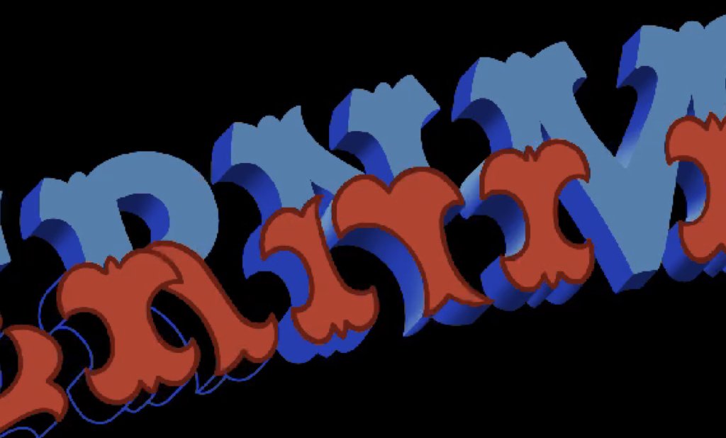
For my piece, I chose to use digital illustration on my iPad with a drawing app called Procreate. I have a lot of experience in using this software, however less so with very finely detailed work such as this, therefore used this as an opportunity to develop my skills in illustration, particularly with intricate letterforms. Having looked through Joby’s instagram and other sources for inspiration I began to sketch out my idea. One element I saw throughout my research was the use of banners to accentuate and put emphasis on certain words; I decided to highlight the word ‘government’ in my piece by using a banner to make it stand out as the main subject.
I started by writing out the word in all capitals in the same height, which is a very commonly seen format in signwriting, I then sketched a rough banner shape and placed the letters within this banner to get an idea of how they would be placed, if the banner was long enough for a 10 letter word, and if it looked too cramped. I was happy with how it looked so moved on to building the actual letters.

To do this, an idea I had was to take a font with a similar structure to some fairground font lettering, namely slab serifs and regular stroke widths, and trace over it to build the base of my lettering. I found a font with this description, Rockwell, and warped it to fit my banner sketch. I then traced the outline of it with a pencil brush to get the base structure.


Following feedback, I realised that by warping horizontal text, the letters were squished together, making them look too thin and too tall. I was advised to try making the letters in a straight line first to get the proportions right and then placing them into the banner shape. I looked back at Joby’s works and realised that any lettering that was shaped into a banner or curve was entirely straight, and only rotated and slightly manipulated to fit the curve. Following this, I redid my process of tracing the Rockwell lettering, but in a straight line this time around.
Development
Decorative Elements
Now that I had the actual basis of my lettering, I moved on to adding the decorative elements to the bottom halves of the letterforms as Joby does in a few of his works. To make this consistent, I created multiple rulers over the type to mark out where the decoration would sit, which gave the word a more fun and playful feeling to it. The rulers not only helped with their consistency in terms of placement, but also the spacing around and sizing of these elements. By ensuring the consistency of the decorations, the letters overall felt more professionally done.

One letter that was especially difficult to design was the ‘M’, as its 2 vertical strokes are very close to the diagonal middle ones, which created an issue of the bottom decorations possibly overlapping into the middle. However after reworking the vertical strokes to be thicker and adding a slight curve to the middle strokes, there was no overlapping.
For the top halves of the letters, I had them kept roughly the same shape as the original font, however after receiving feedback, learned that this felt unnatural with the decorations and out of place. To rectify this, I added brushstroke serifs and more stylised slab serifs to the top of the letters. By making them more curved and adding elements of the decorations, the overall letters immediately became more interesting to look at.


Once all the decorative elements were added, I tried again to add the letters into the banner shape. However, since the letters had become bulkier, they no longer fit in my original banner, and it had to be redrawn to make the lines more curved in order for all the letters to fit nicely together.

3D Effect
To add more interest to my work, I decided to give my letters a 3D effect, almost like a solid drop shadow. Joby has a lot of examples of these on his instagram, so I used them as a point of reference to add them to my own letters.
I did this by copying the whole letters and duplicating them at an offset to the original letters. I placed them slightly lower and more towards the left to give the illusion that they are rising up towards the right, as this follows the natural path of reading, making it flow more smoothly.

Once these were offset, I went in and joined the corners to their respective lower ones to create the depth faces around each letter.

I then put the letters back into the banner shape since now their width and height had changed again. I drew out a rough idea of the full banner shape in order to get the closest impression of what the final piece might look like and if the word looked too small or big in an elaborate banner. After showing it for feedback, it was pointed out that letters didn’t seem as though they were following the curve, but instead just slightly angled. It was at this point that I remembered how Joby’s letters curved – with a slight rotation and manipulating the letters a bit. I now had to reshape the decorated letters again into the banner shape and only then add the 3D effect.


Colour & Shading
Now that I knew the letters were drawn correctly, and created a smooth curve, it was time to add the colour and shading to the letters. I decided on red and blue for the letters, as not only is this very commonly seen on fairground signs, it also has a nod to the red, white and blue of the UK’s flag.
I started by colouring and adding shadows and highlights to the depth faces of each letter. By adding these, the letters had more dimension, and added a sense of realism to them as opposed to the flat colour of a digital drawing. For the front of the letters, I didn’t want to add shading as I thought it would detract from the bold colours. Instead, to create an added layer of depth and dimension, I made a debossed effect on the letter faces to seem as though the outlines were carved out. Doing this created an immediate perception of depth at the first glance, and the shadows and highlights on the depth faces only add to this the closer you look.


During feedback, I was told to experiment with the ‘G’ at the beginning of the word to make it bigger, or more stylised compared to the rest as fairground fonts do this often, which catches the eye and gives a more proper feeling. This was added in towards the end.
Banner
The banner I designed was intentionally drawn to be very elaborate, as I felt this played into the whole ‘His Majesty’s’ part of the official government title and felt very regal. After outlining the banner, and adding the base colours, I noticed that this felt too much like a cartoon illustration because of the dark outline when the letters didn’t have one. Therefore I made the illustration lineless, then shaded it according to the bends and folds. I decided to shade it, as having the colour be block shaded felt too solid and bold, and was conflicting with the front of the letters; by mellowing out these hard blocks of colours with the shadows, the type now stood out.


Finishing Touches
To finish off the piece, I added in the ‘His Majesty’s’ text, drawn in a simpler fairground font that I saw on Joby’s page. I decided to use this because if I had used another one with similar decoration to the word ‘government’, the attention would be split between both rather than being cohesive. I drew it according to the curve of the banner as to not break up the flow and dynamism of it.

Final Piece

Reflecting on the final piece of this contest, I am pleased with the result and proud of myself. The contest was very challenging, especially due to its limited time frame of a couple of weeks. However, as much as it was challenging, it was also incredibly rewarding. Being able to experiment and have a go with a completely new style of type and consequently new techniques, was a very valuable experience that certainly improved my skills as not only an illustrator but as a designer.