
Background
Reading School of Art at the University of Reading were looking to create two interlinked projects. One is the annual BA and MA degree show print publication, and the second is a linked website featuring the participating artists’ work. A group of three designers from the department worked on these two deliverables in collaboration with art students committee.
Restated Brief
The brief was to design a print publication and linked website featuring the participating artists’ work. Our team consisted of two amazing designers, Amy North as project manager, Karissa NG as editorial designer, and myself as a UX and Web designer. The design team collaborated with the art student publication committee to create a design, budget and negotiate all print related issues.
Aims and objectives
- The way in which the publication is designed should not take away from the artwork, the purpose is to celebrate and display the artists’ work.
- The publication should in itself promote the course, displaying the high level art and friendships made through ‘social photos’.
- Credit each participant’s work and ensure the publication favours everyone’s work equally.
- The website and book should hold visual similarities and be recognisably linked. The website is an extension of the book, and an opportunity for students to provide more textual context for their work.
- There should be a distinction between the MAs and BAs in both the book and website. However this distinction should not mean that either group is prioritised over the other.
Audience
The print publication will be available to everyone at the degree show, the students, parents and members
of the department. It will also be displayed at open days for prospective students and visitors. For the
students who are contributing work to the degree show, the print publication will be a resource which they
can use in their portfolio and interviews. The website’s audience is mainly the visitors of the degree show
and the students. The website will offer a place for student’s work which wasn’t included in the print
publication.
Deliverables
Target completion date is: 30/04/2024
1. Print publication
2. Website
Research
As I was in charge of the website, my main research was targeted towards that. I started by identifying the aims, objectives, and target audience as mentioned above. After that, I decided to look at direct competitors. I searched for other universities’ degree show websites.


This website was made for Goldsmiths University art BA students in 2023. I noticed that it is very simple and right to the point. The header is just and image of an area in the art building. The viewer can pick if they would like to navigate through other diplomas. Going though the website is easy as the user would search for a certain artist’s name and look at their art piece and information. The website is too dry because of the lack of images on the main page. The grid is not used properly as text seems out of place.


This website was made for RCA art students in 2022. I noticed that it is more condensed than the Goldsmiths’ one. The website invites the viewer immediately to navigate through the artists that caught their attention. Images help the viewer to pick what type of artist they are interested in. Going into the artist page, the viewer is surrounded by a lot of information. The margins are too narrow that they discomfort the viewer. Artist’s captions are too long and contain some typos. After looking at the competitors’ websites, I decided to navigate through the RSA degree show website of last year.


Looking at our website from last year, I noticed several things that could’ve been better. The text on the main page is too long and too many words are sitting on the same line. I felt like the typography could look better as the typeface used is not appropriate. The artist page suffers a similar issue with the typography. The captions are aligned to the center which looks a bit awkward. I decided to make sure these mistakes do not happen again.
Process
The design team and the art committee had a scheduled meeting every Tuesday to discuss the publication and the website. In the early stages, I showed the committee some sketches of what I had in mind. The provided me with feedback as we discussed what features they wanted to be in. We discussed adding a hover effect over the images that would show the artist’s name.
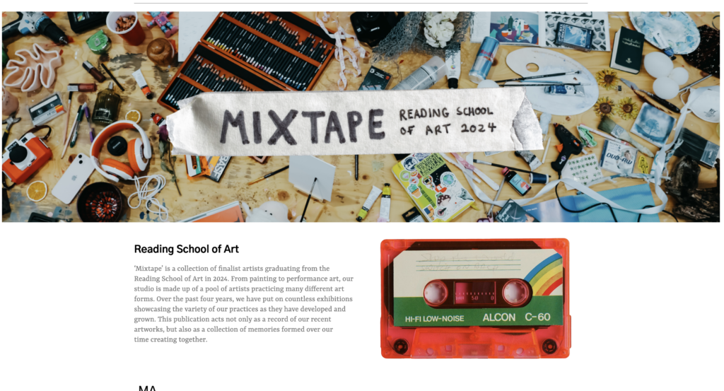
In the early stages, the main focus was on the theme of the publication and the website. As the art committee wanted an 80’s-90’s theme, me and the design team decided to do some sketches based on a mood board the art committee created. After experimenting with several themes, we decided to go with mixtape as the main theme for the publication and the website.
After deciding on the theme, we took two types of images to use in our design. We collected mixtapes from members of the art committee and took photographs of them. We also collected personal students items, with their permission, from around the art studio and combined them for another type of photographs. We edited the images and they were ready to be used.
Before I got access to the website on WordPress, I did a mockup on Figma for how I wanted the website to look like. The art committee liked the mockup and gave me a few comments to adjust a few things like the typography and the header.

After that, I received access to the website. The same template as last year’s website was applied. I reviewed different typographic styles and showed them to the art committee. We then decided on a san serif typeface ‘Gothic A1’ for headings, and a serif typeface ‘YRSA’ for body text.
For the header, I used one of the pictures we took for the art students’ collected items. I used similar images for the footers also. We also added handwritten text over the images to make them relate to the publication better.
I used the hover effect as mentioned by the art committee for the names. I used a blue color for BA students to relate to the publication. I used an orange color for MA students for the same reason. After going back and forth with the art committee, they were satisfied with the results and I added the rest of the content.
Final Outcome


website link: https://mixtape2024rsa.co.uk/