For this brief we had to pick a theme to develop ideas for upcoming logo type trends. My chosen theme was 70’s retro.
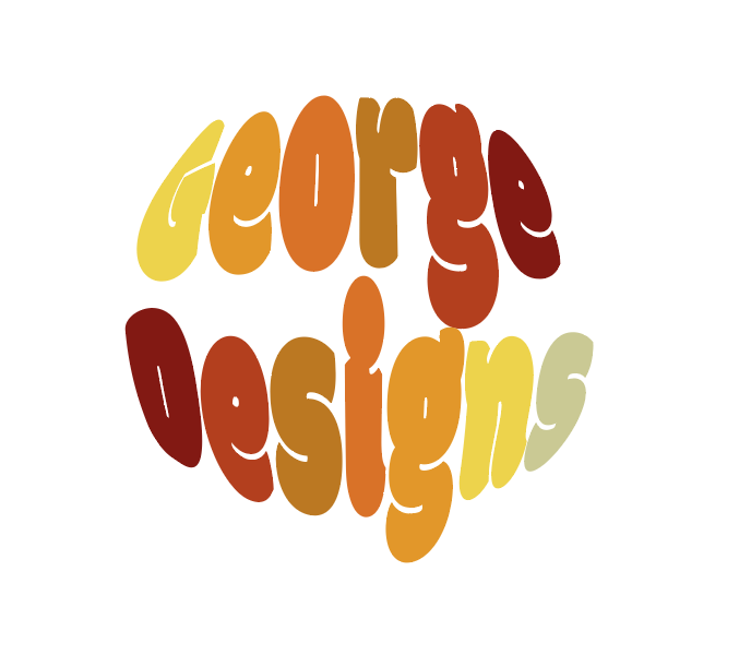
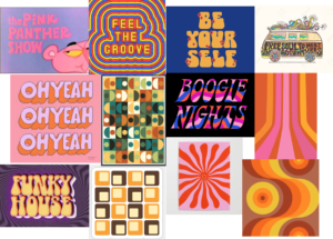
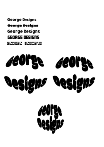
I first created a moon-board to start looking a different colours and shapes involved with the 70s. The retro 70’s theme also has a very warm toned colour palette, which is something I knew I wanted to incorporate into my design. I noticed there were a lot circles involved within the theme, along with a lot the fonts had rounded edges. I started experimenting with different bold ‘bubble letter’ type fonts, however as I started playing around I began putting the logo into different shapes. Once I put the type into the circle, I started playing with the leading, seeing how the type looks both up close and dispersed. For my final logo design, I decided to fit the text close to each other within the circle and use the warm toned colour palette.
If I could change anything about my design I would have space out the lettering a bit more, as the two Gs are very close to each other. I would have also added a ‘S’ to George, making it ‘Georges Designs’, making both words 5 letters to equal out the colouring.


