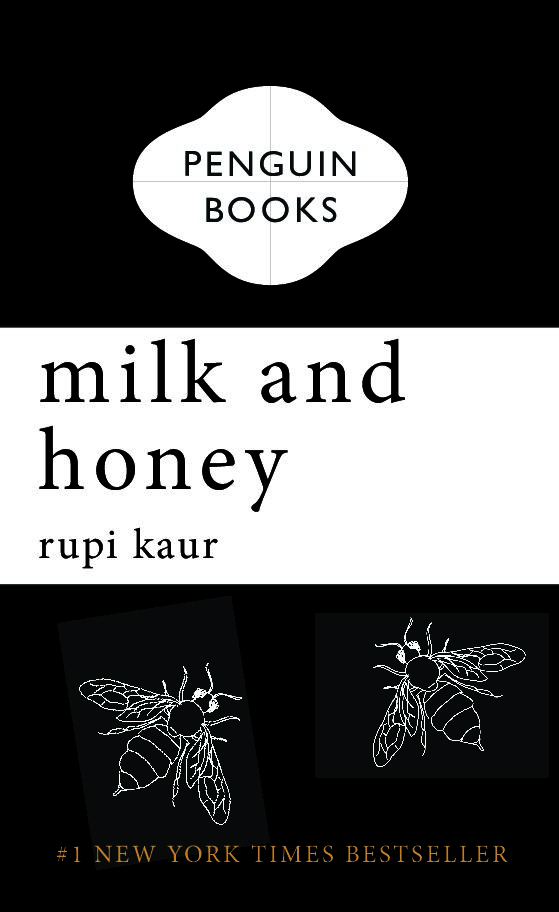
This was for James’s project. We had to create our own versions of a penguin book that he taught us how to make in InDesign.
For my own design I chose one of my favourite books Milk and Honey by Rupi Kaur. I kept the same traditional penguin design, but I made it look like Kaur’s original book by changing it to a black cover and different fonts. I did some research and found the bee images (since I had no idea how to draw them) and got rid of the penguin. I wanted it to give off the same feel of the book I was recreating.
The only thing that bothers me is:
– the crop lines within the cartouche and the fact that it’s slightly placed more to the left and not centred (maybe I’m being paranoid, I’m not really sure)
– and how the image looks pixelated and not clear
Other than those two things, I’m quite happy with it.

