My chosen theme was Organic Materials. I collected lots of inspiration for my mood board, and organised them into two sub-topics Plant Decor or Sustainable/Eco-Friendly. 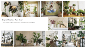
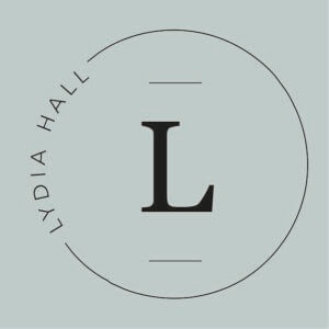
When brainstorming my main icons forced around leaves, flowers and a neutral colour scheme. This is the first logo I created without the floral elements. It has a minimalistic and clean look, but doesn’t yet reflect the organic theme.
I came back to my brainstorm and experimented writing my name in a calligraphy style. I liked the flow that occurred in my first name of up, down, up from the lowercase ‘l’, ‘y’ and ‘d’. However my surname “Hall” didn’t carry this fluidity and looked all rather the same; which is why I have chosen to have my surname in capitals under my first name.
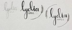 In keeping with the original circle logo idea, I simply drew the leafy elements, following the outline of the circle.
I did experiment with a blue colour but changed it to a neutral green to complement the aesthetics of a natural theme. 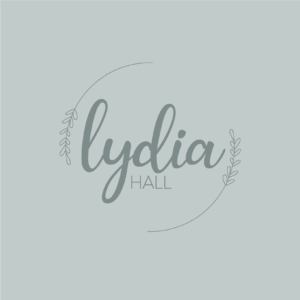
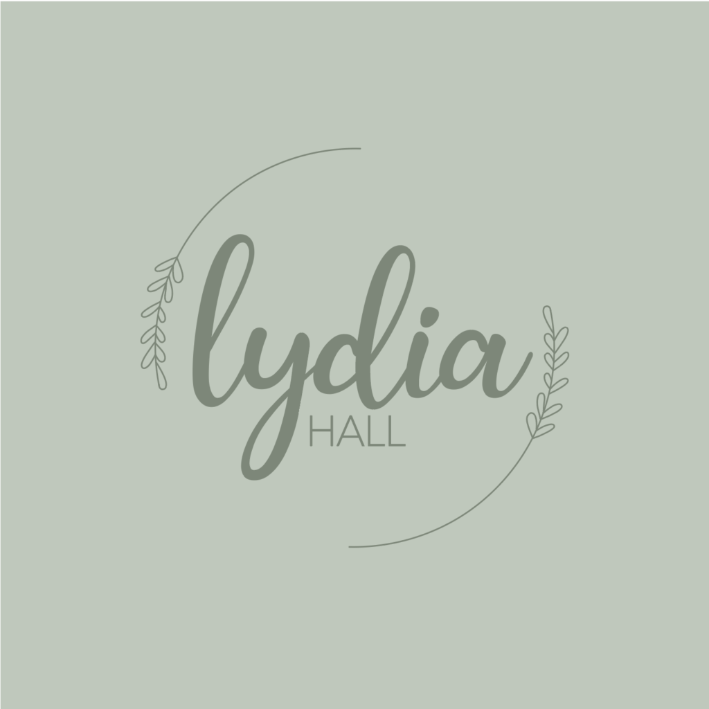
The overall logo does tick the box of a logo inspired by Organic Materials, but I think that the thickness of “Lydia” contrasts the thin outlines a bit too much, and is out of balance.

