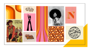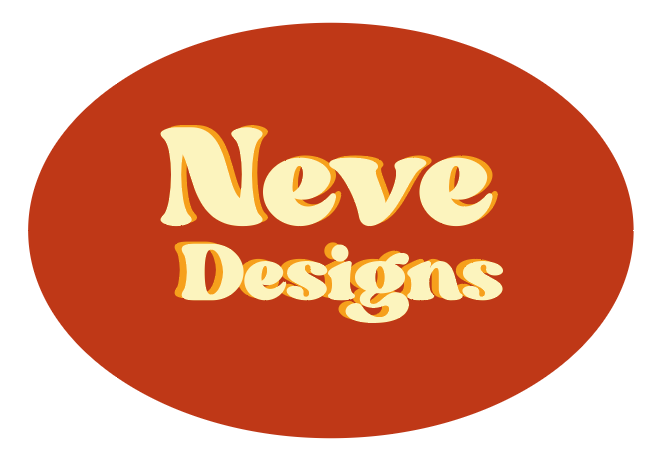

I decided to chose the theme of ’70’s Retro Style’ for creating my logo, as I wanted to experiment with in aesthetic of the 70’s as its still considered iconic for its fashion, patterns, colours and how even music influenced the style of typography. For my mood board I was looking into the different uses of colour and pattern, both vibrant and neutrals. Even though my mood board displays more vibrant colours and shades of pink I focused on the popularity of browns, reds and yellows. When creating my logo, I wanted to copy the 70’s use of shapes and swirls, so I chose an oval shape and tried to represent the classic 70’s shade of brown. For the text, I chose a font that was not on Adobe’s Illustrator and layered two pieces of different coloured text to create a 3D 70’s effect.

