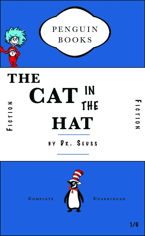
For my Second book design we were given the instructions as followed…
- Sticks to the basic rules of your first classic Penguin
- Introduces new elements, or alters existing elements to create something funny / witty / insightful / relevant to the content or nature of your chosen book.
For this book cover design I chose to do ‘The Cat in the Hat’ as this was one of my favourite books as a kid. I stuck with the Penguin classic design but with my own twist. I chose the blue background colour for the base as this is the colour that the original book comes in. I also changed the font type to be more fun and in an unorganised arrangement as this is meant to be a book to attract kids.
I also added some Cat in the Hat features such as the well known hat and bow he wears and applied this to the penguin logo icon.

