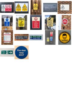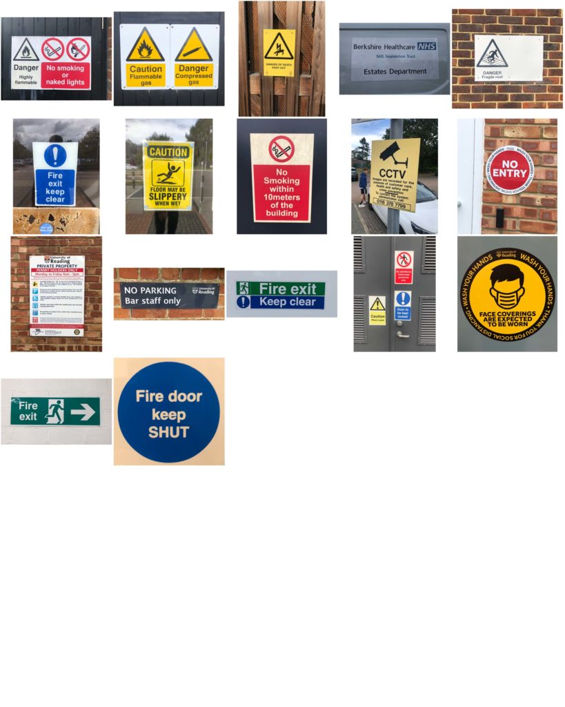
This is a mini project looking at the different types of lettering in the environment. For this project I had a theme of ‘eye-line’ where I took various photos at signs around campus and looked at what features they had.
From looking at the various signs I found that all the signs at eye-line were important or warnings. This was emphasised by bright colours against a plain background and that the had bold sans serif fonts to grasp the viewers attention.

