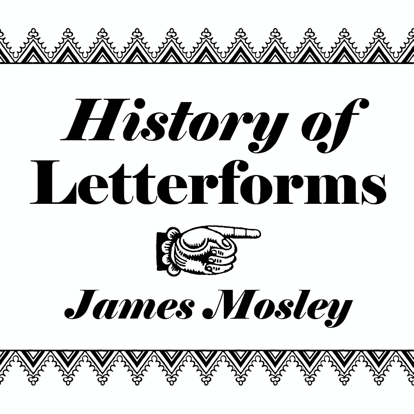
EDIT November 2025: Professor Mosley’s lectures are now available online.
—
Background
James Mosley is an expert in the field of typography and the history of letterforms and printing types, he has lectured at the University of Reading since 1964 and teaches BA and MA students as well as being an advisor to PHD students. It is important to continue James Mosley’s legacy and present his ideas and knowledge to future students, even when he is no longer able to do this in person. By digitalising and professionally producing his lectures to be available online, not only can they be watched more than once, but they can also be viewed by anyone at any time, including future students.
Restated brief
The aim of this project was to produce a coherent set of 20 lectures, each around an hour long. These were to be created via PowerPoint but made slick and professional via smooth transitions, small animations, images, consistent design, branding and a voice-over by James himself.
The set deliverables for this project were:
- Video lectures (Initially 20 lectures, later emended to 21)
- PowerPoint files
- Branding slides
- Trailer
To go with the main outputs of the project we agreed upon these components essential to the content of the project:
- Type: the creator of the lectures is a type expert, the design needs to reflect this.
- Look: these digital lessons will be used for BA and Ma students and need to look good with a professional feel that is also easy to learn from.
- Tasteful animations: small, smooth transitions and movements that combine the slides together and reflect what Mosley is saying.
James’ PowerPoint slides already existed as they were the same ones he uses for his in-person lectures, so these did not need to be created from scratch. But rather made consistent and implement the agreed branding.
Research and ideation
There was several areas I researched for this project going into it:
- Trailers
- Title sequences/animations
- Existing online lecture logos and branding
- Existing opening slides for online lectures about typography
- User personas
- Conference branding
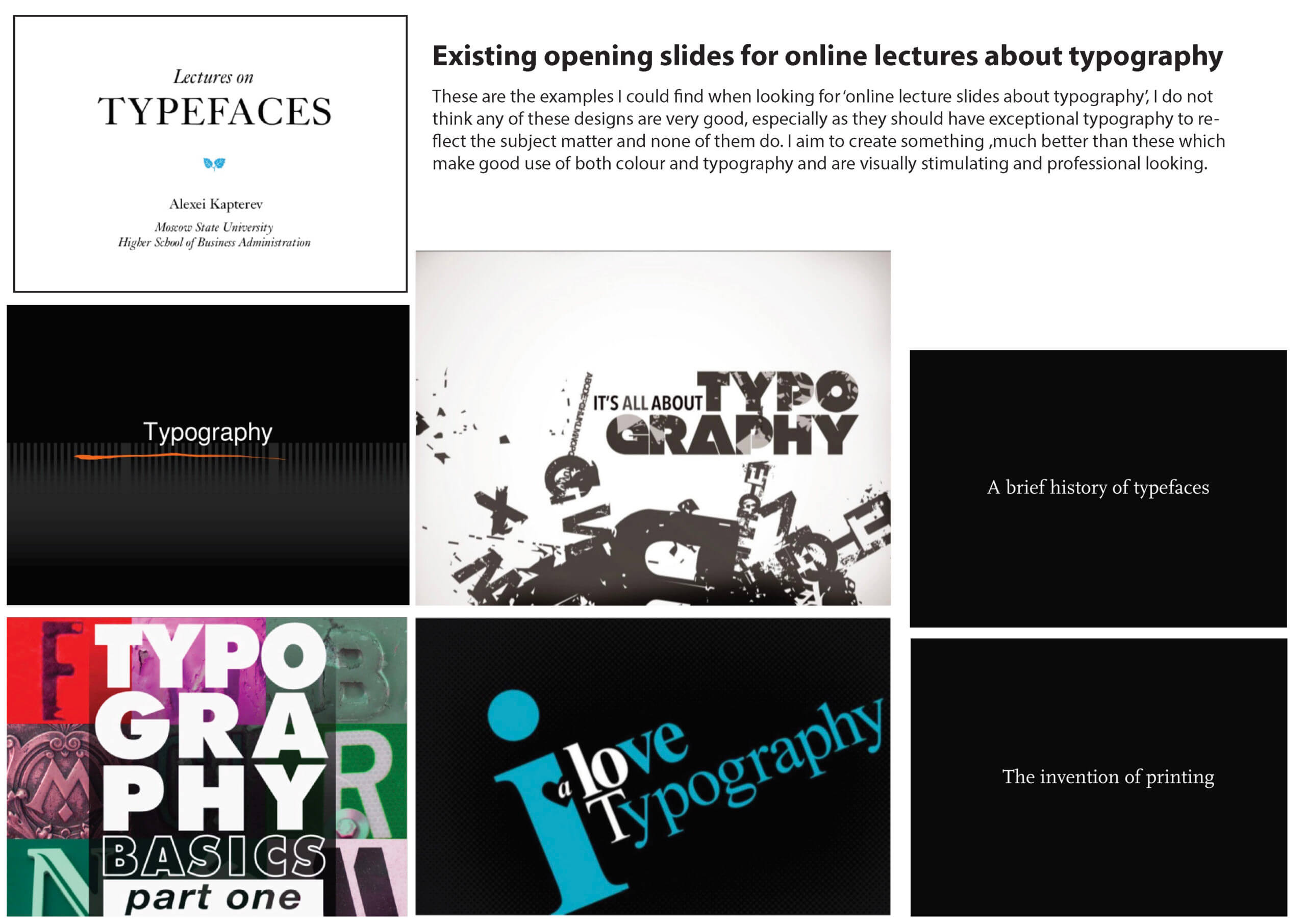
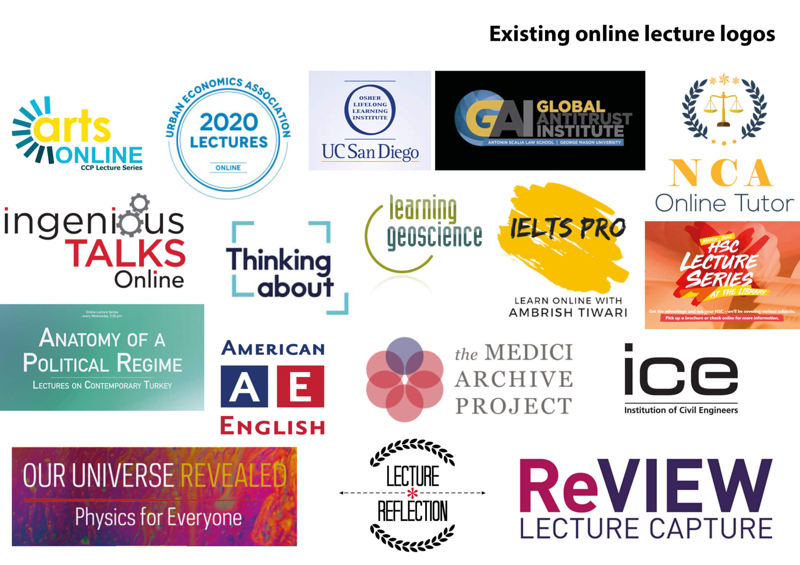
I was surprised to find many examples of existing online lectures about typography, however, the ones I found did not offer much inspiration as they were rather unsuccessful and not the style I had in mind. Nevertheless, it was great to look at them. I also looked for any branding for online lectures on typography and graphic communication, I came across logos but couldn’t find examples of slides that used consistent branding. Furthermore, I looked into conference branding as it retains similarities to the project. I analysed the composition, colours, and different type used in these logo devices to see if there was a common theme or any ideas I could take away to inspire my initial sketches. Although this was useful research, the findings were still different from the subject matter of the lectures and what I would later find out was the client’s personal preference.
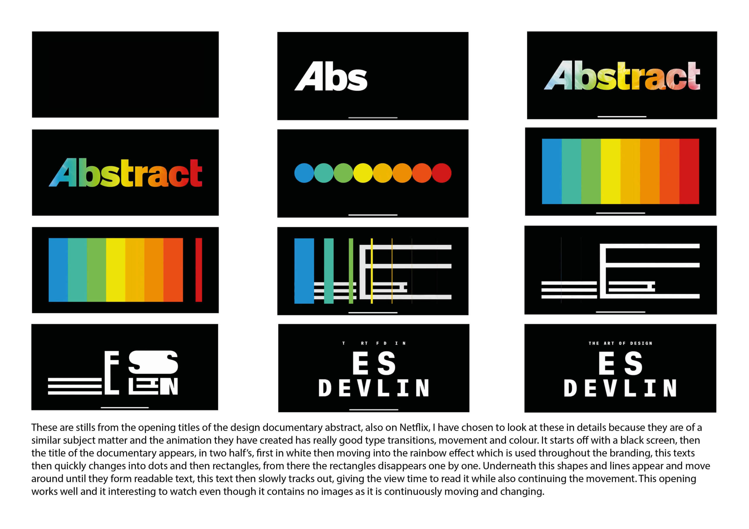
At the start of this project, one of the deliverables was to have a trailer advertising James Mosley’s series of lectures as well as an animation title sequence. To come up with ideas for this I looked at documentaries and mini-series on Netflix. Specifically, I looked at the title sequence of a series on design, this was great as it included animations that used type as well as shapes and colour that transitioned and morphed seamlessly. At the time we felt something like this could be implemented using material from the existing lectures, to give a flavour of what the series was about, however, this was never put into motion.
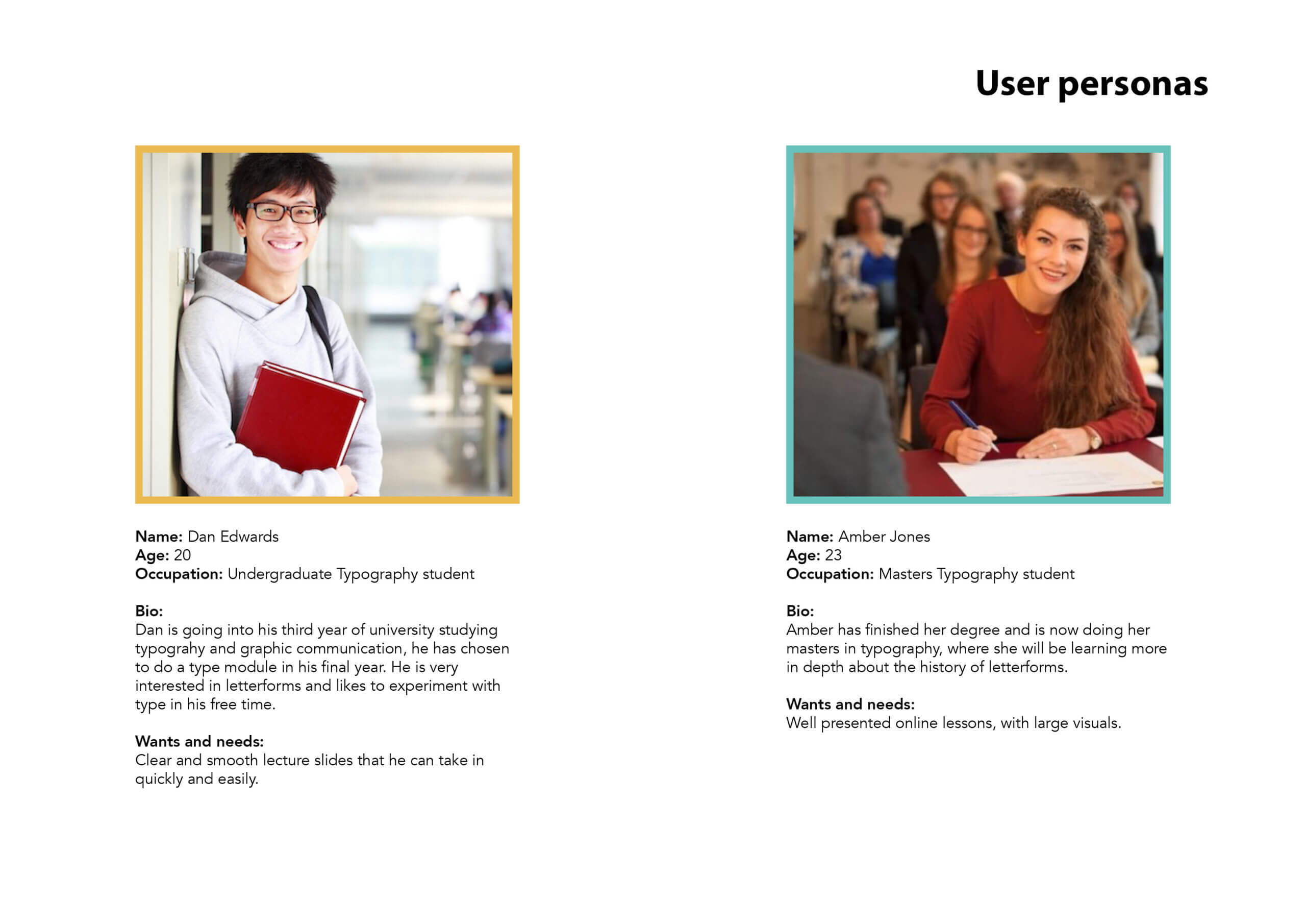
Finally, I completed two user personas to show the kind of people that will be watching and using the final deliverables of the project. These included an undergraduate typography student and a masters typography student. It was important to think about the different audiences varying levels of knowledge on the subject. As a result, the content and layout of the lectures needed to be easy to understand and cater for everyone, a way of doing this was including definitions of words undergraduate students may not be familiar with.
Design development
At the design stage of this project I started by creating initial ideas for the branding on paper. I then looked at typefaces, a colour palette, and logo device. Initially, I worked with a muted palette of greens and cream alongside grey and experimented with different images and layouts for two types of slide, the top level branding and lecture name. Originally I struggled to come up with designs as I was not sure what direction to go in and had never designed branding for a PowerPoint before. However I feel these were a good start, with a few potential directions and a variety of ideas which included decorative borders, textures and images picked out from the existing slides, flourishes, and bold text. I worked with the supervisor to develop these to produce more polished visuals ready to show the client.
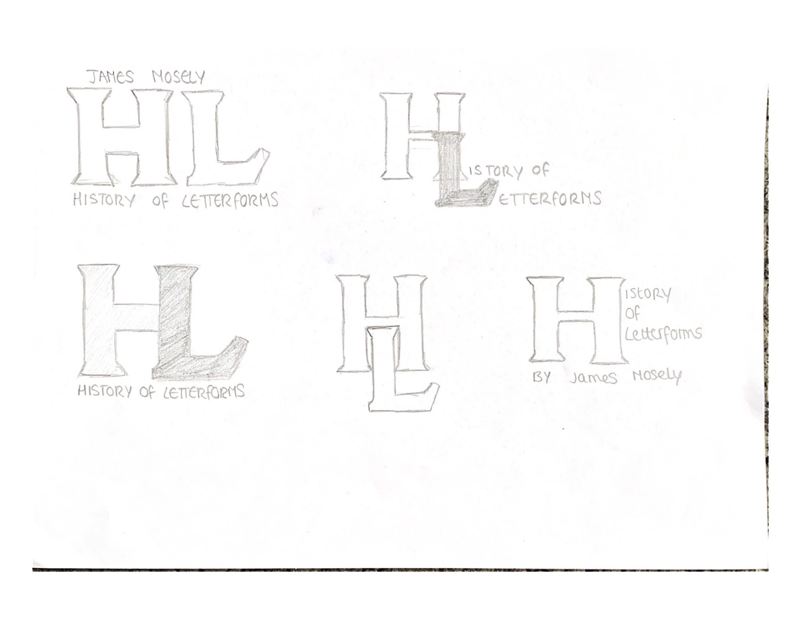
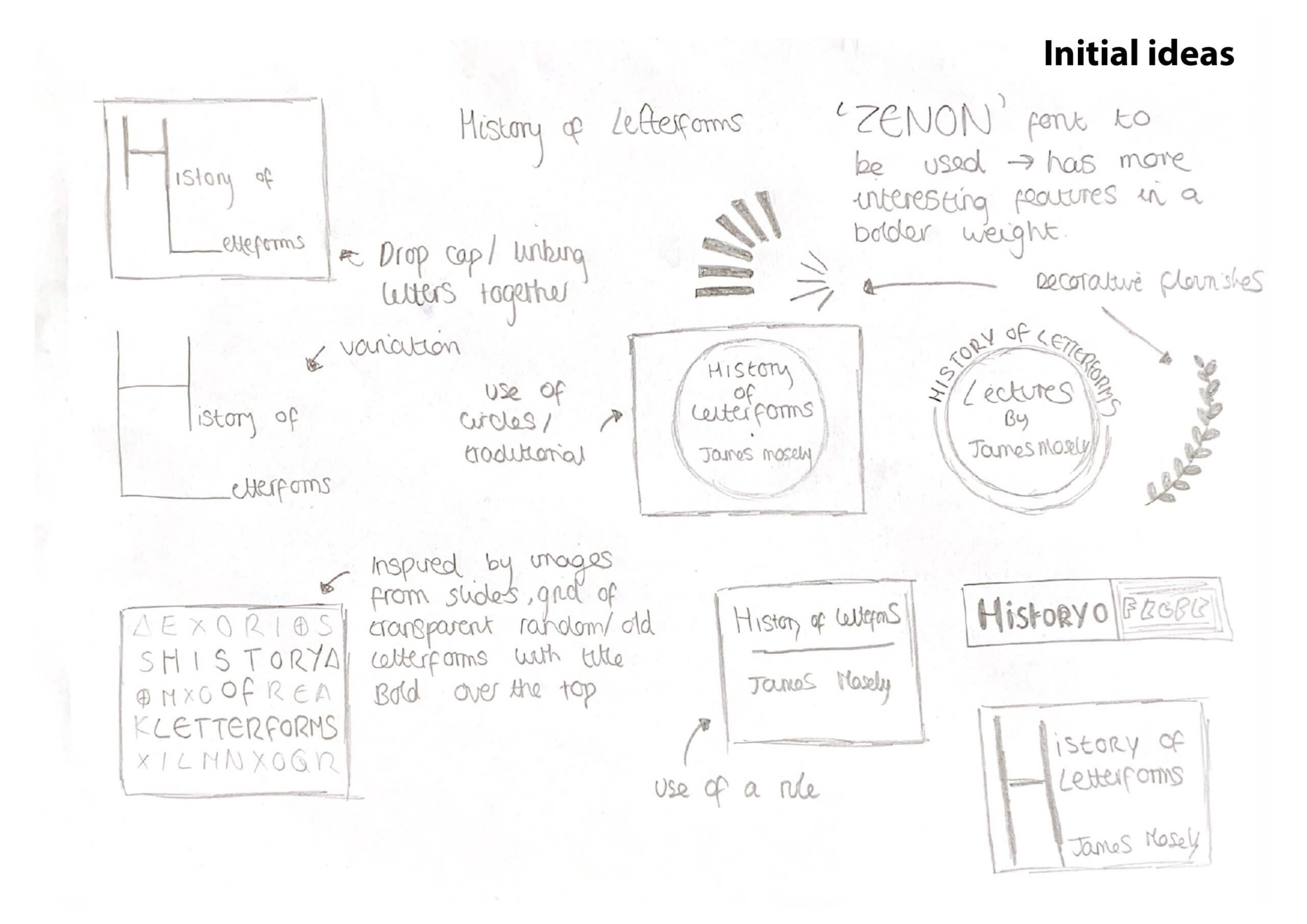
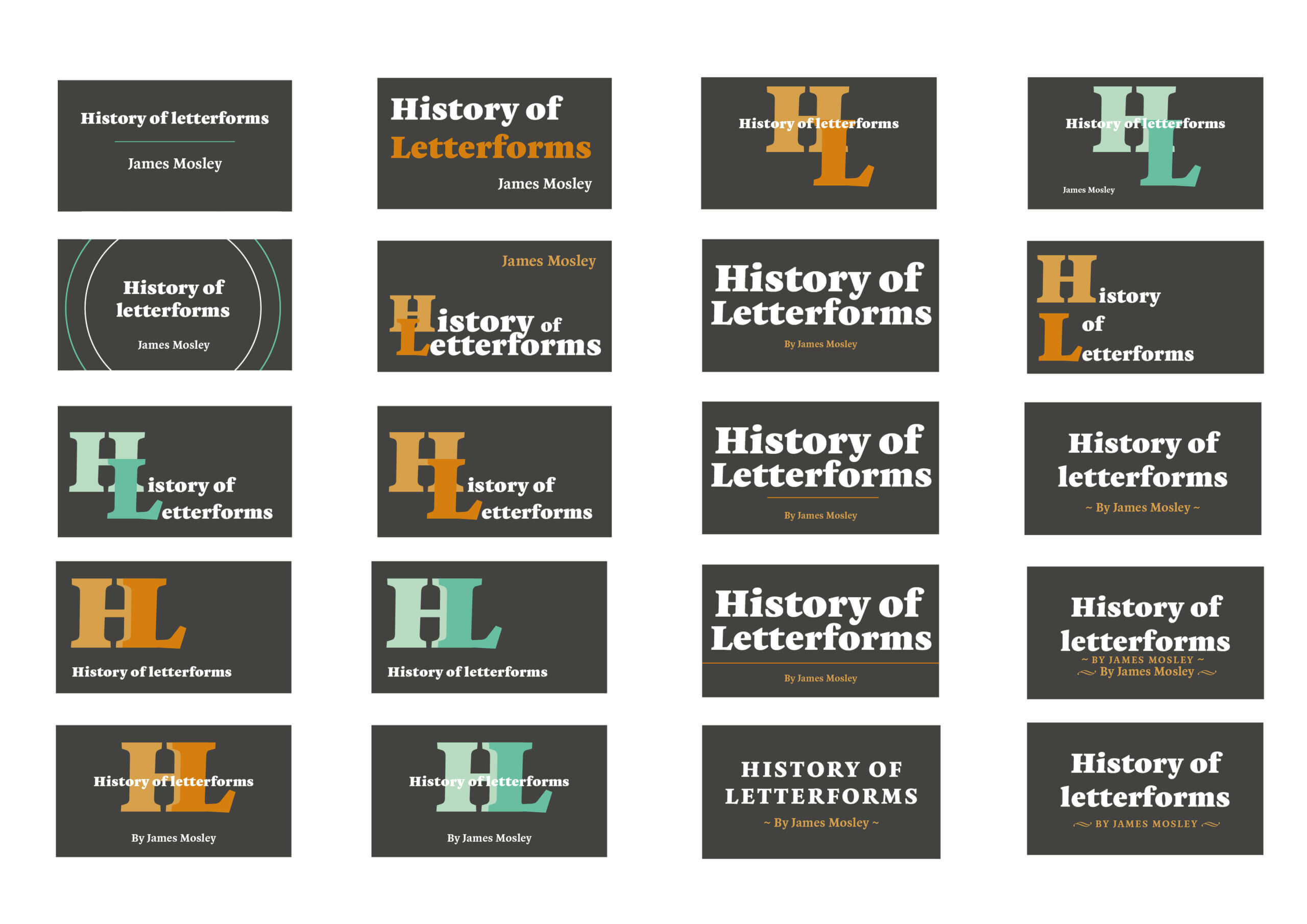
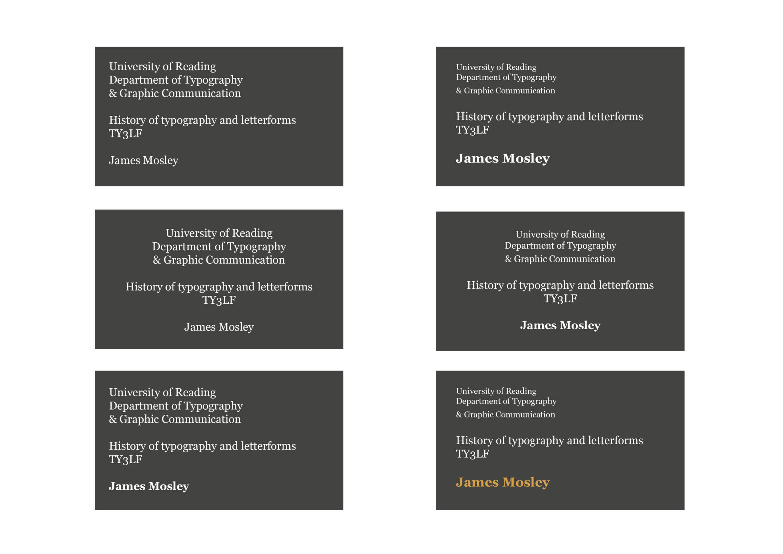
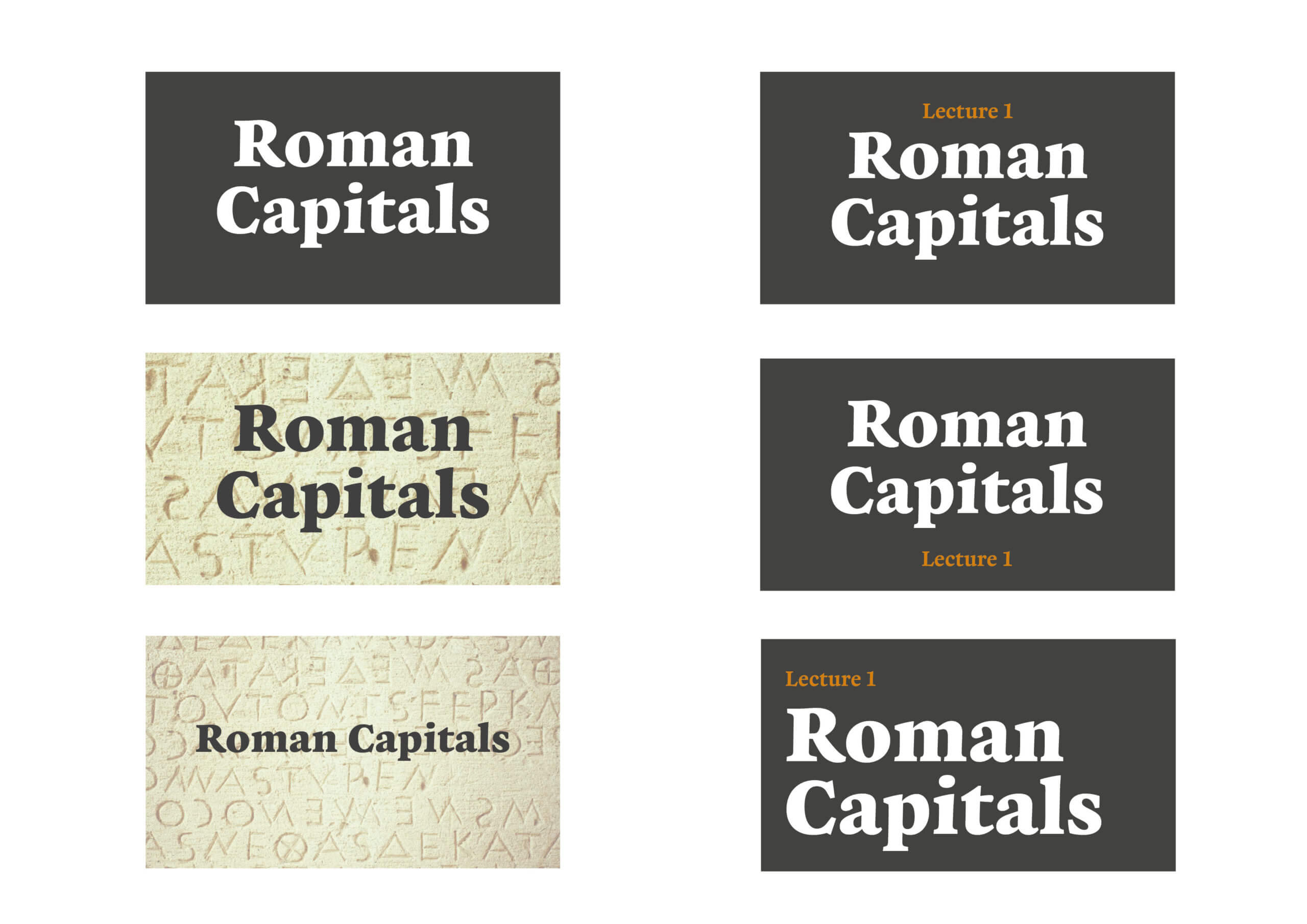
Showing the initial designs to the client was insightful as although the designs were not bad, it made the client realise what branding he wanted to go alongside his work and that he did in fact have a style in mind. James Mosley provided examples of images that represent his ‘house style’, these included a colour scheme of black, white and red, with the typefaces ‘Scotia’ and ‘Elephant’ and decorative elements. I got on board with these straight away and combined design elements I already had with his preferred typeface and colours.

In the restated brief the typeface ‘Zenon’ was to be used for display type, however, after experimenting and discussing designs with the client we decided ‘Elephant’ worked better as it is a traditional English extra-bold serif style. In the original set of PowerPoint lectures, the typefaces ‘Calibri’ and ‘Georgia’ had been used for the main text, in a variety of sizes. However Georgia was implemented throughout in two sizes consistently, this was chosen over Calibri because it is a serif font, therefore corresponding with the display typeface better.
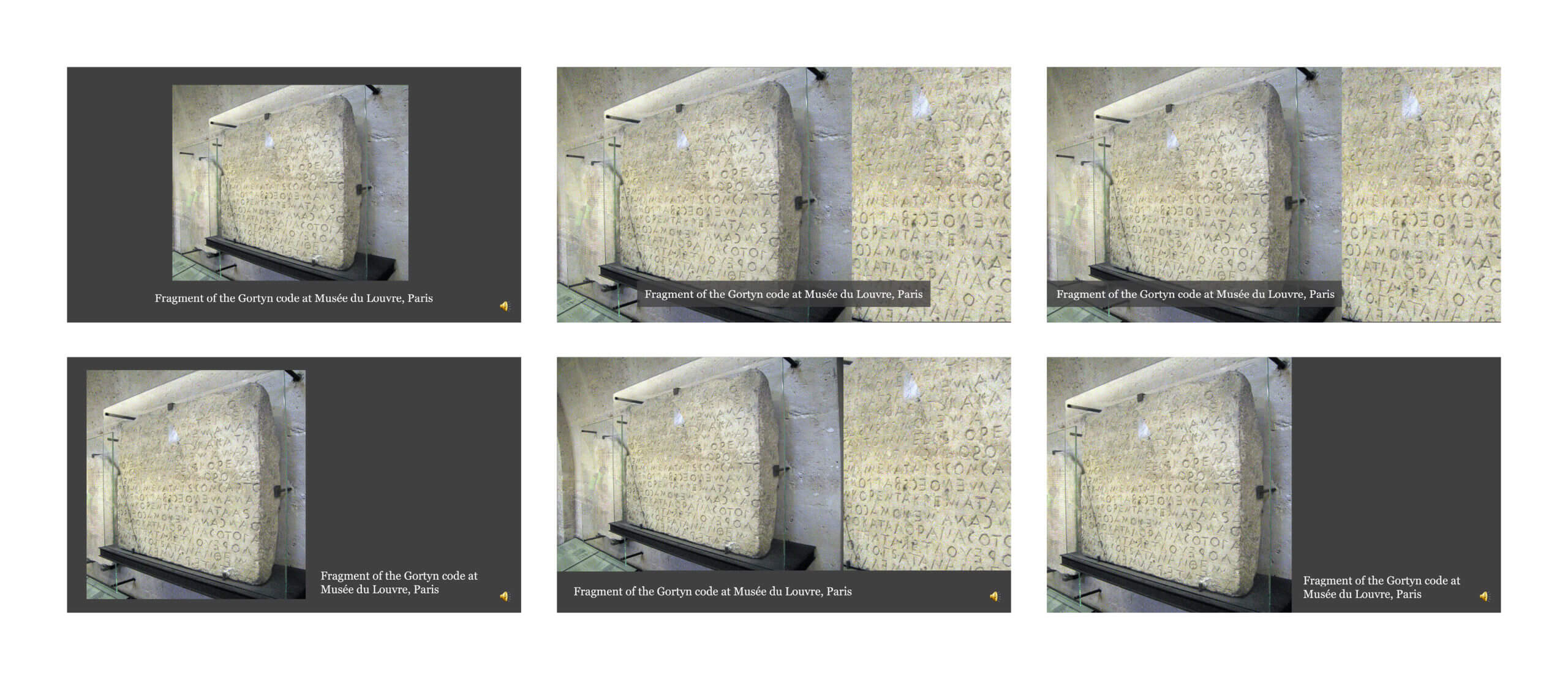
The lecture slides presented to me usually consisted of a picture and caption but each one varied. To find what presentation layouts would work best I took a sample of slides from the first lecture and laid them out in different ways with different compositions and animations. From there the client and supervisor presented feedback and we agreed on a set of compositions to be repeated throughout the presentations for consistency. To implement these, master slides and grids were created to make sure elements were in the same position throughout. This will also benefit anyone in the future who wants to make changes or produce more lectures.
At the start of this process, the idea was the lectures would be more like fluid videos than PowerPoints with complex animations and seamless transitions. However, the client preferred a more simplistic approach with the image and text static to allow for easier watching. This was easily implemented and made sense as the branding also had a traditional approach and if the lectures were to be given in real life they would be simple. We still kept some fading transitions at the start for the top-level branding as it gives a more professional feel and provides an introduction to the lectures.

Final stages
The final deliverables are as follows:
- 20 video lectures
- 20 PowerPoint files
- Branding slides
- 20 Lecture thumbnails
The 20 lectures were uploaded to Microsoft Streams, 10 at the start of Autumn term and the other 10 at the start of the spring term, each lecture contains the relevant branding slides, including the top-level, name of the lecture and a further reading list. Although slightly later than originally planned, they were uploaded to give enough time for the students. The raw PowerPoint files, including older versions alongside the branding slides, are all available on the Typography department OneDrive. This means that they can be added to and developed by members of the department in the future. The master slides are helpful here to allow others to pick up the design. Lastly, each lecture has a thumbnail which is a picture taken from the corresponding lecture and cropped to 16:9.

Reflection
Overall this was a successful and insightful project that gave me the opportunity to produce a unique series of work. I had the chance to learn new skills, including how to work closely with a client that has experience within the design field and has a vision of what they want the final outcome to look like. The closing words from the supervisor of the project were “This has been a pretty epic project with all kinds of challenges that might seem unusual to you, but are in fact a part of life for most practising designers. You’re just getting to experience that early, and with some unique components.”
During this project, I was able to do my own experimentation but also circle back to ensure it wasn’t too off-brand for the client. It was also important to maintain the clarity of the lectures and the flow between slides, the same as if the lecture were to be given in person.
If I were to start this project again I would make an effort to have more of an in-depth conversation with the client at the start. Ideally, this would save time in working out a visual direction, as initially most of the communication was done through the supervisor, however, it was also useful for me to do my own research and ideation. It would also be beneficial to create a more bulletproof system to work through the lectures, receive feedback, make changes, track these changes, and tick things off. I used Trello to make lists of what needed to be done for each lecture, which I ticked off as the project went on to keep track of what needed to be done. However this was only introduced towards the end of the work, a tracking or list system from the start could have helped keep the process consistent, but it took a while to figure out the best way of working through the lectures while both the client and supervisor reviewed them.
I would also work to improve time management on this job. I found instead of working at a steady pace there would be periods of time where I was not working on the project, then I would rush to get lots done when the lectures needed to be made available for the students. It was also important to keep the files organised, well named, and up to date on the OneDrive, as myself, the client and the supervisor needed to access them, and they will be needed again in the future. Towards the end of the project, I feel I got on top of this and left them in a good place for them to be picked back up. Nevertheless, if I were to do the project again I would aim to keep on top of the file names more, earlier lectures ended up with many different versions, yet later ones only have a couple, largely due to the fact I was comfortable with the design and fewer changes needed to be made.
Caitlin Wilton

