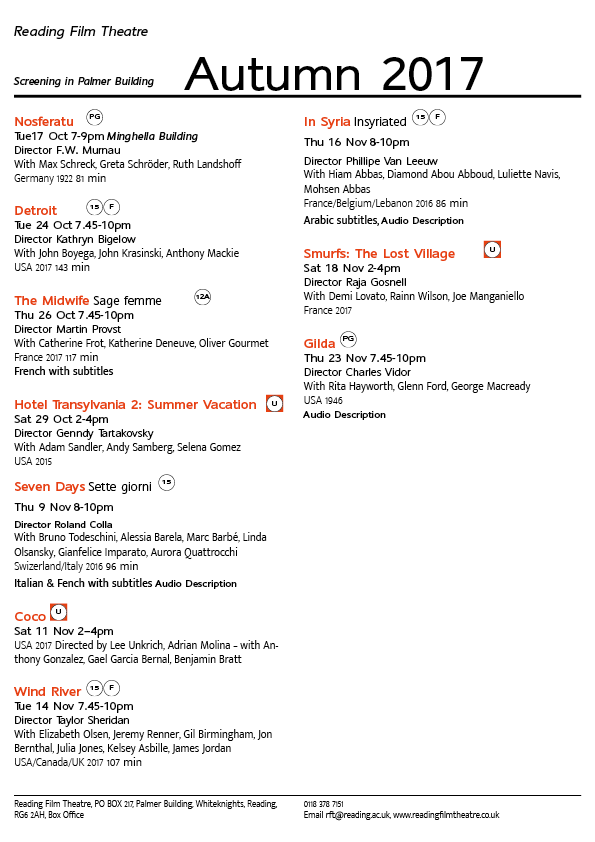
When I think of cinema listings my immediate thought is of the little image displayed by the title, e.g. a still from the movie. Something it gives you a glimpse of what it may be about, other times it catches your attention or causes curiosity. This made the task a bit more difficult to me as we weren’t meant to utilise images merely type.
Having said this I found the challenge quite fun to do as we needed to highlight things such as subtitles, audio subscriptions as well as ratings, whilst also highlighting the date, time and location of the screening and what is being screened amongst other things. We weren’t given the movie blurb which to me meant we were given the bare necessities so this made highlighting particular things more difficult and I really had to think about the importance and hierarchy. Creating this myself made me realise how much help these leaflets have always given me without me realising it – the hierarchy and layout themselves ensure we understand everything and can easily navigate the cinema listings without really having to think too much.
Furthermore, this task truly taught me the importance of ensuring I utilise the correct document size before I start designing in InDesign. You cannot make it smaller once it’s been designed – it will chop the design down and you’ll end up with only a small section. If the brief says A5 don’t create it on A4 accidentally.

