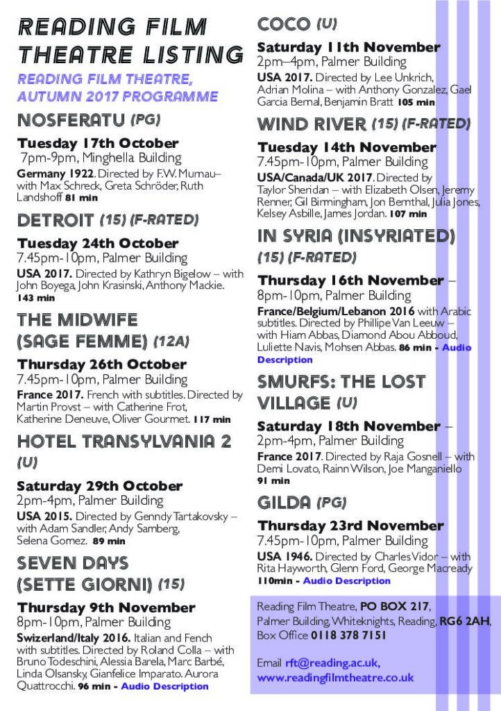
While doing this task I learned that it can be hard to keep track of all the different types of data you might need to handle when doing information design. I thought that my stylings were sufficient but on closer inspection I missed highlighting a lot of information, such as what language the films is and whether the film has subtitles or not. I also now have a greater appreciation for how hard its can be to get all of your information on one page, as it took a lot of adjustments so that the text fit snugly within the margins of one page. Feedback indicated that my decoration clashed with some of the information for the films, so I increased the transparency so that the text contrasts more with the background decoration.

