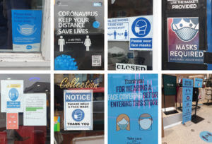
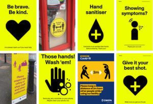
 Sue and Emma’s project was all about gathering real-life examples of COVID images around us. Since it’s been months since the first Corona outbreak, it’s fair to say that we all got used to the repetitive posters and announcements that routinely remind us about the laws put in place to stop the spread of coronavirus in the UK. Having said this, a lot of us stopped paying attention to the posters themselves. I highly valued this experience as it’s not often that I look or analyse real-life examples of information design. It has taught me a lot about features found in Covid imagery, from the choice of colour to the specific fonts and typefaces.
As expected all of the imagery I collected using a sans-serif typeface. Most likely, this is a result of sans-serif fonts are often considered as cleaner and more serious, while also easier to read from up close or distance. A lot of the posters and images I have found had a centre alignment and used a very limited number of colours (2-4 at most). ‘Keeping it simple’ is the key fact in information design as you want everyone to understand the information you’re presenting. A lot  of the posters were also accompanied by icons and vector images that illustrated what was stated on the posters.
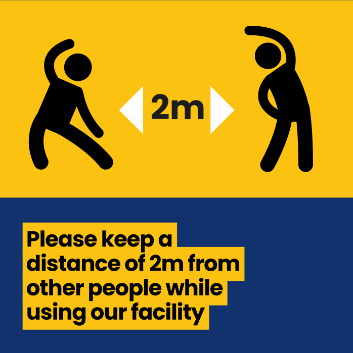
Notably, I have noticed that most of these posters came in 3 colours, blue, red and yellow. Blue is quite commonly used in information design as it is a neutral cool colour. While I agree that the posters in blue were effective, I feel like they are more of a guide rather than enforcement of the law. On the other hand, the yellow posters were combined with a highly contrasting colour such as Yellow (in the examples presented on this page). Unlike the blue posters, yellow draw much more attention, as the combination is known in nature for indicating caution.

