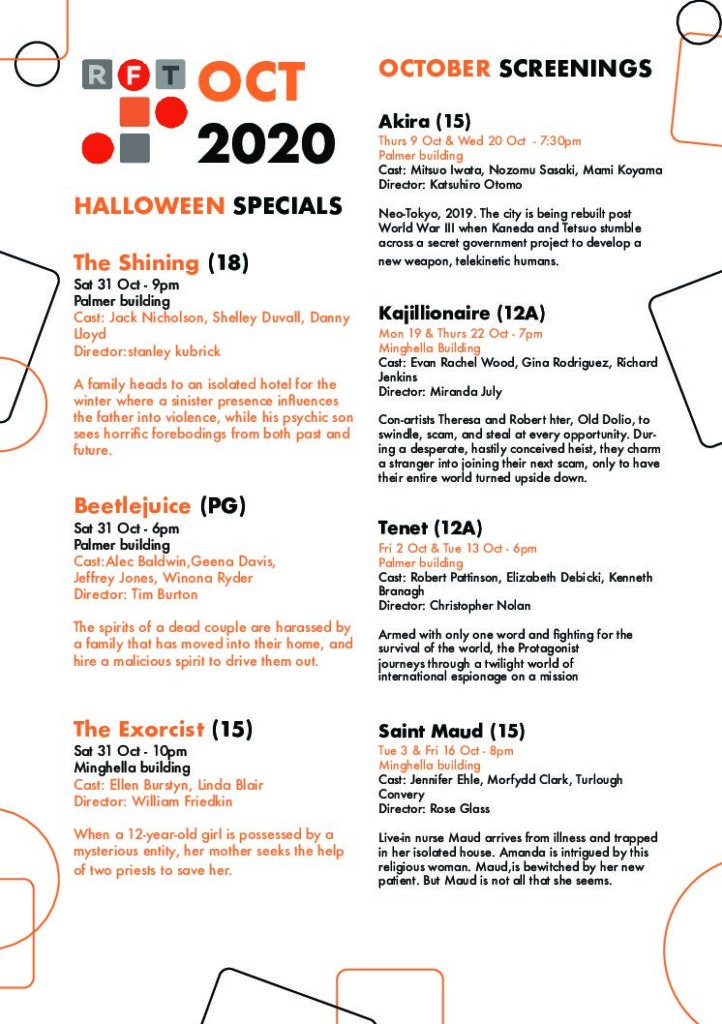
Here is my current final draft for the cinema project, my feedback suggested that I re arrange the halloween listing so that it flows down rather than across, and so that the ownership of the heading becomes less ambiguous. I edited my work by placing all the halloween showings on one column, and the regular showings on another.
I considered putting the halloween showings in a box but thought this might not look quite right, so i just moved them and edited the sizing and spacing a little to make it line up. I also changed the spacing between some paragraphs a little by moving the showing time onto the same line as the showing date, widening the space between the paragraphs and the headers.
Although I had a comment that the colour scheme might be visually confusing, I felt that it was what worked best and so kept it as it was. I did change some of the decorate elements as they did seem a little overwhelming, so I removed a few and changed others to give the illusion of more space.

