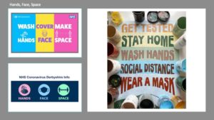
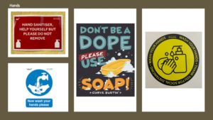
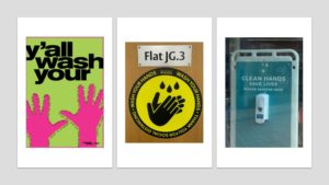
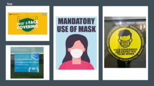
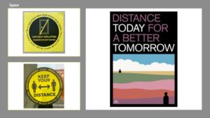
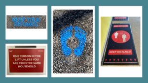
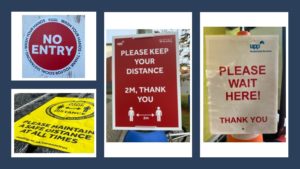
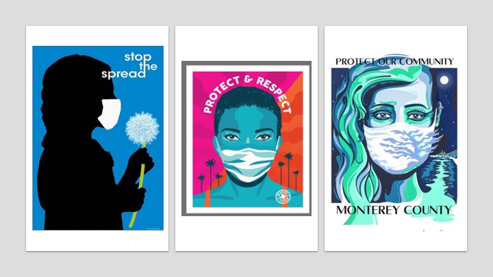
For Sue and Emma’s project, we looked at the graphic language of Covid-19 signs and posters, both on the Whiteknights Campus and from the internet. I began this project by exploring campus to take photographs of all the Covid-19 signs that I could find. I then used social media and google to find some more examples of posters that use imagery and typography to convey information or messages about the Corona Virus. It became clear to me, that there was a wide range of approaches that could be used to create eye-catching and visually appealing designs. One technique most of these signs and posters adopted, was the use of colour. Vibrant reds and bright yellows are often associated with danger and warnings, hence why these colours appear frequently in the Covid-19 signs.
To organise my images, I created powerpoint sides, grouping the signs into the following categories: hands, face, space.
