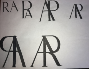
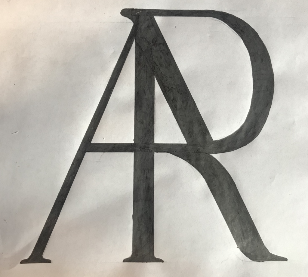
My initials, R and A are really similar in terms of shape, so I think I had an easier time with this brief than most. That doesn’t mean it was that straightforward though. Because of their similar shape, when I tried to blend the characters together it tended to look a lot more like A and P rather than A and R. I found that the solution was to morph one of the legs of the A into one of the legs of the R by making it curve off at each end. T think this has worked pretty well as it should look a lot more like A and R in the final image than it does in the process photos. This has taught me that even when a brief appears to be easy, there will still be graphical problem solving that requires creative thinking.

