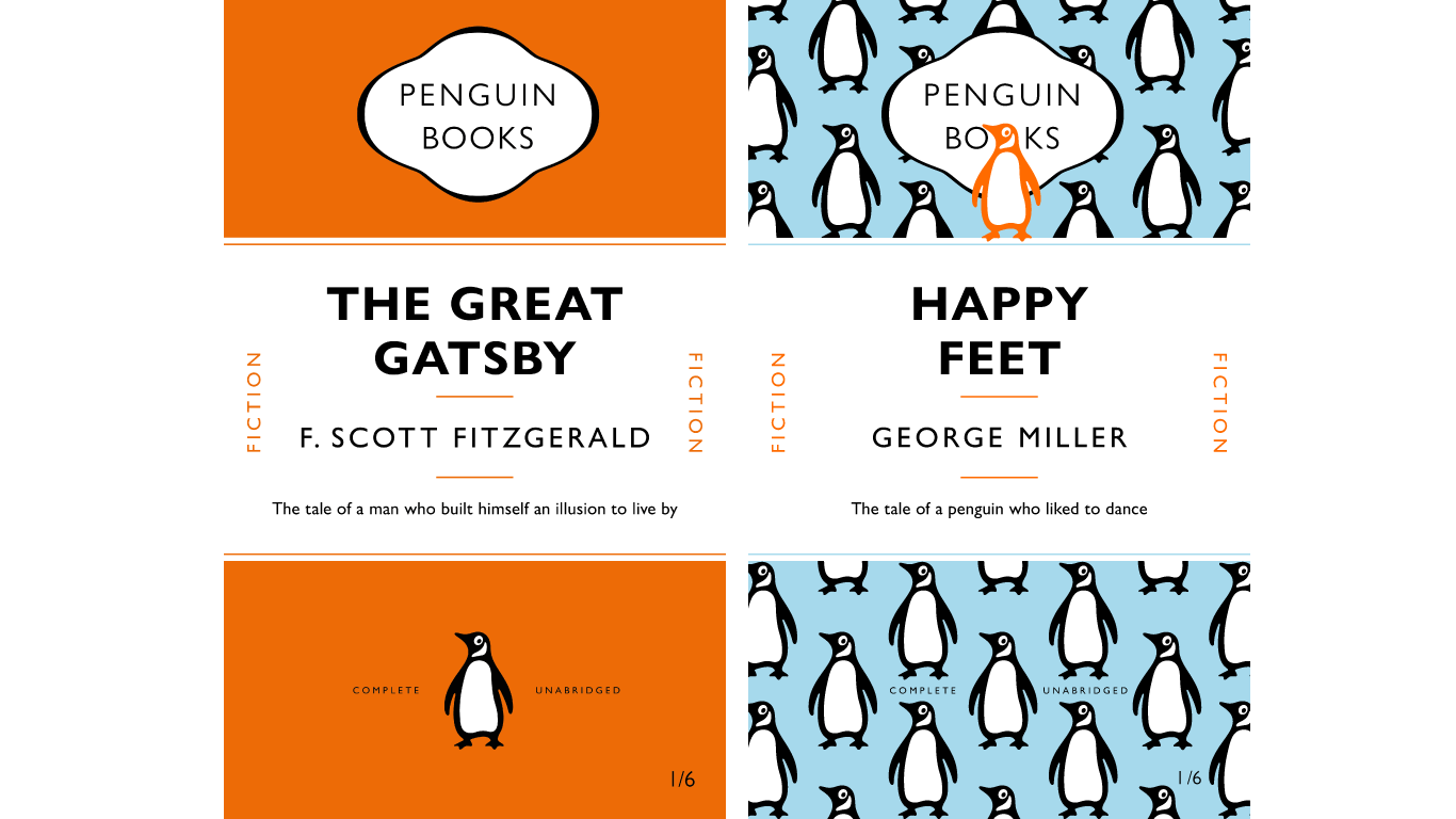
The class
Through this class I gained a much better practical understanding of the appropriate use of spacing tools such as tracking, leading and space before, and the guidelines with which spacing within text should be considered. I had not used paragraph rules before and so I was very glad to have discovered this particular tool. I also enjoyed learning how to create a template, in this case replicating a classic Penguin book cover and then using this template as the foundation for experimentation.
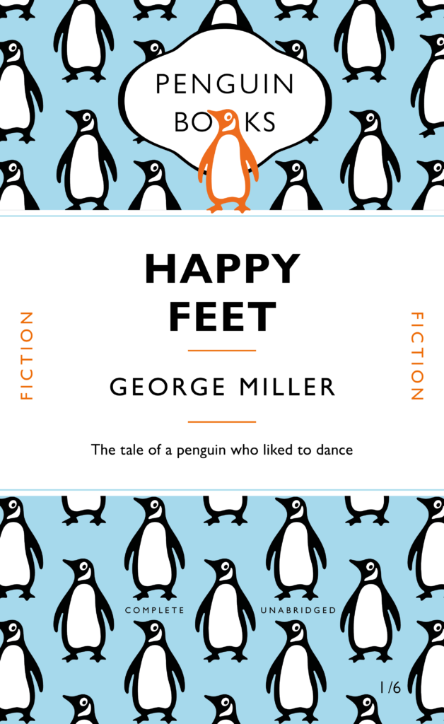
The cover
For my cover I chose to focus on the penguin logo. It has become so iconic but is often not designed to be the focus piece of any cover designs. It is almost always positioned in the middle of the bottom third of the cover on a blank background. The movie ‘Happy Feet’ singles out one penguin from the rest as being different and unusual so I wanted to play around with the use of the penguin, it’s colour and it’s position to create the background of the top and bottom thirds whilst echoing the storyline of the movie.


