On Friday’s TY1INT practical session, we copied the design of a classic penguin book in InDesign. I found this task reasonably simple to follow and it helped me get to grips with using InDesign for the first time. I found making the shape at the top of the book most challenging, however, once we went through it a couple more times I managed to get the hang of it. We were then briefed to change some parts of the design and to create a new book cover for a book or film we have enjoyed recently.
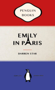
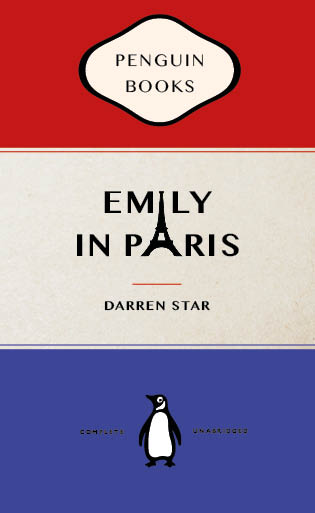
Here was my first attempt at the task to change our existing book cover into a different penguin book. – TY1INT PENGUIN03
I have been watching Emily in Paris, a series on Netflix, at the moment and decided to recreate that in the form of a traditional penguin book cover for the task.
My initial idea was to have a silhouette of the Eifel tower as an ‘A’ in the word ‘Paris’. However, as I experimented more with the text alignment, I noticed that the top of the Eifel tower PNG formed the ‘I’ in ‘Emily’ as well. I thought this was a fun way to bring the cover together and tried to make it look as visually pleasing as possible. I also changed the colours in the book to the colours of the French flag.

Overall, I found this task fun and very helpful to get started on InDesign. If I were to do it again, I’d like to break the traditional structure of the book a bit more. However, I do enjoy the subtle differences I have made to encapsulate the essence of the series.

