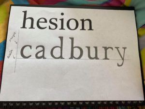
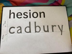
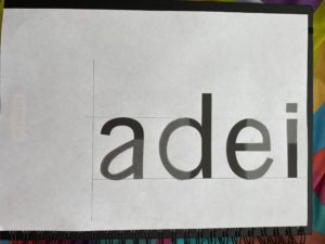
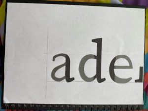
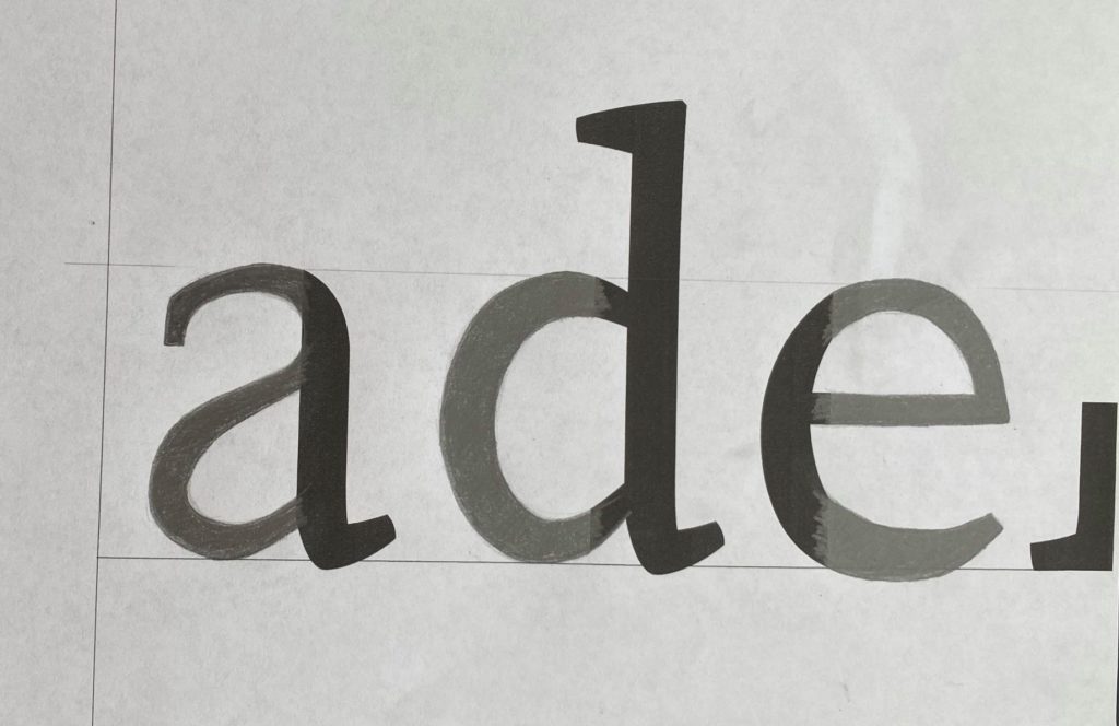
This session has allowed me to concentrate on finer details like using precision whilst sketching the letters. In the first task, we were given a typeface which we then had to replicate using a different word with different letters. The typeface was not specified so the challenge was to think about what the letter could look like with some help from the letters already given. The letters in the alphabet follow into specific groups. For example, characters with descenders fall into a group of their own; characters with ascenders fall into another. I drew in the x-height line as I knew it would help me know how tall/short the letter should be. In the second task, our objective was to use clues from the visible parts of the letters and then try to imagine what the rest of the letters may look like. We then had to draw this. From the feedback I got from the previous task, I concentrated on how much weight I put on the different parts of the characters.
