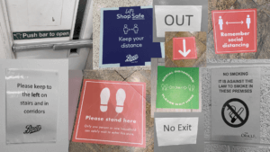
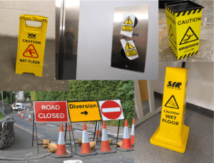
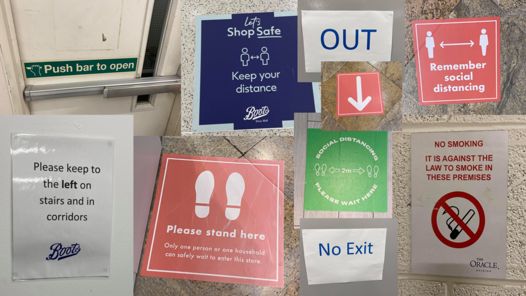
Whilst doing this project, I realised how much of lettering is present in our day to day lives. The different signs, logos and numerals we see around us inform, educate or inspire us in one way or another whether it be through an instructing sign, a warning, or a form of merchandising. Although most of the time it is clear what a sign means, sometimes we need to see the scene around it (the context) in order for us to understand the true meaning. After photographing the pictures, I categorised all the images into 4 sets of groups through collages. Each group follows a set of rules to communicate the intended meaning effectively to the public.
I noticed that especially during this unprecedented time due to the virus, we have a large variety of signs and lettering instructing us to behave in a certain way. To show this in my collage, if you see below, I have accentuated these specific images by editing the ordinary instructive signs we see in our day to day lives black and white. Nearly all these signs use imperative verbs to not only convey the message across, but to highlight the significance and importance. This is also done through the use of the vibrant, pigmented colours. The font used is predominantly sans serif which makes it easier for the public to read. This conveniency is vital as these signs would usually be placed in any fast-paced environment (e.g. shopping centre, restaurant) where people should be able to understand the message without any hesitation or confusion.
Below are some more of the collages I created with the category labelled.


