
Background
Turbary woods owl and bird of prey sanctuary is a non-profit organisation in Preston, Lancashire and is run by volunteers. All the money made from the sanctuary, from flying displays and entry costs, is put towards the wellbeing of the birds and the upkeep of the sanctuary. Two of us were lucky enough to visit the sanctuary in June 2019 and meet the client and all the birds. This helped us to understand how the signs we were going to design would be situated and also get an overall feel of the sanctuary. From this trip we learnt about the audience and gained knowledge on how our signs would need to be used. The age of people who visited the sanctuary on a regular basis was very varied from the elderly to keen bird lovers to children and their families. Already, we knew that the signs created had to appeal to a wide audience and meeting the client in person and visiting the sanctuary helped us to put this into perspective and get a clear idea of exactly what the client required.
Restated Brief
What we were asked to do
The main aim of this project was to create a consistent and aesthetic wayfinding signage system around the sanctuary to give the space a more consistent and well-branded feel. Therefore, we were asked to create around 27 2ft x 18 inches signs to be put on each aviary. Depending on time, we were going to replace other existing wayfinding signage to help direct users too, however visitors to the site did tend to approach it in an exploratory manner. The client also asked for something interactive on the signage or a quiz to engage children. The client asked that the signs be adaptable to potential changes in the sanctuary. For example, leaving space for number stickers where they will put the cage number of a particular bird and also stickers to help the carers of the birds with feeding.
Target audience
From our visit, it was clear that a range of ages visited the sanctuary. This meant that the signage must appeal to both adults and children, therefore there are different sections on the signs that suit all ages and interests. For example, enough information for bird enthusiasts, but also enough imagery like the owl mascot on the Did You Know section and the icons for children.
New restated brief
After some changes with the client, discussed below, we felt it was necessary to re-do the restated brief. On this, we changed the deliverables to the circumstance, which was to simply finish 3–4 of the original signs to the standard we would’ve sent them all to print. This included a new logo for the sanctuary too.
Schedule
This real job went on longer than planned due to a variety of reasons and, therefore, we were unable to stick to the original schedule. However, as a team we were organised and kept on top of the work throughout this project, but due to different situations the deadline got pushed back. We were assigned this real job over last summer, and as none of us were together in Reading, it was a lot more difficult to start this project as anticipated. However, once back in September we started making quick progress, coming to a decision on our sign template reasonably fast. We made consistent, steady progress throughout the year, showing this in real job meetings every Friday, but things began to slow when waiting for all the information to come through from the client. Once we had changed clients and the deliverables changed, we were fast to have the signs done, and got it all signed off to be done for this term. Overall, we could’ve maybe gone a bit faster at times, which may have stopped the new client making a rash decision, however we think we dealt with the problems and kept organised as much as possible.
Process
This job took us much longer than anticipated to finish. It started as a relatively short job that would take us three or four months, but we soon found out we needed much more time. Although it took us nearly a year, the job had a mostly consistent and steady build. We needed the extended time to ensure that the icons were uniform and felt like they worked together and also to allow time for the client to provide all of the copy for the signs and perfect each sign to our satisfaction. In the end, we believe that, although things moved slowly, we created successful signs that effectively communicate information.
Existing signs
We carried out research into various different signs that were used at zoos and also specifically for birds as we wanted to gain insight into what an aviary sign may look like. Some of the signs were very text heavy which appeals to enthusiasts or adults but with this there were also a lot of diagrams and fun headings or jokes which help to engage younger audiences as well. A few existing signs used icons as a way to represent the diet or habitat of the animal and this was something we took as inspiration to use on our own signs. Most of the signs researched had a good balance of text that would be suitable for enthusiasts to learn more but also the use of diagrams for quick information for those that are interested but don’t want to read a lot but also for parents to point out and interact with children.
Information gathering
In order for information to be shared between us and the client efficiently we set up a shared excel spreadsheet which was live and allowed us to see where information had been added by the client. The client ensured that all the different types of birds at the sanctuary were included and we created different columns for each type of information that we believed should be included on the signs such as incubation period, habitat and a longer paragraph detailing more information about the bird. The spreadsheet also had reference to the image that the client had chosen to be used on the signs for each bird and these were set up as links to a photo drive that we could all access. This system worked really well when it came to inputting the information into the signs as we were all able to view the document and the information updated automatically if the client wanted to change anything. This made it much easier for all of us as it was clear when information was missing for a particular bird and there wasn’t an issue with trying to find the correct documents for individual birds as it was all in one place and could be easily updated.
Trello
As a group we think that we worked very effectively with our Trello board as we kept it regularly updated with notes from meetings and designs. We recorded our progress and helped us keep track of where we were in the project. Now, at the end of the project, it looks very full and we have easy access to the various stages of the project.
Teamwork
As a team we worked very well together, improving our understanding of working with others and playing to our strengths. Throughout the project we often divided the different areas of the project up depending on these strengths. We learnt this when, over summer, we first all made a set of icons each, which meant that when we pulled these all together they did not make a cohesive set of icons. Back in September, two members of the team had stronger Illustrator skills so they made these, while the other member started on the template in InDesign. We took this approach throughout which made the workload easier to deal with and we think, made our work stronger as we were able to collaborate to produce a range of ideas and variations but were also able to step back and let others develop from these initial stages.
Initial designs
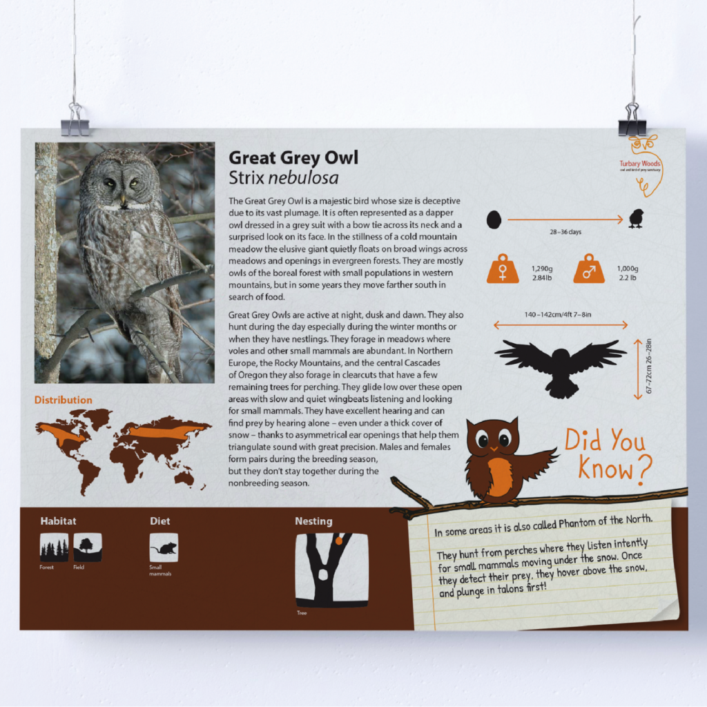
Early on, we already had some sort of idea of how we wanted to group up the information on the signs and had a vague idea about how to lay it out. We knew that a visual way of representing the diet, habitat, nesting, and distribution would make it easier to inform people than for it to get lost in the text. There was just one issue we had at this initial stage in that we didn’t have any content for the signs yet, so we were blindly trying to sort how things were supposed to slot together. Although it was quite difficult to imagine, it did come with an advantage as we were able to tell the client what we believed needed to be on the signs and how long each section should be. Therefore, we had full control of picking and choosing relevant information.

When we came to inputting content and designing the signs in InDesign it was more difficult that we first believed. We use one of our favourite first ‘templates’ made without any copy or imagery. However, it still looked too much like columns and separate parts rather than an integrated sign that makes it easy to look at and find different bits of information. We were very lucky to be appointed a mentor as well, who really helped us out with this. Oliver from TDL Creative, helped us realise that we could go even further and turn more of the information into visual representations and that maybe adding the icons to the bottom would be great for children trying to learn something as well as it would be easier for them to read this part of the sign if it was lower down and therefore more accessible.

The second stage of designing
With a clearer idea of how the sign would be laid out, we were left to figure out how showing the other information graphically would work. We came to the conclusion that showing the incubation period along a timeline would work well since it suggests a progression of time. The weights of the birds could be represented with an actual weight rather than just a line of text which makes the display of information more engaging. Then came making the ‘did you know’ facts visually interesting for children, who were one of our main target audiences.
We decided that a mascot would be the right way to go after trying countless different thought bubbles and speech bubbles. A mascot would signify that that part was specifically made for children while also not seeming too degrading or moving away from the bird theme. Further, it could also be reused on anything else the sanctuary would want to make for children like a quiz or specific exhibitions/events. We went through many different owls from hand drawn to digital, very cutesy to realistic and using a variety of different colours. It took a lot of playing around and trying different styles, but eventually we landed on a vector owl, a hand drawn typeface, and a notebook. This choice allowed for enough differentiation from the other elements while also remaining consistent and fitting in with the rest of the sign. It was clearly something different from all the other information, but it did not stick out like a sore thumb and look like it was only relevant for children.


Filling the templates
Once the final design for the signs had been signed off we were ready to start inputting the information to each of the signs. This was a big task but we decided that one of us would input the written information and choose the correct icons to be used for diet, habitat and nesting, one of us would fill in the correct area on the distribution maps and the other would go through the completed signs and check for inaccuracies and inconsistencies. To allow this to work well we used Dropbox which meant each of us could view the updated signs easily and the confusion of back and forth emails trying to find the updated signs was avoided. We could all see when a sign had been changed and keeping the dropbox well organised and saving the files in new places when the information had been added helped to ensure we weren’t overwriting something that had already been changed.
Although the technical aspects of this process were very smooth we had issues with some of the signs as the information had not been provided to us by the client on time. We understood that the client was compiling the information for these signs in their own time as they were a volunteer at the sanctuary so other priorities had to take precedence. As the client was not in a position to complete the information for the signs we carried out our own research to fill the gaps on the signs with missing information which was copied but with intention to send to the client for editing into their own words so that there were not issues with copyright. In doing so, we found that a lot of the information the client had provided was copied and therefore there were already issues with copyright. To ensure that this information was not used we highlighted it in a bright colour and made it clear to the client that they wouldn’t want to print this as they would have problems with the copyrighted information. These signs, along with the signs that we had sourced the information for, were then sent to the client for editing.
Change of client
The change of client and problems that came with this was definitely the biggest challenge we faced on this job. We started with one client, however, due to personal reasons, she was no longer able to carry on, so the manager of the sanctuary took over as the client for the last few months. The new client was less accessible by email, which was a bit tricky, but at that stage we were close to being done except for some missing information and a few missing images, so it wasn’t the end of the world. However, the main issue came when we had sent the client a link to our dropbox with the current pdfs for him to check the information and rephrase some due to possible copyright issues. We were disappointed to hear back from the client a few days later that the signs had been sent to print. We were confused at first as we had taken the precautions and made the pdfs print proof, putting a watermark across the sign in Adobe Acrobat. However, due to the client having his own print studio, he must’ve found a way around this. We made sure to do this because the client had previously asked for our raw InDesign files which didn’t seem right to us. We are very disappointed that after all of our work we weren’t able to send them off all finished to the standard we would’ve liked, but we didn’t want this to ruin our project, so we decided to continue on with 4 signs and finish them to our standards. In the end, we took the 27 original signs to about 95% but were only able to get to 100% with 4 of them. This was a massive learning curve for us as we learnt that the client can be unpredictable, but that you still need to stay polite and professional.
A new logo
Even though the client had decided to print the signs, we were not yet completely happy with our work. There were a few minor things to fix (such as spacing around en dashes), but mainly we were dissatisfied with the logo, which we did want to put on the signs. This was something we had already been discussing earlier on in the project, but the clients did not express any want into having a logo redesign. Now, left to change things to our standard, we had the freedom to take this in a direction we thought was suitable.
There was some conflict between digital media and the feeling that we needed to have something more hand drawn. However, without trying the smoother and more digital looking logos, we wouldn’t have known that we preferred the hand drawn look, which gives a much more personal feel. This suits the sanctuary perfectly since it is such a small place that is run by volunteers.
Eventually, we actually happened to go with our original idea. It was choosing a typeface that was difficult. It had to fit with the hand drawn vibe while also remaining legible and balancing out the roughness of something that has been hand drawn. We went through a cycle of nine fonts and then twelve fonts based on what the first nine fonts were missing. Seeing all these fonts together, we were able to compare and contrast to see which fit best with the message we were trying to convey and with the illustration. This shows just how important a font can be to a logo: it can either make it or break it.
Eventually, we thought we had finalised the logo. However, when we actually photoshopped the signs into the real situation at the sanctuary, we realised it was not as good as we hoped. The owl disappeared a little compared to all the other elements on the sign. Luckily, this was an easy fix. All we had to change was the line weight and the logo looked much better. This was a really valuable lesson and we learnt that before you can actually call a logo finished you need to see it in the situation where it will be used.


Final designs These are the final four signs that we finished to a completed standard and they also include the redesigned logo in the top right hand corner.


![]()


Below shows the final logo in three different forms, with the whole name of the sanctuary, the shortened name, and the logo graphic without text.
![]()
Reflection
Joanne
This was my first real job and I definitely learnt a lot from it from learning how to communicate effectively with clients to using new tools in illustrator. The main thing I learnt was how to work with a client when it is not possible to see them face-to-face on a regular basis. This meant we had to be on the ball with replying to emails and also to be careful when writing them to ensure we did not take on a pressuring tone when we required information that the client had not yet given us. It was really important that we kept a strong relationship with the client especially when our form of communication was predominantly emails as this meant we could ask for more time when we needed it and know that they would understand any issues we were having our end as well as us being able to understand issues that they may be having regarding providing us with the resources we needed to complete the work. I learnt new skills in illustrator such as the clipping mask tool and different uses for image trace. This project also taught me a lot about showing work to clients and how to have a degree of professionalism such as showing numbered variations set out in a clear way so that it is easy for clients to reference them over email.
Liselot
This real job has taught me about a different group dynamic that is actually quite pleasant. Rather than just dividing the work equally between the three of us, we really worked with each other’s strengths. Although we all had a go to learn new skills, we also knew that the outcomes would be the best if the people who understood what was going on better actually did that part. It also made it easy getting work done rather than always feeling like somebody was doing more or less than the others. Further, I would say my illustrator skills have improved. I did already know the tools we used, but I had to use them so often that I got much faster and better at them. Especially the pen tool. I figured out little tricks that worked for me, making it so much easier to actually get the shape I wanted.
Immy
This job has been a learning curve in many ways. One thing is that this was the first job where we visited the client on site face-to-face. I was nervous for this initially, however, was very pleased with how the day went, and it definitely built my confidence in communicating with the client, which has helped me on other jobs since. I have really enjoyed working on this job, as our team worked efficiently together, playing on each of our strengths for different aspects of the signs. We experimented very well with different ideas before landing on our final ideas for the owl ‘Did You Know’ section and the logo, which is something I now make sure I do in each project as the development of our ideas was large and definitely improved throughout. Something stressed to us in real job meetings was the importance of how we present ideas clearly and professionally to clients too. My Illustrator skills have developed over this project through this experimenting, having also learnt from my team how to use tools such as image trace, that has been very valuable in my other work now too. Most importantly though, this project was an insight into the possible problems we’ll face in industry, when a client does something you didn’t want but you still must remain professional and polite.