
Design Ideas & Design Process
Firstly, how did I come up with the title, “Dear, Typography” you may ask. A letter is a type of typographic piece of work; specifically the most dearest one to me. Another reason why I thought this choice in title was the best fit for this post is because of the play on words – we see a ‘deer’ visually on the final design, right?
…
DESIGN 1
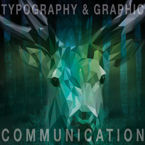
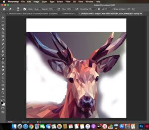
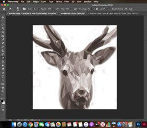
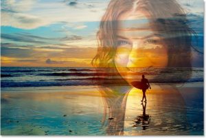
My first design (Design 1), which ended up being my final design, consists of the combination of 2 separate images. my goal was to make it look like as though the image originally had come like that. This required me to research how to blend 2 images together in Photoshop as well as experimenting myself using the different tools available on the software. I used the eraser tool (shown in screenshot 1) to remove the background of the deer in the original image so that I had something feasible to work with in order to blend the crop of the deer in my desired background of the forest. I chose the luminosity filter (shown in screenshot 2) – this made the colours of the background come through into the deer making the 2 images blend together effortlessly. I then played around with the levels of the opacity for the typography and the images making sure both were balanced and legible.
…
DESIGN 2
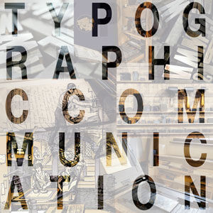
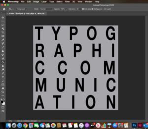
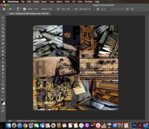
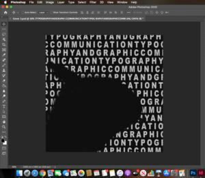
Whilst working on my second podcast cover, I developed a new skill. I had a vision of seeing a collage of images through the outline/fill of ordinary text so I hopped onto Youtube and found some content which helped me achieve what I wanted. I was introduced to a new feature I previously was not aware of before – a layer mask. This enables you to reversibly hide parts of a layer. In this case it was the fill inside the text which made the imagery behind seep through. The fill colour of the layer mask was a sold white, but I wanted to show more of the imagery so I decreased the opacity to show it through the mask (shown in Figure 3) The collage of the images behind (shown in Screenshot 3) relate to the Printing Press and the arrangement of the type on top reflect the topic of the podcast. I experimented with the size, leading and tracking of the text to make sure each letter looked equally spaced out. The knowledge I have gained from the TY1INT module has helped me massively here as I now know how to experiment with the different typographical variants effectively (size, leading and tracking)
…
DESIGN 3
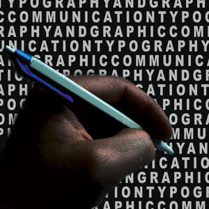
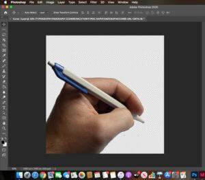
My third idea also taught me a new technique. In my previous experience with Photoshop, I have always used the quick selection tool to remove the background of images, however I discovered through my research that with more simpler images, you can do this easily by just clicking a button. I used the object selection tool along with selecting ‘select subject’ (shown in screenshot 5) Photoshop selected the area which it thought I wanted – the simpler outline. Afterwards, I used the select and mask option to soften any rough edges and to double check that the software had removed and kept what I wanted. I used the vivid light filter on this which gave an abstract look and then placed the hand on a ‘nearly’ black background. I used the image and action of the hand writing as I think it reflects the subject well and to go with it I added repeated text onto the background. I was inspired by this repeated text from my previous design but I wanted to show it in a different place: the background. The repeated words replicate the appearance of a word search, which was my intention. I noticed that due to the filter applied to the hand, it made the text show through on top of it even though the layer was beneath the layer of the hand. To correct this, I used the eraser tool to remove the additional text which was present on the hand. Screenshot 6 shows how the text ended up after I erased the text on top of the hand – you can see that it has made an outline where the hand was. After arranging the layers, I put the hand at the front as I think this is the most vital aspect of the podcast as it displays the theme.
Software Tutorials
From previous experience with PhotoShop, I was able to perform the basic techniques such as: adjusting image quality, combining and layering images. However, with each design I made, I learnt a new skill. Not only this, I practiced, reviewed and consolidated the previous skills I already knew. This has developed my understanding in PhotoShop further. In my first design, when I removed the background on the picture of the deer, I learnt how before you convert an image to a layer, when you upload an image into PhotoShop, it comes as a smart object – with this you are unable to edit it. I discovered shortcut keys to make the brush of the eraser tool bigger and smaller which made it extremely easier as the job was done faster. To make the two images blend together, I used a mixture of varying the opacity and made the use of a filter from the effects option. The next thing I want to work on is blending 2 images in a linear manner. For example, combining 2 faces together, using one side from each individual. I want to use this technique in the TY1DP1 module for our film poster production. *Online resource used: https://www.youtube.com/watch?v=US3NZc_pmSI&ab_channel=VerticDesigns
The tutorial I used to help me with my second design enabled me to experiment with text, which I found to be necessary as previously I worked with images. During my A – Levels, I never really understood the concept of a layer mask, however after working on this design, I secured my understanding. The two most important pieces of information I took away from the tutorial I used was choosing the correct blending option (soft light) and selecting the inverse of the text; in other words the outside area of the text. Now, I was able to make the adjustment layer, before choosing the white solid fill and decreasing the opacity, which gave me my desired finish. *Online resource used: https://www.youtube.com/watch?v=bG5r5TM5e2o&ab_channel=PhotoshopTutorials%7CPhotoeffects
My third design was where I sort of combined all the techniques I had learned through this task together. It also taught me a new, and an alternative technique to remove the background of an image. As mentioned previously, the object selection tool is an extremely clever way of PhotoShop helping you to perform the action you want to do. The tutorial taught me how to refine and neaten the edges after the crop was made. This is essential as the last thing you want is to have rough edges surrounding your image. To further develop my skill set in this area, I want to practice using the different background removal tools such as: the eraser tool, quick selection tool and the object selection tool with different images varying in complexity. *Online resource used: https://www.youtube.com/watch?v=DWSa5SYzZu8&ab_channel=VerticDesigns
Resources for Research and Inspiration
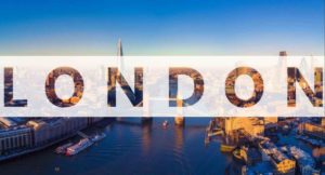
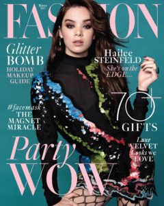
These three images inspired me to make my designs. I came across the first two images when I was searching through PhotoShop edits. The reason why these images stood out to me was how both of them have manipulated the subject of the work. The designer’s have chosen a specific perspective to show the main picture through whether it be through a completely different image or through text. I wanted to learn and understand how to do this in my own work and use it in other areas in this module, as well as the other modules in this course. The third image is part of a big ‘umbrella’ of magazine covers. Many magazines place their mastheads behind their model. They do this because they know that their target audience are aware of about their publication. I was inspired by this idea, therefore incorporated it into my design but in a different style. In the future, I would like to explore this topic; constructing magazine covers and magazines in general. However, I know that a text like a magazine should be ideally made in Indesign.
Reflection
I improved my skills in using the different layers efficiently; photograph editing; using tools such as the eraser and selection tool and experimenting with opacities. I have realised that there are multiple ways to do one thing in Photoshop – some are easier than others. However, each skill/tool results in a different finish.
I feel like I need to improve more on image manipulation and how I can combine images in different ways other than collages and blending. The next thing I want to work on is blending 2 images in a linear manner. For example, combining 2 faces together, using one side from each individual. To further develop my skill set, I want to practice using the different background removal tools such as: the eraser tool, quick selection tool and the object selection tool with different images varying in complexity.