Category: Editing images

Exploring Photoshop tools to improve existing images

Design Ideas and Design Process:

For this chosen task ‘Editing Images’, I created three images that presented a change from the original. My first design focused on editing colours within an image to change them from their original or natural state. This would make them stand out and could be used for a number of reasons. However, the two designs that were more confident and ambitious focused on removing parts of an image to improve the attention on the desired focal points and, therefore, the overall compositions. But my most confident image also focused on changing colours to draw and remove a viewer’s attention. Editing images is the primary function of the Photoshop software, so choosing this task was inevitable as it allowed me to enhance my skills with the software overall as well as learning new functions within it. I began the task aiming to create three images that successfully demonstrated a change from the original; either to create a sense of surrealism, draw attention to a specific part of the image, or to simply improve the composition of a photograph.

Design 1:

Figure 1: My first completed image for this task. Involving an anatomical diagram.

For my first image in this task, my approach was to change the colours within an existing image to draw attention to a specific section of it. I began by finding a suitable image that could be edited for a specific purpose. I aimed to edit the colours in a specific area of an image to give it significance and possibly have an educational purpose. This would stand out against the rest of the image by making it black and white elsewhere. Therefore, I chose an anatomical image as often these types of images are labelled or used for demonstrations in an educational setting. For me to create this image (shown in Figure 1) successfully, I investigated different techniques in changing colours within an image. The most effective for a simple image was by using the Hue and Saturation adjustment layer within Photoshop. To begin my design process, I first opened the raw image in Photoshop (Figure 1.2). I decided the area I was going to highlight was the pectoral muscles as they were in view on both figures shown in the image. I then utilised the Hue and Saturation adjustment layer to change the colour of the image to an unrealistic blue tone (Figure 1.3). This stood out from the original red tones. Next I edited the layer mask which was a new skill for me as I had never explored the function before. I used the brush tool to paint in black on the layer mask so that only the areas of the muscles I wanted were affected by the Hue and Saturation adjustments (Figure 1.4). I tested different hues further and eventually changed it back to a red colour so that it followed the themes of anatomy which were present in the original image. However I shifted towards a brighter red hue and increased the saturation to make it pop from the rest of the image (Figure 1.5). I found that the selected muscles could have stood out more so I developed the image further by changing the rest of the body to black and white. This encouraged me to use a similar technique to before which meant adding a black and white adjustment layer and masking out the areas I didn’t want to include by using the brush tool on the layer mask (Figure 1.6). To complete the image, I adjusted the contrast so it wasn’t too bright and affecting the image quality. I finalised it by adding labels using the text and line tools to point out the highlighted areas and put a name to them (Figure 1.7).


Figure 1.2: Opening the image in Photoshop.


Figure 1.3: Changing the hue of the image.


Figure 1.4: The hue area on the masked section.


Figure 1.5: Experimenting with the hue and saturation to make a red area.


Figure 1.6: Adding a black and white adjustment layer.


Figure 1.7: Adding labels and lines.

Design 2:

Figure 2: My second completed design including a primary photograph with a subject removed.

For my second design during this task, I wanted to remove a subject from an image to move the focal point or attention away from it. In this case, I wanted to use a primary image because I had a number that were suitable for these techniques. I chose an image of a street which originally had a person on the left hand hand side. I aimed to remove this figure to draw attention to the landscape and centre the attention onto the mountain in the background with the leading lines which already existed. In order to create the image shown in Figure 2, I had to investigate techniques in removing parts of an image. I therefore investigated the clone stamp tool and the healing brush tools. To begin my design process, I began by opening my selected image in Photoshop (Figure 2.1). I decided I was going to remove the person on the left hand side because it was a large figure and obstructed lot of the image. It mainly drew attention away from the background and the mountain in the distance which was the most interesting part of the image. I began using the clone stamp tool to remove the person from the shot. I did this by alt-clicking to select an area I wanted to copy and then dragging my cursor over areas I wanted to replace to cover it up using existing parts of the image (Figure 2.2). Eventually, I fully removed the figure by using the clone stamp tool but it left an area that could’ve looked much smoother and more seamless (Figure 2.3). To develop the image further and improve my use of the software I cleaned up the area where the person had been previously by using both the clone stamp and healing brush tools in similar ways to each other. This made the image look more realistic as if there was never a figure in the foreground (Figure 2.4). Next, in order to make the image feel more complete, I experimented with things like saturation and levels to create a more accomplished composition. I also increased the vibrance and decreased the contrast to make the sky stand out more. This creates almost a set of leading lines which moves the viewers attention to the mountain in the distance (Figure 2.5). To finalise the image editing process, I added shadows and lighting to the pavement using the brush tool. I lowered the hardness of the brush and the opacity of the layers so it looked softer and more natural. This completed my image and made it feel more natural overall (Figure 2.6).

Figure 2.1: Opening the image in Photoshop.


Figure 2.2: Using the clone stamp tool to remove a subject from the image.


Figure 2.3: Person fully removed from image using clone stamp tool.


Figure 2.4: The remaining area after being cleaned up.


Figure 2.5: Experimenting with colours and vibrancy.


Figure 2.6: Adding shadows and lighting to the pavement.

Design 3:

Figure 3: My final edited image which involves edited colours and parts removed.

For my third design, which I used as my final, most successful design, I wanted to remove parts of the image that took attention away from the focus of the mirror and the scenery. I also wanted to lighten and darken parts of the image to transfer a viewer’s attention towards a specific part of an image. I again chose a primary photograph to edit because it had an appropriate layout. Throughout this design process I wanted to experiment with the dodge and burn tools to create a change from the original. I began the design process by placing the appropriate image in Photoshop (Figure 3.1). Next I cropped it slightly and edited the rotation to make it straighter and so it followed the rule of thirds more effectively (Figure 3.2). To develop the image, I used the clone stamp tool again to remove parts of the image within the mirror. I think it makes the image look more pleasing because it removes distractions (Figure 3.3). When I began editing the image colours, I started by using the burn tool on the mid-tones of the image. I applied it over the hill background to make it darker and draw attention away from it (Figure 3.4). Next I used the dodge tool on the highlights of the image. I was able to experiment with a higher exposure to make the mirror area of the brighter and therefore make it more of a focal point (Figure 3.5). To complete the composition, I edited the contrast of the image to make the mirror stand out further. Adding the contrast adjustment layer also improved the colours in the overall image, making it feel more dynamic (Figure 3.6).

Figure 3.1: Placing the image in Photoshop.


Figure 3.2: Cropping and straightening the image.


Figure 3.3: Using the clone stamp tool to remove parts of the image.


Figure 3.4: Using the burn tool.


Figure 3.5: Using the dodge tool.


Figure 3.6: Adding a contrast adjustment layer.


Software Tutorials:

The software tutorials I used helped me with various editing techniques within the Photoshop software. I already had some previous experience with Photoshop, however it covered only basic techniques and common processes. I used a tutorial I had found to secure my knowledge with layer masks because I had previously never used masks to make selections. After following this tutorial I was able to apply adjustments to selected areas rather than whole layers. Consequently, I was able to create my first design from this knowledge. It made the design process much faster and more accurate than my previous techniques which would have involved using direct selection tools to select a certain area and then duplicating them to edit in a new layer.

I used this tutorial to learn how to remove unwanted objects from an image. It simply stated how to use the clone stamp tool and spot healing brushes to retouch an image. This was a crucial skill for my second and third designs which required me to erase parts of images and replace them to make it look more natural. I was then able to create seamless removals of details or people in my second and third images. I was able to reassure my knowledge in using the clone stamp tool by following  this tutorial too.

Another tutorial I used was able to teach me the crop tool effectively. Although I previously knew how to use the crop tool, I was unable to optimise its use. This tutorial allowed me to improve my third image and make it different from the original by cropping it and then rotating it using the given grid when in the tool interface. I then was able to use the rule of thirds and created a more accomplished image.

I was able to use this tutorial to find ways of changing the colours in an image. I vaguely knew about the hue and saturation adjustment layers previous to seeing this article but this showed me how they could be used to brighten and even change colours completely. This was very useful for my first image in this task which required a drastic change in image colours to highlight something specific.

By using a tutorial on the dodge and burn tools, I was able to see how the tools could be used to edit an image’s colours. I had never used these tools in previous design work so this tutorial was extremely helpful in enhancing colours in areas I wanted to highlight whilst also darkening areas I wanted to set back. This became extremely useful in my final, most confident design which used both of these tools effectively to make the mirror stand out from the scenery without removing detail.


Design Resources and Articles:

I found the design article below on enhancing colours in Photoshop. Although I didn’t follow the steps provided, I was able to take inspiration from the given example within the article which showed enhanced and more vibrant colours after editing an image. This helped develop my ideas for my second and third compositions which went on to use various techniques to brighten areas of an image and increase things like saturation and vibrancy. This source also displayed successful edits which improved the look of the sky in an image. I was able to take direct inspiration from their example to improve my second image which had a vibrant sky in the distance.


Learning Throughout the Module:

Throughout this module, I was able to develop various design skills in Photoshop. On top of this I was also able to work with InDesign, Illustrator and After Effects. I improved my knowledge of the software overall and became more efficient when getting the effect I desired. Some skills I developed include:

  • Enhancing colours using dodge and burn tools
  • Cropping an image to make a more effective composition
  • Using adjustment layers effectively for various purposes
  • Making use of layer masks to make adjustments to selected areas rather than complete layers
  • Creating projects in After Effects
  • Animating text with combinations of animations
  • Combining letterforms in Illustrator
  • Creating coherent designs from initials
  • Building tables from scratch in InDesign
  • Editing table design elements to make more visually aesthetic tabular content


Editing Images

Photoshop Task – Editing images, Spring Term

The best software for editing images is no doubt Photoshop, there isn’t really any other software that provides tools for editing images like Photoshop and is the industry standard for editing images.


Fundamentals of Image editing:

  • Removal of objects from the background
  • Lighten/darken parts of an image
  • Changing the colour of parts of a photo


Design ideas and design process

For this design, my idea was to develop my image editing skills. I used two images to create this design, both of of Pixabay (a copyright free image library). I decided to not touch the background, to try and blend the horse and the cowboy in to the background rather than blending them both in together as it’s more of a challenge. The two pictures below is what I used to create the design.


Figure 1
Figure 2


Figure 3

To mask the horse, I used Photoshop’s AI tool, the object selection tool. However I was just trying it out and wouldn’t recommend using it because it didn’t do a great job of masking and I had to go over it with the eraser and lasso tool.


Figure 4

Create a perspective, to do this, find a light source and use your imagination to fit the subject into the background to make it look as realistic as possible. You also want to make sure that your subject looks like its well balanced and standing up well to create the illusion that you haven’t just stuck an image on a background.


Figure 5

Add a temporary desaturate layer (lets you see better), then play with the curves until the subject blends in with the background.


Figure 6

I used a Selective layer and turned down the black to -100% in every colourful colour (e.g. red, blue, yellow) and turned it up in white, neutral, and black to +100%. The reason to do this is to get information on the saturation levels in the image. Then as I did with the curves, play around with the saturation until it’s as dark as the background.


Caption 7

I then deleted the desaturate layer, added a shadow to help with the perspective and the design was finished.


Software tutorials

The tutorial that helped me the most to help develop the design above was this one: 10-Step GUIDE: Blend Images and Create Composites with Photoshop. A one hour in depth tutorial that really helped, and taught me a good range of tips to help improve my designs. For example, I found that desaturating the layer tip very useful. It not only saves a lot of time eyeing it up to blend it in, it also blends in the design really well for you.

I want to develop my colour matching skills further in Photoshop as I feel like you cant stop getting better at it and it can really make your designs stand out from other people as it is quite an advanced skill to learn.

Additional helpful tutorials I used:


Design resources and articles

When researching, I found these articles interesting and helpful:

I find it fascinating that there are many ways to edit images in photoshop. The two articles above are about light matching for composites and how to merge images together. As much as I found them interesting and helpful, I don’t think I learn as much from them as I do with tutorials. I feel like I can pick up on skills much faster when someone is basically talking to me step by step and I can always replay it if I missed a bit. However with articles I feel like I need to fill in the blanks sometimes and the images aren’t as helpful as a video because they are always missing something important like where a tool is for instance.

These articles did help me with my design ideas though. The first article gave me the idea to not touch the background so I can focus on developing my skills with modifying the subject to match the background. I’m glad I did it that way instead of just playing with the brightness and contrast on both layers until they looked the same, because this outcome will always look better if you take your time with it and go into detail.


Learning throughout the module

Skills I have learnt and developed throughout the module:

  • Developed idea generation
  • Learnt basics of digital illustration and vector shapes
  • Developed skills with image editing
  • Developed typography and layout skills
  • Developed time management skills


Photoshop

I am most confident with this software, and feel happy with where I am at with it. I want to keep developing my colour matching skills, because after learning more about it I think that they are a very important skill to master to become a good designer. I am happy that I developed my image editing skills as well especially with lighting and colour.


Illustrator

I am happy with my progress in Illustrator, I got a lot more familiar with the software and feel more confident with creating vector shapes to form a design. Overall, I think that I improved a lot with this software.


InDesign

InDesign was the software that I was least confident with at the start of the module. I’m glad that I got an extra week to work on the skills for it. I improved my skills in formatting text and layout, and formatting tabular content. I feel a lot more confident using the software than I did at the start of the module, I am also happy that I can use the tools it provides effectively.


Modifying Images in Photoshop

Design Ideas & Design Process

I approached this task with the goal of learning how to use more tools in the software. So, after some research, I had ideas to develop, tools to learn and skills to master.

Design 1

Figure 1 – Final edit 1

Like many others, there are countless photos I have taken that include an object or person that just ruins it, the original photo from this design being one of them. In instances like this, once you remove the item that feels like it doesn’t belong, it gives off a much more peaceful feel. So, my aim for this edit was to seamlessly remove the sign from the image.


Design 2

figure 2 – final edit 2

As someone who loves flowers, I have seen lots of different types and colours, but very rarely do I see blue ones. The fact that Photoshop has the ability to edit the colour of specific sections of images is fascinating to me, so after some research I developed the skills of how to do this.


Design 3

figure 3 – final edit 3

This idea stemmed from visiting a Mini car dealership. Their cars can be seen as if they’re driving up the walls and I wanted to replicate this in my work. To develop the idea, I selected an image of a skyscraper to give a much more dramatic feeling and to ensure this was the sole focus of the design.


Software Tutorials

Design 1

Figure 4 – Original image

Figure 5 – Close up of edit

figure 6 – retouching layer

The use of the clone stamp tool is how my design went from the original image (Figure 4) to the edited version (Figure 1). I used a portion with similar pixels as my sample area and covered the sign with duplicates. Different brush sizes really helped me achieve the result as they allowed me to be precise with my placing. With the background not being consistent, I had to take multiple sample areas to conceal the sign. This raised some challenges as this was not covered in tutorials I watched, but I solved them by using great attention to detail. I would like to develop this skill further in terms of accuracy as the tree trunk is not completely straight and there is some obvious repetition.

https://helpx.adobe.com/uk/photoshop/how-to/clone-stamp-remove-object.html


Design 2

figure 7 – original image

figure 8 – use of eyedropper in hue

figure 9 – refining the background

figure 10 – use of curves

After following tutorials, I learnt that the first step was to add a hue to certain colours using the eyedropper tool (Figure 8). Then, to erase the unwanted colour changes, I used the brush tool in black and white. As seen above, I paid close attention of the finer details of the flower outline to create a realistic result (Figure 9). Once I was happy with these refinements, I experimented with a curves layer to add some depth to the image (Figure 10). Although I was careful with editing around the flower, a skill I would like to further develop is ensuring no original colour comes through. I will experiment with different brush types as I think ones with soft edges don’t help this matter.

https://helpx.adobe.com/uk/photoshop/using/replace-colors.html


Design 3

figure 11 – original image
figure 12 – use of object selection tool

figure 13 – adding layer mask

The efficient way I did this was using the object selection tool. This selected the car and once I added a layer mask, the car had been cut out of the image. I had to research further about how to refine the cut as it was not as smooth as I had desired. After this edit, I placed it on top of the background image and that was my edit completed. Technically, this edit is not the strongest I created as the image cut is not perfect, meaning this is a skill I would like to improve on in the future.

https://petapixel.com/2020/04/08/how-to-make-photoshops-object-selection-tool-way-more-precise/


Design Resources & Articles

Design 1

After looking into lots of tutorials and articles, this one stood out to me. I came away with multiple ways to approach the task of removing a defect from an image. This really helped develop my idea generation as I knew the capabilities of the software, and therefore could select an appropriate image.

https://helpx.adobe.com/uk/photoshop/how-to/photo-retouching-basics.html


Design 2

My inspiration for this design was the idea of colour psychology. This refers to the emotions that certain colours convey. I researched into what each colour could represent but made the choice to use blue as it has connotations with calmness, an emotion also related to flowers. It is also a contrasting colour to the warmer colours like yellow and pink in the image, meaning it stands out effectively.

https://www.verywellmind.com/the-color-psychology-of-blue-2795815


Design 3

Harry Fairbairn MINI (Inverness) | Car Dealership | Arnold Clark

figure 14 – Mini car dealership in inverness, Scotland

Linked below is an article that explains some of the advertising choices behind placing MINIs on the walls of their buildings. This reading really emphasises the lengths the brand has gone to so I decided to reflect that in my work by selecting the type of building that is taller than everything, a skyscraper.

Learning Across the Module

Personally, I would say my knowledge in which software to use for certain tasks has improved tremendously, along with combining softwares for desired outputs.

  • For InDesign, the design skill I developed most was how to use grid systems for even layouts.
  • For Photoshop, my overall skill in manipulating images to look a certain way has improved, but in particular my ability to edit positioning of pixels to give off a different impression.
  • For Illustrator, I have a wider skill set thanks to this module, especially when it comes to the amount of tools I know how to use and what situations to use them in.

In regards to my quiz results, a skill I gained over the course of the module is the ability to set up documents correctly for both digital and print purposes. I still need to develop my skills in file and font formatting as I have not come across these a lot. Also, I need to further revise settings for importing and scanning images.

Retouching images

Design Ideas and Design Process

For this task, I wanted to solely remove people from images. I wanted to get a feel of home, so wanted to retouch images of Cornish beaches. The image above is the final result from St Ives (a notoriously busy holiday spot). Often, my family will hand me photos to edit so this task was useful for me as it was a highly transferrable skill that I can use in my day-to-day life. I started by gathering my royalty-free images from UnSplash here are the before pictures below.

As a whole, the design process was quite straightforward once I had my images and had watched some tutorials. The general process for each image was to use the spot blemish tool to remove people from the images. I started with the St Ives image, this was solely getting rid of the families in the image. Next, I wanted to challenge myself more with the Porthcurno image. For this image I removed the surfers, this was relatively straightforward, although one of the surfers was in an awkward position on the wave which meant playing around. After that, I adjusted the levels and curves in the image, this made the tones stand out more without overexposing the image. I then added a photo filter to tie it together. Lastly, I wanted to use these tools and try some other tools I was not as comfortable with, in particular, the burn tool. I followed the same process as the previous images, removing people, adjusting levels and curves. The Fistral Beach image had a lovely orange tone in the sky which I wanted to stand out more. I experimented with the burn tool to make it stand out more, and make the clouds more prominent. I used the burn tool with large brush size, low density, and decreased opacity. I then used the sharpen tool to make the lone surfer stand out and extenuate the horizon.


After Retouching

Software Tutorials

The main tutorials I followed were supplied which I will link at the end of this section. I found most of these tutorials useful and relevant to my task. They helped me develop my skills by using the spot blemish tool, dodge and burn tool, sharpen tool, and so on. I used some of my own knowledge to adjust levels and curves. The tutorials gave me the confidence to apply these skills within my work. The additional link below was a useful gateway to other tutorials, this gave a wider insight into retouching images, more to do with modeling i.e. removing a blemish and evening skin tone, or changing eye or hair colour. I would like to venture and try out these skills despite having a stance on retouching faces and bodies due to the harm it causes. That being said, it would be interesting to have a better understanding of the software and how to use it for other purposes.

https://helpx.adobe.com/photoshop/how-to/photo-retouching-basics.html

https://helpx.adobe.com/photoshop/how-to/crop-straighten-to-improve-composition.html

https://helpx.adobe.com/photoshop/using/retouching-repairing-images.html

https://helpx.adobe.com/photoshop/how-to/clone-stamp-remove-object.html

https://helpx.adobe.com/photoshop/using/content-aware-patch-move.html

https://www.youtube.com/watch?v=Hg1WS_yOcHMhttps://www.youtube.com/watch?v=_A5XZPnzOP0

https://helpx.adobe.com/photoshop/how-to/replace-background.html

https://helpx.adobe.com/photoshop/how-to/photoshop-sharpen-photos.html

additional:

https://www.photoshopessentials.com/photo-editing/

Design Resources and Articles

These articles and resources were useful with the wider knowledge that was included. The second link is a gateway to more articles and resources for tips etc. This was the most useful additional resource that I found. The adobe link helped me with my designs as it showed the fundamentals that I needed to get started.

https://helpx.adobe.com/photoshop/how-to/photo-editor.html

https://fstoppers.com/category/photoshop

Learning Across the Module

Across the module, I feel a lot more confident in using the software. I feel that I can confidently format text and utilise paragraph styles, which was my area of improvement in Autumn Term. Specifically, retouching images using particular tools is something I am now very confident in. I enjoyed creating the letter logo in Illustrator as this was one of the areas I missed in TY1DP1, it gave me the opportunity to edit letterforms in Illustrator which isn’t something I have tried before. I could improve on my time management skills and idea generation, however, I do feel that I have improved marginally from Autumn term.

Enhancing with color

Design Ideas & Process

Editing images is a huge field in photoshop as it is basically the whole concept of the software. I explored different ways to edit and change pictures using the most tools in the least amount of time. I chose to enhance my images with adding colors and changing all types of tones. I started my photoshop task aiming to develop my skills on working with color and I set out a plan to be able to change the color of all images using blending modes


Design 1


I wanted my first edit to be believable and admirable. It was basically a deformed picture, as if on purpose, of a young boy in black and white (Figure 1). I tried to achieve a clean picture that would be realistic. At first, I got rid of the big white gaps on the left side of the picture (Figure 2). I tried using the spot healing brush tool but I didn’t succeed with big gaps. I used this tool with small gaps only it went perfectly well after changing the scale of the tool (Figure 3). For the big gaps however, I used the stamp tool (Figure 4). I took the color nearest to the white gaps and tried to fix it slowly so the image wouldn’t look deformed. After healing all the white gaps in the image (Figure 5), I decided to enhance my image with colors. I colored the boy’s face with a brownish color based on what I thought he would look like (Figure 6). After trying different modes, I settled on the color blending mode for his face. Then, I colored his mouth and teeth. I used the soft light mode for these features because they looked more natural (Figure 7). Finally, I colored his eyes also using soft light mode, and his shirt using color blending mode. I felt that his eyes were kind of dark brown and his shirt had a light color which I assumed was bluish (Figure 8)


Figure 1 (Black and White Image)

Figure 2 ( Removing the big gaps)

Figure 3 (Using the spot healing brush tool on small gaps)

Figure 4 (Removing the big gap with the stamp tool)

Figure 5 (Image healed)

Figure 6 (Using color blend mode for the boy’s face)

Figure 7 (Using Soft light blend mode on teeth and mouth)

Figure 8 (Final)


Design 2


I wanted to learn everything new for my second edit. I searched for what I can do with photoshop and I saw the auto blend tool and wanted to know what that is. At first I took a random image of a guy with headphones on. I decided to take a selfie and replace this guy’s face with mine (Figure 1). I regret not taking a better image but the important thing is that I know how to use the tool. At first, I self selected my self on photoshop (Figure 2), and I cropped my face. Then, I placed my face on top of the guy’s face on photoshop (Figure 3). After that, I used the match color tool, which is new for me, and I changed my colors to match the guy’s colors (Figure 4). Then, I decreased the luminance and changed the color intensity (Figure 5). I contracted the face’s selection so it wouldn’t take the darker tone of my face (Figure 6), and I changed the levels of color for the image (Figure 8). I used the auto blend tool (Figure 9), and viola. Photoshop did it’s job well in my opinion (Figure 10). I decided to change the beard because it looked fake (Figure 11), and I tried removing the glasses from my face. Unfortunately, the eyebrows got in the way so I took the guy’s eyebrows which doesn’t suit me well.


Figure 1 (Taking a selfie)

Figure 2 (Self selecting)


Figure 3 (Adding my face to the image)


Figure 4 (Placing my features on the guy’s)


Figure 5 (Using match colors)

Figure 6 (Decreasing the luminance)


Figure 7 (Contract the selection)


Figure 8 (Changing the colors of the image)


Figure 9 (Auto blend the image)


Figure 10 (Looking good)


Figure 11 (Changing the beard)


Design 3


For my final Design, I wanted to experiment with colors to the maximum. At first, I got a black and white image (Figure 1) that felt so real. I was shocked and amazed by the guy’s ability to show me emotion without motion. Then, I painted his skin color and tried moving around with blend modes to see what suits him best (Figure 2). I used specific brushes to color the skin part that was narrower and had hair in (Figure 3). After that, I painted the mouth with the color that suited an old man’s mouth (Figure 4). I didn’t like his skin tone so I changed it several times so it would suit him (Figure 5). I decided to color the eyes, which was the hardest part, and I wanted to go with an unrealistic eye color (Figure 6). I used several modes and layers for the eye to make it pop and speak up (Figure 7). I added layers of blue and used the overlay blending mode to make it less attractive (Figure 8). Then, I painted the shirt with blue because it suited the level of grayness in the picture (Figure 9). I decided to decrease the level of blue because it looked odd after many trials of blending modes (Figure 10). I colored the suit with a reddish color because I wanted to make a diversity in colors (Figure 11). After that, I added a layer of light on top of everything because I saw light coming from the right side (Figure 12). I used the divide blending mode and added more light to the right side (Figure 13). Finally, I used the burn tool to add some dark layers on the left side and make it more realistic (Figure 14).


Figure 1 (Black and white image)


Figure 2 (Using color blending mode)


Figure 3 (Using different brushes)

Figure 4 (Painting the mouth)


Figure 5 (Experimenting with colors)


Figure 6 (Coloring the eyes)


Figure 7 (Using color blending mode for some layers)


Figure 8 (Using overlay mode for blue layer)


Figure 9 (Coloring the shirt)


Figure 10 (Trying a lighter blue)


Figure 11 (Coloring the suit)


Figure 12 (Adding shades of light)


Figure 13 (Using divide blending mode)


Figure 14 (Adding some burn for contrast)


Software Tutorials

Because I had basic knowledge using the selection tool and cropping out stuff in photoshop, I decided to try new tools and experiment with everything. I lacked skills with coloring before, so I searched for tutorials that provided that. I wanted to show a level of professionalism in coloring.

For the first design, my purpose was to only remove the gaps at first. It was so much harder than I thought it would be. I used this Tutorial on how to use the stamp tool. Before starting, I was under the impression that the stamp tool was the only tool to use for this process but I was wrong. For that, I searched on how to remove the small gaps in a faster way. I found out that I should use the spot healing brush tool for the small stuff. It worked very well and I understood how both tools work properly and how they compliment each other in an indirect way. For the second design, I used  this Tutorial  to do the whole thing. I tried to move on step by step and I succeeded. My main problem was that I used a bad selfie image for my design. I tried to make the best of it and it turned out fine but it seemed fake. I was so proud of myself for using the auto blend tool and making all the image colors look alike. The coloring and editing wasn’t the problem and that was my main goal.

For my final design, my purpose was to color the whole image and make it look very realistic. I used this Tutorial mainly and tried to follow it even though I had a different picture. I wanted to become good in blending modes and I think I did. The tutorial helped me understand adjustment layers and how I can change the details of every picture with a tiny little adjustment. I was able to use different brushes and I focused on the details of the image. I colored it with more layers that my first design. I can say I’m proud of myself for achieving the goal I had in mind.


Design resources and articles

Inspiration 1


Inspiration 2


Inspiration 3


My inspiration for my designs were these 3 main images. In the first image, I was amazed by the level of precision in colors. The image was very suited to be colored and I can feel like a grain effect coming out of it. The designer wanted to show that the picture was old. The second image however, I was amazed by the shades and the lights. The designer was able to portray a good and believable level of brightness. He also added shades to show contrast and the girl’s skin tone was on point. The third image speaks for itself. The designer was able to swap faces of two random girls while keeping the same level of color. Although the girl’s chin was way wider because of her expression, the designer was able to perfect it and it didn’t look deformed at all.


Reflection

By doing this task, I was able to understand colors on a different level. I can see now how people convert old movies into colors. The best thing about this task is that everything was fun in it. Time passed by so quickly and I enjoyed the whole process. I feel like my photoshop skills developed in the kind of way I want them to.

Now that I look at all the designs that I did, I can safely say that I can do much better in all of them. I will definitely work more on my photoshop skills and I’m relieved that I learned many tools and improved a lot in this module.


TY1SK – Spring Tasks

Design Ideas and process

I believe my most successful task was the photoshop tasks, I tried a few including Combining multiple images, using select and mask tools, changing the image in the background and combining black and white with colour. My most successful task was using the select and mask tools to combine an image of a busy street and elephants to create a single image of the elephants walking along with the people. I started by overlaying the elephant image over the street image then selecting the marquee tool, clicking select, select and mask, then using zoom, the quick select tool and refine edge brush tool to cut out the elephants then resizing them to fit on the street.

Overlay elephant image onto background image
Choose select and mask
Enlarge the image
Use quick select tool and refine edge brush to cut out elephants
Final image
Combining images
Select and mask
Combining black and white with colour

Software Tutorials

For the illustrator task I used tutorials that warp text into custom shapes, how to change text, size and colour. They helped me to learn simple skills and ways to manipulate text into shapes and further on. To develop my illustrator skills further I would like to look at more advanced ways of manipulating text and more creative ways of combining them. To develop my learning for letter logos, I developed my understanding of ways in which to form them and create them in order to give me a wider range of outcomes (https://www.youtube.com/watch?v=TQUrVwzMWXE). For the photoshop tasks I used tutorials to select areas to remove a background, how to use layers and masks.They helped me to learn skills I had either not yet tried or wanted to recap over, I was able to create images that I was happy with. I feel to improve my skills on photoshop I need to be more ambitious with my designs and really push myself. I watched this additional video/ tutorial on using a layer mask, which I found helpful in teaching myself the steps to the final product (https://www.youtube.com/watch?v=yQsYziKvx9c) For the Indesign tasks I used tutorials on making tables and flyers and also learnt how to make a hyperlink for my files. To improve my skills I should watch more tutorials and practice making more flyers as well as other layouts in the software and broaden my knowledge to the differences they oppose. I watched a video on flyer design to give me more inspiration for design and visual flare within a flyer layout and how I could make my design stand out (https://www.youtube.com/watch?v=3aT66tMPx5s). I’d like to develop all my skills further on Illustrator, photoshop and Indesign by pushing myself more, watching more videos and practicing more varied and previously learnt skills.

Design Resources and articles

To develop my design ideas I looked at a broad range of articles, examples and step by step guides to create outcomes that challenge my skills and broaden my knowledge of the softwares. From Learning about layout in indesign adobe articles (https://www.adobe.com/uk/products/indesign.html?mv=search&mv=search&sdid=LCDWTLJX&ef_id=Cj0KCQiAmpyRBhC-ARIsABs2EAqKbPv8AiQ16zLNVnNYKe7KJWemY80ndBuxbQiQrS9TB4PHASLvsaAj5uEALw_wcB:G:s&s_kwcid=AL!3085!3!520877072614!b!!g!!%2Bindesign!1422700472!55325978309&gclid=Cj0KCQiAmpyRBhC-ARIsABs2EAqKbPv8AiQ16zLN-VnNYKe7KJWem-Y80ndBuxbQiQrS9TB4PHASLvsaAj5uEALw_wcB) which encouraged me to really test how layouts can best be used for certain information, to looking at Pinterest for examples of letter logos for inspiration, this creating ideas in my head of the type of designs I could create (https://www.pinterest.co.uk/pin/832814156079697545/) And finally looking at step by step guides for photoshop to create contrasting images that can tell a story, the step by step guides were helpful in allowing me to take my time, have visual examples to follow and refer to, being a visual learner these are a lot easier to follow (https://helpx.adobe.com/photoshop/how-to/black-and-white-with-color-photo.html)

Learning across the module

Throughout the module I have improved with my knowledge of all software, enjoying some creative freedom on photoshop, whilst seeing some encouraging signs for myself that I’m growing more confident with the likes of InDesign and Illustrator, with a strong understanding of what each software can be used for and what its benefits are, as seen in my quiz result going from 90/150 at the start of the module to 120/150 at the end. On photoshop the use of may tools has enabled me to grow in confidence about what I can do and where I can go with my designs, whilst on InDesign my knowledge of character and paragraph styles, layouts and tables are encouraging in broadening my understanding of the software and how it works. Illustrator also enabling me to focus on some key issues I has, such as the manipulation of letters, along with the basic tools. I also experienced using adobe after effects where despite colour not playing on my side in the final uploads, the use of transitions and learning the software was an enjoyable experience. Overall it has been an enjoyable module that has encouraged me and enabled me to grow in confidence.

#NoFilter

Design Ideas and Design Process


First Image

First royalty free image, edited using Photoshop.
First original photo.

This is the first image I edited using Adobe Photoshop. I obtained a royalty free image online of a sunset and intended to use both tutorials provided and my own to brighten up the photograph. I began by pasting the image on a separate layer and experimenting with existing filters and the ‘liquify’ tool which enabled me to blur lines and make areas appear cleaner. On the adjustments panel, I further edited the contrast, vibrancy, brightness, exposure, hue and saturation to create a desired balance and make it appear more eye-catching than the original.


Second Image

Second royalty free image, edited using Photoshop.
Second original photo.

This is the second image I edited also using a royalty free image found online inspired by the famous red bus of London picture. I began by applying the black and white filter on the original image but found this darkened certain areas so solved this by altering the balance of brightness and vibrancy. I then pasted the original photo on a separate layer, ensuring both images were the same size so I could use the pen tool and cut around the bus. After removing the background, I layered the bus onto of the black and white picture and used the blending tool to make it appear seamless.


Third Image

Third photo edited on Photoshop using my own image.
Third original photo.

This is my third and final, yet favourite edited image, this time using one of my own photographs. This image consisted of aspects I didn’t like such as a used tissue and part of a phone screen on the table. I watched tutorials on how to use the clone tool and found the task of removing them to be much simpler than anticipated. I selected the desired layer and brush size to clone an area of table to repeat over the unwanted areas. This left me with repeated patterns looking unrealistic which I corrected using the liquify tool to adjust the lines and shadows.

   – Development

Below is the development and process to creating my final image.


1) Selecting my chosen image to edit and opening it as a background layer on Photoshop.


2) Unlocking the layer to edit freely.


3) Locating the clone stamp tool.


4) Choosing brush style and size.


5) Pressing option and creating a sample to clone over.


6) Tapping to clone across the sample over unwanted elements.


7) Holding option again to create a new sample for a different part.


8) Finally using the liquify tool to remove repeated patterns.


Software Tutorials


When starting, I knew the basic functions and tools Photoshop offered, including using tools like existing filters, shapes and type to change an image, however lacked understanding of using it at a more professional level, with better editing and the ability to remove things whilst still making the image appear realistic. I chose this task in order to improve this skill and to teach myself how to edit whilst watching both tutorials provided as well as ones I found myself.

Some tutorials I found useful from the list provided for my first images of changing colour include; https://www.youtube.com/watch?v=Hg1WS_yOcHM and https://www.youtube.com/watch?v=n9fwiNyDHLI as well as https://www.youtube.com/watch?v=x2Lf4cZcIok. These videos taught me the basics of how to use the colour correcting tools in the adjustments panel, such as brightness and exposure and showed me how to create a balance that was meaningful. I also researched and found that https://www.youtube.com/watch?v=cuy12EOEztg was in depth about hue and saturation which was easy to follow along.

In my third image of removing elements; I found https://helpx.adobe.com/photoshop/how-to/clone-stamp-remove-object.html, https://helpx.adobe.com/photoshop/how-to/photo-retouching-basics.html and https://www.youtube.com/watch?v=D7jf6MCVvmk&t=73s extremely useful as they provided an in depth understanding of the clone stamp and alternative methods such as the spot healing brush which was interesting to learn about to further develop my knowledge. I enjoyed how these videos were short and straight to the point whilst also being easy to follow along so I can apply the same principles to my own images.

Watching these tutorials really boosted my ability to edit confidently and helped me overcome difficulties I was facing when using Photoshop. I also found they aided my ability to design confidently and use tools I was first unfamiliar with. Even though with tutorials provided, I have increased my skills within the software dramatically, I think I would still benefit from learning more about the complex tools it offers (such as duplicating elements) which I hope to learn by watching more tutorials and practicing myself in my own time to design more professionally.


Design Resources and Articles


Additionally, from the resources provided, I found that for my first image, this article was extremely useful (https://helpx.adobe.com/photoshop/how-to/photoshop-sharpen-photos.html). This article explained how to sharpen areas to make it more defined, therefore when changing colours and altering balance, it would be more drastic. I also did some of my own research and found the ones that Adobe themselves provided were helpful. These include both https://helpx.adobe.com/photoshop/using/replace-colors.html and https://helpx.adobe.com/uk/photoshop/how-to/change-color-object.html which gave me an in depth understanding at a beginner level and then at intermediate with advanced tips to create a more professional image. I liked how they each described every element in the adjustments panel so I could understand what I’m really changing.

For my third image, which was focussed on removing elements, I found from the list provided that https://helpx.adobe.com/photoshop/using/retouching-repairing-images.html and https://helpx.adobe.com/photoshop/how-to/clone-stamp-remove-object.html were useful links when describing the uses and functions of the clone stamp tool and how to successfully apply it to my image. The steps in both of these articles were easy to follow along which I valued. In my own research for how to use the tools, I found https://expertphotography.com/clone-stamp-tool/ and https://www.lifewire.com/photoshop-clone-stamp-tool-tutorial-1697534 explained well what the tool actually did and how I could apply it. Furthermore, I read https://shootdotedit.com/blogs/news/how-to-use-liquify-tool-photoshop which showed me how to use the liquify tool to finalise the edit.

I also looked at pre-edited image to see how successfully others have used the tool, this allowed me to see the extent to which I should use it. These articles helped me to design effectively and also acknowledge me of the uses and functions of tools within the software that I could use when editing my images.


Learning Across the Module


Comparing both quiz results obtained at the beginning and end of the Autumn and Spring terms, I found that I have improved not only my knowledge of softwares but my confidence in being able to use them correctly. At the start of the Skills module, I only knew the basic fundamentals of each software, and had the ability to use simple tools such as type and shapes, but since undergoing the modules tasks every week, varying between Adobe Illustrator, InDesign and Photoshop, I have developed lifelong skills which will help me become a better designer and work more effectively as well as professionally in the future.

The tutorials I watched, really enabled me to understand each tool in depth and were easy to follow along, which I think played a large part in how I took in information to apply to my own work. Some of the greatest benefits I think I have received from this, is how to use the clone stamp tool, which I found to be much easier than anticipated as well as colour correction. I also have improved on precision using the pen tool in both Photoshop and Illustrator and understood the importance of hierarchy when designing which I think are all good skills to have. I feel like I can use all three softwares to an extent where I’m happy with. including editing images, sorting layouts and illustrating, but hope to continue building on this in my own time to further develop my ability.

Photoshop Editing Sunset

Photoshop Editing

To start my exploration with Photoshop I decided to visit the website Pexels.com which possesses many royalty free images that are allowed to be used. I knew I wanted to edit an image of a landscape or majestic setting as these type of images usually have a lot to edit, and depending on the surroundings, may make the effects that would be edited look more effective.

I decided to use the effects panel on Photoshop to play around with what I could manipulate, I discovered some great effects such as colour balance, hue/saturation, linear dodge, photo filter, and dissolve in which I incorporated into my design to display the effects that they would have on the image. As evident in the images I have inserted, the overall hue of the images are of a purple tint, in comparison to the rather naturally orange hue of the regular image. The overall image has been effected by the colour balance, turning almost every element in the image darker and of a slightly more abnormal colour to emphasise the effect and that it has actually changed the image’s properties. The dissolve feature had made the clouds especially pixelated, which could be seen as  a negative approach to showing the effects, but in this instance it works well to show the limitation to combining multiple effects.

Overall, I really enjoyed performing this task as it was a nicely comfortable session where not too much concentration was needed to create an image that shows off the capabilities of Photoshop and to see how “messed up” you could portray an image.


Exploring Photoshop

Explore, verb: travel through (an unfamiliar area) in order to learn about it

Software Tutorials

Coming into the Spring Term I’ve built on my knowledge and skills in Photoshop, Illustrator, and InDesign. I’ve also met new software along the way, After Effects, Adobe XD, and Premiere Pro.

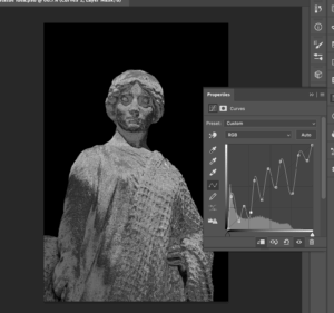
I have been exploring Photoshop in a more thorough way, rather than just an initial first look. For instance, the clone stamp tool is such a fundamental part to photo editing, but I didn’t even know it existed! Only by this in-depth exploration can I progress from just familiarity to a higher, more professional usage of any software.


Design Ideas and Design Process

Cutting Things Out

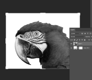
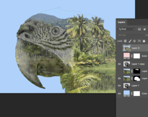
I started with the intention to change the background, following along with this given tutorial.

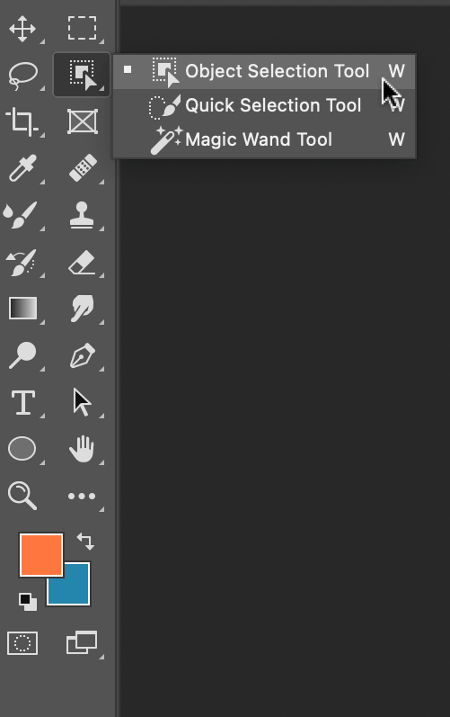
Previously I have used the ‘quick selection tool’, but the tutorial spoke about using the ‘object selection tool’. This was something that I’d never come across before, so I searched up how to use the this tool and came across this tutorial.

Firstly, I located the ‘object selection tool’, Figure 1, which was in the same place as the other selection tools. With the tool selected, I drew a box around the selected object, Figure 2. The computer then shrinks the line down to a shape it thinks you’re trying to select, Figure 3. This tool was pretty good at selecting most things, but I cleaned this up using the ‘quick selection tool’.

Figure 1
Figure 2
Figure 3
Figure 4
Figure 5  


By holding down the option key (⌥) you can toggle between adding a section or subtracting a section, Figure 4 & 5.

In the tutorial I was following, it also showed how to change the background to a black & white image. I kept the cut-out flower on another layer and applied the filter to the original image. This effect makes the foreground pop and is something that I would use again for photo manipulation.

Figure 6


Clone Stamp

I explored one of the given tutorials, which was a useful introduction to the ‘clone stamp’. It looked like magic, until you understood the logic behind it; of copying similar parts of the photo to erase unwanted sections. I used a photo of some ducks, Figure 7, to begin with.

Figure 7
Figure 8


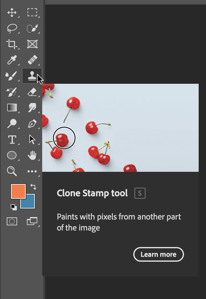
I created a new layer so that the edits could be toggled on and off. The ‘clone tool’, like the ‘object selection tool’, is located on the left-hand toolbar, Figure 8.

Figure 9 
Figure 10

To choose which part to copy, hold down the option key, and you will notice that the cursor changes to a circle with a cross inside it, Figure 9. The selection is the part of the image which you are copying. When pasting this new selection, a small cross, Figure 10, shows you where this information is being copied from.

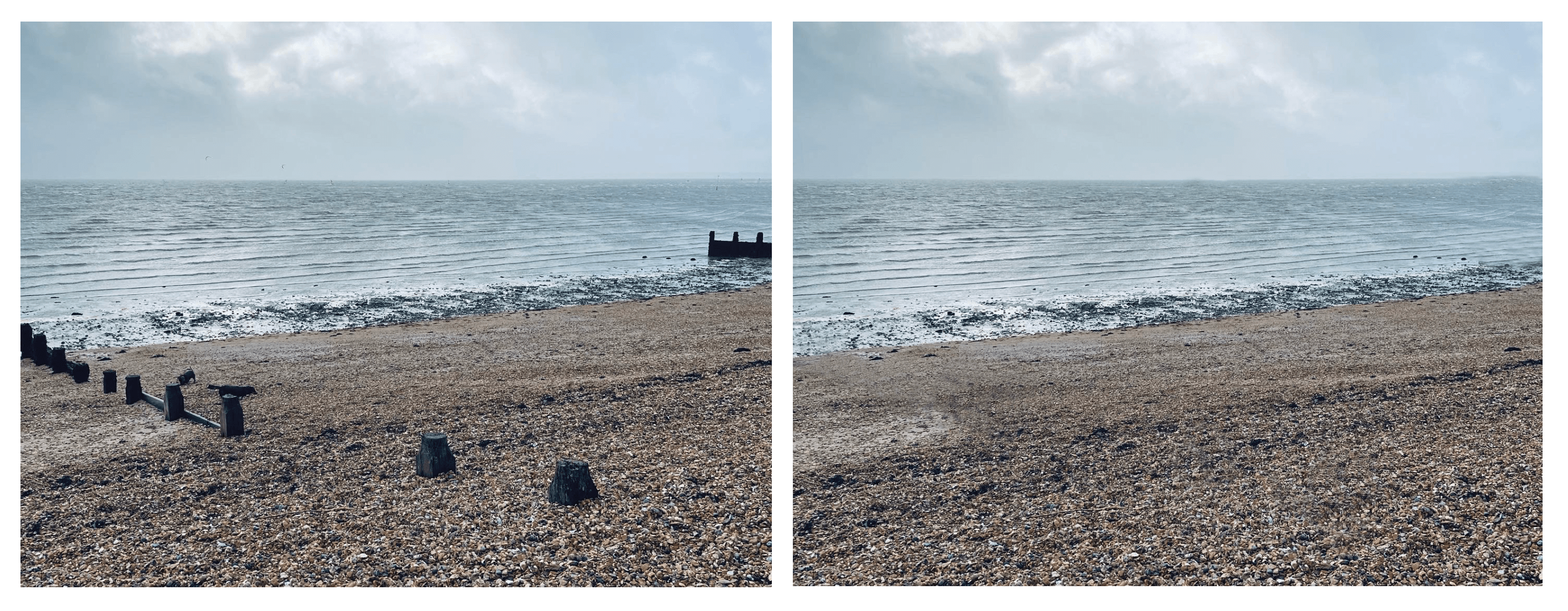
I  put this into practice and edited out some unwanted parts of a picture I took at the beach. I removed the dogs and wooden structures by copying other parts of the photo. I think it is successful because it’s done seamlessly, you can’t tell that I’ve copied other parts.
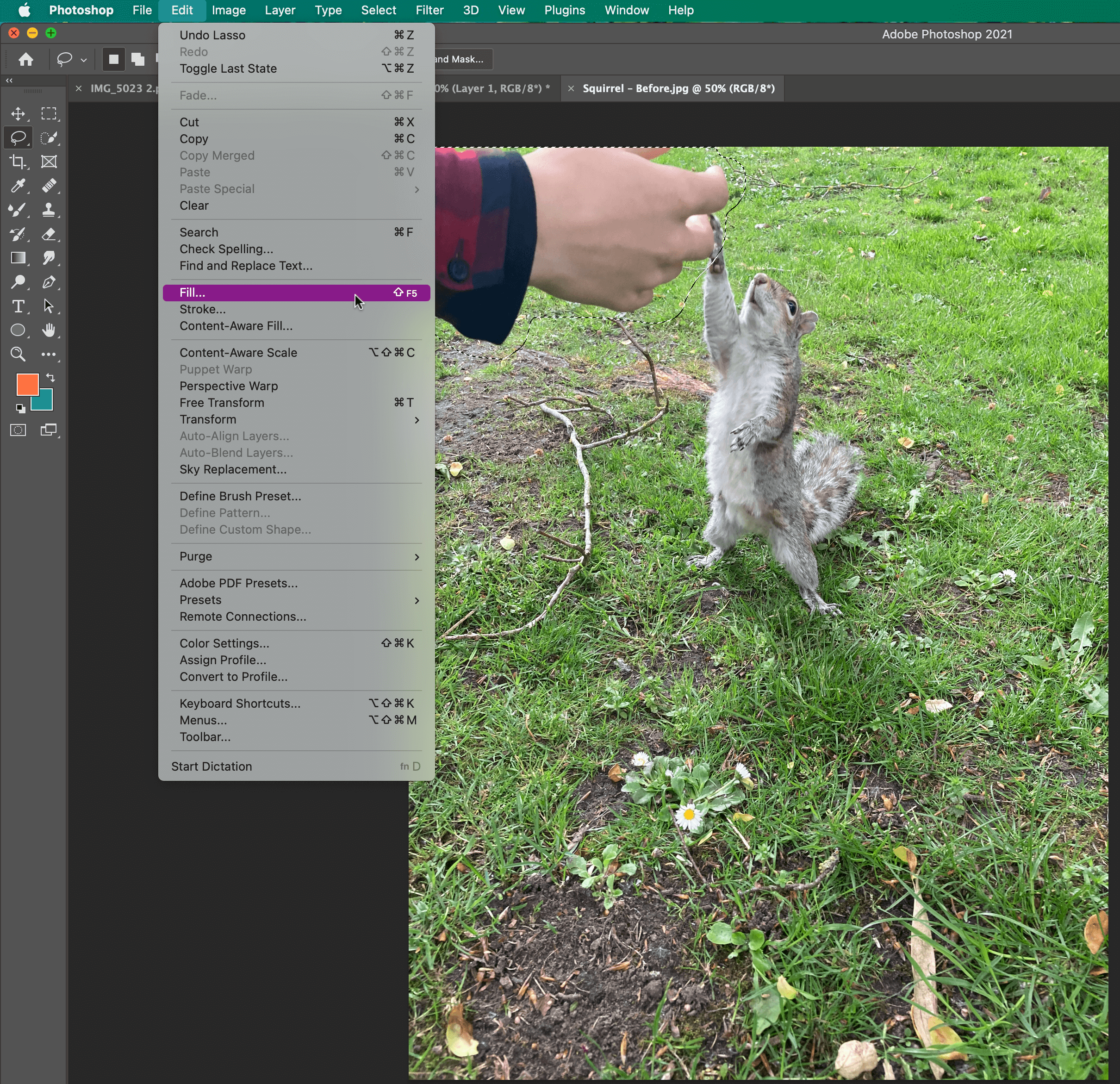
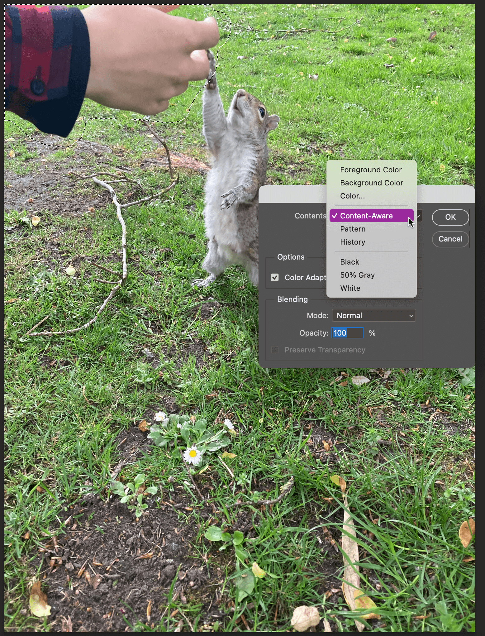
Figure 11

Content-Aware Fill 

Figure 12

I explored one last tutorial for my third design idea, which was how to remove objects with the ‘content-aware fill tool’. Firstly, use the ‘lasso tool’ to select the part you want to remove, this can be quite loose, in my case, it was the hand, Figure 13. Then locate the fill option, which is in the top menu bar, Figure 14. Choose content-aware fill, Figure 15, and this is the result, Figure 16.

The software does all the thinking about which parts to copy, similar to the steps taken in the clone stamp tool.

Figure 13
Figure 14

Figure 15

Learning Across the Module

I’ve found this module particularly helpful to my development as a designer and as a professional. I’ve been able to lead this module in ways that have been useful to me, in terms of learning new skills.

The skills that I have learnt across the module include: the clone stamp and content-aware fill in Photoshop, 3D text effects and the envelope warp tool in Illustrator, and making tables in InDesign.

However, the biggest thing I have learnt is how to use new software. This term I have had to learn three completely new software: After Effects, XD, and Premiere Pro. So, you get quite used to the process of accepting scary new software and simply just opening it. Thankfully the Adobe software is all fairly similar, which has made this process easier.

Skills I have improved on this module include: cutting things out in Photoshop, and using the pen tool and creating gradients in Illustrator. Other skills have been using Adobe fonts more, for instance I now know how to search by an image in order to match fonts. Finally, I have been able to build upon my time management and staying on top of the independent tasks, even when no one checks upon it!

Skills to continue to develop:

Two skills that I would like to develop are being able to make screencast and using Adobe XD in a fluent way. Making videos is a fundamental skill, especially in increasingly digital world, and is something that I’d like to build my confidence in.


Design Resources and Articles

In my current design work, I hardly use Photoshop. However, being able to use it to a higher standard would enable me to have a wider skill set. How to get to that stage? A wider exploration of the software, for instance opening up all the menus to see what everything does.

I could do a thorough LinkedIn learning course, which  would enable me to learn pretty much everything there is to know about Photoshop. Or I could continue to set myself design challenges, similar to this module, where I carry on with a strict regime of learning new skills. We never stop learning, even more so with software that is constantly changing and adapting.


Developing Basic Skills in Photoshop

Introduction

In this part of my journey, I was asked to edit a variation of images in Photoshop. Upon approach to this task, I felt quite skeptical because I had very little experience in Photoshop. However, Photoshop is something I have always wanted to excel in but had not yet had the opportunity to fully practise the software. This was my perfect opportunity.  As someone who is aware how crucial Photoshop can be in the Design world, I was eager to get on and start this task.

Design Ideas & Process

I began by familiarising myself with the software. Considering my lack of experience in Photoshop, I thought practising a bit first was important. I research a couple of tutorials on youtube and this is where I found the inspiration for my first practise where I made a cow disappear from the scene using the clone tool. I would then take this skill i’ve picked up onto something a bit more relevant to the likes of a Typography and Graphic Design Communication Podcast cover.

Before


After

Spot the difference?


I then directed my practise towards something a little bit more complex. I wanted to create a sort of colour pop image where everything is in black and white but with a pop of colour. I instantly thought to make the colour of an eye pop and thought this would be great practise where I could then go on to apply this to something more relevant. Here, I am experimenting with adjustment layers and the eraser tool to create an hole through the adjustment layer, therefore showing the image behind the black & white adjustment layer.

Before

Using the eraser tool to reveal colour underneath.

After


After having a bit of practise, I decided I may be ready to start some more relevant designs. I came across a desk image which I thought I could play about with. The cup of coffee was a bit awkwardly placed for me, as I also wanted to include some text. I applied my previous cloning experience to make the cup disappear. I used a variation of colours to contrast the clinical background and then used the clone tool with a more abstract approach to create a David Carson grunge inspired Typographic feature in the bottom right. I felt this would most definitely be suitable for a podcast cover.

Before

After

Cloning Practise and experimenting with text.


I then came across another image that inspired me and I thought it could be more abstractly interpreted into the design world as it is quite artistic and unique. With this image, I wanted to practise upon the previous black and white adjustment layer I had managed where I erased the layer to reveal the colour layer behind. I’m really happy with how this turned out, I think i’ve developed well on previous skills and I could now easily be able to carry out this task again with little difficulty.

Before

After

Using Black&white adjustment layers and creating a pop of colour.


Lastly I found this one image that I was particularly drawn too. I felt it was extremely fitting to the Podcast theme and I wondered how I could change it to make it somewhat my own. I used same black and white adjustment layer technique to create a pop of colour but I also edited the colour settings to achieve a darker more grungey appeal. I’m really happy with how this panned out.

Before

After

Editing colour and adjustment layers.


Software Tutorials


The resource above is the one that kickstarted my design and development journey. As you can see right in the beginning, he removes a sheep from a field – I found this quite fascinating and from this I recreated my own using the field of cows you have seen above. This was a great starting point for me as a way of removing things from an image which I then went on to use further in this task. This was extremely quick and helpful, sometimes the longer videos can be a bit longwinded and you tend to loose focus but I found this was straight to the point and when I got stuck I had just had to rewind and watch a bit more carefully. So this was the basis of the skills behind my first design where I experimented with the clone tool in many different ways. I also read through THIS page > https://helpx.adobe.com/photoshop/using/retouching-repairing-images.html < before starting and this helped me to understand the true basis of what I was about to take on.


Below is another link that heavily influenced a lot of my work here. This resource, although short, was extremely helpful and I only had to walk through it once before getting the hang of what I was doing. I did have to rewind once but it was very good at portraying the message it wanted to convey. I was really proud of myself and what i achieved with the help of this resource.

Skills I would want to develop further within Photoshop, would be the cutting out and replacing the backgrounds of images. I have always been interested in the likes of these projects and it is something I would like to practise within my own business where I buy and sell or hand-make items. Generally I would love to develop my skills in Photoshop, as this is something I have always longed to do but I never really had the confidence. Now I have completed these tasks, I do feel I could take on future challenges much more willingly having the confidence i do know my way around the software now.


Resources & Inspiration

As you can see most of my resources were taken from youtube. Youtube is a great platform for learning and I always turn to it when I am unsure where to start or if i’m stuck on a particular thing – if you are unsure on how to approach ANYTHING, youtube it! There is always a solution on there for everything.

Not only have I payed close attention to the resources provided by the lecturer of this module, I also made sure to venture out and discover my own resources. I find these type of videos extremely helpful as long as they are not too longwinded and confusing. The videos I provided were all short and to the point which is how, I believe a good tutorial should be.  The tutorial below is a perfect example of good qualities in a resourceful tutorial.

I also took some different approaches by keeping an eye out on for inspiration on the likes of Pinterest and Instagram. Similarly, I looked up key words like “Typography” and “Design” on free image download website as a way to kickstart my creative thinking. Another way I kept myself inspired, was by referring back to our classroom Padlet wall where we all post our work. Sometimes I find it helpful to look at my peers work, making sure i’m on the right track and to draw inspiration from here while keeping it original and true to myself.

Inspiration is something you can find in all different ways and walk of life. All it takes is to take a walk or look around the house to draw inspiration from things you may never have expected. I found it helpful familiarising myself with the task brief and then coming back to it a few hours later while I had collected some thoughts.

Conclusion

I really impressed myself on this particular topic and I truly do feel like I have learnt a-lot along the way. Having come into this with next-to-no experience in Photoshop, I am leaving eager to get practising my skills again. I have selected a variation of tools and developed them in such a way that I now feel I could do it again without much difficulty. I really enjoyed myself here and felt i pushed myself to achieve more than I thought possibly. I have done things that I have always wanted to learn to do and i cant wait to practise this for fun rather than because I have too.