Author: StephenHickson

Stenton Lecture 2016: print promotion

Brief
The brief was to design and print promotional material for the Stenton Lecture: a prestigious history lecture that occurs annually at the University of Reading. The client asked for the design to reflect the momentous subject matter of the lecture.

The title of the lecture: 
Britain’s wars with France 1793­­­–1815­­ and their contribution to the consolidation of its Industrial Revolution.

Deliverables
The deliverables requested by the client included 10*A3 and 100*A4 colour posters. These were to be displayed around campus during the run up to the event.

Aim
The aim was to engage a broader university audience and increase overall attendance by creating a conspicuous and thought provoking visual that promoted the topic as stimulating and exciting.

Design restraints
The challenge was to distil a complex historical topic into a succinct visual message. At first, potential design directions seemed limited:

  • Photography was not an option, as the technology did not yet exist during the Napoleonic wars.
  • Appropriate high-res illustrations were scarce and only served to represent snap shots of particular battles: they did not encompass the overarching themes of the talk.
  • There was little opportunity for typographic expression as the project had to adhere to university brand guidelines.
  • The restrictions enforced by the poster templates pre-determined both layout and typographic styling.

My response to these restraints was to create original vector artwork that uses colour as the dominant design feature.

Design concept
The concept was to pictorially/symbolically juxtapose the themes of war, nationalism, and industrialisation. White smoke erupting from an industrial chimney divides the red and blue areas of the French Tricolour flag and leads the eye towards the lengthy lecture title. The flag’s colours dominate the design: an emblematic reminder of the French contribution to Britain’s Industrial Revolution. The iconic Nelson statue towers over the cityscape, representing Britain’s naval dominance at the time.

Fortuitously, red, white and blue are also the constituent colours of the Union flag: the posters is ambiguous, creating a sense of intrigue for prospective attendees. The strong use of red also helps to reinforce the UoR branding. The addition of an industrial texture overlay conveys the griminess of both war and coal fuelled factories.

The poster can be understood and appreciated on multiple levels. At first glance (and from a distance), the viewer may only see the unmistakable design of the Tricolour and immediately understand the ‘French connection’. On closer inspection, other details are revealed which communicate a narrative that explicates the lecture title. Multiple viewing levels may result in the observer spending more time with the poster and potentially engaging with the information to a greater extent than a poster with a single viewing level.

Feedback & lessons learned
The design was well received by the history department and I was pleased to satisfy both the client (Prof. Joel Felix) and the key speaker (Prof. Patrick K. O’Brien).

Here are some lessons learned on professionalism, design and print production:

  • Agree on the exact copy at the start of the project (before the design process begins)
    This would have accelerated the process significantly as it would avoid waiting for email responses and repeatedly having to make small copy alterations.
  • Discuss the hierarchy of elements with the client upfront
    This would have highlighted the importance of featuring the key speakers’ name in a more prominent position (and size) on the poster.
  • Do test prints before going to press and, if possible, ask for a printers proof
    I’ve learnt that there is a discrepancy between the appearance of opacity layers onscreen and in print. I was disappointed with the finished printed product because the overlaid texture printed much darker than it had appeared on screen. Similarly, the contrast between the red type on a black background was noticeably inferior in the print version.
  • Use a ‘rich black’ for large areas of black
    Since finishing this project I’ve learnt to enhance the density of printed black by underprinting 100% black with 50% of cyan, magenta and yellow.
  • Avoid using light weights of type (unless used very big)
    In hindsight, I used too many kinds of type variation on this poster. The light faces were intended to sit back in the hierarchy but they look too scrawny and lack presence on the page. If I were to re-do the poster, I’d be more judicious with methods of type differentiation and rely on scale, case, colour and italics before altering weight.
  • Try out the client’s design ideas, even if you think they won’t work
    At first I was dubious about adding a Nelson statue to the poster as I thought it might overcomplicate both the composition and concept: I only tried it out in order to appease the client. However, I see now that it is a crucial addition to the design, without which, there would be no reference to the British.



Winckelmann exhibition design

Brief
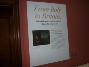
To design print materials for an exhibition hosted by the classics department at the University of Reading entitled From Italy to Britain: Winckelmann and the spread of neoclassical taste.
This distinguished exhibition was part of a two-year international celebration (2017–2018), of Johann Joachim Winckelmann, the ‘father’ of classical art archaeology and promoter of neoclassical taste in eighteenth-century Europe. It explored Winckelmann’s work and influence in Neoclassical Britain and in particular Reading (epitomized, for example, in Soane’s Simeon Monument in Reading’s Butter Market), as well as publicizing Reading’s Special Collections.

Deliverables

  • An A4 trifold exhibit leaflet (in the form of a handlist of exhibited objects)
  • Exhibition panels, A1 & A0 (in width)

Challenge
The turn around for this project was very tight because I inherited it from another student at the eleventh hour. I had only a few days to design the materials in order for them to be printed in time for the exhibition launch. I was galvanized by the time constraint; there was no time to procrastinate or come up with multiple solutions: the design simply needed to reflect the neoclassical subject matter and be pleasurable to read.

Handlist cover
The image supplied for the cover involved a semi-nude woman brandishing an oversized tambourine above her head. The tall proportions of the figure translated well to the narrow page format but the image required careful scaling and cropping in order to satisfactorily display fine details, such as the folds in her drapes, while also avoiding collisions with the type. Beyond merely avoiding collisions with text the ‘dancing woman’ gracefully interacts with the exhibition title (note the way the right hand cups the second line of the subhead).

Hickson_S_Winckelmann_handlist

Typeface
Using a neoclassical typeface revival for display type and headings was an expected but pertinent decision. I tested a number of didone faces and settled on ITC Bodoni 72. The face works well at large sizes (particularly the gigantic 435pt size on the A0 display panel), but is less successful as a type for headings in the handlist because the exquisite hairline serifs are rendered fuzzy once printed.

I chose to set the exhibition title in italics in order add a sense of movement and excitement (‘From’ Italy ‘to’ Britain) as well as a subtle nod to Italian design.

The clients wanted to use the didone type style for all text, including body copy. They were concerned that the sans serif I’d chosen (Skolar) was too modern and did not match the subject matter. I showed them some example copy set in Bodoni and managed to convince them that the fragile structure of the face was difficult to read at body size. The straightforwardness of Skolar contrasts well with the grandeur of Bodoni and links the neoclassical history with modern appreciation.

Design lessons
Typesetting a handlist was a good opportunity to learn how to properly create a numbered list with right ranging outdented numbers: a skill that will be no doubt required on future projects.
If I were to change one thing to the design of the handlist it would be the key. Reversing small type sizes out of a solid colour made the acronyms difficult to read. In future I’ll opt for bold as a more robust form of typographic differentiation for this purpose.

Copy editing
I suggested slight amendments to handlist copy in order to better serve the pace of the document. For example, I recommended placing a pull quote above the exhibition blurb, which required a slight alteration to the wording of the text. Prior to the real jobs scheme, I had never considered that my role as a designer would include writing and editing copy. Learning to do this well will be a valuable addition to my skill set.

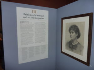
Designing the exhibition panels
The content of each exhibition panel was simple: a heading, body text and footnotes. I opted for a symmetrical centred layout to match the ethos of classicism, but coupled this with left aligned text for ease of reading.

Designing at this large scale was new to me (I’d never designed anything above A2) so lots of print tests were required to ensure the text was readable from a distance.

The main challenge was how to accommodate the amount of text on each panel (this varied significantly). I eventually surmised that each panel would need a discrete height that matched the length of text.

Working with the clients was enjoyable because their academic background informed my typographic detailing decisions with elements such as quotes and footnote markers. I’ve learnt that design conventions can differ in certain contexts. For example, footnote markers in books tend to be set using superscript numbers as these are less prominent than ‘normal size’ figures yet clearly visible. The clients insisted on using normal sized figures with surrounding square brackets for their footnote markers, as is the convention in exhibition design.

Conclusion
The real pleasure of this project was the opportunity to see my work displayed and used in the environment it was intended for and to witness real users interacting with it. After working mostly on small-scale print designs during this course it was exciting to see large typography come to life in a setting. I paid particularly close attention to typographic details on this project, as I knew any mistakes would be enlarged for all to see.

The clients were fully satisfied with my designs and were very complimentary about my professionalism; I even received a round of applause at the exhibition opening.