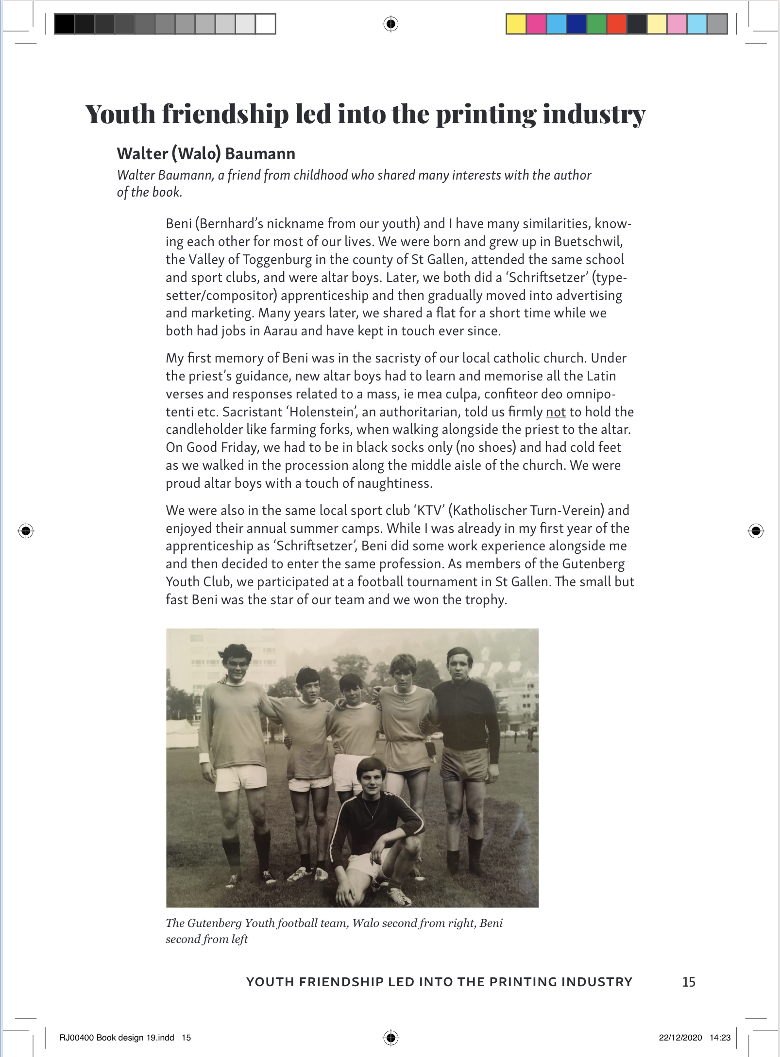
Third year students Ruth and Maya and second year students Lucy and Grace were selected to form the ‘Undergraduate Recruitment team’ to increase applications to the BA Graphic Communication course throughout the 2020/21 yearly cycle. The deliverables for the project were to be determined by ‘blue-sky thinking’ and the innovative ideas that were generated, with a variety of possible outcomes, including social media posts, digital or physical brochures/leaflets, presentations and the organisation of online portfolio days. The success of deliverables was measured by the number of applications that the course and department received for the academic year, aiming for a greatly increased number than that of last year.
Aims
To increase undergraduate applications for the BA Graphic Communication course
To raise awareness of the course to students who may not think of it as a viable option for their career or university experience i.e. those not currently studying art or design
To generate innovative and creative long-term methods of promoting the department across the UK
To effectively encourage prospective students to apply through the emphasis of key statistics and facts about the unique academic and creative aspects of the course
To ensure portfolio days are run in the most effective way despite COVID-19 and so that they are run as similar as they would be if they were in person
To increase the use of student-fronted promotion of the course
Target market
Students in their last two years of schools who are preparing for open days and beginning to think about their UCAS application
Schools who hold career/university days to help their students explore many different degree paths and specific universities
Not just art students but also the academic students who may not have even considered Graphic Communication because they do not yet understand what the course is really about
Three specific target groups; prospective students, applicants and offer holders. These groups will all be at different stages of the applicant journey, so it is important that our approach is appropriate for each one
Additional considerations for parents, who are interested in the application process for their child
Roles and responsibilities
The roles and responsibilities of the design team varied per deliverable and each team member was heavily involved in the idea and design generation process throughout the project. Additionally, each team member had a specific role that allowed for better team organisation and understanding of individual responsibilities. Ruth was project manager, being the point of communication between the design team and the client, Maya was finance manager investigating the realistic costs of implementing ideas, whilst Lucy was creative director supported by designer Grace.
Lucy and Grace will continue the project into their third year with new team members in the next academic year, carrying our ideas forward for the next recruitment cycle.
User research
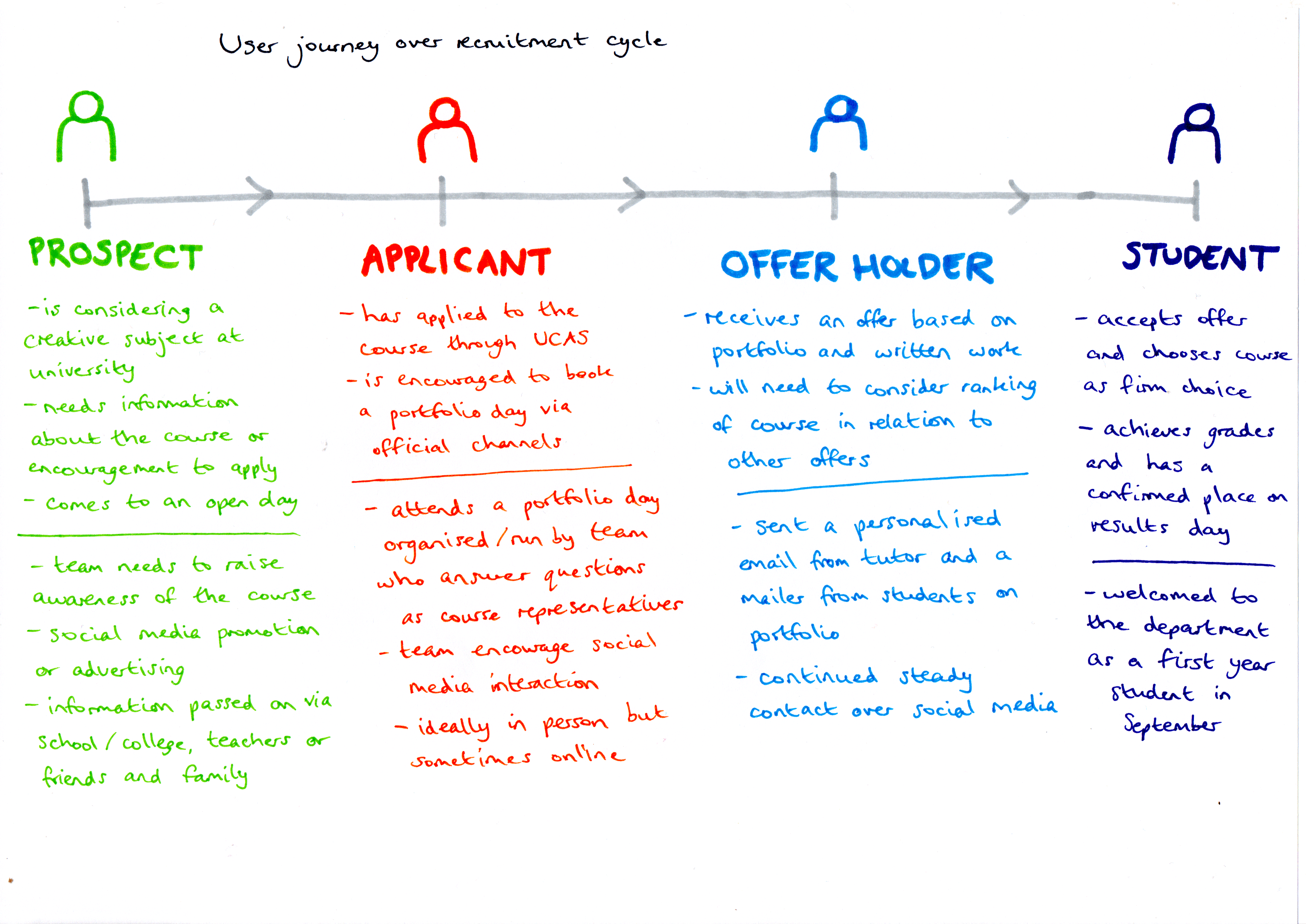
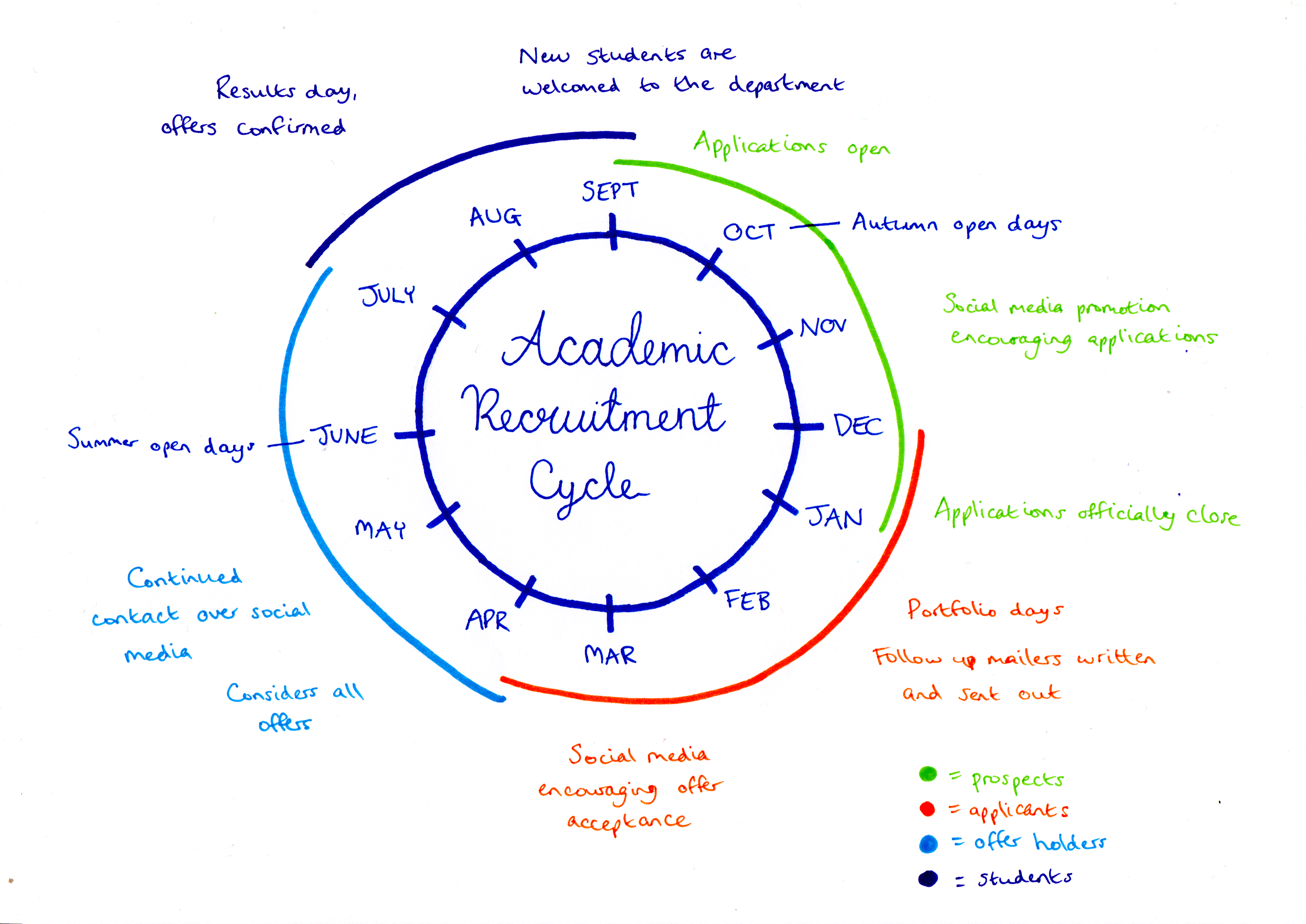
In order to fully understand the deliverables that were required at each point of the applicant cycle, a user journey was developed, mapping the various points at which we could interact with potential applicants and the language that would be used to target them. Figure 1 demonstrates how target users move from being prospects to applicants to offer holders throughout the year and the outcomes involved at each stage to promote the department. Figure 2 explains how this journey fits into the academic recruitment cycle, which is repeated each year, starting in September.
Figure 1: the user journey undertaken by prospective students over the course of the recruitment cycle and the corresponding actions of the recruitment team to meet their behaviour
Figure 2: how the applicant journey fits into the annual academic recruitment cycle
Outcomes
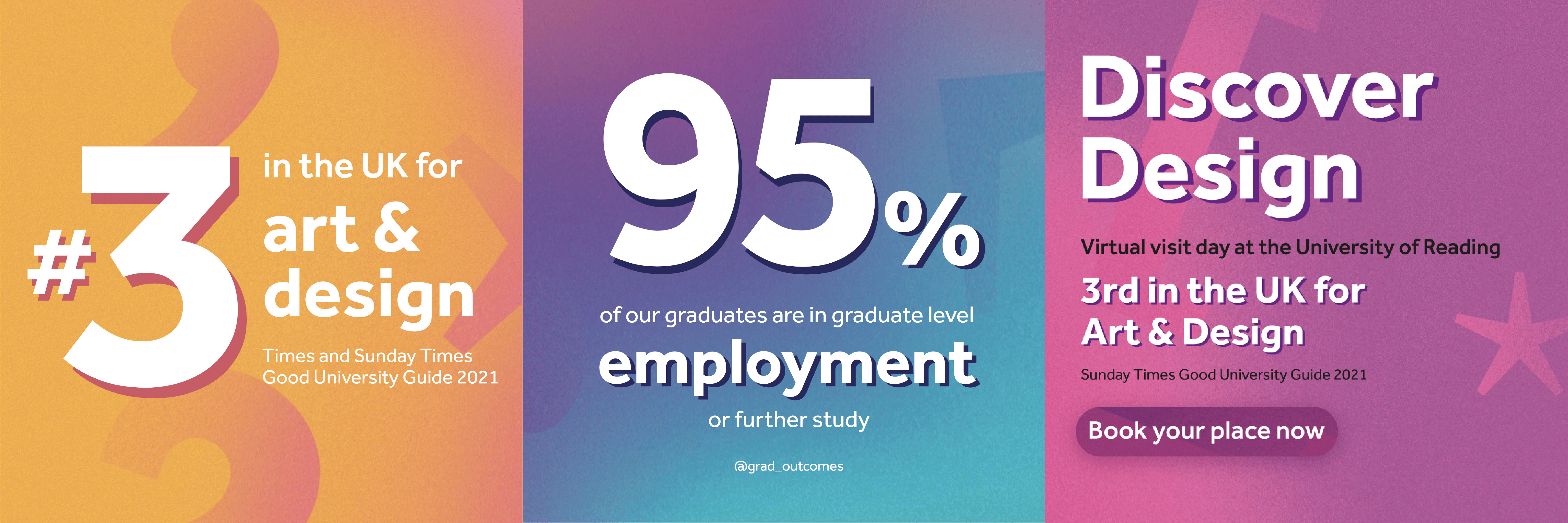
As the project progressed, a number of outcomes were developed and explored. As a team we were involved in the development of a Facebook group that was aimed at applicants. The purpose of this Facebook group was to create a platform for applicants to ask questions and to engage with the content that we posted. The Facebook group also enabled applicants to link with other students on the course and begin to recognise names from portfolio mornings and applicant sessions. Additionally, we helped to create posts for the department Instagram to promote the course, examples of which are shown in figure 3.
The portfolio mornings and applicant sessions were arguably the biggest part of this real job where most Saturday’s two members of our team would join our supervisor and tutor James and help him run the session. We felt having existing students have some alone time with the applicants helped to make the applicants more comfortable and gave them time to ask us more general questions related to university life. Following each portfolio morning, a personalised mailer was written and sent by Ruth to each applicant turned offer holder, commenting on their individual portfolios and aspects of the course that were discussed in the session. A copy of the departments diversity zine was also sent out, as seen in figure 4. These were also supported by emails and phone calls to the applicants, a personalised approach that proved popular and received positive feedback from the students.
Aside from portfolio days and running the Facebook group we were also tasked with smaller jobs to promote the department. One of these tasks was to create a promotional video for applicants that had a brief introduction about some of the students in the department (including ourselves). The creation of this video had the purpose of showing potential applicants that it doesn’t matter what background they have come from, graphic communication may still suit them. Using a variety of students helped to highlight our range of backgrounds despite still ending up on the same course.
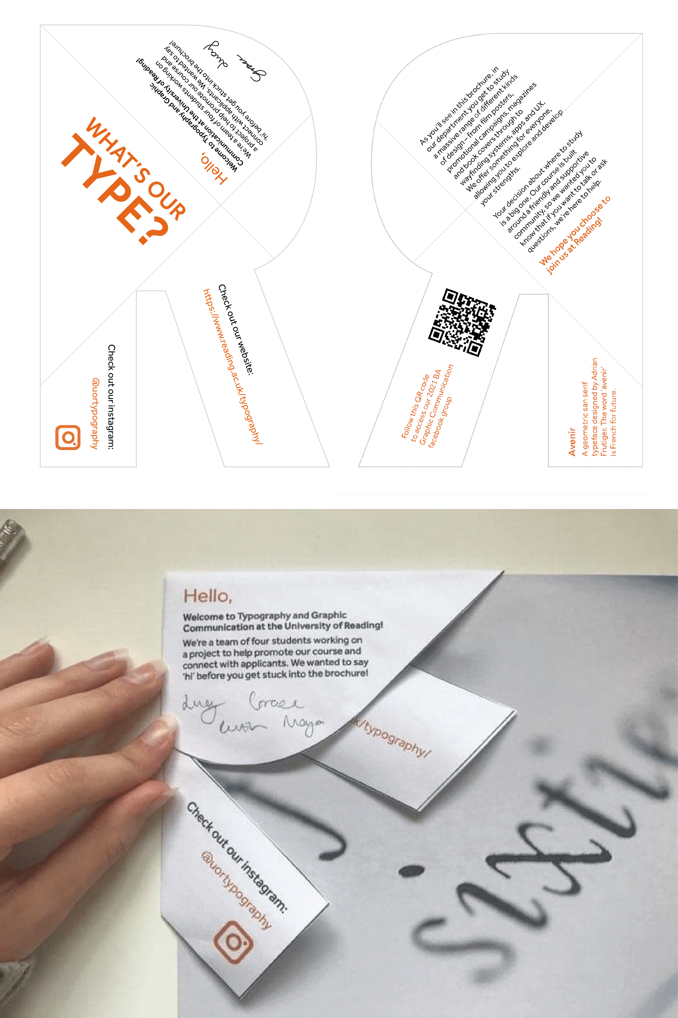
As a team we also created a mailer that was to be sent out alongside our course brochure. We decided as a team that we wanted the mailer to be integrated with the brochure, and thought we could achieve this by creating a folded ‘R’ (for Reading) to sit on the corner of the brochure (figure 5). The ‘R’ contained a personal message from ourselves and also some information about the typeface of the ‘R’. Although this design was not produced for this year, the concept may be used within the next academic cycle.
Figure 3: The series of posts designed for social media to promote the course
Figure 4: the mailer containing a personalised written note and a copy of the diversity zine sent to offer holders
Figure 5: the ‘R’ mailer concept that would accompany a course brochure and intended to be sent out to prospects
Team work
As the yearly recruitment cycle progressed, it became clear that working as a team and delegating roles efficiently was the best method of ensuring success. The portfolio days that were held every Saturday from December through to April were mainly hosted by Ruth and Lucy to ensure consistency and so that each week ran smoothly. Ruth and Lucy formed a partnership and by the end were completely confident in running a portfolio day alongside James. Despite Maya and Grace not being involved in all the portfolio days, Ruth and Lucy had briefed us on what we needed to do so that everyone was able to step in if needed.
Aside from the portfolio days, working as a team was important when trying to create an innovative method to recruit possible students. In our weekly catchup with James we were often briefed with a task to prepare for the following week. We decided it best to think of our own ideas ready for a team meeting where we could then collaborate and develop our ideas further. We found this the most useful method to generate ideas as we sparked thoughts of each other.
Not only did we work as a team of four but James was also an element of our team where working with him was crucial to progressing through the recruitment cycle. James’ advice and insights into his previous experience of the recruitment cycle was helpful for us when pitching our ideas as James helped us to fine tune our thoughts into a successful plan.
Reflection
Working on this project during the Covid-19 pandemic created various challenges, mainly in generating and implementing mostly digital ideas, compared to the physical and more personable approaches used in previous years. As a team, we were required to adapt past outcomes in order to provide a relatively similar application experience for this academic year and we were conscious of increasing prospect participation at online portfolio days and continued interaction over social media and mailers.
Measuring our success was slightly different and more difficult compared to other design projects we have worked on in the past, as we were more focused on applicant numbers and response rates, which we did not always have immediate access to due to confidentiality issues. However, it could be considered that this academic year is not comparable with other years due to the pandemic, which will result in changes to applicant behaviour despite our work to improve prospects.
Overall, we worked coherently as a team throughout the year, having the opportunity to develop our creative thinking and strategy generation within the constraints of a mostly digital space. The project provided experience of working as part of a wider marketing team, as designers, consultants and idea generators, roles that could help inform our practice in our future careers. Personally, I (Ruth) have been able to improve my confidence and social skills in talking to a range of people online, especially at portfolio days answering applicant questions and promoting the department, which I can apply to upcoming job interviews.
The transition of adapting social skills to work online I (Maya) found initially nerve wracking, however as we began the portfolio days I began to develop more confidence. The skills I developed through the portfolio days will be transferable as I begin to apply for jobs and undergo interviews. Overall, I feel that this job was an exciting job to be a part of, as the success of this real job has a direct impact on our own graphics department, which is unlike other real jobs.
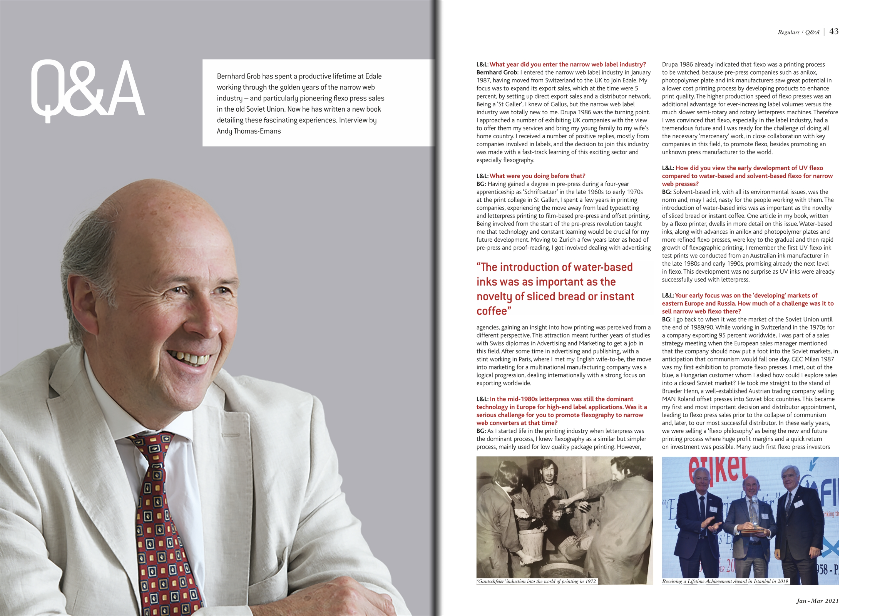
Over the last thirty years in the label and packaging printing industry, Swiss-born Bernhard Grob has travelled across the world to promote and sell flexography printing presses for the company Edale Ltd. of which he was a co-owner and Managing Director. During these travels, Grob has written a series of annual travel journals, detailing his experiences, and the developments and issues in the printing industry that he came across, now collated into his book; ‘Destination: Travelling the world for the printing industry.’
Grob enlisted third-year student Ruth to design the inside pages of his book with the main aim of producing a consistent layout appropriate to the content. This would involve proofreading, editing and typesetting the text, and sorting, editing and arranging corresponding imagery. Clarity needed to be achieved, whilst also ensuring that the book remained engaging and interesting. The client stated that they were aiming for this project to be ‘something that is not the norm, something that is different to everything else on the bookshelf, something unique’ and hoped that, as a student designer, Ruth would be able to expand her knowledge of the subject matter whilst also bringing a more youthful and on-trend approach to the design.
Additional stakeholders
The book was originally intended to be printed as part of a live event at the international Drupa print exhibition in Dusseldorf, Germany, initially due to take place in April 2020, then pushed back until 2021, until it was eventually cancelled entirely until 2024, due to Covid-19. Belgium-based digital printers, Xeikon, agreed to produce and print the book, to demonstrate their leading technology and highlight their high-quality digital colour printing.
After printing, the sheets were sent to be bound by book manufacturers Mueller-Martini who produced the final outcomes ready to be distributed. Professional designer Richard Jones was also part of the project as the designer of the book cover.
Throughout the project it was important to consider the various factors and influences on the production of the final book, whilst also maintaining necessary contact with the relevant stakeholders. These industry professionals allowed me to gain valuable insights into the publishing sector, improving my communication skills and expanding my technical knowledge.
Target audience
The publication is aimed at professionals within the printing industry, specifically those producing self-adhesive labels and packaging. The book will help to inform their practice, provide technical knowledge, be a reference point on the development of printing processes and most importantly, detail the entertaining experiences of the author on his travels around the world. It also includes articles from prominent international figures within the industry, whose inclusion will help promote the publication. As the book features many technical aspects, it is unlikely to appeal to the general public who have little knowledge of printing processes, and is therefore not for sale, but rather distributed with financial donations to the department of Typography and Graphic Communication at the University of Reading being welcomed.
Deliverables
Proofreading and editing of all text and imagery
Design of inside pages for the entire book, specified to be in full CMYK throughout to highlight the high-quality colour printing of Xeikon
A loose bookmark that is printed separately and fits into the front of the book containing information regarding donations
Input on the design of the cover
Design process
Research
Receiving and writing the brief was straight-forward in content yet complex in compiling as information was provided in small sections and by a number of stakeholders which I then had to combine into a succinct single brief. After clarifying the responsibilities of each party involved, I had a much clearer understanding of my role within the whole project and what each stakeholder was expecting of me.
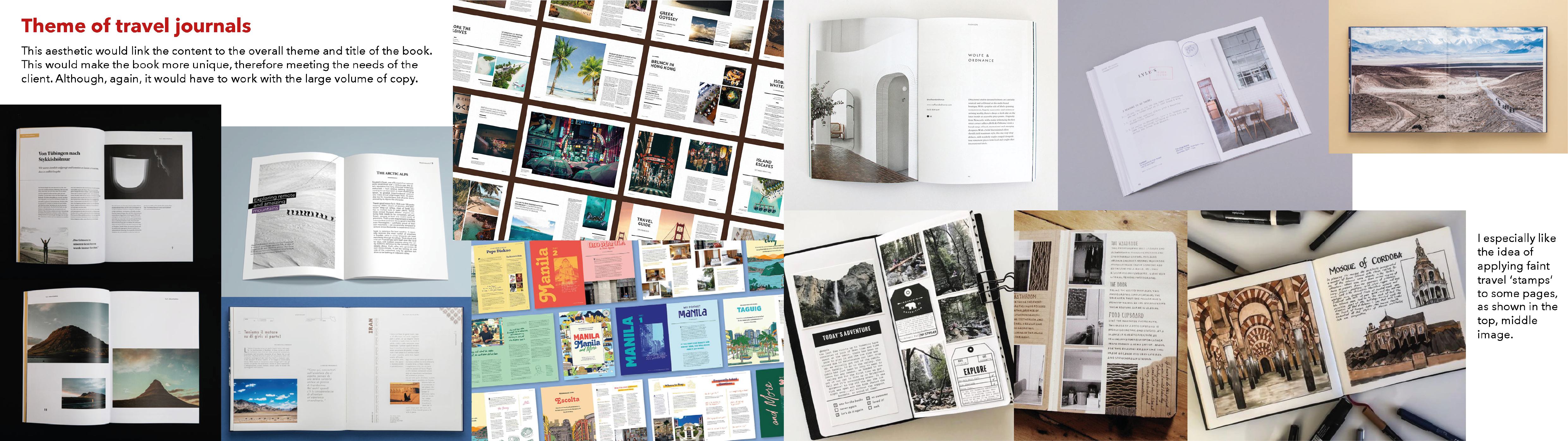
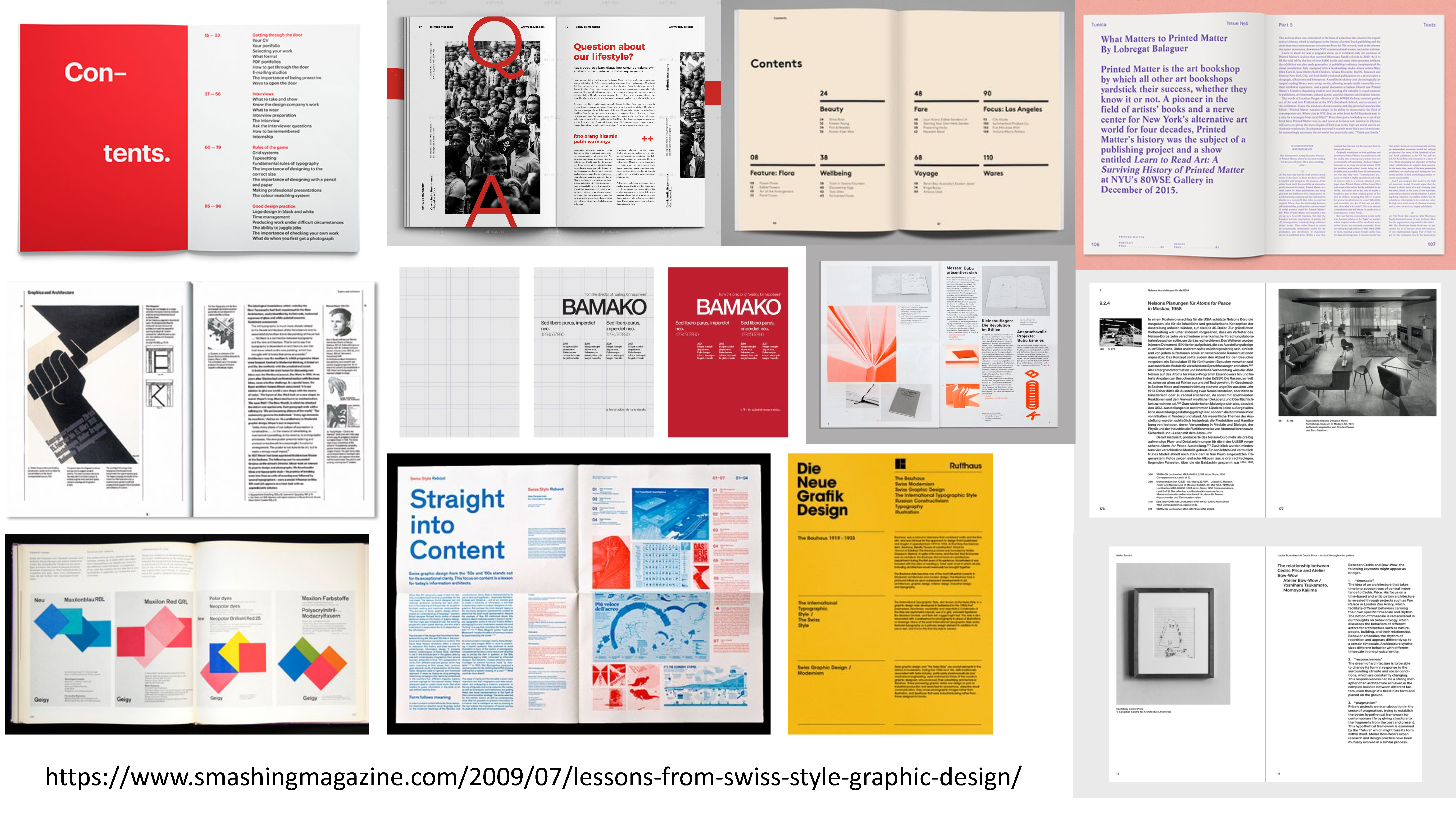
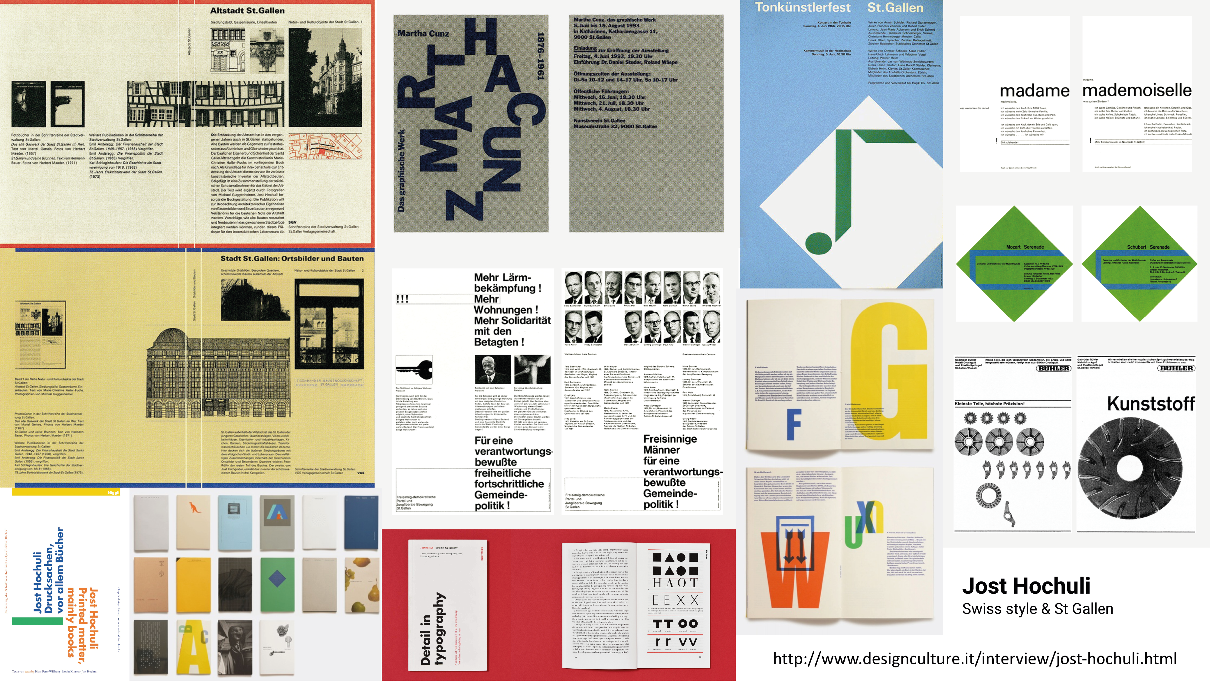
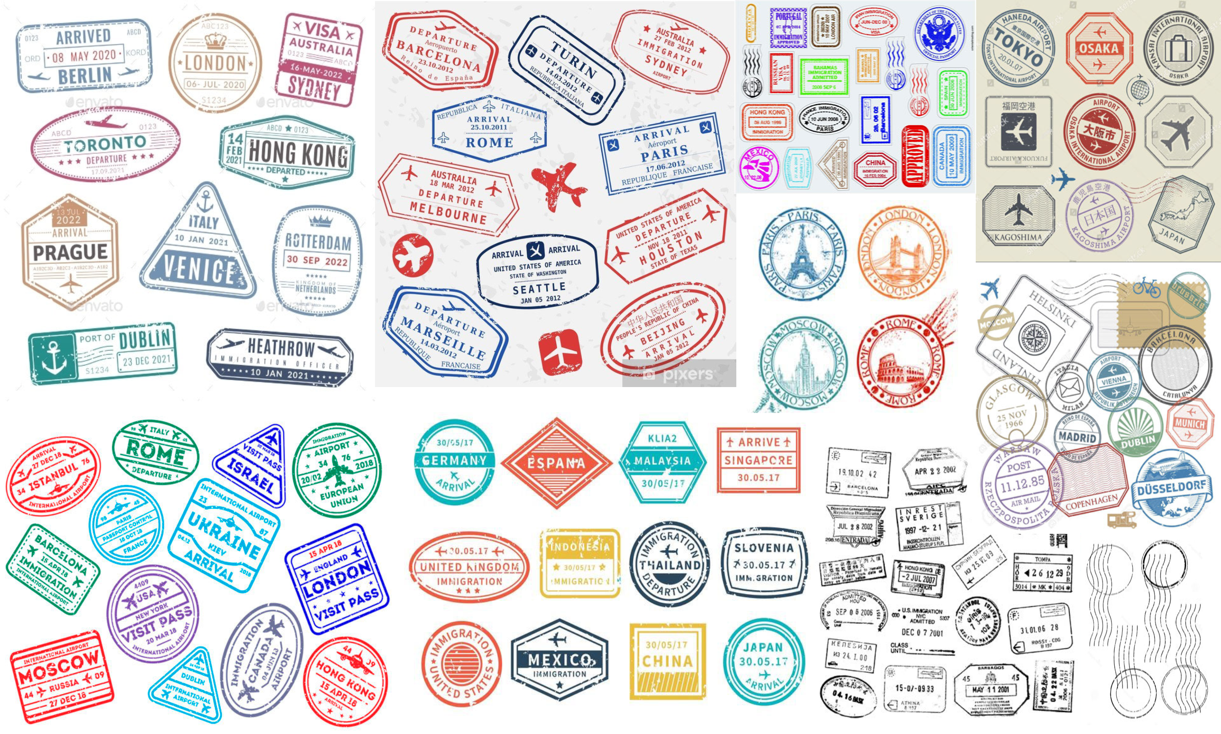
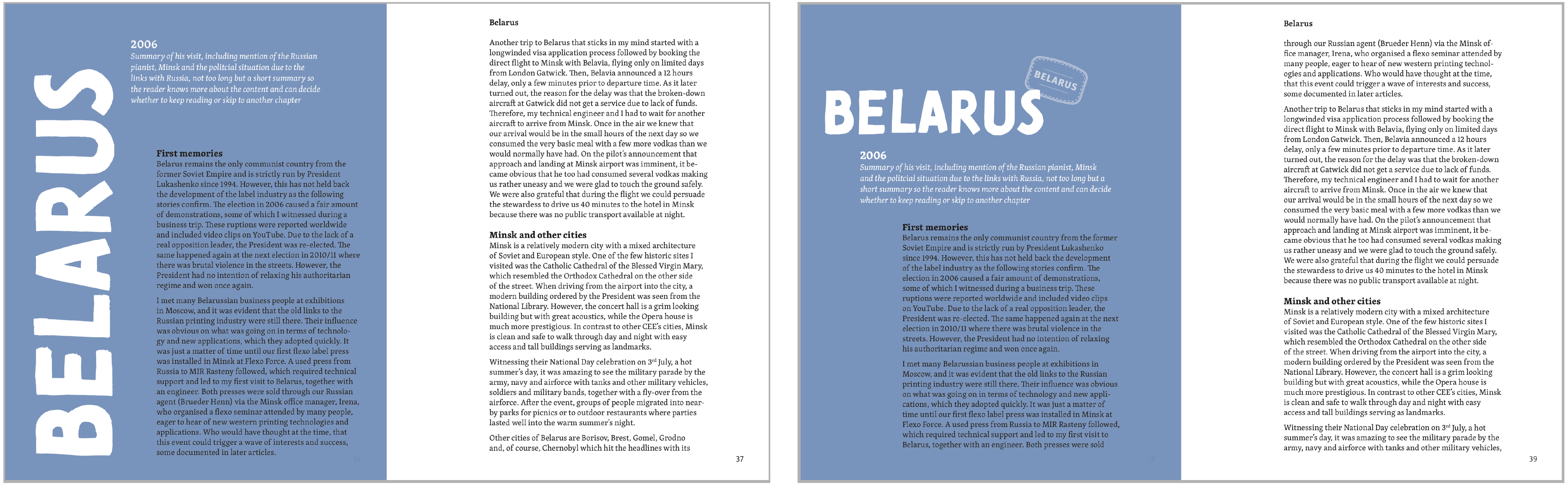
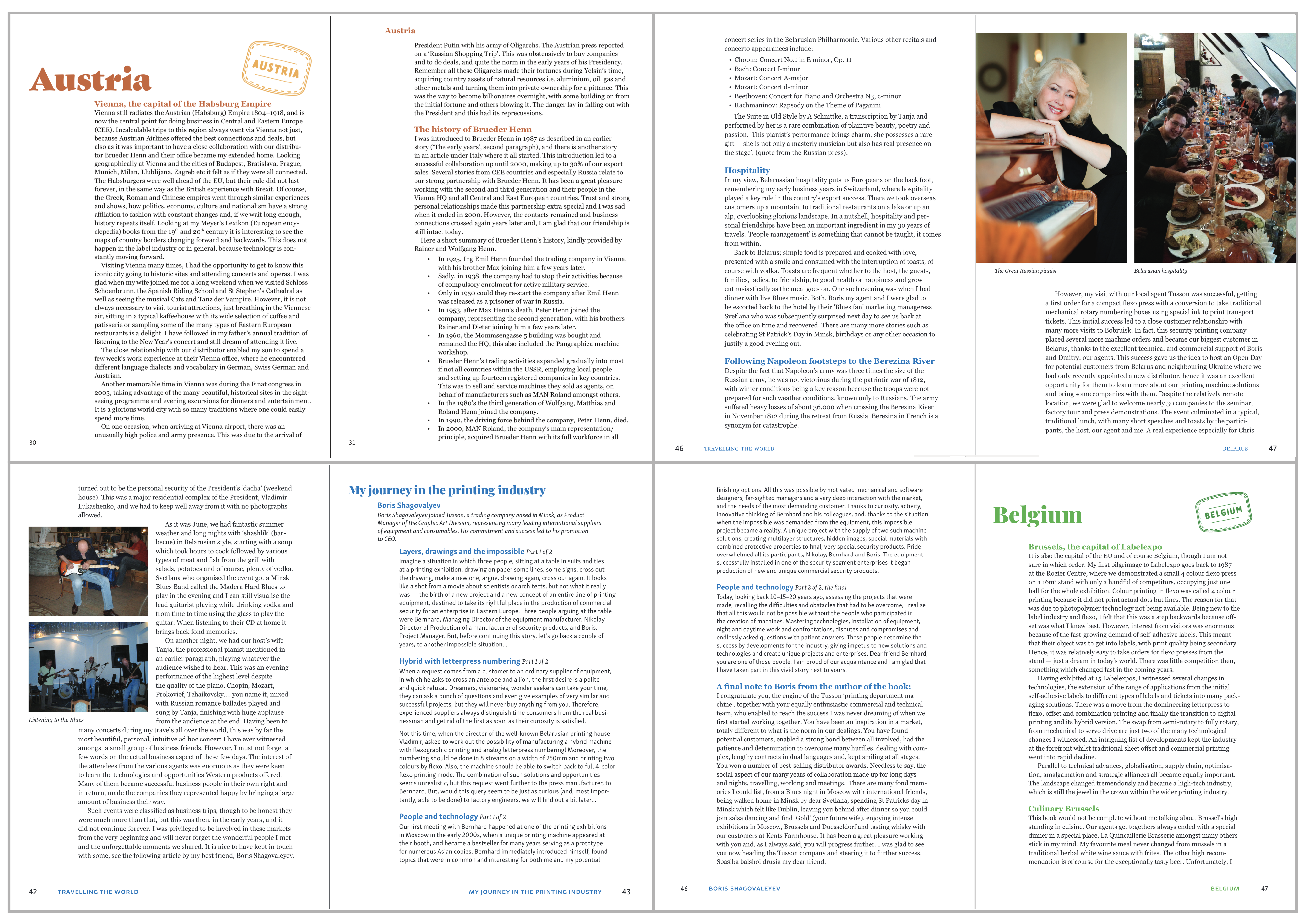
Taking inspiration from the Swiss heritage of the client, I carried out research into interesting book layouts (figure 1), within the theme of travel (figure 2), and examples influenced by the famous Swiss style (figure 3), particularly editorial work by Jost Hochuli who is from the same town as the client, St Gallen (figure 4). Additionally, as the chapters of the book were organised by country, I had the idea of incorporating travel stamps into the chapter openers, inspiration of which can be seen in figure 5. Eventually these involved a mixture of illustrated stamps and photographs of the real stamps taken from the client’s various passports over his years of travelling.
Research into the client’s company, Edale Ltd, and the other stakeholders involved (Drupa, Xeikon and Mueller Martini), was also carried out to gain a better understanding of how the book would be produced and distributed, technical aspects involved in the project, and the motivations for each stakeholder in the project. I was also able to broaden my knowledge within the area of flexography and print exhibitions, having the opportunity to collaborate with international companies leading the sector.
Figure 1: mood boards demonstrating research into interesting book layoutsFigure 2: research into the design of travel books and journalsFigure 3: research into Swiss style book designFigure 4: research into the work of Swiss designer Jost HochuliFigure 5: inspiration for the concept of creating illustrated travel stamps for each country chapter
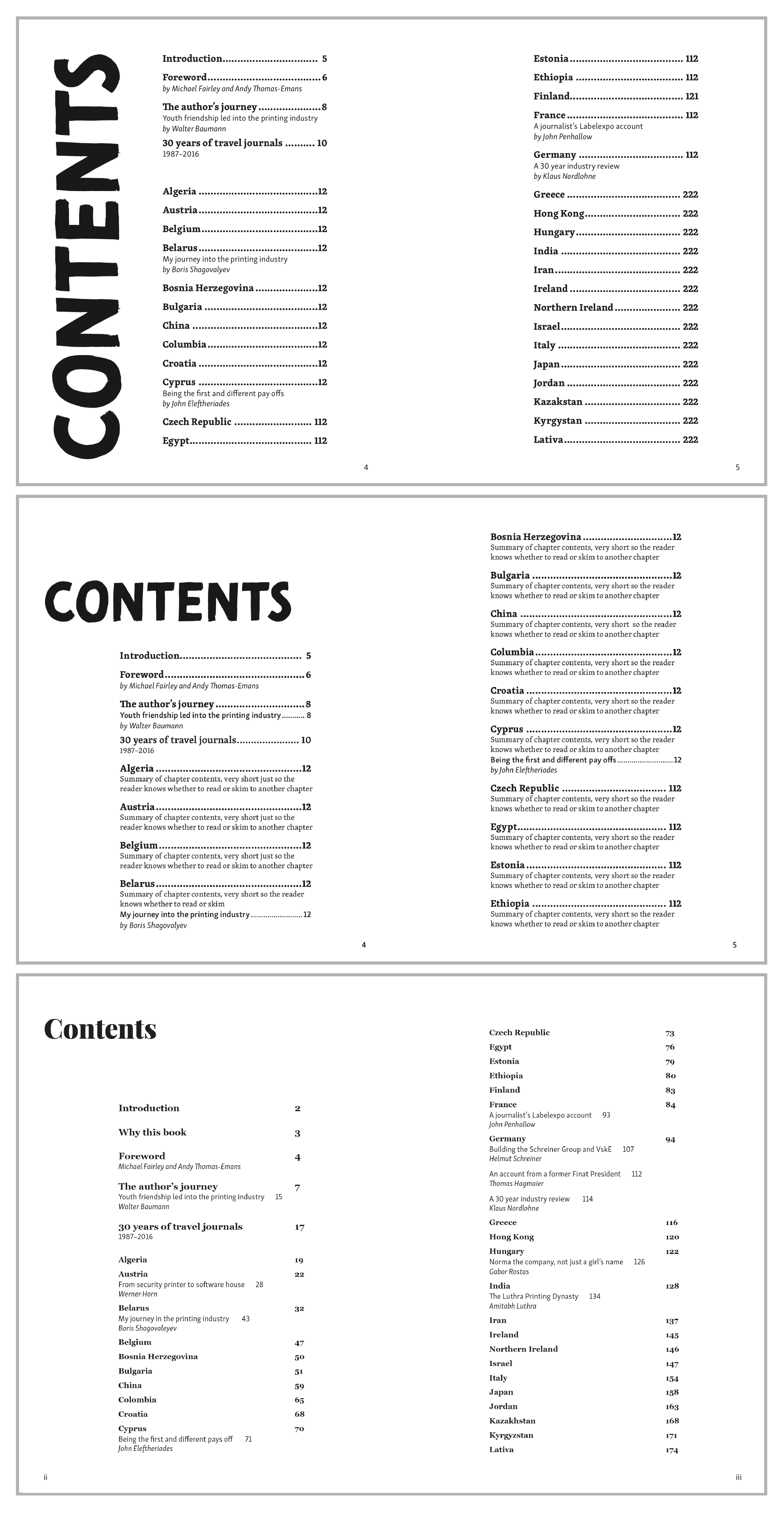
Content structure
The next step involved the client sending across all of the copy, which included a large text document and a series of photographs, sent both digitally and physically. I then organised these into their relevant country chapters, scanning in the physical photographs and ensuring all images were in CMYK and at least 300ppi, as requested by Xeikon to demonstrate their high-quality digital colour printing. The text was proof-read to ensure typographic consistency, such as capitalisation, the use of commas and correct use of hyphens, and to check for minor grammar errors given that English is the client’s second language.
Having read through the entire text, it was agreed with the client that the order of the content could be moved around slightly. Organised alphabetically by country, the book also contained additional articles written by friends and colleagues of the client, which originally interrupted the main text and disrupted the flow of reading and therefore the potential design and hierarchy. The client therefore allowed me to rearrange these articles to the end of each country chapter, with the addition of short descriptions of the external authors.
This initial stage of the project required great organisational skills, as there are around 60 chapters in the whole book, with a range in the number of images per chapter. This would later demand selective skills, ensuring that the best quality images were included next to the most relevant sections of the text. It also allowed me to fully experience the whole process of copy creation and editing alongside designing, a role I am now more familiar with and can build on in the future if I become a professional editorial designer (a career option I am currently considering).
Initial ideas
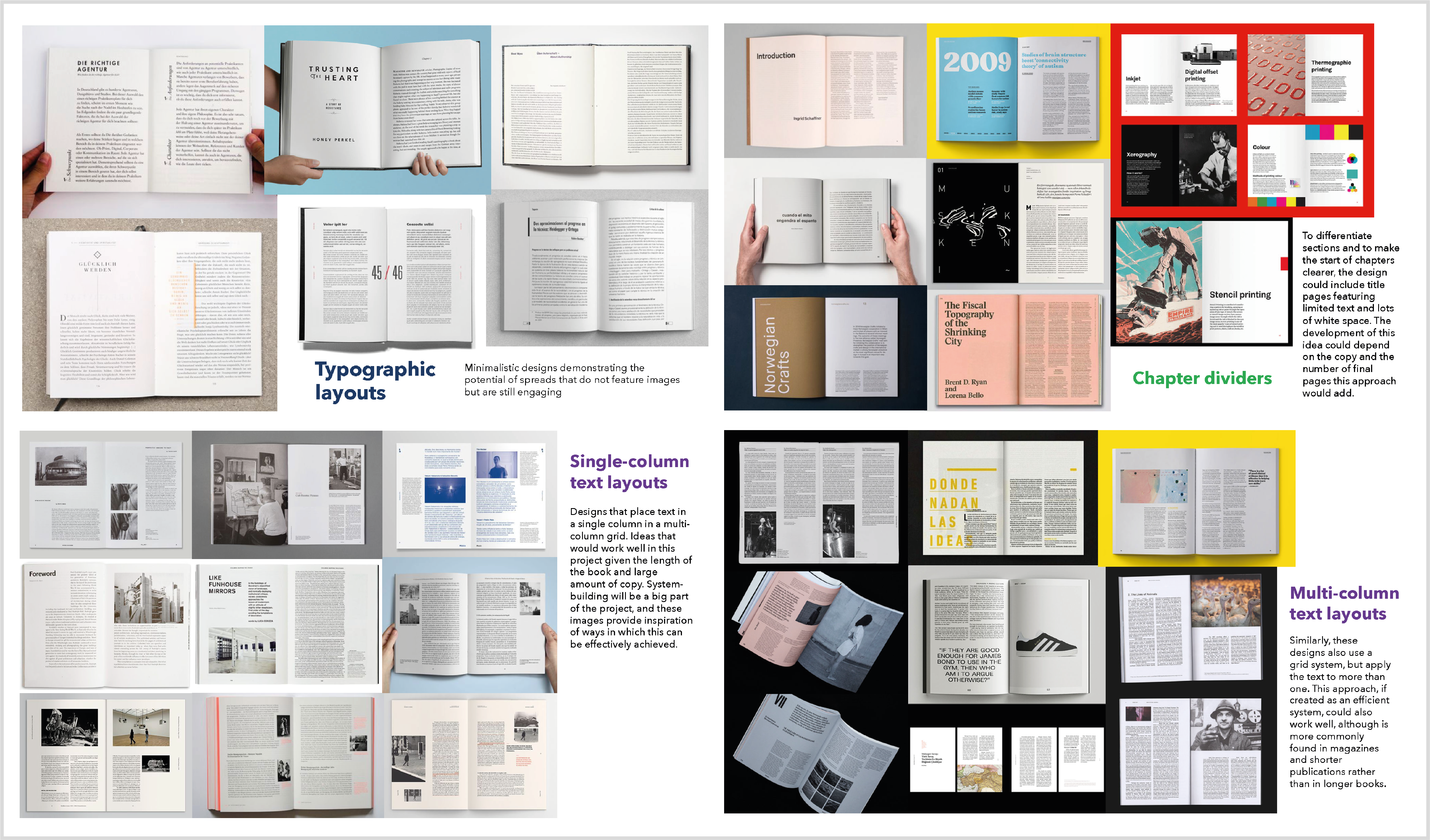
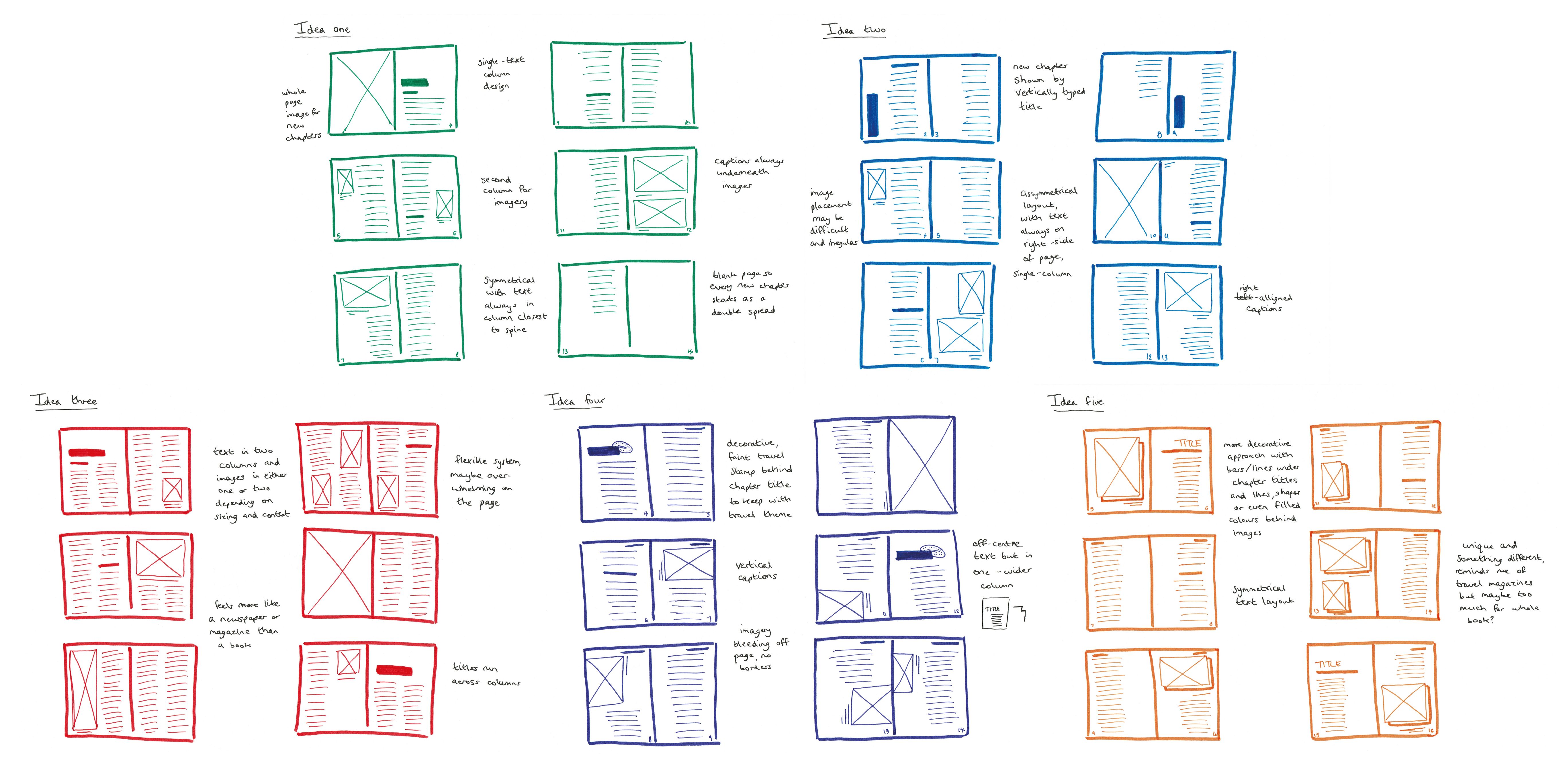
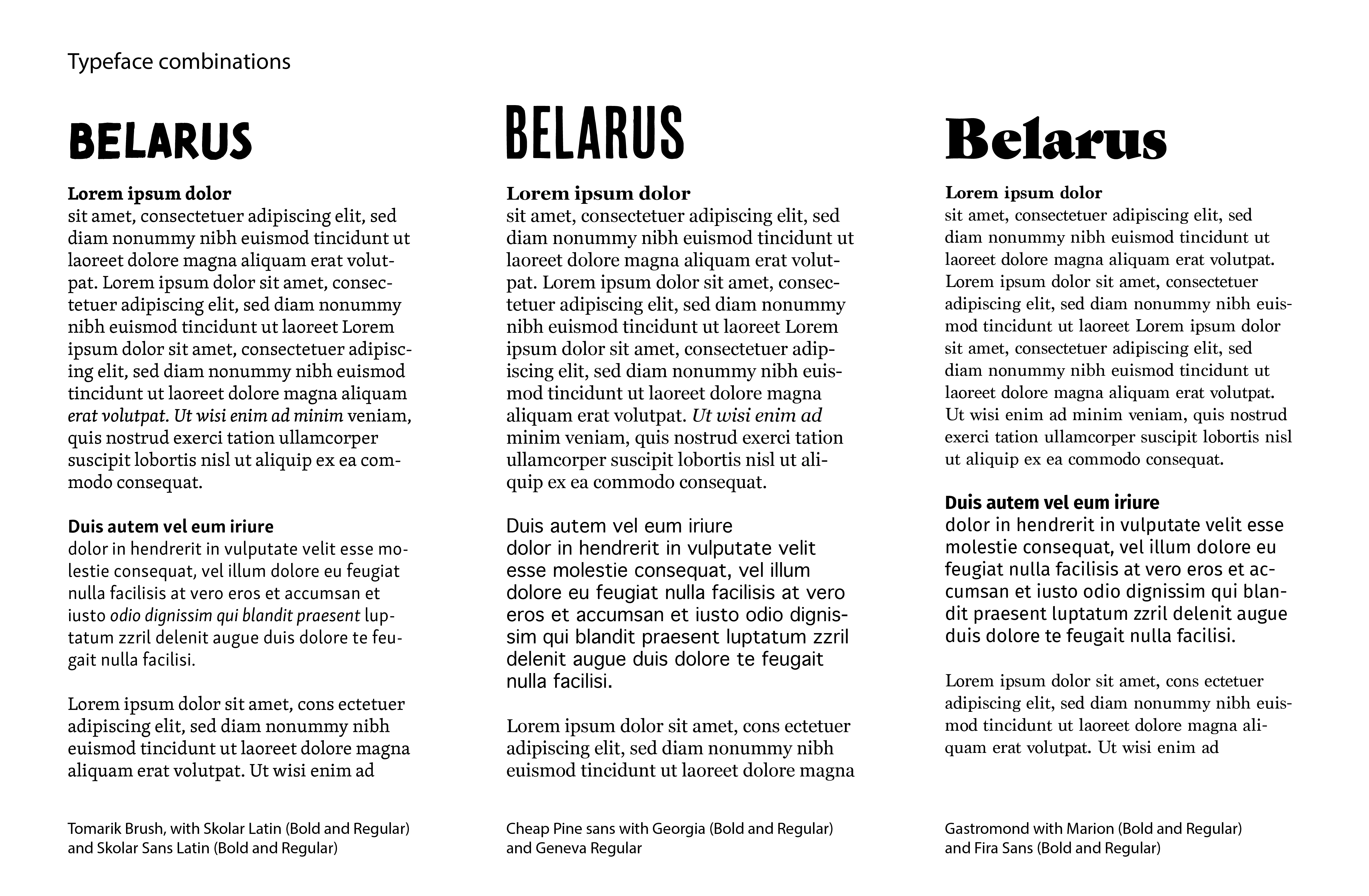
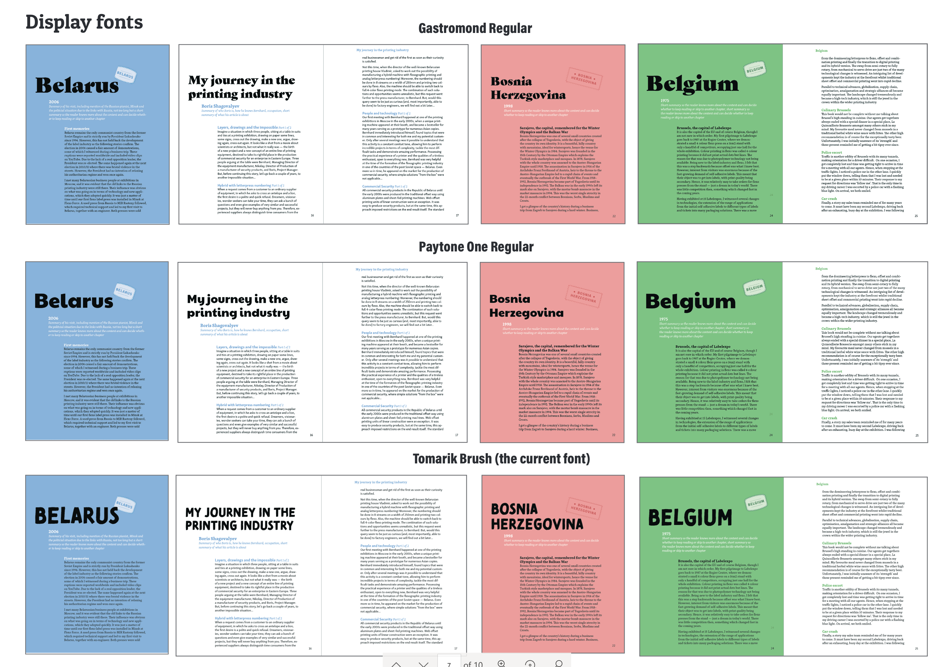
Using the content structure as a basis for the design, I created a number of initial layouts using a sample chapter from the text and accompanying images. Figures 6-10 demonstrate how these ideas progressed from initial sketches to digital iterations, experimenting with the grid system, number of columns, image placement, chapter openers, measure and typeface combinations. A key concept that was taken forward from this initial ideas stage was the inclusion of similar serif and sans serif typefaces for the different authors of the book, a serif typeface would be used for the main author (the client) which would be differentiated to the articles written by other authors with a sans serif typeface, ideally within the same type family.
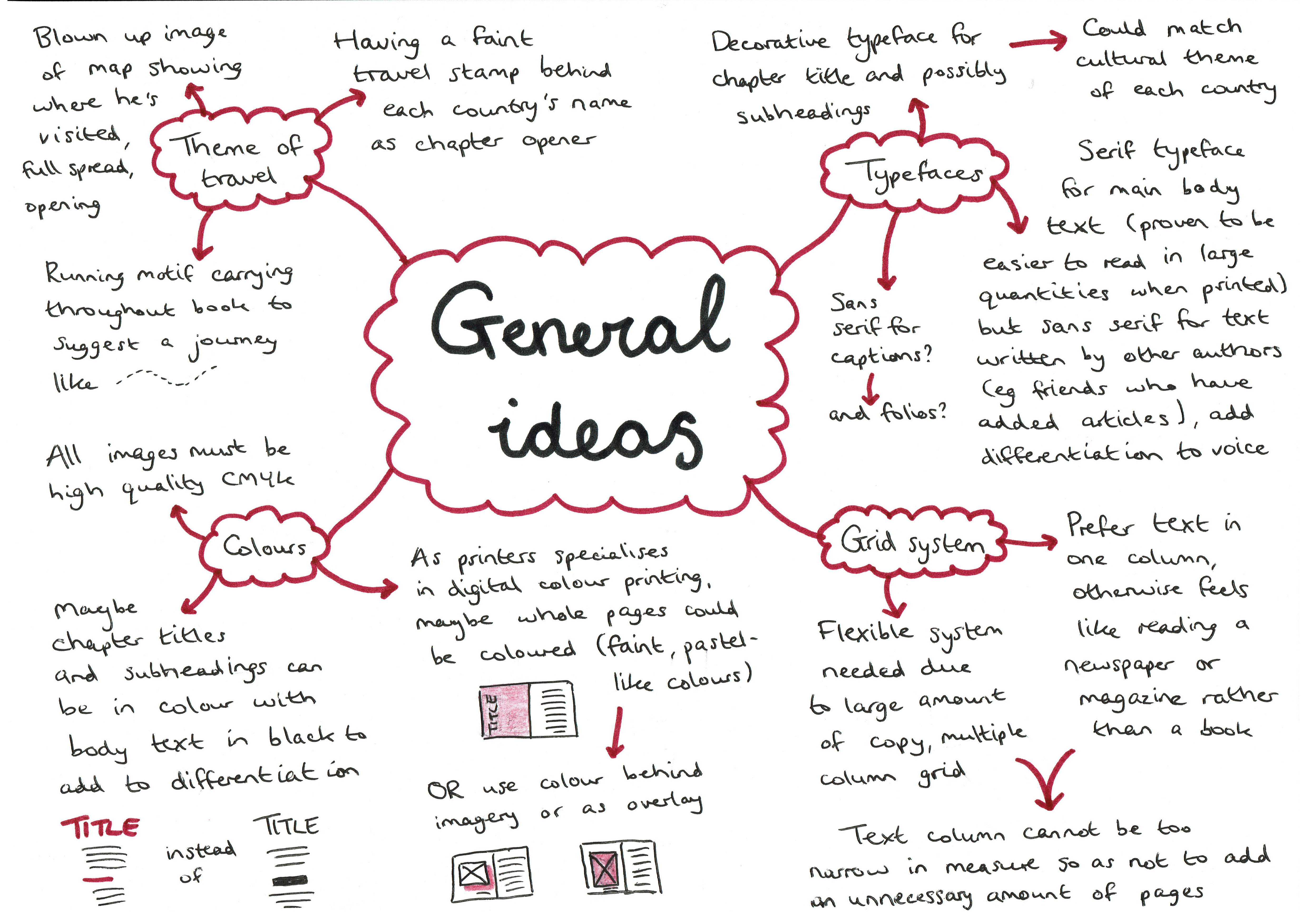
Figure 6: sketches exploring initial ideas of layoutFigure 7: digital iterations of initial sketched ideas (ideas in same order as in figure 6)Figure 8: chapter opener design from idea four, which became the basis for developmentFigure 9: mind map of general ideas to apply to the design of the bookfigure 10: initial exploration of typeface combinations and hierarchy
Design development
Over the course of six months, the design progressed substantially. Frequent online meetings with the client proved extremely useful in the development of the design, as a wide range of options were shown and then narrowed down based on personal preference and effectiveness for the large amount of copy.
Taking into account the various levels of text and inspired by the ‘step’ approach often used in Swiss design and by Jost Hochuli, figures 11-14 shows how this typographic design was applied to the content.
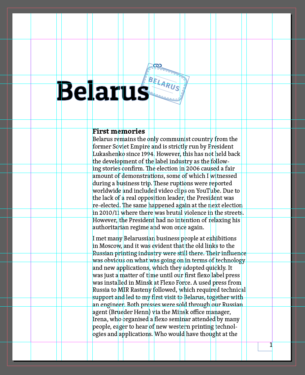
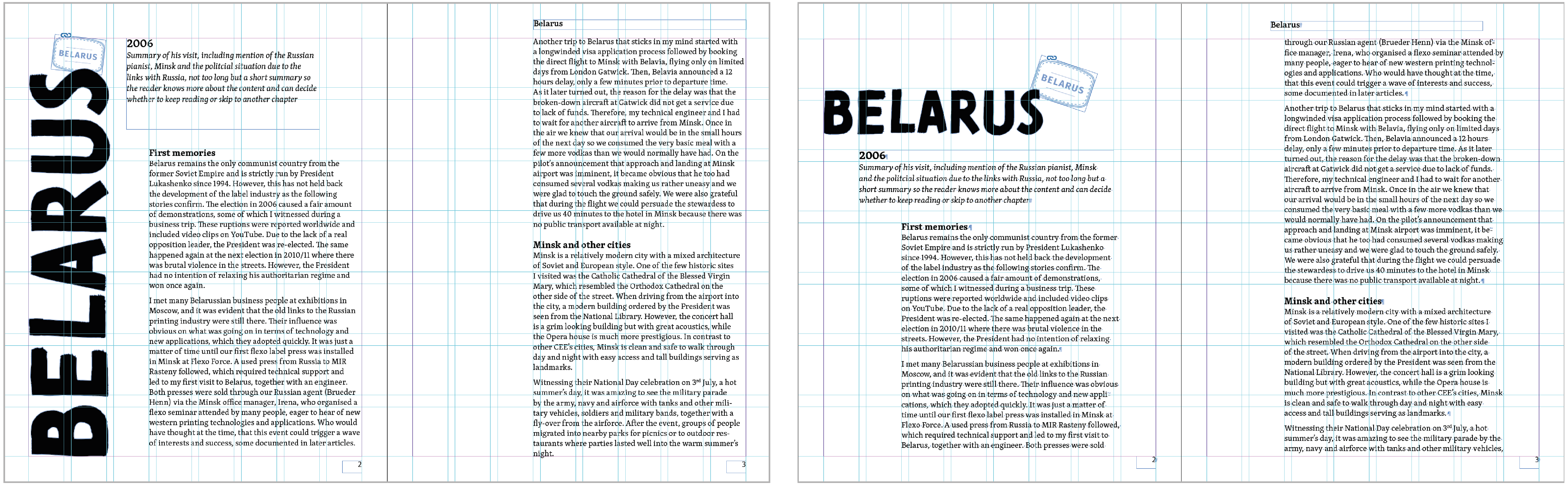
After a design direction was established, I attempted to apply it to the copy of the entire book. This highlighted some challenging issues, mostly the unnecessary length of the book created by paragraph spacing (479 pages without images), which was resolved by using indents (figures 14). Additionally, the large number of images sometimes proved difficult to match up to the relevant paragraphs efficiently, however detailed notes from the client helped solve this. Further considerations were then also made, regarding the use of colour throughout the book, the chosen display typeface, spacing between headings and prelims design (figures 15 and 16).
At this point, I referred back to only making amendments to a smaller sample of the book, roughly the first 75 pages, to allow for quicker changes to be made whilst still designing enough of the varying types of content to understand how these would work throughout the rest of the book. After these issues were resolved, the new system was applied to the rest of the content, with only more minor alterations then being carried out afterwards (mainly moving some images around, some grammatical changes, addition of more images that better illustrated the content etc).
Throughout the design process, when it was realised that the book was going to be unnecessarily long, the dimensions of the pages were changed to a more effective size (from 160mm (w) x 200mm (h) to 170mm x 240mm), but all other aspects of the original print specification remained the same.
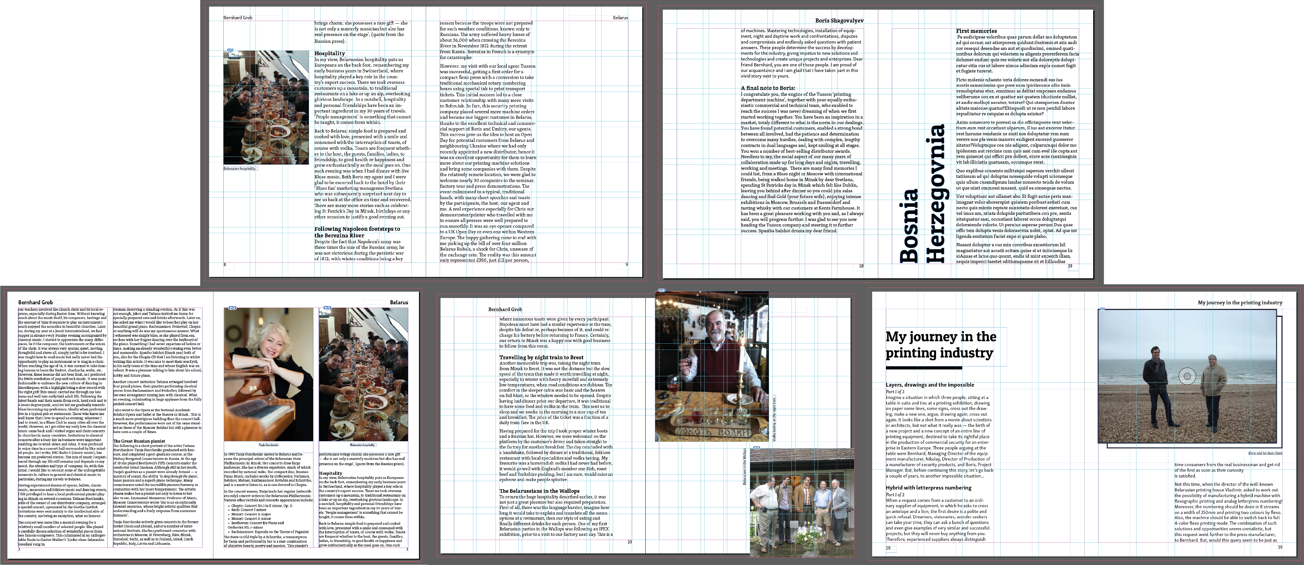
Figure 11: experimenting with different chapter opener layouts and text block placementFigure 12: testing out using coloured pages to differentiate new chapters, which although bold and eye-catching would result in clashes with the coloured imagery, makes the first page of each chapter appear separate to the rest of its content and was turned down by Xeikon due to the cost of inkFigure 13: comparing display typefaces and colour options for new chapters. Gastromond was eventually chosen for the display type, although at a smaller size than shown above, due to supervisor feedback that as a heavy font with only one weight, it should not overpower the rest of the text and should therefore have less prominence on the whole page.Figure 14: the development of the design from using paragraph spacing (left) to indents (right) to reduce the overall length of the text. This was implemented after the full book had been formatted and was found to be far too long (479 pages without images) so indents were preferred to cut down on the number of unnecessary pages. The right image also demonstrates the ‘step’ approach used to create hierarchy within a Swiss style.Figure 15: some example spreads that demonstrate developments in the use of colour in the text, image treatment, running heads/feet, measure, text placement, type size, display text spacing and the contrast in typefaces for different authors. At this stage, the main body typeface was also changed from Skolar Latin to the more consistent and ‘classic book’ typeface Georgia based on supervisor feedback, which was still paired with Skolar Sans Latin for external authors (compare the body type in figures 14 and 15).Figure 16: the development of the contents page matching developments to the overall design, with the last image being preferred for clarity, length and navigation
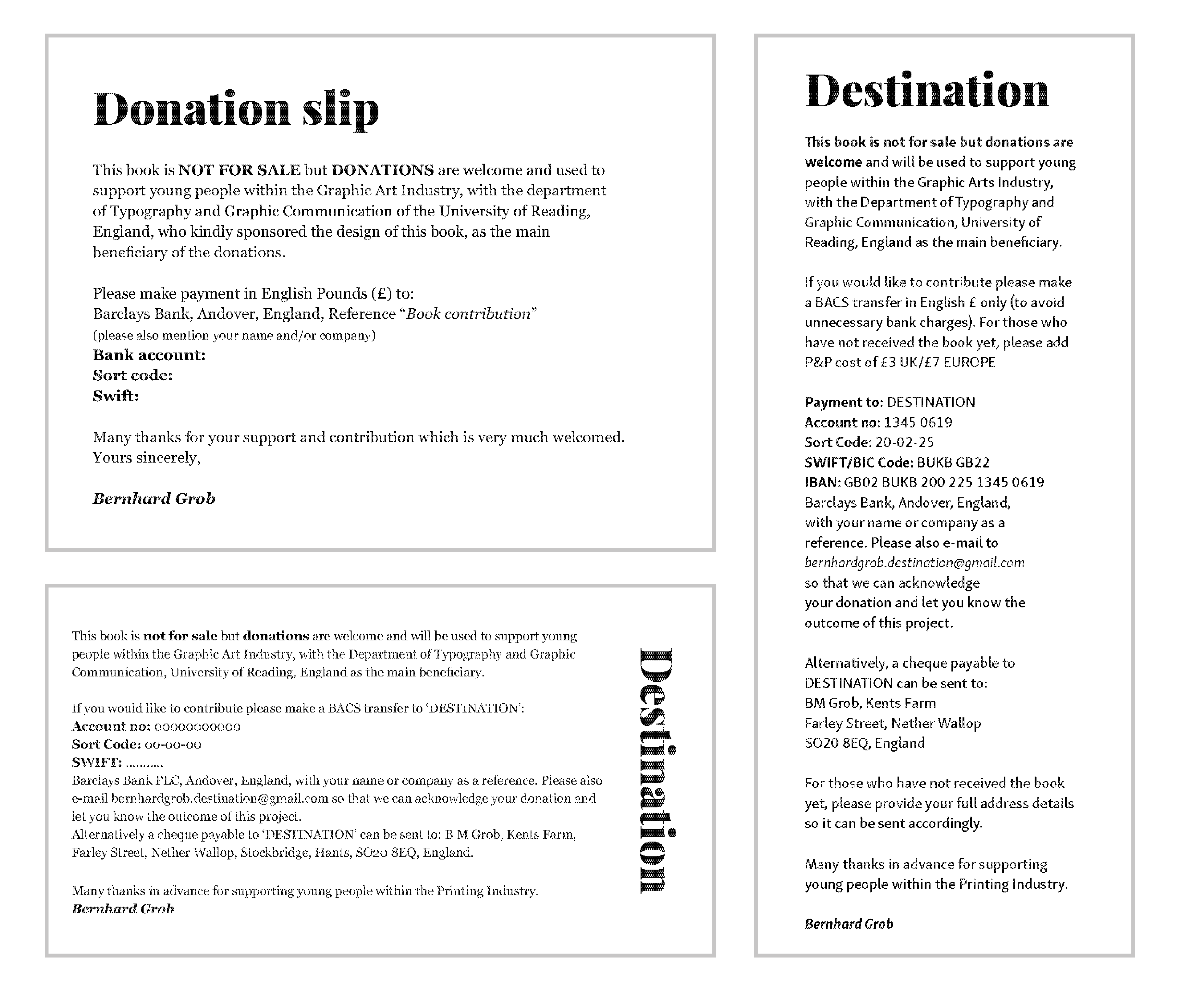
Bookmark design
In addition to the design of the inside pages, the client requested the design of a bookmark style slip that would be inserted into the front of the book informing the reader of the possible donations to the department rather than the book being for sale. This used text provided by the client which was then organised typographically to match the design of the inside pages, changing from a horizontal to vertical format to aid the reading experience. The developments of the bookmark can be seen in figure 17.
Figure 17: the different iterations of the bookmark donation slip design, with the final outcome on the right
Production
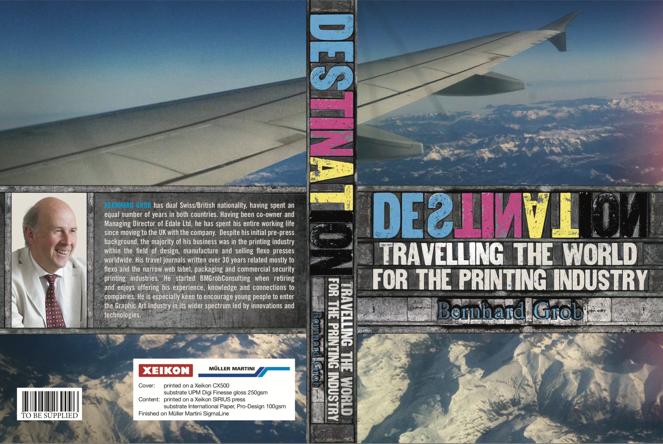
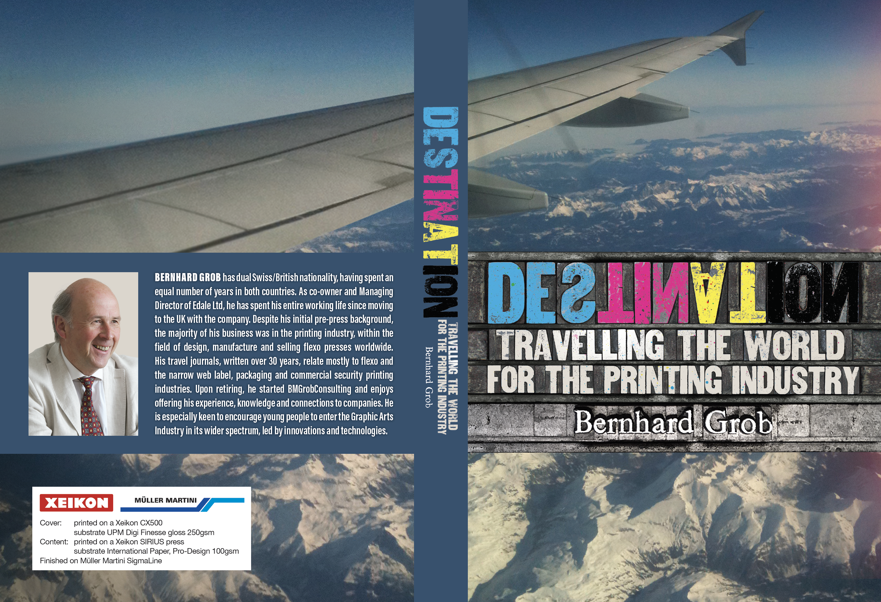
Professional designer Richard Jones created the cover of the book, combining the themes of travel and printing, through the use of reflected type representative of letterpress processes. I was able to offer some input on the design of the cover, and made some changes to the back and spine, changing the metallic effects to a more legible navy, as can be seen in figures 18 and 19.
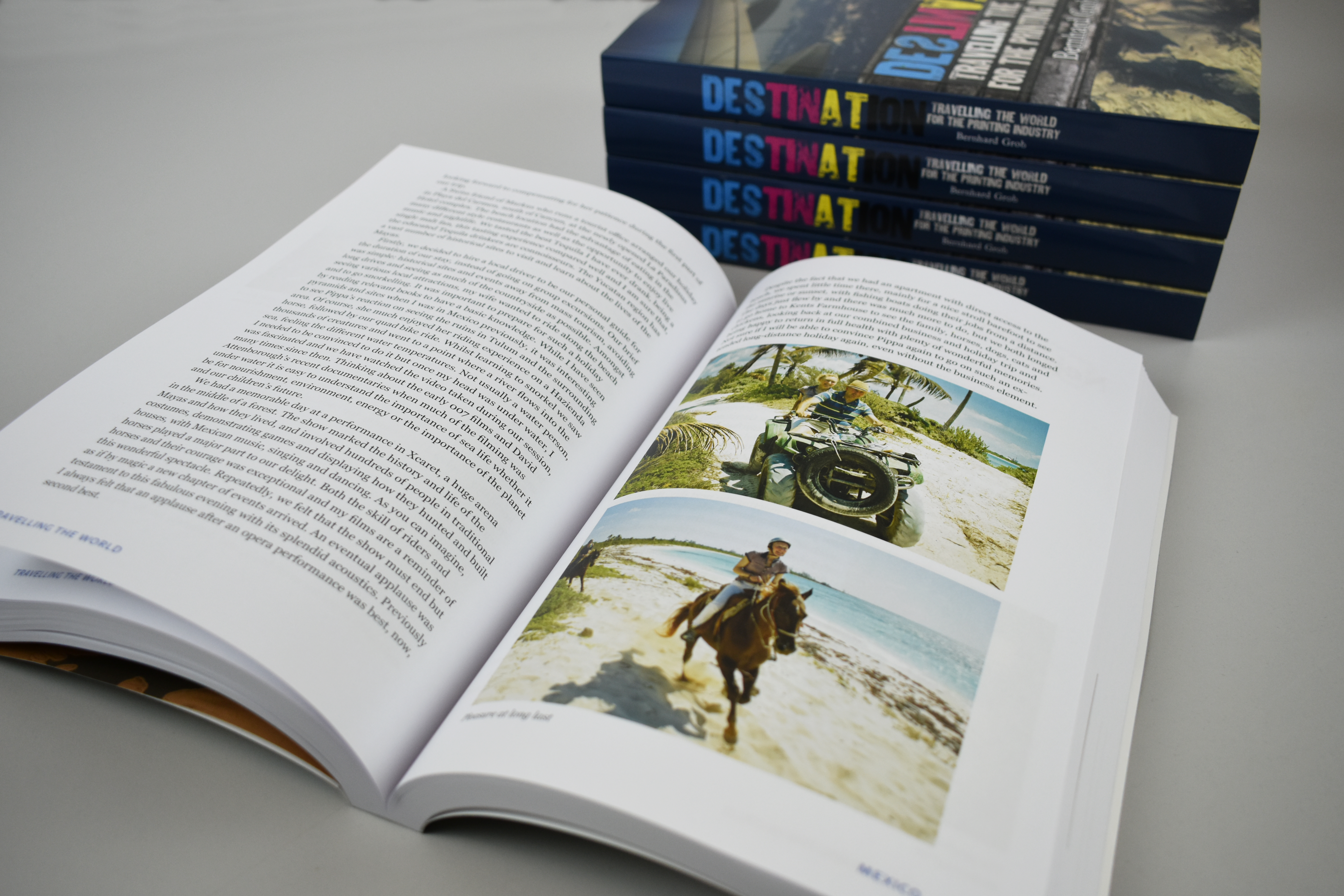
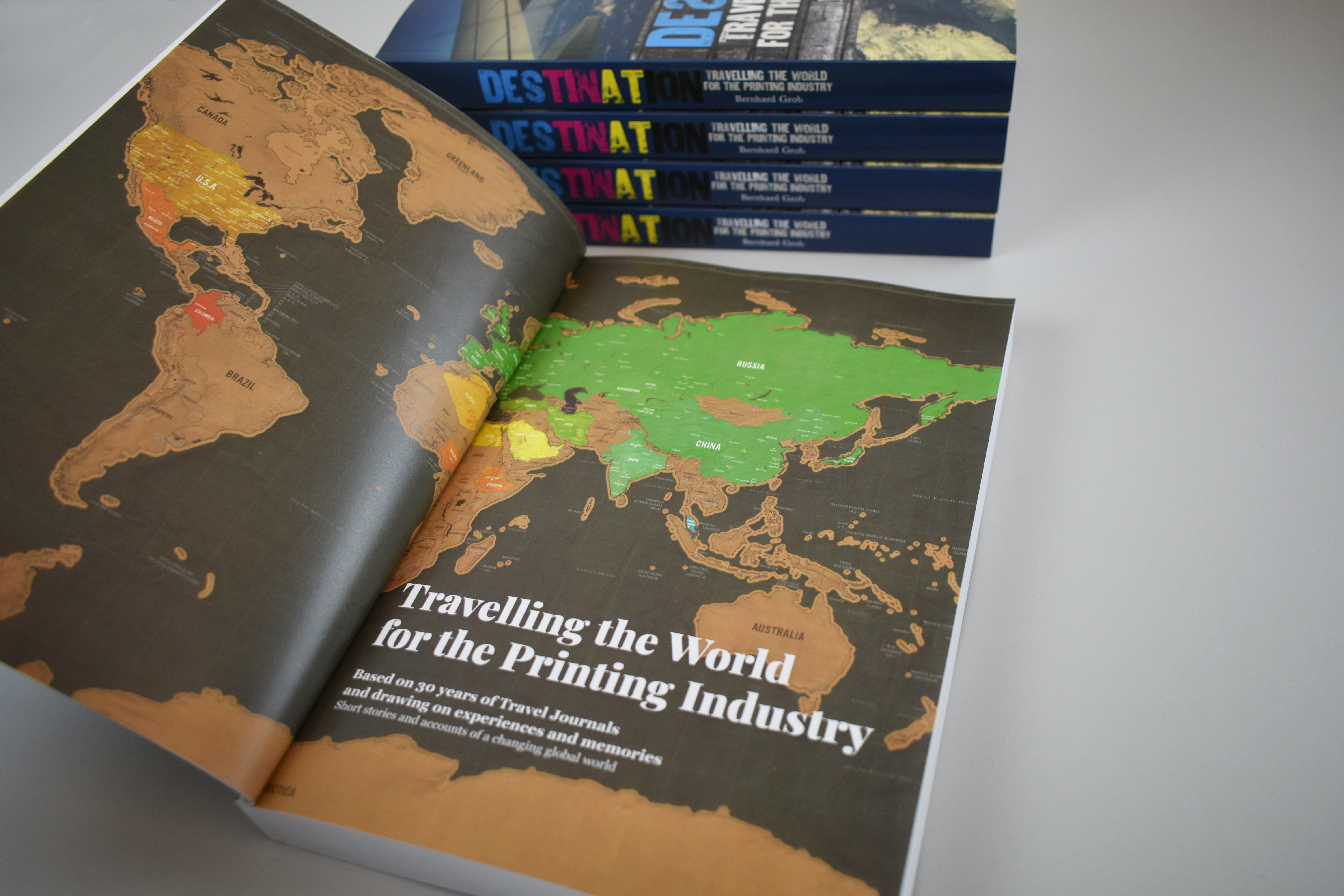
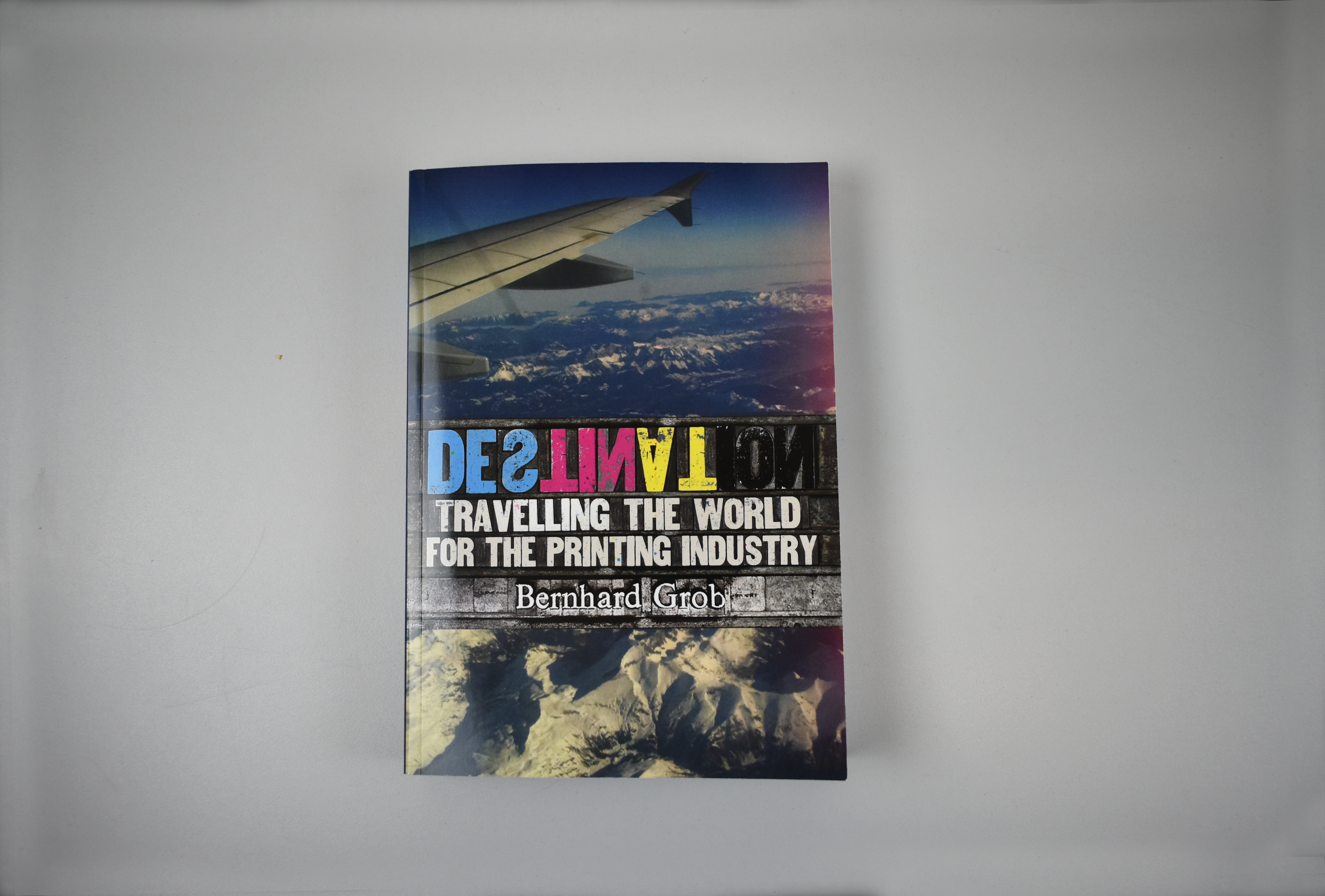
The final books were printed in Belgium and France on Xeikon’s SIRIUS and CX500 digital presses, before being sent to Switzerland to be finished by Mueller Martini on their SigmaLine. 1000 copies of the book were produced, 500 for the client and 500 for Xeikon and Mueller Martini to use as technical demonstration pieces for their industry-leading machinery. The production of the book also featured in an international webinar by Xeikon Cafe TV, which can be viewed here: https://go.xeikon.com/l/61642/2021-03-30/3sp4lx2
Although I was not immediately involved in the actual printing and crafting of the final books, it was important that I understood the production processes used and that my files were well-organised and print-ready, to ensure understanding and clarity across the different nationalities involved. Receiving copies of the final book was a really satisfying experience, and it feels like a great achievement to have produced a physical item in a year where digital deliverables have been prioritised. The full book was larger (in depth) than I had expected, as this was the first time I was able to fully visualise all 355 pages, but this only added to the overall feeling of satisfaction in holding something so large that I had designed. I had been slightly worried about the inner margins, but the main text block was appropriately placed on the page, with only some headings reaching into the margin on right-hand pages. However, as these are headings and are therefore in larger coloured type, these are still very legible and do not hinder the reading experience. Some of the images printed quite dark, although these had already been edited to be brighter and was more due to the actual printing outcome rather than the images supplied.
Figure 18: the cover design by Richard JonesFigure 19: the final cover design, edited by myself, changing the back and spine coloured blocks to navy for improved legibility. Additionally the author’s name was changed to white on the front and spine, and spine text was reduced in size. The text on the back was also edited for clarity and consistency.Figure 20: an example page from the press ready PDF file, sent over in single pages and will all printers marks included, as requested by XeikonFigure 21: the final books
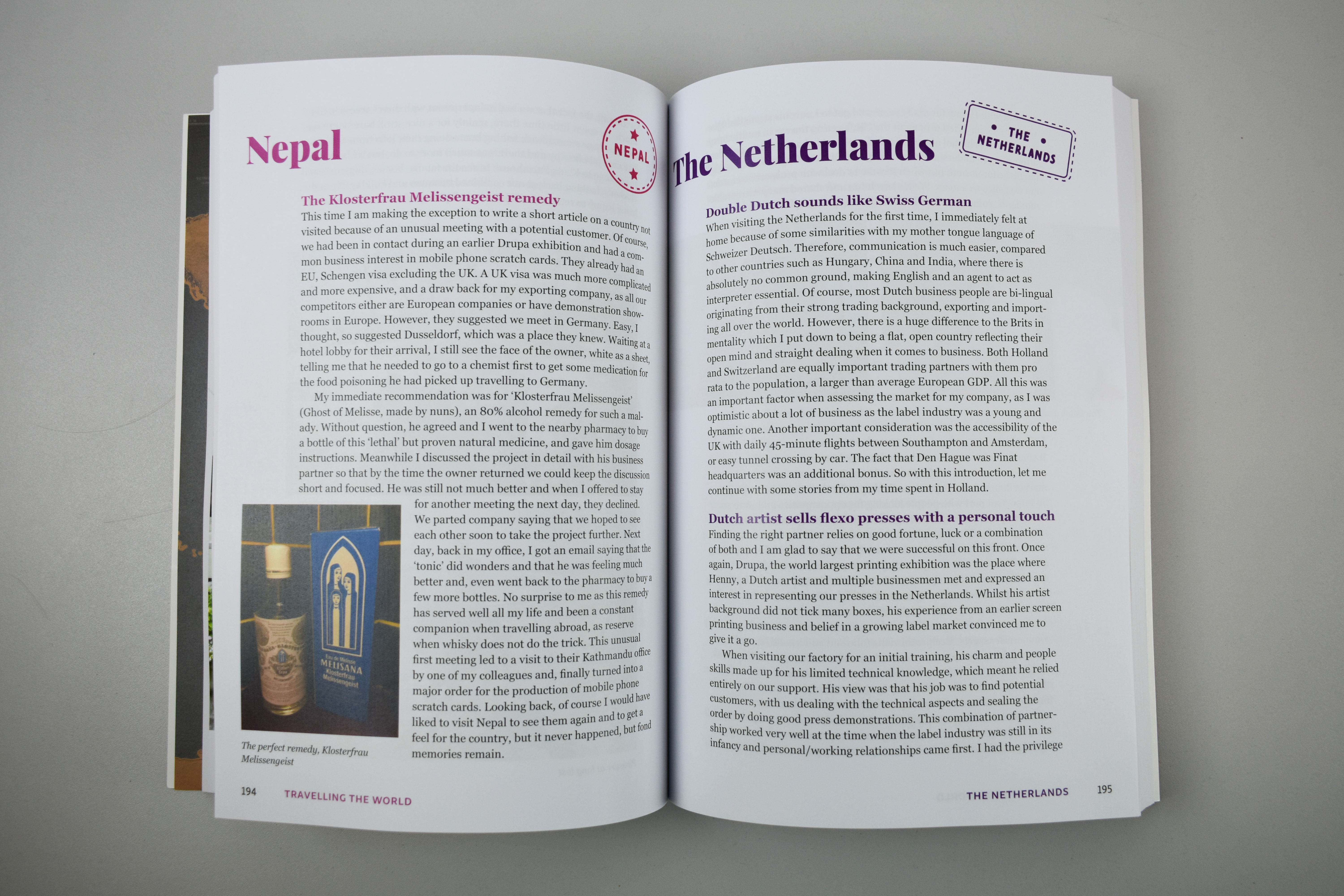
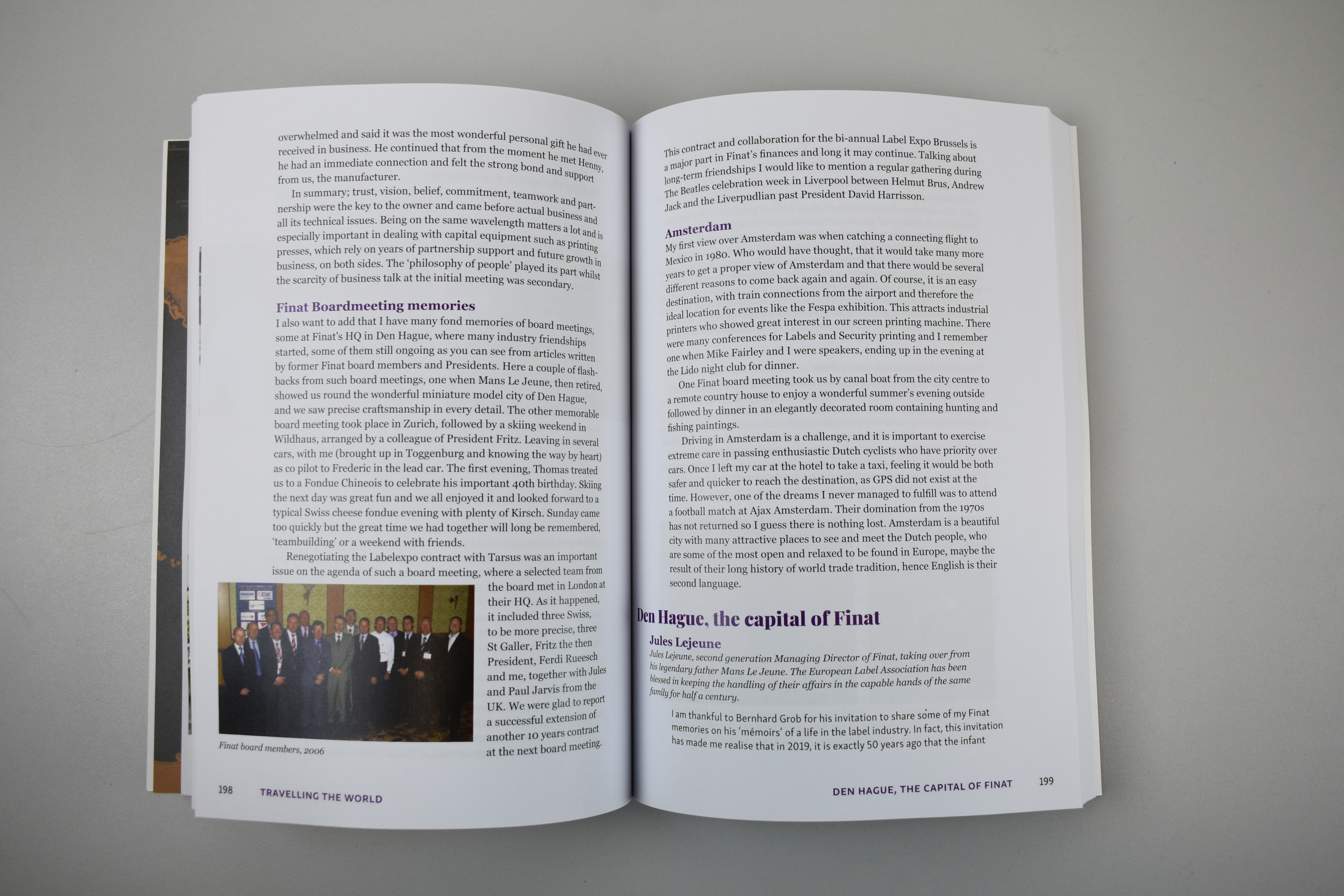
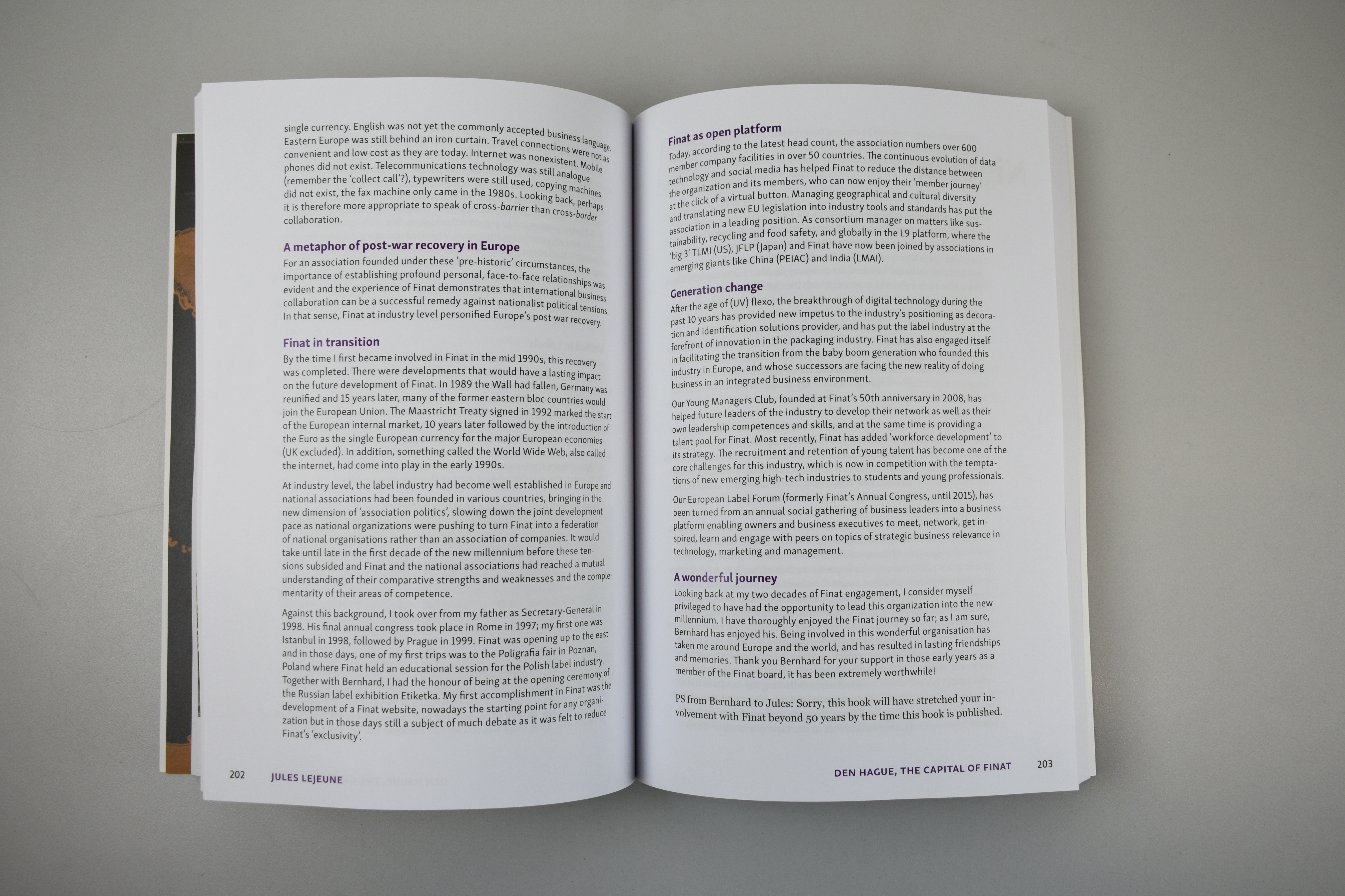
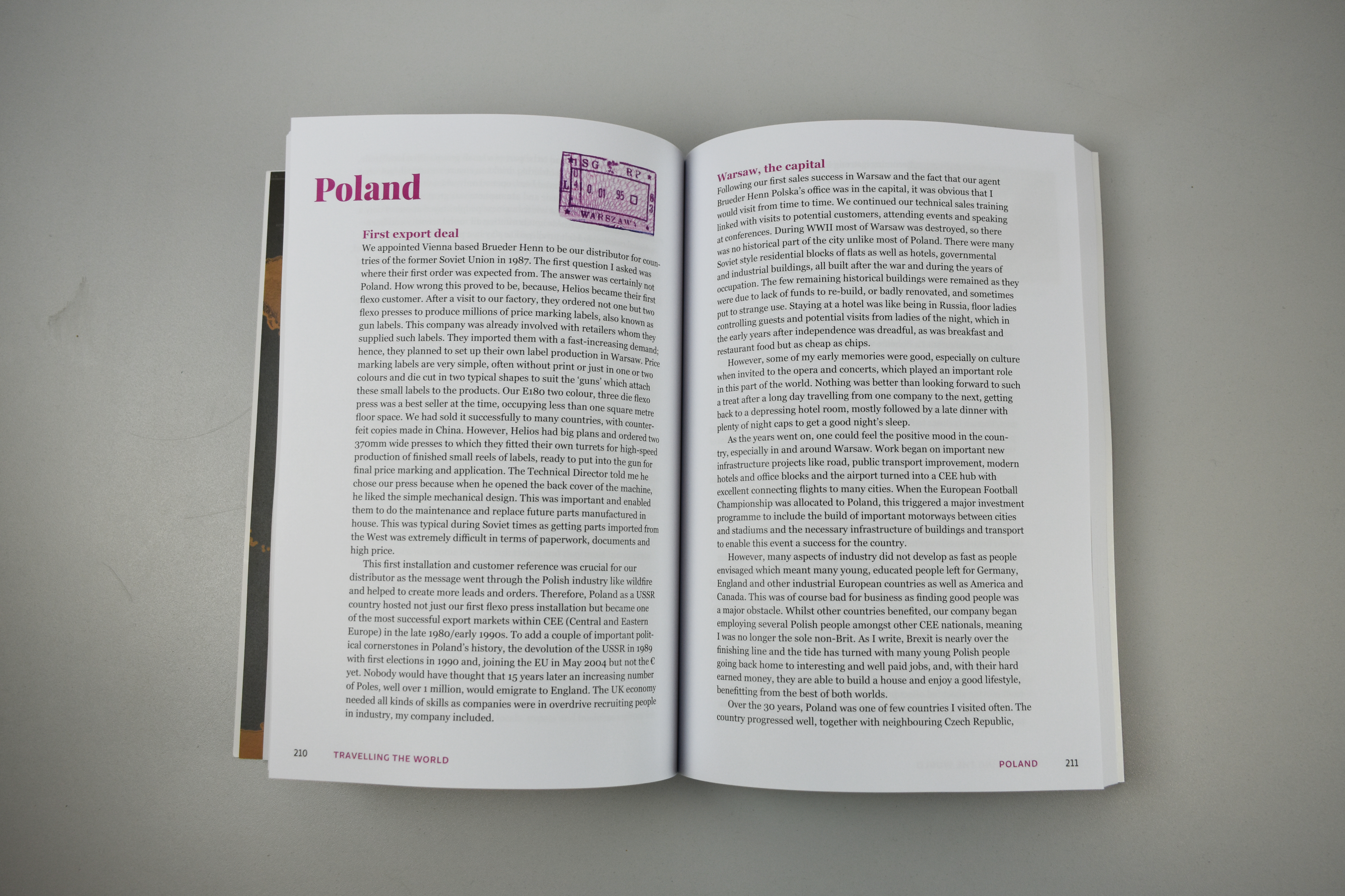
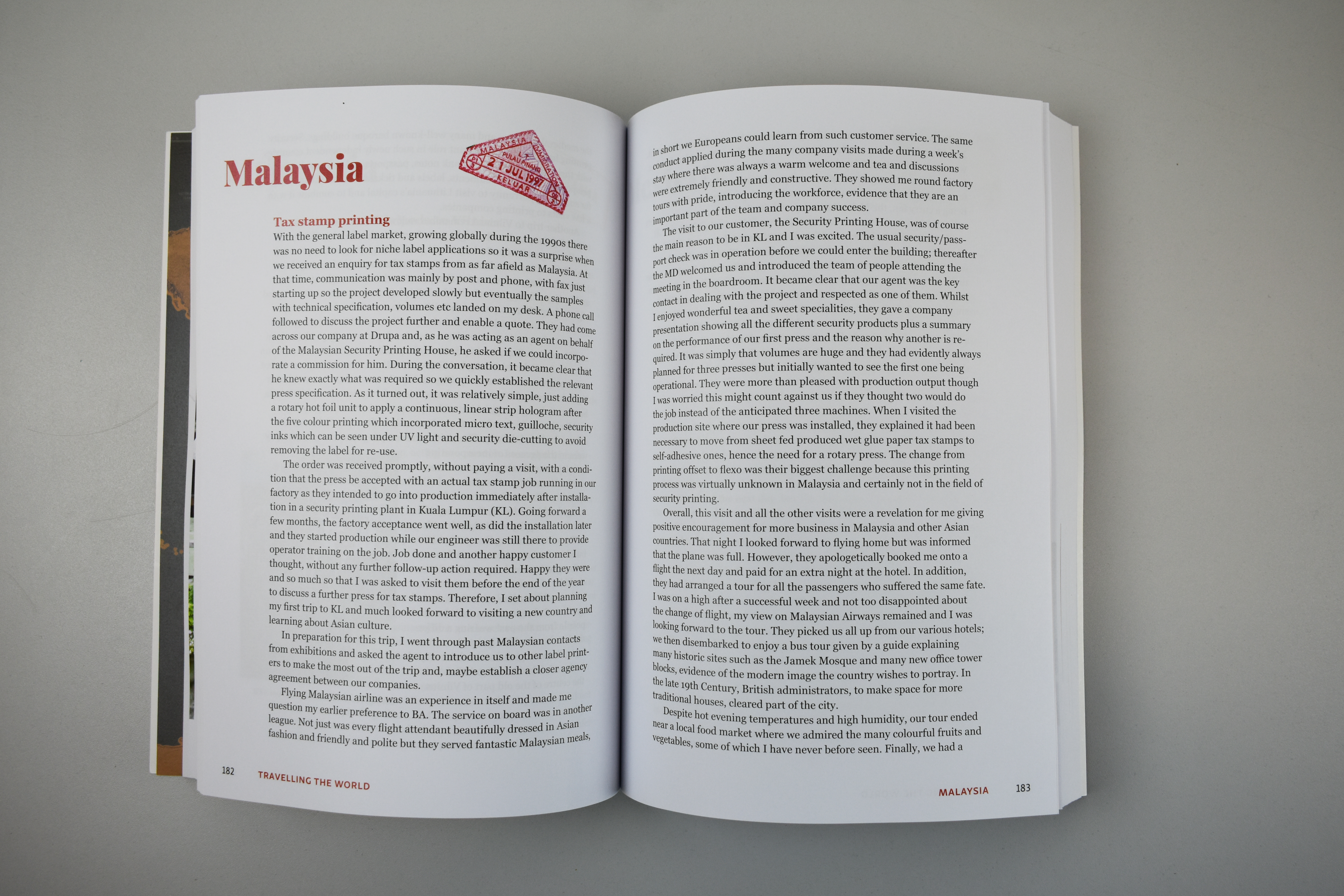
Figures 22-32: spreads from the finished bookFigure 33: the finished book
Promotion
The client’s extensive connections within the label and packaging printing industry provided the opportunity for an article in Labels & Labelling to discuss his career and promote the release of the book. Pages from this article can be seen in figures 34-36, in which I provided the images that were used. This article was later translated into Russian for their equivalent magazine, again with further images that I provided.
Figures 34-36: spreads from the article featuring the client in ‘Labels and Labelling’, including images sent by myself
Reflection
Overall, although a long and sometimes challenging process, the actual designing of the book was interesting and fun, especially as the use of colour in the text was encouraged, something unexpected and different to other books I have designed. Organisational skills were a must-have for this project given the large quantity of copy provided, alongside effective editing and selection skills, which I was able to develop.
It was a pleasure working with the client, his own knowledge of design helped facilitate the process and his feedback was always constructive and honest yet friendly. It has also been a great experience for me to work with industry leading printers, gaining a better understanding of large-scale production processes and technical considerations. I am grateful to have had the opportunity to work on such an international project, with the production, promotion and distribution of the book involving many countries.
As an individual project, I have been able to greatly improve my ability to make critical design judgements, now having more confidence to work independently on such large deliverables and becoming more efficient in managing my workload. I have also developed my professional communication skills, having a great relationship with the client, feeling more authoritative in justifying my design decisions and ensuring effective communication between the various stakeholders involved. I am very pleased with how the final book turned out and feel grateful to have been part of this large-scale project, providing a valuable learning experience that I will be able to discuss in job interviews, something that many students will not have had the opportunity to experience.
If you are interested in receiving a copy of the book please contact bernhardgrob.destination@gmail.com.
Client reflection
“After a relatively short online introduction (as it was during the pandemic), Ruth grasped the ideas and intention of my book quickly, coming up with a detailed brief to ensure we both understood each other. The next step included her various design ideas which we talked through and again, quickly agreed on the chosen version. The real work started once I transferred the 140,000-word document, together with numerous photographs in electronic form, as well as some historic actual photographs and documents. It was a real minefield to put all this into the right order and sequence, but Ruth tackled it in a confident, efficient and prompt manner, with fewer queries than I had anticipated.
Dealing with Ruth throughout the lengthy process was a great pleasure and I much appreciated her professional punctuality, accuracy and attention to detail; something I considered rare in a final year student at university, eager to enter the real business world. Her keen creativity and understanding of the author’s mind-set played a key part in completing the design in such a short period of time, leading to the finished file, ready to go to the digital printing press manufacturer for printing. The only negative outcome is that the planned live book production during Drupa 2021 at the digital press manufacturer’s stand was unable to happen due to Covid.
In conclusion, I can highly commend Ruth as an excellent designer with an understanding for the bigger picture. A competent, driven young person with ambition who can lead from the front in the interests of the customer. I am sure she will go a long way in her future career making full use of her skills and entrepreneurial spirit.” — Bernhard Grob, BMGrob Consulting
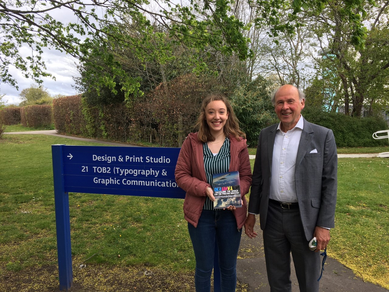
Figure 37: Bernhard visiting the department and Ruth receiving the finished book