Restated Brief
The aim of this project was to rebrand a charity website, the charity (Signpost) being based in Essex with the aim of working with people who are struggling to find employment and training. This was my first real job project so I must admit that nerves got the best of me and that I didn’t start off as soon as I did, such as with organising a meeting with the client and supervisor, but when I did eventually get there it ended up being quite alright. My first supervisor meeting basically informed me of everything to do, there was a lot to remember going into this project so having this meeting really helped me make heads and tails of the whole process.
After that the next stage was to set up the client meeting and establish the brief, since the client was in Essex it would be more beneficial for everyone if meetings were organised via email and happened over Skype video calls. The client’s old website was hosted on wordpress, so this would be the program that the rebranding would be happening on, and it certainly wasn’t the greatest looking website ever made.
Research & concept
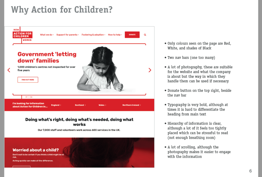
The next stage was to look for inspiration of other websites, Signpost already has its own branding however it was necessary to see what other charity websites were doing with their website and establish a similar look/structure through a moodboard. Websites such as ‘Rainbow Trust’, ‘Action for Children’, and even ‘Freebooks’ all have a consistent design style with appropriate use of the branding colours on the screen making the overall page more vibrant and friendly to look at over a plain white background.
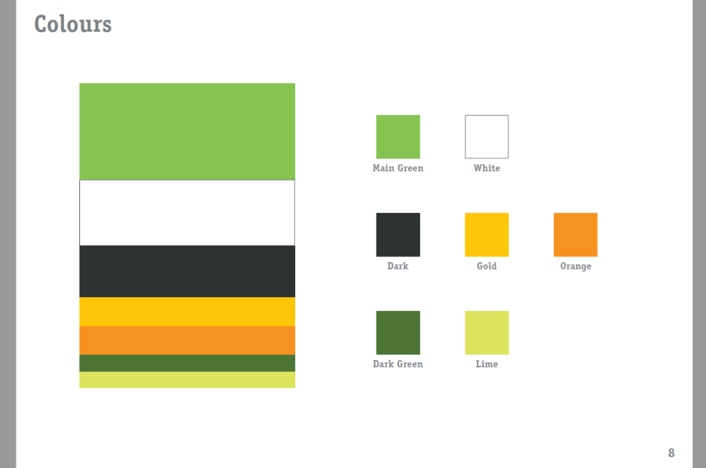
This developed from a moodboard and into a branding proposal mainly because I began to add things such as proposed branding colours and typographic and designed treatments of what the new website design COULD look like, this helped the client visualise the sort of things that the new website could do and feel like once designed and he was pretty happy with it to say the least. There was a lot of back and forth on this document as a branding proposal turned out to be more complex than I thought, there were a lot of considerations to take into account such as making it clear that the type used for the document wasn’t actually part of the branding proposal. Another aspect which I’ve found interesting (and will never forget) was in how I showed the colours, Having them simply in a row doesn’t really say much to the client meaning that it would be more appropriate to make the boxes bigger or smaller depending on much of that colour would be used on the page (such as with green being the most used whilst gold and dark green being the least used).
Design Development & Deliverables
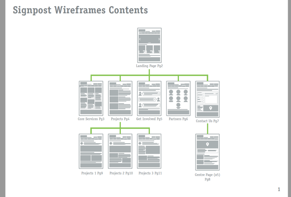
Next began the wireframing, the document for this was straightforward as this was basically a duplicate from the previous document, however the things shown on here were completely different to before. The design for this had to be compatible to show a sort of contents page for the wireframes, so that the client could easily go back and forth between pages from corrections (which was actually what happened, this was also useful for his board meetings), I didn’t go all out with the overall style of the wireframes as I mainly wanted to quickly show where certain elements could be placed. However for future reference it may have been more useful to have had some text prepared for this stage, as later on it was awkward building the page and then realising that the column that was meant to have a certain amount of text on the wireframes only had less than half intended, this was not such a huge issue along the road as I worked with the client in terms of telling him whether or not a page needed text and how much of it/what needed to be said along the lines of.
The next stage would be to actually start drafting the website on wordpress. Admittedly this project had originally began as a pair, however there were problems which caused progress on this project to be halted, from this it was in the end sorted out and drafting of the website could begin
WordPress drafting
This was my first time using wordpress therefore going into it was very overwhelming, the UI seemed very complex to grasp and a lot of the features are there without any explanation as to what it does (leaving the only solution to basically look for online tutorials). However I did find that wordpress’s way of building a website was very groggy, what’s meant by that is that the way in which images and text work on here is very reminiscent to how images and text works on Microsoft Word. This obviously could not do so I delved deeper into what could be done about this issue, I was more concerned as to how the client would be able to work on the website and update it in the future after I’m gone (especially if he or anyone in the charity didn’t know how to code) so anything to make it easier for him would make me happy.
In my research I found that wordpress ran on themes and plugins that were basically like having extensions with special functions built in added onto the website, to explain in brief a number of plugins I used added:
- Image carousel for the home page.
- Contact form, although this is off the client can simply turn this on and it will appear on the contact page.
- Optimised search engine, and so on.
The number one plugin that resolved the problem of maintaining the website for the future was definitely the ‘Elementor’ plugin. It eliminated the tedious use of wordpress’s default way of adding stuff to the page by simply drag-and-dropping elements onto the page, there is a row based grid at work but that’s okay because the website was built using this one plugin which made the whole process fast and efficient especially when compared to coding which would’ve taken not even 5x as long.
There was a lot of back and forth with the client in terms of what was needed on the website and what could be added on/changed next, this was a very lengthy process which after discussing this with my supervisor it basically came down to what was necessary on the website as it had been in a launch-able state for quite some time. However this does not mean that I had to make changes all based on the client’s wishes, a lot of what he said came from members of the board and also funders of the charity which made the changes in a way necessary to be made in order for the website to be able to launch. In the end we sat down together and went through the content on the website one last time before it was finally in a launch-able state.
Reflection
I must confess, this project took a lot longer than it should have taken. There were a lot of problematic factors that occurred throughout sure, but I blamed mostly my inexperience with time management for the client and also pushing people to do things that need to get done. With this project I feel like I’ve gotten confident with talking to clients about projects and making sure that they basically stay on task as well as making sure that I work efficiently by being more ruthless with my time early on so that I have more time to work on things in the future.
Another interesting aspect I’ve learned is about wordpress and appreciating the things that it is able to do, from my understanding it is very good at making posts (such as blog posts or articles) especially since the typo network is on wordpress. Mentioning that, the client did have an idea of having a sort of blog posts for each of the charity’s centres, even though I couldn’t do this I let him know that through wordpress it was certainly possible to do in the future.