Real Job by Lydia Hall
Exploring Photoshop
Explore, verb: travel through (an unfamiliar area) in order to learn about it
Software Tutorials
Coming into the Spring Term I’ve built on my knowledge and skills in Photoshop, Illustrator, and InDesign. I’ve also met new software along the way, After Effects, Adobe XD, and Premiere Pro.
I have been exploring Photoshop in a more thorough way, rather than just an initial first look. For instance, the clone stamp tool is such a fundamental part to photo editing, but I didn’t even know it existed! Only by this in-depth exploration can I progress from just familiarity to a higher, more professional usage of any software.
Design Ideas and Design Process
Cutting Things Out
I started with the intention to change the background, following along with this given tutorial.
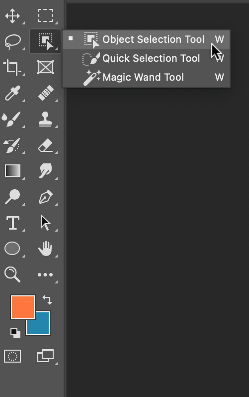
Previously I have used the ‘quick selection tool’, but the tutorial spoke about using the ‘object selection tool’. This was something that I’d never come across before, so I searched up how to use the this tool and came across this tutorial.
Firstly, I located the ‘object selection tool’, Figure 1, which was in the same place as the other selection tools. With the tool selected, I drew a box around the selected object, Figure 2. The computer then shrinks the line down to a shape it thinks you’re trying to select, Figure 3. This tool was pretty good at selecting most things, but I cleaned this up using the ‘quick selection tool’.


By holding down the option key (⌥) you can toggle between adding a section or subtracting a section, Figure 4 & 5.
In the tutorial I was following, it also showed how to change the background to a black & white image. I kept the cut-out flower on another layer and applied the filter to the original image. This effect makes the foreground pop and is something that I would use again for photo manipulation.

Clone Stamp
I explored one of the given tutorials, which was a useful introduction to the ‘clone stamp’. It looked like magic, until you understood the logic behind it; of copying similar parts of the photo to erase unwanted sections. I used a photo of some ducks, Figure 7, to begin with.

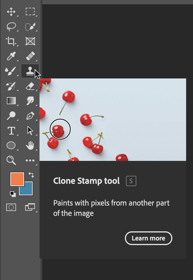
I created a new layer so that the edits could be toggled on and off. The ‘clone tool’, like the ‘object selection tool’, is located on the left-hand toolbar, Figure 8.


To choose which part to copy, hold down the option key, and you will notice that the cursor changes to a circle with a cross inside it, Figure 9. The selection is the part of the image which you are copying. When pasting this new selection, a small cross, Figure 10, shows you where this information is being copied from.
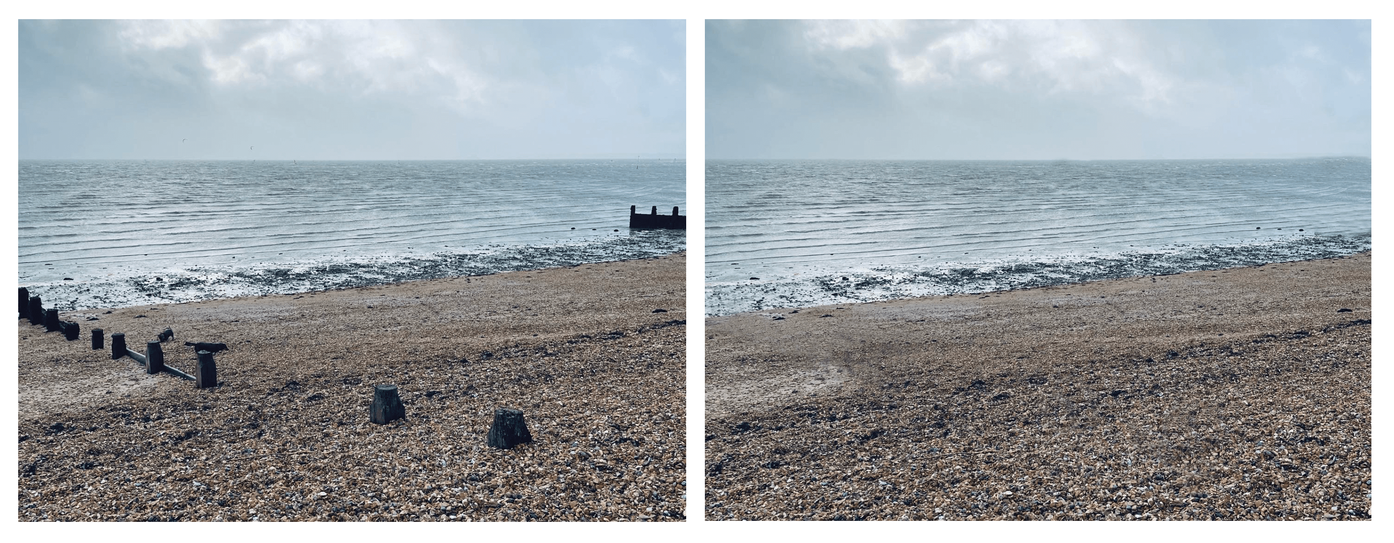
I put this into practice and edited out some unwanted parts of a picture I took at the beach. I removed the dogs and wooden structures by copying other parts of the photo. I think it is successful because it’s done seamlessly, you can’t tell that I’ve copied other parts.
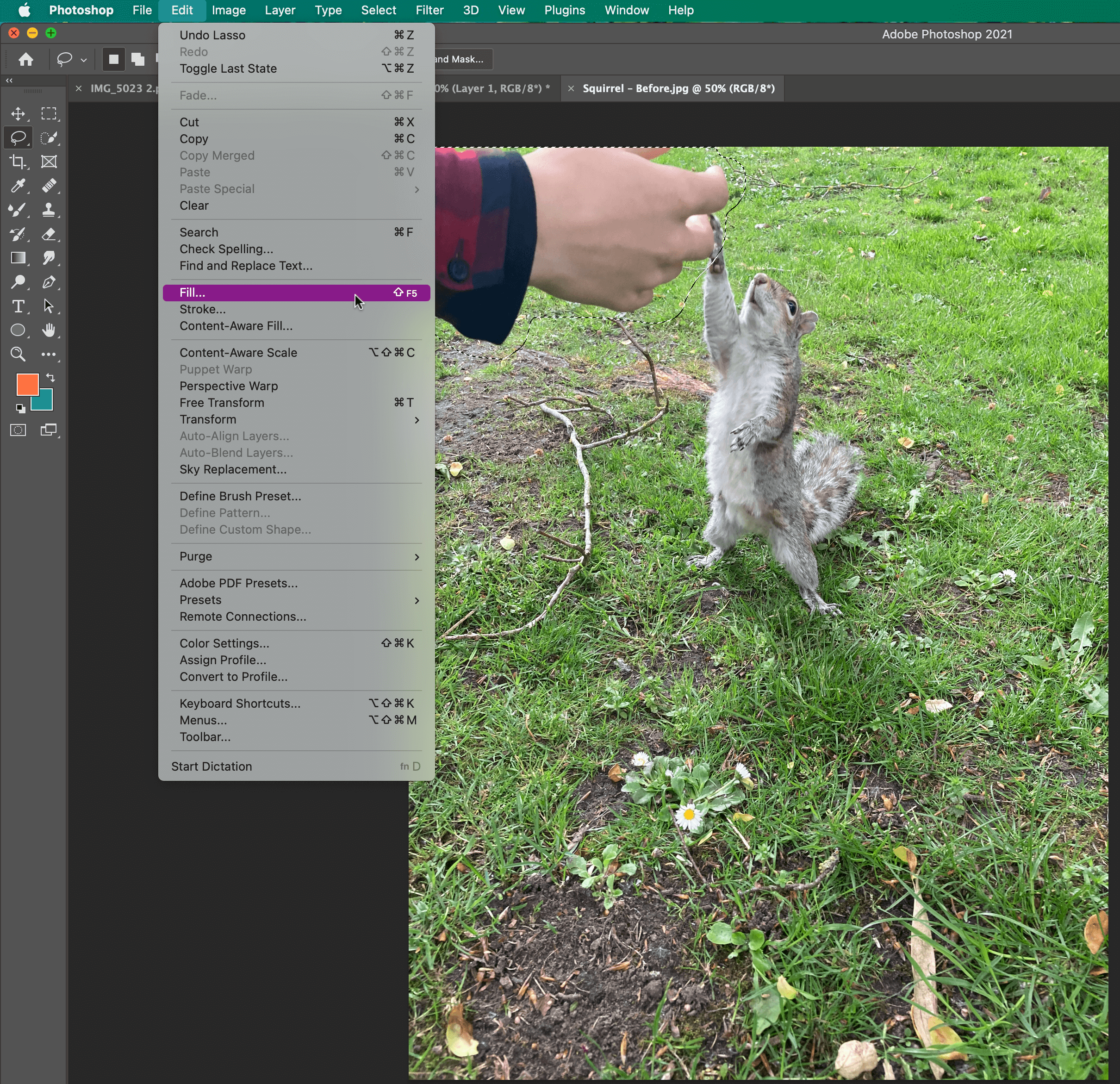
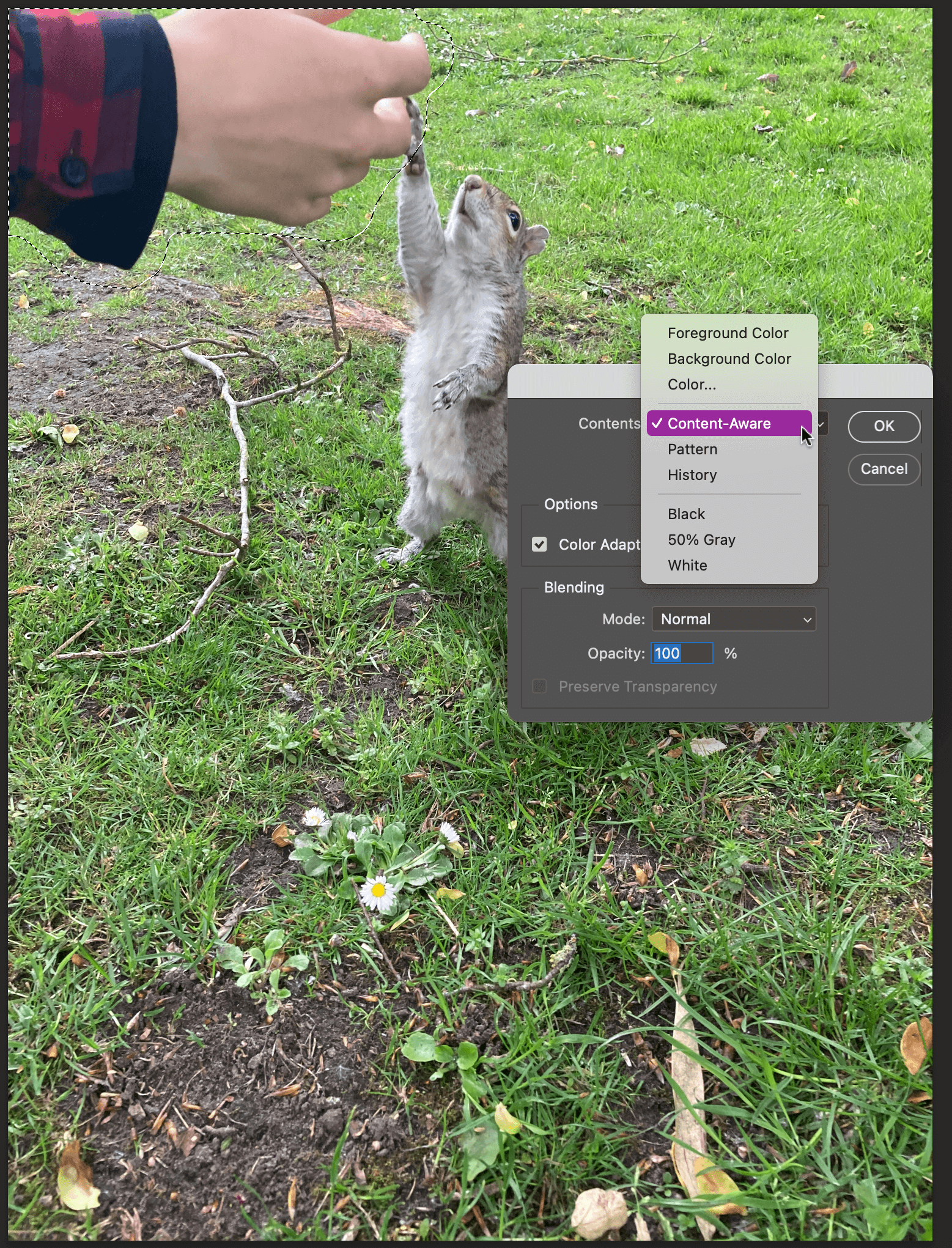
Content-Aware Fill

I explored one last tutorial for my third design idea, which was how to remove objects with the ‘content-aware fill tool’. Firstly, use the ‘lasso tool’ to select the part you want to remove, this can be quite loose, in my case, it was the hand, Figure 13. Then locate the fill option, which is in the top menu bar, Figure 14. Choose content-aware fill, Figure 15, and this is the result, Figure 16.
The software does all the thinking about which parts to copy, similar to the steps taken in the clone stamp tool.

Learning Across the Module
I’ve found this module particularly helpful to my development as a designer and as a professional. I’ve been able to lead this module in ways that have been useful to me, in terms of learning new skills.
The skills that I have learnt across the module include: the clone stamp and content-aware fill in Photoshop, 3D text effects and the envelope warp tool in Illustrator, and making tables in InDesign.
However, the biggest thing I have learnt is how to use new software. This term I have had to learn three completely new software: After Effects, XD, and Premiere Pro. So, you get quite used to the process of accepting scary new software and simply just opening it. Thankfully the Adobe software is all fairly similar, which has made this process easier.
Skills I have improved on this module include: cutting things out in Photoshop, and using the pen tool and creating gradients in Illustrator. Other skills have been using Adobe fonts more, for instance I now know how to search by an image in order to match fonts. Finally, I have been able to build upon my time management and staying on top of the independent tasks, even when no one checks upon it!
Skills to continue to develop:
Two skills that I would like to develop are being able to make screencast and using Adobe XD in a fluent way. Making videos is a fundamental skill, especially in increasingly digital world, and is something that I’d like to build my confidence in.
Design Resources and Articles
In my current design work, I hardly use Photoshop. However, being able to use it to a higher standard would enable me to have a wider skill set. How to get to that stage? A wider exploration of the software, for instance opening up all the menus to see what everything does.
I could do a thorough LinkedIn learning course, which would enable me to learn pretty much everything there is to know about Photoshop. Or I could continue to set myself design challenges, similar to this module, where I carry on with a strict regime of learning new skills. We never stop learning, even more so with software that is constantly changing and adapting.
The Text Does Not Control You!!
While this task was mainly about establishing visual hierarchy, I ended up learning a lot more about how different types of information should be presented.
How to Format a Date
In the “raw text” all the dates were set out like this: Tuesday 24th October 2017. In the “Typographic style Handbook” it states “Only numbers should be used for the days, not 1st, 2nd, 3rd etc.” (Mitchell and Wightman 2017: 77). Before this task I didn’t know that dates had to be formatted without the “th” bit, so I listed serval of the different date options.
Tuesday 24 October 2017, Tue 24 Oct, 24 Oct, 24.11.207, 24/11/17
For the flyer aimed at family I chose to format the date as Tue 24 Oct, omitting the year 2017, it does say “Autumn 2017” in the title. Many families have weekly occurring events, for example every Wednesday is an extra curricular club, and so would have to work out which day the 24th is, and see if they are free next Tuesday.
For the flyer aimed at the old couple I left out the date, 24 October. With the assumption that if they really want to see this film they would make room for it rather than just wanting to fill their day.
How to Format Time
In the unformatted text there were a range of different foments for the time. Younger children struggle with reading the 24 hour time, and so I chose to use the 12 hour version, and kept the time in the 24 hours for the retired couple.
When to use an En dash
“A spaced en dash indicates spans of time” (Mitchell and Wightman 2017: 77).
How to Format Names
Names are important and so they should not be hyphenated over a line break, or having the name go over two lines. By using a “soft return” I was able to keep the list of names in the same paragraph but was able to respect the actors and keep their full name along one line.
Hierarchy
In the text there are 12 different pieces of information, listed here in alphabetical order:
Age Rating, Audi
o Descriptive, Building, Cast, Country of Origin, Date, Director, Film Title, F-Rated, Language, Time, Run Time, Year of Origin
![]() A new concept to me was brainstorming with having a user in mind, rather than just having ideas. When having a user in mind, you can make design decisions to support their needs.
A new concept to me was brainstorming with having a user in mind, rather than just having ideas. When having a user in mind, you can make design decisions to support their needs.
For the flyer aimed for families, this is how I ranked the information:
Film Title, Age rating, Date + Time + Run time, Building, Cast + Director, Year of origin + Country of origin, Audio descriptive, F rated, Language.
I grouped like information, that would be in the same paragraph style. This helped me to know how many chunks of information I had to design for.
Design Process
I found it helpful going over the printed version with a class mate, and could pick up on a lot of the silly mistakes, where the spacing or formatting is simply missed out. Printing out the flyer means I could see that the text was simply too small, and printing in italic yellow isn’t really that clear. Even now I have realised that for the 24 hour time I have typed “pm” which isn’t required. This has highlighted the importance of going over the printed copy and spotting errors, serval times.
Extrapolating Type
Extrapolate means to “extend the application of (a method or conclusion) to an unknown situation by assuming that existing trends will continue or similar methods will be applicable”.
This is exactly what we were tasked to do, by looking at the letters and using the clues to work out what the other letters would look like. In this example the serif on the ascender of the “d” would be similar to that on the “n”. The letters “a”, “e” and “n” should all be the similar sort of height, reaching to just above the x-height.
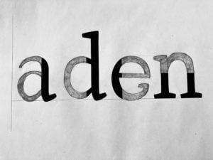 From this close inspection at the letter forms, I learnt that no “e” has a serif. The counter of both the “e” and “a” should roughly be the same space. This is to create balance and harmon within the typeface.
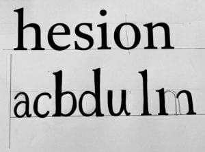 I found designing the rest of the letters, from the given letters, quite a bit harder than completing the letter form. How narrow or wide should the letter be? Where do the serifs go? What style should they be?
My letters are too thin, with not enough contrast between the thick and thin strokes. They are also too narrow, compare the “a” to the “e”.
From the exercise I learnt many things, I am happy enough to leave this to the type designer! But it made me more aware of the features, when blown up. Letters are usually only a few millimetres high, so the characteristics are so small to be noticed. When reading I hardly pay any attention to the typeface and the anatomy of the letters, but after spending a few hours really paying attention you notice these tiny difference in the characters.
Price’s Candle
From the vast range of Ephemera I chose to look at a set of advertising for Price’s Candles, which could be advertisement to be displayed in a shop, or more likely to be labels or packaging from the candle its self.
I think that this set is from the Edwardian era, of the early 1900s, due to the rather recognisable white tie dress code and the elaborate table decorations that are associated with this time period, featured on Image D.
To begin with they look like rather decorative forms of branding but at a closer look they tell us a lot about the time period, in particular the role of women in the home.
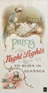 Image A depicts a house maid or nanny looking after a young child, perhaps showing that any wealthy Mother need not to be tucking the child into bed, but leaving that responsibility to one of the house staff. This image suggests that it its not the lady of the house hold to be choosing which candles to purchase but rather than head house keeper.
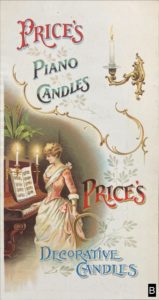 In Image B shows the women or wife in the role of entertainer, but also highlighting her education in the arts and music. Any aspiring women should be able to play the piano. The design is rather clever in the way that on the surface it looks like it is about the different candle types you can buy, but further than that is it informing women, in a rather passive aggressive way, in how the ideal women or wife should be.
 In Image C the Mother, of all people, is shown taking the child to bed rather than the nanny! Perhaps this is a more bit more of a modern image in comparison to Image A since it encourages (wealthy) mothers to take a more active role in the raising of their own child.
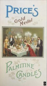 Finally, in Image D the ideal wife in hostess role. I am assuming that the hostess is dressed in red, making a last minute tweak to the cutlery. This suggests that it is the female’s role to make sure the house is well presented, and thus it is her role to chose the candles. Her husband is not the focal point, but he is still present none the less.
To summarise, a women has a high calling, since she has to take on many roles: the soft and motherly side, the wealthy home owner, the educated entertainer, the extravagant hostess, and a wife. The home is the place for any women, her husband is merely at her side.
The colour illustrations indicate that this is an expensive make of candle, looking to sell to the large estates. Any cheap candle makers would not have gone to the effort or cost of printing colour labels. The content of the illustrations confirm the indented buyer.
Each of the labels have a slight different take on wording of “ Price’s ” which lead me to believe that they are not part of the same set, but rather have been collected over serval years.
I think Image D is the oldest because the illustration is placed in a box, unlike the others where the image is softer without a definite edge. Images A, B, C have serval of the same features including the golden swirls, a similar style of the women at the focal point.
In Image B there are four different styles of text, which goes against the typographical rules of the present, to only use two typefaces, even more so when the wording “ Price’s “ is repeated twice. Yet the overall style reflects the very traditional and decorative era that this design comes from.
The Great Gatsby
I am fairly new to using InDesign so this took a lot longer than I thought it would. Using the paragraph styles was something that I haven’t done before and thought it was fairly time consuming, but when I changed the text for my spin off version, there was no extra work require, since it was like a template.
Nature Inspired Logo
My chosen theme was Organic Materials. I collected lots of inspiration for my mood board, and organised them into two sub-topics Plant Decor or Sustainable/Eco-Friendly. 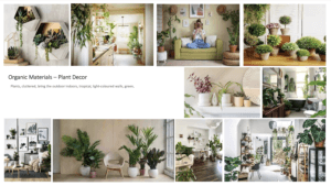
When brainstorming my main icons forced around leaves, flowers and a neutral colour scheme. This is the first logo I created without the floral elements. It has a minimalistic and clean look, but doesn’t yet reflect the organic theme.
![]()
I came back to my brainstorm and experimented writing my name in a calligraphy style. I liked the flow that occurred in my first name of up, down, up from the lowercase ‘l’, ‘y’ and ‘d’. However my surname “Hall” didn’t carry this fluidity and looked all rather the same; which is why I have chosen to have my surname in capitals under my first name.
![]() In keeping with the original circle logo idea, I simply drew the leafy elements, following the outline of the circle.
In keeping with the original circle logo idea, I simply drew the leafy elements, following the outline of the circle.
I did experiment with a blue colour but changed it to a neutral green to complement the aesthetics of a natural theme. ![]()
The overall logo does tick the box of a logo inspired by Organic Materials, but I think that the thickness of “Lydia” contrasts the thin outlines a bit too much, and is out of balance.
The Secret Garden
After creating the original penguin book cover, I thought of ways to make it different. I have been inspired by various illustrated collections, the Puffin in Bloom, Penguin Clothbound Classics and the Puffin Classics Deluxe Collection. 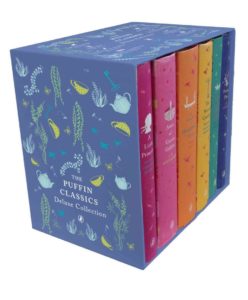
To begin with I changed the background to a green to reflect nature, and the garden. To further add to this theme I drew a leafy floral line illustration, over the top of the cover, to show the overgrow garden and that it cannot be contained.
I lastly changed the penguin to a robin, since is a key piece of symbolism in the book, and helps Mary to locate the secret garden.
Exploring Patterns in Signs
To begin with I started to take pictures of anything that caught my eye, all the while trying to find a linking factor. When you’re looking for lettering you find out that it is everywhere! Instructions, directions and notices to name a few of the categories. Many of the signs around department and campus were to give instructions regarding social distancing requirements in relation to the pandemic. All of the signs were designed in the same way and so they formed a set and were consistent across the University.
 After collecting the photos I began to sort through them. I noticed that nearly all of them were circles with only a handful being rectangular. Within the circles, I organised the images by colour: white, green, yellow and red. They abided by the universal traffic light system with green meaning go and red meaning stop. Yellow is used to give instructions.
I could extend this way of categorising signs through shape and colour to see the different trends, not only on campus but in road signs too.
Obsession
For my theme I chose “Obsession”, for each stage of the story there is a section of the book to represent it.
Firstly the story begins with a woman reading a book in the library, so I left the pages as they were.
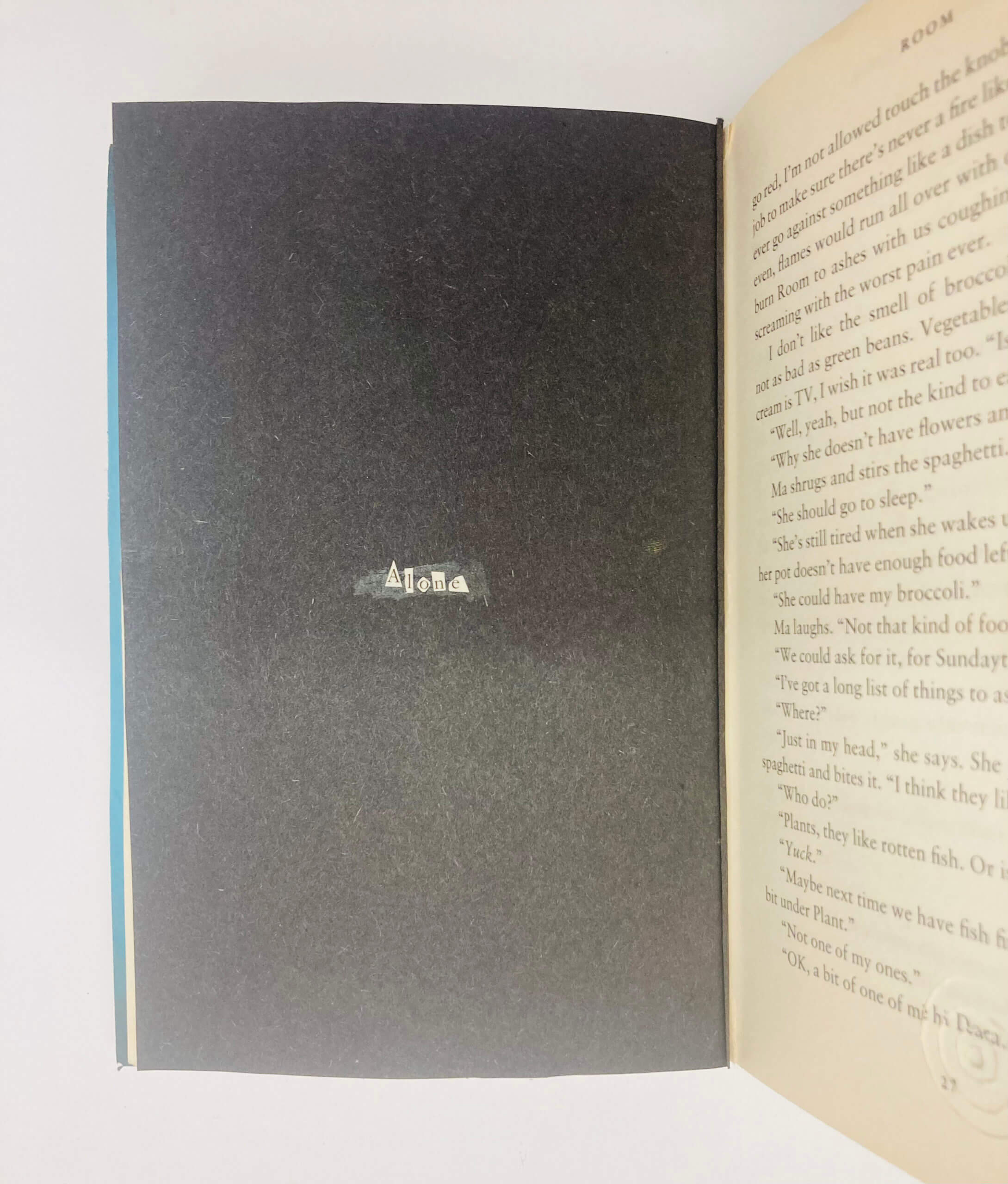 She is alone.
And starts to hear some noises, represented by the concentric circles. 
In the later end of this section the reader gets a glimpse of the mouse, but never sees it again.
She starts to look for this mouse, and starts to look under objects, and gets more and more obsessed about finding the mouse and eventually tears up the floor board and carpet. 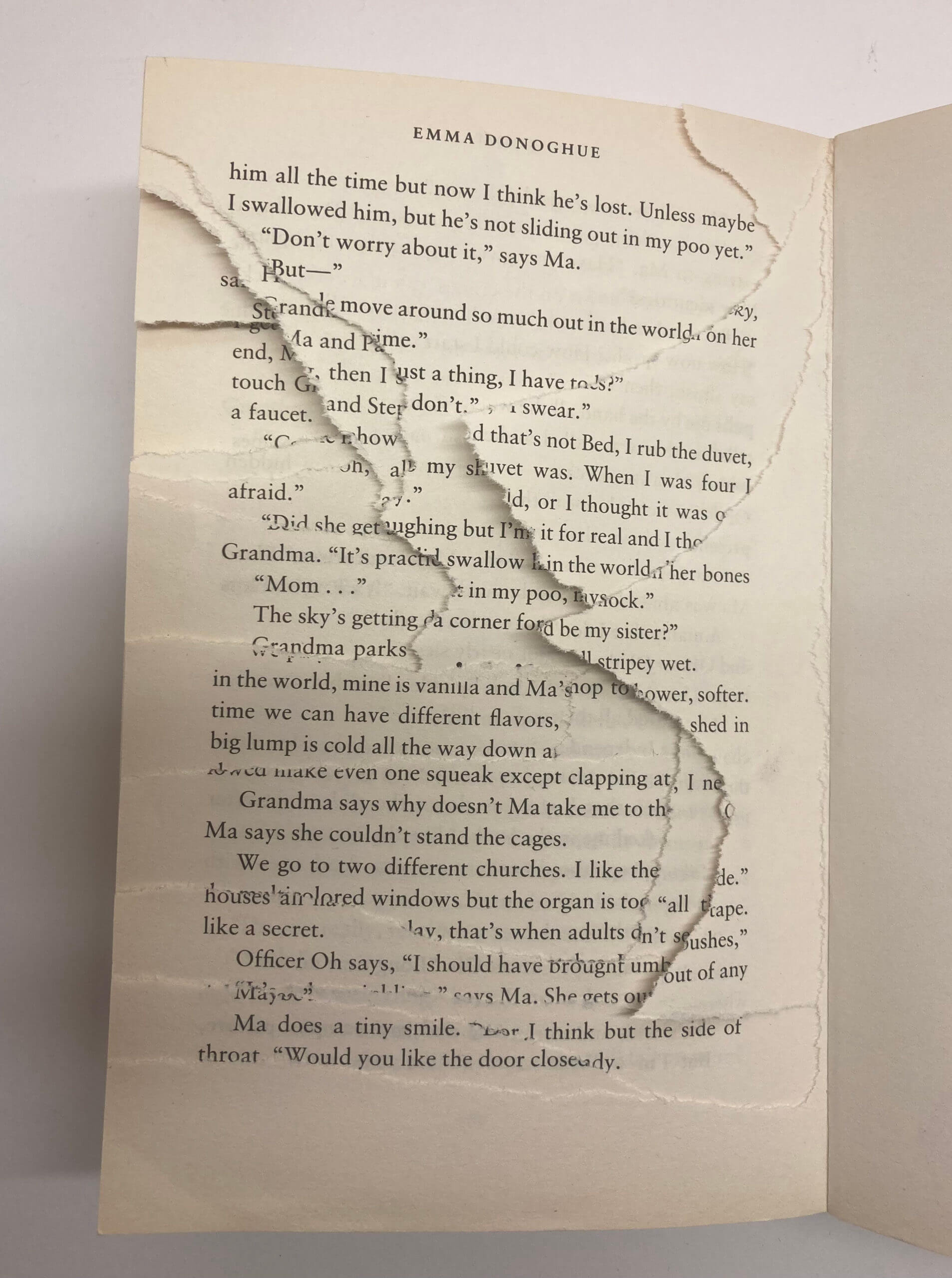
She finds nothing.