Lettering – Signs in Public Places

Signs in Public Places

For this project, I decided to focus on signs that we all see in our day to day lives. The color combinations, the familiar Sans-Serif font, and the graphics contribute to the eye-catching design that we all recognize. While we are used to many of these signs such as “no smoking” and “fire exit” signs, a lot of them aim to protect us from not so obvious situations. But due to the similar look between all of them, we are all aware that these bright colors and conspicuous fonts are there to warn us about something. What I found most interesting was that some of these signs use all capital letters, while others don’t. I am not sure why one is used over the other for certain signs, but regardless, the bright and bold colors as well as the simple graphics cause them to stand out.

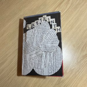
 

Labyrinth

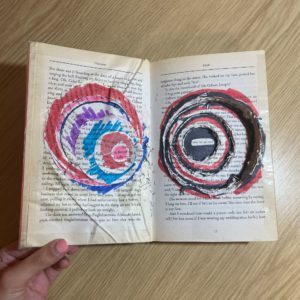
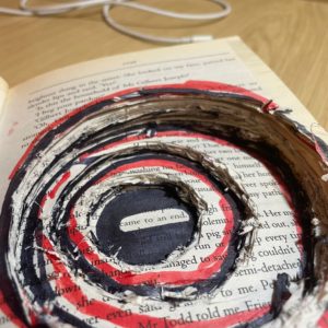
For this project, I chose the word “labyrinth” due to its intricate nature, which I thought would make for an interesting end result. The brief provided a story of a family that had moved into a house with unique spatial characteristics, which leads them to discover that they are not the only people that are lost in the “infinite labyrinth” of the house. With these details, I decided to carve out a tunnel with rugged details into the book to convey the story and confusion of the family that was provided in the brief. At the end of the tunnel, it leads you to the phrase “came to an end” which I thought was suitable. Additionally, I used the cuttings from the tunnel and glued them onto the cover of the book to create a seamless transition from the outside of the book to the inside.

Minimalist Branding

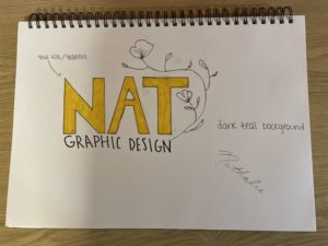
For this project, I decided to go with a minimalist branding approach. I love how clean this style is, and with the right color combinations, font, and graphics, you can create something that is eye-catching, yet simple. I feel as though a lot of “minimalist” brands these days look the same, so my goal was to keep these elements by adding texture and unique colors. The font I decided to go with was a bold Sans Serif that was all upper-case. The reason I decided to go with this instead of something thinner and lower-case was because the goal would be to use a gold foil/gradient effect for the letters. Additionally, I love the look of line drawing, so to add something extra, I decided to incorporate a flower that would frame the entire logo. As for colors, I think the gold foil details would look great with a dark teal background as featured in the mood board. The combination of all of these elements give a natural and organic look which is what I wanted to achieve with the photographs that I included as well.

Electronic Easel

For this assignment, my partner’s name was Jess. The three facts she gave me were:

  1. Enjoys art
  2. Avoids cycling due to various injuries from it
  3. Enjoys baking

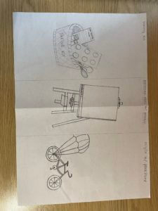
With these facts, I drew a baking kit, an electronic easel where you can submit your work to an attached printer, and a bicycle with a parachute to avoid it ever flipping over. The electronic easel is personally my favorite if we had to choose just one.