Background
Longhaul is a company which strives to create savoury performance food for endurance athletes. Currently they have one product on the market, a pouch of blended all-natural whole foods with no added sugar. Although they have two flavours available right now, they are working to offer a larger range and are expanding to four flavours. Each pouch ensures slow released energy that should keep you fueled steadily over a long period of time. They reached out to the department to update their packaging design and make some tweaks to their brand identity so their products have a better shelf presence and stand out from other brands once they launch in grocery shops and supermarkets.
To see more about Longhaul go to: https://longhaulendurance.com/
The brief
The initial brief called for us to edit the logo and strapline and design the packaging for four flavours (two existing and two new ones). However, it soon became clear that they did not actually want any change to their logo, although they did seem to like the proposed tweaks we brought forward. Instead, we worked on a new strapline, which went through many different versions until the very end, and then also made the packaging for the four flavours. Unfortunately, we also started realising that designing finished packaging for the two new flavours was not going to be possible since the client had not yet finalised recipes and gotten them approved. Instead we offered to give them editable files for them or future designers to edit once all the copy and information has been confirmed.
In the end, our deliverables were as following:
- Logo files with new strapline
- 2x indesign files of finished packaging for the existing flavours
- 2x indesign files with missing information for the new flavours to be used by designers in the future
Research
The user
Longhaul specifically brands their product towards endurance athletes. Since none of us in the team are endurance athletes, we had to break out of our own comfort zone and start thinking outside the box. We created a few user personas who ranged from professional athletes to recreational athletes who are serious about their sport. While it was easy to figure out what they would want from the product, it took some more time to think about what they would want from the packaging design. We were confined to the type of pouch the client had chosen, but we had to figure out an attractive and effective way of communicating important information. Although we tried to do this before starting the project, it was something that kept developing as we designed. In the end, it became clear that athletes buying endurance food (or other sports supplements) most care about what they are about to put in their body, what it’s for, and at which stage they should be using it.
The current market and how Longhaul compares to it
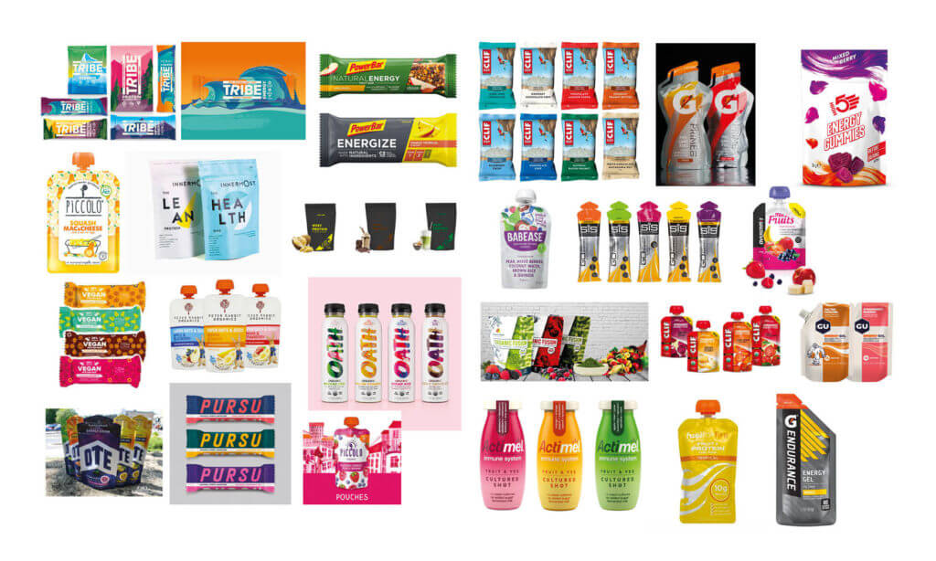
To understand how sports food packaging works, we had a look around at the current market. We actually found that most existing energy related food packaging is not the most eye catching or effective. However, they do often use bright, almost neon, colours so they do still tend to stand out amongst other food packaging. Further, if using any sort of image, most products would use a photo of the main ingredient that the flavour is based on.
The one brand that both we and the client thought stood out the most was Tribe. This brand is also very focused on natural performance energy supplements, much like Longhaul. However, the main difference on the surface is that Tribe creates sweet flavours while Longhaul makes savoury blends. Tribe’s packaging really works on visualising the natural aspect of their product by showing illustrations of scenes of nature such as a wave, iceberg, or peak of a mountain. The colours of the scenes change for each flavour.
While finding such a successful design was nice for us since it showed that sports food packaging does not always have to be neon and pretty boring, it also made the challenge for us even bigger. There was a brand out there that stood out, so how were we going to design something that stood out even more compared to that?
Designing
Setting up a template and colour matching
We received a complicated product data sheet from the client that discussed all the technical data from the printer and manufacturer. I took to trying to decipher all the different measurements on their technical drawing and translating this to an inDesign file that we could work with including a different bleed than we’re used to and strange margins.
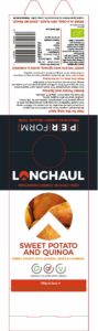
In the logo files we had received we found three different versions of everything: RGB, CMYK, and Pantone. Unfortunately, neither we nor the client knew which file had been used in the end for the packaging (Pantone or CMYK). Alex went and printed out many different versions to find equivalents which we eventually got to compare the original packaging to after the client had mailed those to us as well. After doing this, we also did a few legibility tests of the red and blue used on the packaging since we saw this as a possible issue. Although we proposed a few changes, the client decided in the end that they were still happy with their original logo.
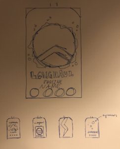
Initial sketches
As usual with design processes, we started with sketching some rough thumbnails for the front on the pouch. Although this did help us understand what the client wanted better, we quickly also realised this was not the best way for us to explore ideas. We had very specific colours and assets to use since those parts of the brand already existed. It was very difficult to see how specific aspects would look together in the different situations. What we did learn from our initial sketches was that we were trying to stick too much to the existing brand and how they had used it in their original packaging.
Moving on from the original design
Based on what we had learned from our quick thumbnail sketches, we moved to working digitally and tried our best to move away from the original packaging design. However, we were faced with a whole new list of issues. First, working digitally meant that it was easier to try out small changes and more difficult for us to work collaboratively. This led to a whole range of different ideas, which may sound good initially, but it left us completely lost. There were so many options. We took a very shallow approach: focusing on sport. Since this idea was not specific enough, none of us were able to create a design that truly fit. Everything was either too general and so boring to look at, or would exclude certain athletes. For example, after a meeting with our client we all agreed that representing specific sports would not be appropriate for food that is meant for anybody that falls under an endurance athlete.
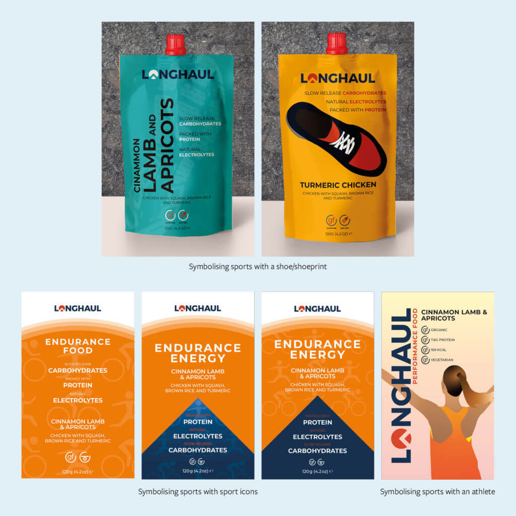
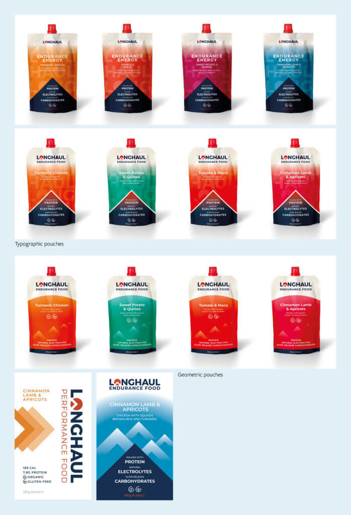
Typebased and more geometric
After a discussion with Rob, our supervisor, we made an attempt to choose something more specific and move away from imagery that suggested certain sports. This attempt entailed a typographic approach and a geometric graphic approach as these can be very successful when done right. It already became clear quite early on that this was also not the way to go, but I believe our team was trying desperately to hold onto some kind of direction so we did not want to let go of these approaches.
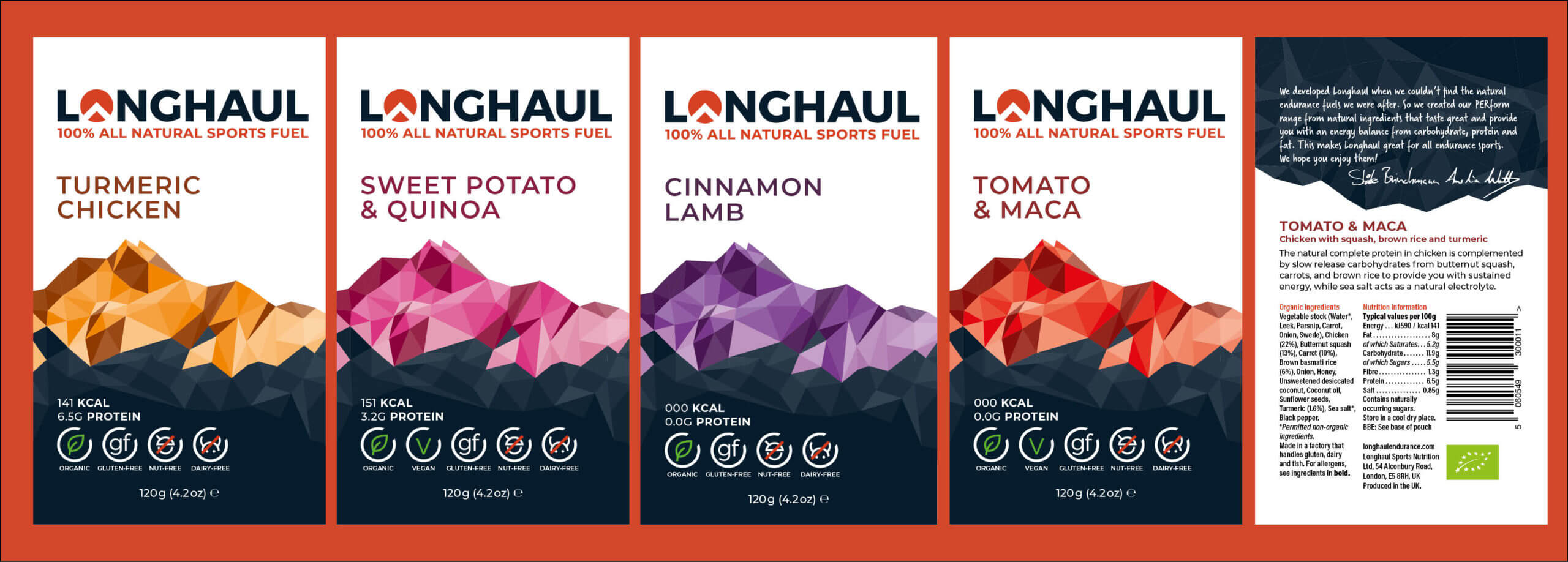
Although this approach wasn’t what we ended up going with, we did start getting the information hierarchy down. We did still continue to develop this to make it even clearer, but we started realising what information would be important for athletes and what should stand out more than other aspects. For example, to grab the attention of an athlete walking by in a grocery store, things like protein is more important than knowing the details of the flavour, which they can read after picking the product up.
Restarting and figuring out what the brand means
We had a meeting with Rob after trying to make the typography and geometric designs work for very long. During this meeting, he asked us for a few keywords that described what the brand was and what it stood for. It quickly became clear that we had no clue. This was the root of our problems. How can you design something that suits the brand if you don’t know what it’s about? We went away and created a list of words to describe the brand and what the design should be like, eventually narrowing it down to ‘energetic, impact, light, bold, clean’. Although that list may still seem a bit contradictory and generic, we knew exactly what we meant with the words. After that, our designs finally started going into the right direction.
Effective mountains and tweaking the visual information
Alex and Ro had been experimenting with using mountains as the main graphic for the pouch, reflecting the mountain that can be found back in the logo. However, these still were not suited. They were either too detailed or too simple (and so looked more like a shape than a mountain). During a meeting with Rob talking about exactly that, that the style did not seem to work correctly, an idea suddenly hit me. In our first year, I had taken it upon myself to learn how to create polyart. I created a mountain using this style, which gave us a nice balance between geometric and detail. We all immediately really liked the new idea (which was the first time, so it was a very good sign), and were hoping our client enjoyed it as well. After we got positive feedback from them, Alex went back to edit the mountain so it used tints and fewer swatches as it had already taken me a few hours to create the original mountain, and this was another job that would take a while. Doing this made it easier for us to switch out swatches so we could make the mountains in new colours easily.
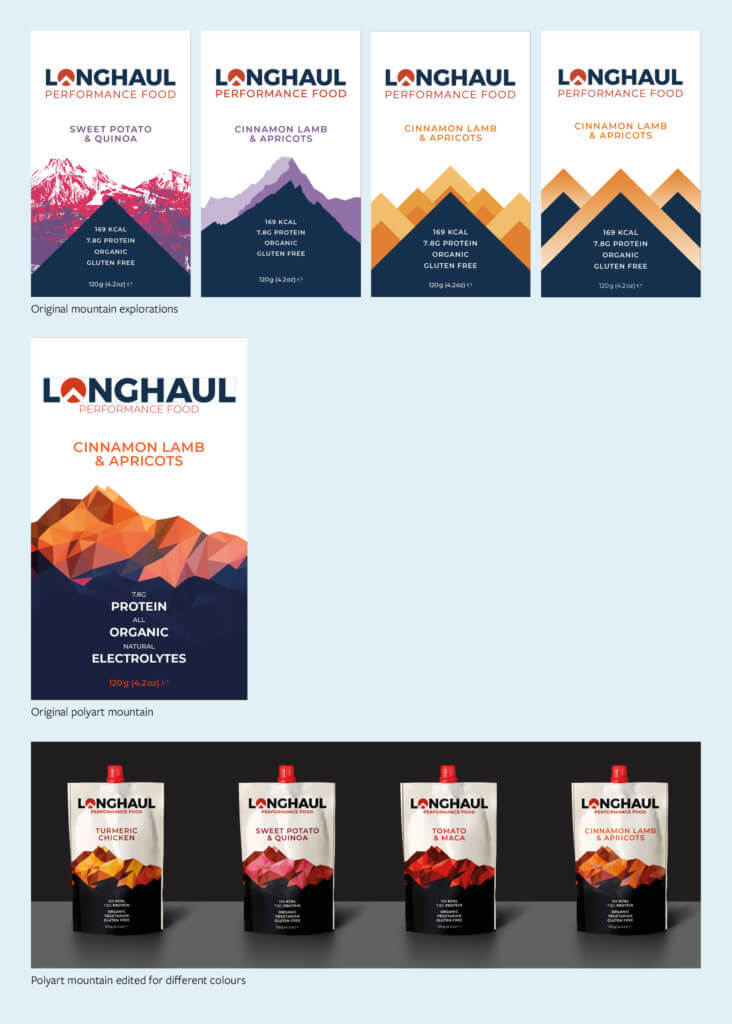
Our initial idea with the mountain had most of the information as text on the front. It was quite text heavy for packaging that should catch somebody’s eye. Luckily our client really wanted to use their icons, so we could replace much of the text with icons. Unfortunately, the existing icons did occasionally have a different line width and used the colours in a less consistent way. I went in and made changes to make them more consistent. For example, gluten free was first in red since all the other icons mentioning the food was free of something had a red line through it. However, it made gluten free seem negative and putting a red line through the icon would create a double negative. Instead, we decided to keep it white and in line with the other white icons. I also went as far to create a new icon that signified organic. This was originally because the icon was missing from the files we received, but in the end we and the client liked the new icon more.
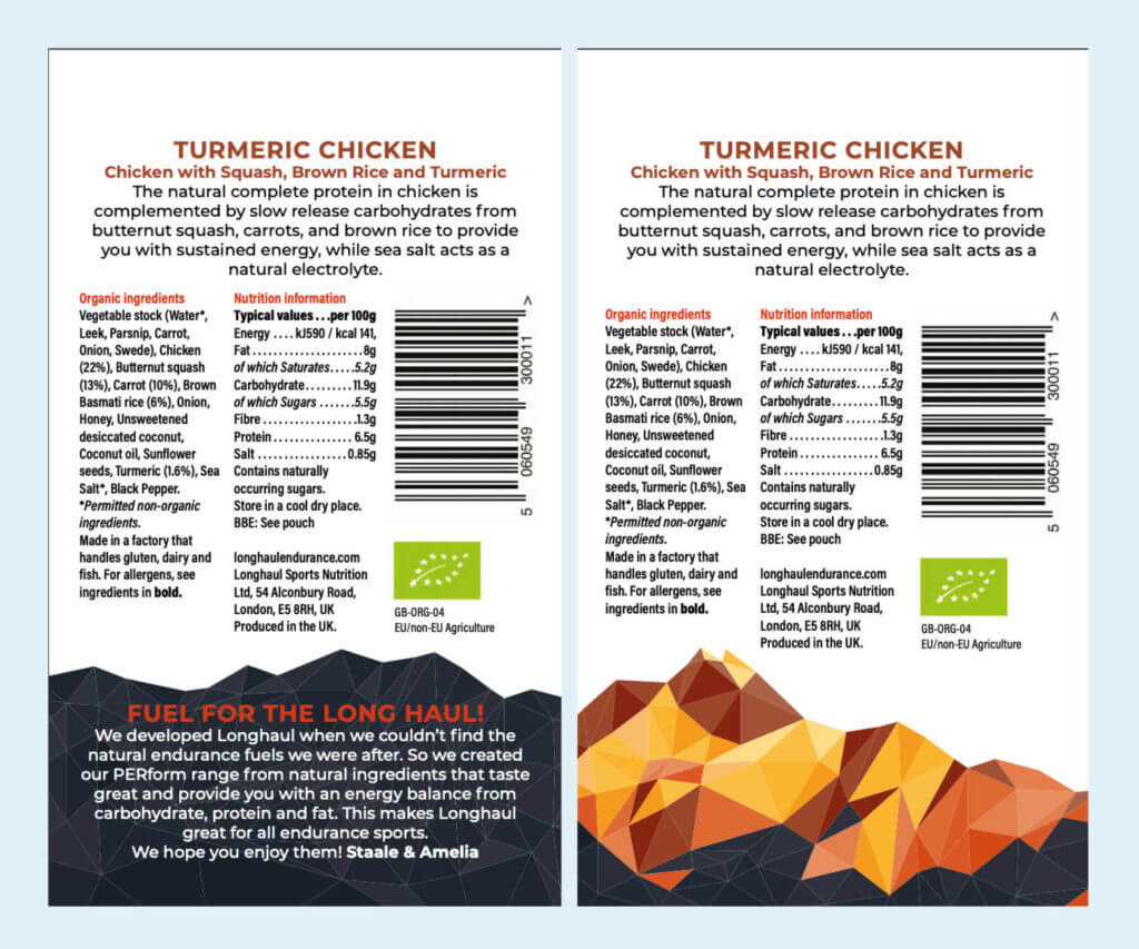
The back
Alex did most of the work for the back of the pouch while the client was too busy to get back to us with feedback on the front of the pouch. The original pouch had way too much text on it, so we agreed on which bits had to be taken out. While a lot of text had already been taken out, a real change was making everything fit on and still follow the type size guidelines. What we really liked about the original back was the clients’ names that they had in a different font at the end of their message. We decided we could make this even more personal. I wrote out their names initially to see if we could fit on handwritten signatures. On the final design, we had managed to get them to write out their own names, which makes the pouch just that bit more authentic.
The colours
We looked at colours throughout the entire process, it was not done at a specific point, we were still tweaking up until we sent the files off for sign-off. There was a lot of playing around. Many sports related food products use neon colours on their packaging. We tried using bright colours as well, but this felt very fake and tacky. We also tried correlating colours to the flavours, but most blended foods just turn a shade of brown. Not only is that not a great colour to use for this kind of packaging, but it also really limited us. In the end, using tints and only three swatches on the mountains gave us a nice balance between giving the flavours a relatively bright colour that wasn’t necessarily related to the flavour and a muted colour scheme that fit with the natural aspect of the food.
Production
Production was different than expected. At first, we were working towards press ready files, however in the end we had to perfect our inDesign files for other designers to work further with. Luckily, we had kept our files very clean. We just had to compare them to the printer’s specifications so we wouldn’t burden a new designer with that job and risk our designs being compromised. When we were almost finished, we came across a rather confusing requirement for the type. Alex got in contact with the printers and found out all text had to be a solid colour, meaning we had to go through and either make text fully C, M, Y, K, or a Pantone swatch. Luckily the client had already told us he was willing to pay for more than just 4 colours, so this was an easy fix.
Final designs

The client was very happy with these designs, listing:
- [It’s a] more current design, and the use of a mountain is very well aligned with the brand image we want to portray.
- The design is both clean and eye catching
- More striking and would stand out on a shelf against competitors well
- The colour combinations go really well and the nuance in the colours of the mountain looks great.
- The design works well as a concept that we can apply to new product ranges
Reflection
This job took much longer than any of us had expected. At first, it looked like the turnaround was going to be in just a matter of weeks, but it took just under a year. Although I am very glad that we ended up having more time, since our designs for the original deadline were not successful, the job did stretch on for a little too long. There wasn’t much we could do about this with our client occasionally being out of the country and corona hitting everybody in a way that could not have been expected. That being said, there was much I learned during this job. Our main challenge was finding out what sort of graphic and design would fit the brand the best. I now know to never start a project without having a clear sense of what the company is about and what the brand should mean. Further, this job also made me understand group work better. We took an approach that leaned towards equal distribution and everybody working on everything, which is not always the most efficient. However, there was not much to distribute amongst us since we were creating a series of packaging (Maybe the team was just a little too big for how small the job actually ended up being).
We have been extremely impressed with the designs that you have all put forward & are very happy with the final results. So thank you for all of the hard work! – Amelia Watts (client)
It’s been a pleasure working with you all and I’m very impressed and pleased with the final result. – Staale Brinchmann (client)