
Background
My client for this real job was an independent publisher based in Reading. The client is writing and publishing a new book that details historic events dating back to the early 19th century. The book tells the story of Danish prisoners of war, residing in Reading during the years of 1807 – 1814; mainly taking from the memoirs of one of the prisoners, who became better known in the town as the Gentlemen Danes (also fittingly the title of the book). The book is the first to detail the ventures of this particular group of war prisoners as the memoirs were recently recovered and have only been translated fully as of 2020. The story of the Gentlemen Danes follows the group mainly throughout Reading and different parts of Berkshire; describing their lived experiences that make for an interesting, historic read.
Restated Brief and deliverables
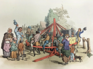
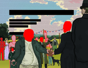
The job originally started off as a commission for an illustrative font cover with a rather quick turn-around; it entailed that I create an illustration that works as an eye catching, historically accurate front cover that did allowed ample bleed and did allowed for the integration of text for the title to exist in the same space also. To begin with there were not many reference images to work from, aside from one sketch that my supervisor had quickly drawn herself. Ultimately the illustration was described to me as a somewhat realistic illustration for The Gentlemen Danes history book that displays one fete (‘Revel’) as described in the text (the text was provided for me also). After emailing my supervisor who was in direct contact with the client, I then found out more about the nature of the illustration and some possible additional deliverables on top of the proposed illustration. It was being discussed if the cover would also serve as a smaller sized thumbnail image on the inside of the book also. I was also told to consider using the colours that were see in the Danish flag and that the exact colour values I use would have to be noted for possible use elsewhere on the book; perhaps for the titles or other text on the cover. This meant that I also had to think carefully about which tones would work on top of the illustration for it to be legible enough.
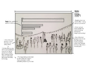
After going back and forth further with my supervisor and client however, we came to an understanding that the colour would be dropped as a deliverable and that the main focus was just the cover as an illustration. During this process the dimensions of the cover (275mm x 212mm) were given to me as well as how much bleed was required (3mm around all sides). From the start the illustration was set as being CMYK as it was definitely going to be printed, and the point was made that care would have to be taken to make sure all necessary detail was big enough to be see on a cover at the size it was. The other considerations that were very important that I think about carefully were the accuracies of not only the scene being depicted, but the clothing, hairstyles etc. of the time as well.
There were only two reasons where the brief had to be changed in a substantial way; one being because of the change of deadline and the second being because the main deliverable changed. During around December time the client decided to change his mind about what he wanted for the cover. I was told that he came across an original painting that displayed the Danish flag on its sales and he thought it to be a very good cover for what he was writing about. This did not mean that I had been designing for nothing however, and he made the compromise to keep a space left in the book for my illustration to be displayed. The brief had to be updated from a cover illustration to a general inside pages illustration; which fortunately meant that I would not have to change much except fill in the space where I left empty for text to be.
Schedule
The job to begin with was a rather quick turn-around of Around 5 weeks, of which I was confident in reaching on time. This did not go as planned however, and the level of accuracy and detail that my client required was more than initially expected. Not reaching the deadline I was given was not however a problem; I had warned my client before time that I may not reach the deadline I was given, which was originally the 15th of October and he explained that he truly wanted the illustration done by January. I assumed then that the original date given wasn’t entirely true to the sentiments of the client. Over the time it took to create the illustration, I believe that I have kept a steady, suitable pace, even when other commitments got in the way. In terms of communication with my supervisor and client this real job felt a little different than the average. My supervisor was a Masters student who was very busy a lot of the time, and it became apparent when her reply times were getting longer and longer. We came to a happy medium however where I would directly email and set up video meetings with the client instead of going to my supervisor first. This was agreed on by all parties and in retrospect made sense for this kind of job; I was making changes as per the clients request so the supervisor just being an extra messenger was not the most efficient. From this point in about early November, I would be meeting frequently with the client, and every so often emailing my supervisor with an update on the illustration process.
Process
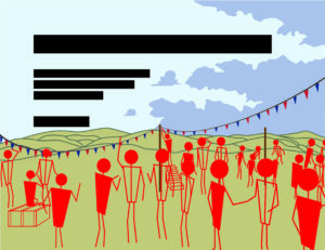
At the beginning the job ran like a normal real job would. I contacted my supervisor for feedback, and when given the green light I would get feedback from the client. Often times my supervisor would be medium between us, but after a while it was established that I was better off getting feedback directly from him as it was his specification I was catering to. It also meant that I wouldn’t have to go through my supervisor just to get to my client. From then we were in agreement that this be the process for communication. In the first couple weeks the interaction between me and the client was mostly to do with general styles of illustration and the composition of the scene. We settled fairly quickly on a style, but the layout of the scene took a while longer to agree on. At this time I was still working with barely any detail and mainly would move rough stickmen figures to signify where a person would be in the illustration; perhaps the lack of detail and didn’t allow for a true representation of what the layout actually looked like at this time. In this part of development we went over a lot of changes in a period of time, building up the composition piece by piece.
After a while of talking about research for the kind of clothing they would wear at the time, the client requested that I visit the Museum of English Rural life to get a more accurate and confident look and feel for this aspect. The visit was very fruitful, and the notes I took were very helpful to the character development over time. The books where I got the most useful information from were British Working Dress – occupational clothing 1750-1950 (Jayne Shrimpton) – Shire Library, and Pyne’s British Costumes (William H Pyne) It was the first time that I would have to an extended amount of research for an illustration. It was also a learning curve for me in terms of illustrating from descriptions in text.
Design
The first sketches I sent to the client were in pencil and were to get a feel for the number of people in the scene how the scene would be generally set up.
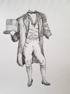
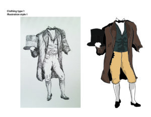
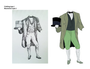
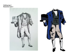
I would also draw in pencil a template for the styles I gave to the client to decide from. I had already been told that the client liked some of the styles shown on my portfolio, and I had also been told that the illustration was to be somewhat realistic. I drew the same human figure and took it to illustrator to create a few different styles of which the client picked the one that incorporated shading made up of hatching. The reason was that it resembled engraving and gave historical connotations in of itself.
From here we would simultaneously go through different characters and the accuracy their clothing, and the composition of the scene as whole. Up until the last one, every meeting with the client would result in either a major or minor change to the illustration.
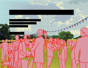
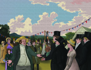
For a while it was quite intense with the number of changes suggested, but I soon got the hang of it. I also learnt very quickly to work in a way that would allow for things to be moved easily around the illustration without any problems, i.e. ensuring each person was their own entity (by grouping their components) so if they were to be moved to the left or made bigger, it was an easy change. After a while colour was incorporated, many characters were changed around, taken out or added and the whole scene became a reality.
Reflection
The real job ended different to how it started in more ways than one. Firstly I didn’t realise how much detail and research was required for this illustration, and it came as a little bit of a shock to me how much time I would go on to dedicate to it; it stands to reason that the initial brief set false expectations due to it being advertised as a quick turn-around. Another area where there was a big change was the connection between me, the supervisor, and the client, with the supervisor eventually becoming an unnecessary step in getting feedback from the client. The final area was when the job illustration changed from being a for the cover to being for the inside content.
At the start there were a few things that the client wanted to explicitly be in the illustration in some way or another. The list consisted of a black and white dog, some of the Gentlemen Danes in the frame, one of the main Danes being very tall and skinny, a large famer welcoming them into the fete, a line of fete banner across the field they were on and some kids playing one of traditional summer game. With all of these worked into the illustration, the client seemed very happy with what was achieved. A word from the client that further justified this;
“Lewis put his name forward to do an illustration of a country event in Berkshire in the early nineteenth century for a forthcoming book. In order to be as historically accurate as possible Lewis had to do a lot of work in researching the costumes people were wearing at the time. After many online meetings, and a number of adjustments and modifications to the original brief, we finally honed it down to a picture that I was very happy with. Happy not only because it is an authentic reproduction of how the event might have appeared like, but also because it was done in Lewis’ own graphic style. It was a very pleasant experience to work with Lewis and I wish him great success in the future”
Overall I was very happy with how the job turned out, and although the prospect of having my illustration as a book cover was more exciting, I am still very glad and grateful that it even gets to be in a publication of some sorts. The end product felt deserved due to all of the time, research and effort that went into the work. Thank you to Libby Skipp and John Nixon.