
Real Job by Jack Taylor, Amy Babington and Matthew Lui
Old Windsor Carnival Programme
Background
The Old Windsor Carnival which is in its 61st event is a thriving occasion that raises money for local charities and is known for bringing the community together. Each year comes a different theme, this year of 2023 the theme is Kings and Queens and is to be emphasised through the use of a carnival programme. The committee planned to print 2400 copies to share across the village of Old Windsor. The programme is the hub for sharing information and the schedule for the three-day event. The programme consists of a 50/50 split of adverts for local businesses and information around the carnival and its various events.
Restated Brief
From an extensive brief from the client, we aimed to create an inclusive cover design that is lively and eye-catching. The cover needs to depict the selected theme of ‘Kings and Queens’ in which the client has stated that they want the colour choices to be vibrant. So therefore, we aimed to implement this into the design. On top of this, to also design a sophisticated structure whereby a variety of advertisement sizes work on a fixed template alongside the editorial text ensuring an easy read for all audiences. Deliverables for this project consist of a printed events programme exhibiting an impactful cover.
Research and Ideation
With the theme of ‘Kings and Queens’ being prominent in the early stages of this project, the end product needed to convey this with aspects that all audiences would recognise. As it was being delivered to houses across Old Windsor and they actual event has activities for all ages, the target audience was extremely vast. Alongside the client we had various meetings into what can be exhibited on the covers. The obvious subject matter we spoke about was members of the Royal Family and previous kings and queens. We then ventured into the realm of kings and queens of the animal world as well as playing cards and chess pieces. Due to this list of potential ideas increasing every meeting we suggested to the client to produce a cover in a collage style as it can accommodate for all topics mentioned above. This would create a sense of community by combining contrasting imagery all in one place much like the carnival does for the community of Old Windsor. The list below was accumulated from these meetings:
-
- Kings & Queens past and present
- Crown
- Sceptre
- Sovereign’s orb
- Coronation spoon
- Chess pieces
- Playing cards
- King Cobra
- King Penguin
- King of the beasts – Lion
- King of the birds – Eagle
- Kingfisher
- King Prawn
- King Salmon
- Queen Bee
- Queen Snake
- Queen Angelfish
- Queen Alexandra’s Birdwing (largest butterfly in the world – 30cms wide!)
- Queen Snapper
- Queen Carola’s Parotia (bird of paradise)
Design Process
The Cover
As the cover will be the first thing our audience will see, this was a priority in the early stages of the project. We provided various different sketches around the subject matter in the list above. This was done to broaden our ideas and once receiving feedback from the carnival committee we were then able to refine these into a final cover concept.
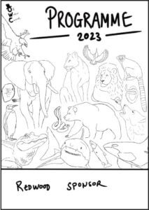
With feedback from the committee, it was made apparent that they thought an all animal or mixed collage would be best suited for the current theme of the carnival. The animal covers were approached as a scrap-book collage and each animal had an effect of a sticker. This was done to easily identify each animal as well as keeping the illustration style the same for a cohesive look. This also provided the cover with varying yet vibrant colours which is something the committee wanted to see within the cover. See Figures 4. & 5.
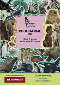
With these covers and from feedback from both committee and supervisors, this imagery did not directly link to the theme of ‘Kings and Queens’ and more linked to a theme relating to just animals. As a result of this information the committee favoured the concept of a mix between animals and royal paraphernalia.
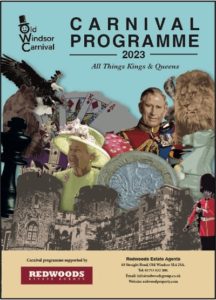
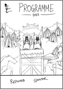
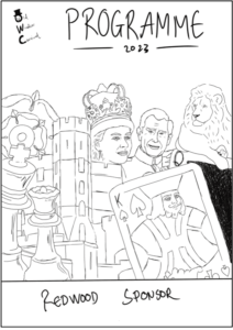
This cover included the right imagery but did not reach the objective of being vibrant and colourful. This meant going back over the illustrations of each element and manipulating the colours to stand out more. It also heavily emphasised the Royal family and royal paraphernalia over what the committee wanted to see. This being more of a mixture of aspects that could represent the theme of ‘Kings and Queens’. See Figure 6.
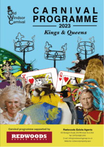
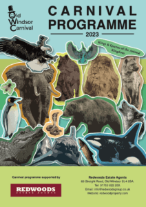
The final cover seen in Figure 7. depicted the right amount of elements from the list both us and the clients came up with in our meetings. The clients felt this option was what they wanted to achieve with vibrant colours, recognisable elements relating to the theme and links to the village of Old Windsor. These links being the three crowns which is a statue positioned on entry to the village.
Pages and Their Contents
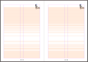
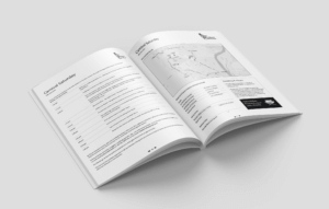
The inside pages of content were an extremely challenging component to this project due to multiple stakeholders sending content through via different formats. Each committee member is tasked with gathering information for different segments of the three-day event which meant dealing with multiple points of contacts. On top of this, information received had many inconsistencies in which needed to be mended. With lots of information coming in through different formats a well-structured document with fixed styles was needed to manage the content. With this project, content was still being sent the day before the print deadline, so the use of grids and paragraph styles made it easier to implement the content and pages throughout the programme remained consistent. Figure 8. shows the 2-column grid used for body copy throughout the programme. Light rules were also implemented to help assist in the navigation between pages which can be seen in Figure 9.
Using paragraph styles ensured that the hierarchy was easily established and navigation was simple. This is something we wanted to focus on within the content of the programme as feedback from the committee about previous years mentioned that legibility and loose text made it difficult for readers to take in the information especially for the large elderly population in Old Windsor.
Advertisements
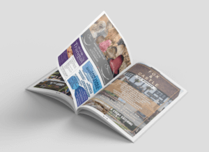
Adverts play a huge role within this programme as the money made from organisations submitting adverts is what pays for the production of the 2400 copies. As companies were paying large sums of money for their space in the magazine it was essential to have a format in place to ensure the adverts were equally treated depending on how much they paid. Below is the template used for the adverts throughout the programme as well as an example of how this looked. Smaller organisations such as local businesses who purchased smaller advert spaces sent across files that did not fit within this template. With permission we were able to create our own versions which included the same content but was more malleable to the advert template.
Reflection
This project helped with an array of different elements into the professional world of graphic design and more specifically editorial design. One thing that was extremely beneficial was understanding the importance of a well structured document. Due to information being sent the day before the print deadline, a well structured document meant that we were able to manage this efficiently under the pressure of a tight deadline. This project also helped in developing communication skills with clients and setting realistic expectations for both parties involved. This made communication easier and created a scenario in which potentially letting down the client was not an option. Speaking with printers also helped in understanding what is needed in order for the printing process to move efficiently.
TY1SK – Submission A Blog post
TY1SK – Submission A Blog post
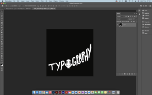
This is my photoshop work where I completed the task as per the brief in making 3 Podcast Covers.
Design Ideas and Design Process
Idea 3
This was my first design where I wanted to highlight the use of books because of their importance to typography and graphic communication, and what better way to represent th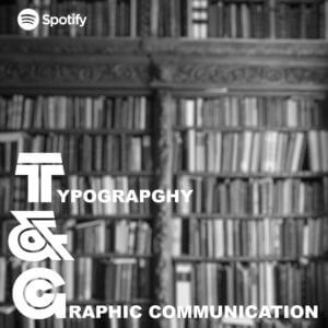 is is using an image of bookshelves. From viewing covers a black and white background with text over the top is an extremely common trend. However, this looked rather busy so I decided to blur the background to put more emphasis on the text but still can tell what the image is.
Idea 2
This is my second design where I wanted to link the topic of the podcast to something that people always look at and relate to. So just li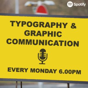 ke the book idea above, I created this idea using road signs. However, with this design I feel like the sign I created does not look weathered enough.
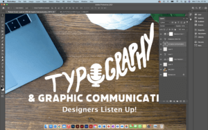
Idea 3 – Final Idea
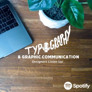 This is my last and final idea and by far my favourite one. Just like the covers above I wanted to make a cover that could relate to a lot of people but because this podcast is of a specific topic, I wanted to really filter down on Designers themselves. So, I decided to take a picture of my desk space because this is where a lot of designers will be sitting to complete their work, even including a MacBook as this is pretty much industry standard. I think by doing this makes listeners more comfortable because it is something they are used to seeing.
- Working in layers to create suitable Hierarchy
- Cropping & Dragging image across using lasso tool
- Choosing a font to match the same thickness illustration
- Cropping and colour correcting image
Software Tutorials
Because I have some experience in using photoshop, when completing the task, I used existing knowledge of the software and where my knowledge lacked, I would look into alternative means in filling those gaps. I did this mainly by looking at tutorials provided on Blackboard but also venturing through YouTube videos.
The one tutorial I heavily used in one of my podcast covers was because I wanted a desired effect of a weathered or distressed road sign. This was because the text and the boxes used to create the overall cover looked very unnatural to me, so I looked at means to make this more realistic. A lot of the road signs I have seen look weathered, rusty and warn down. This tutorial helped me develop my skills further as it is something used a lot in projects, and it also opened me up to seeing and playing around with filters to change images.
https://www.youtube.com/watch?v=3rGFkOvpPrE
I’d like to improve on cropping and using the likes of the lasso tool to make sections look sharper and crisper. This is because I kept finding additional tags when cropping out images which made the image look blurry and messy. It took multiple attempts for me to be happy with some of my cropping.
Design Resources and Articles
When it came to looking at additional resources around the podcast covers, I mainly looked at various different websites and podcast services/ apps to find what common conventions each cover had. As an avid podcast listener and knowing how to navigate these I found this extremely beneficial as I created a list on what covers had in common. This is the list I created and used throughout my covers:
- Minimal/ simple
- Use of white (either for background or text)
- More illustration than photography or combination of the two
- If photography is used it is very specific
- Mainly use 3 colours
- Square
These really helped me and inspired my designs for my covers.
TWA Travel Poster
I found that going through some of the collections and having discussions on the work exhibited was a real eye-opener on how work was produced and how we have moved on in terms of design, materials and processes. However, there was an item of work that stood out to me especially once finding out the date in which it was produced.
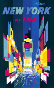
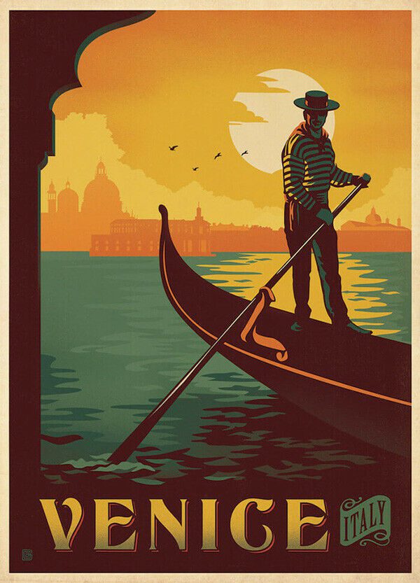
I was drawn to David Clines ‘New York’ travel poster which he produced in 1956. The concept behind this advertisement was so intriguing to me due to it being so ahead of his time. I did further research into travel posters and advertisements around this era and when comparing Cline’s work to other poster, his work was extremely contrasting. This is because other posters consisted of 3 or 4 colours, place names and a directly linked image to the country or city. Where Cline’s work differs is through the use of layers, colours and shapes to depict a country or city, in this case being New York.
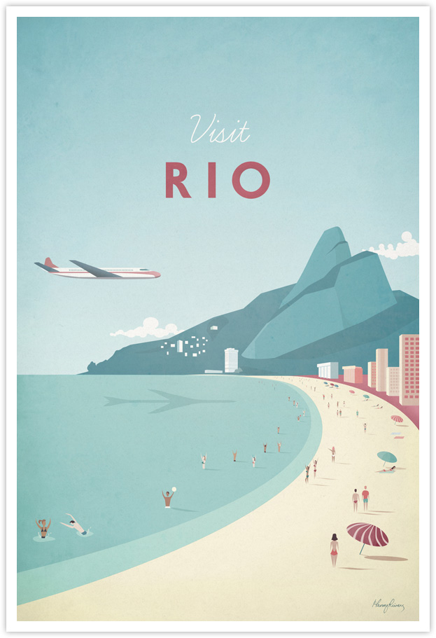
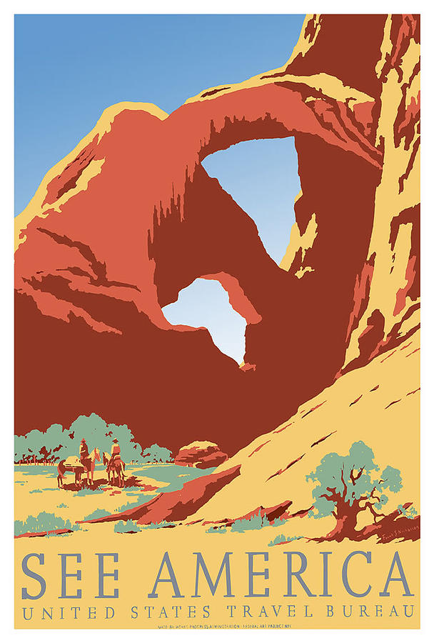
Here are some examples of posters produced during the 1950s:
I would describe this specific piece of Cline’s work as a “controlled mess”. Intentional because Times Square in New York is an extremely hectic place, Cline has used multiple different colours in layered shapes to represent the vibrant advertisement boards and shop windows as well as dotted lines to depict bust traffic on top of this.
Typeforms
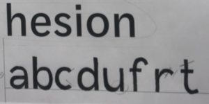
I found this practical task very insightful as I gained a greater understanding in the different aspects and features revolving around typefaces. What I found most useful was understanding why features where designed in a certain way to make it less challenging for audiences to read.
The session was split into two activities, firstly we had half of a font in which we had to draw what we thought the other half would look like and the last activity was drawing missing letters using the features from examples above. I had to really take into consideration curves, Line thicknesses and the lengths for both ascenders and descenders.
Bravo Two Zero
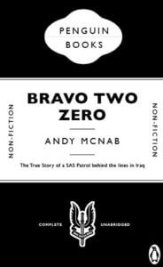
This is a remake cover of the action packed true story of ‘Bravo Two Zero’.
I decided to use a black & white colour scheme for this cover to represent the SAS Uniform and its badges. Not to mention that serious forms and documents use only black & white, which emphasises how serious the topic is surrounding this book and the events that took place within it.
I thought to match the same font as ‘The Great Gatsby’ due to the fact that it is a bold sans serif typeface. I feel this was appropriate as the soldiers who endured the events within this book were both bold and brave as individuals and as a unit, but also to link with the font on the face of the SAS Badge which states “who dares wins”.
I did make some slight changes to the cover where the iconic penguin logo was replaced by the SAS badge and changing ‘Fiction’ to ‘Non-fiction’ as this book is based on true events.
Eye Line
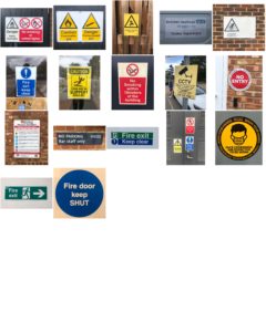
This is a mini project looking at the different types of lettering in the environment. For this project I had a theme of ‘eye-line’ where I took various photos at signs around campus and looked at what features they had.
From looking at the various signs I found that all the signs at eye-line were important or warnings. This was emphasised by bright colours against a plain background and that the had bold sans serif fonts to grasp the viewers attention.
Labyrinth
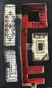
This is a mini project called ‘Broken Narratives’ where I experimented with ideas for a conceptual book and it’s materiality. I looked into the theme of a Labyrinth.
‘Labyrinth: a family moves into a house with unexpected spatial characteristics. The rooms keep shifting position every time a door is opened. The family members are trapped inside the house and start a journey to find the front door. While they keep moving from one room to the next, they discover that they are not the only ones lost in the impossibly infinite labyrinth of the house.’
The whole concept of my idea was focused on the rooms of the house and a way in which the family could escape. I created cut outs after glueing pages together to make a 3-dimensional floor plan of a fairly generic home (living room, kitchen, dining room, etc). I then highlighted in red the shape of the landing and hall way, which is in the shape of a key, to emphasise how the family could escape.
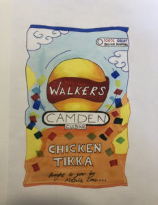
Flavour From Home
Using aspects from someones interests and applying them to an ideal gift for them. I Can link this to a real working example, using client details to produce a product or piece for their needs.