Author: HafsahCulasy

Creating letter logos

Design ideas and design process:

My final design ideas:

Letter logo with envelop distort

Letter logo with envelop distort

My first design idea started with me using a typeface to create my initials. Then I created a rectangle using the square tool but then using the direct selection tool to select one of the points of the rectangle created and moving that selected point to create an elongated shape. I then selected the transformed shape as well as the initials and clicking on the envelope distort tool in the objects tool and then selecting the ‘make with top object’ tool which transformed the initials into the shape I created. This skill was helpful to learn and use as I can use this tool in the future not with initials but also paragraphs of text to create a artistic look.


For my second letter logo design I used the same tool with a different shape and adapted the design at the end. I created my initials then created outlines of them using the keyboard shortcut of “cmd o”, by doing this I was able to separate the letter then change the colour of one of the letters. I then used the pen tool to create the shape in the picture above, I then created an envelope distort using the tool in the objects above. Again I used the ‘make with top object’ tool which created the aesthetic of the letter logo. I adapted the letter logo further by duplicating the letter logo and reflecting it and placing it above the original which made the logo look enhanced.

For my third letter logo which was the most challenging but fun to create I used the letter from my first name and using the ellipse tool to create two ellipses on top of each other but making the ellipse on top smaller in size. I changed the colour of one of the ellipses so that I could distinguish between the two ellipses when I was editing them. Selecting both the ellipses and then using the pathfinder tool and selecting the minus front tool which removed half the ellipse. I then positioned them over the letter and adjusted them so that they look as if they are wrapping around the letter, I then changed the colour of the first ellipse and the top half of the letter to red and the bottom half to black so that it stood out more and looked more creative.

Software tutorials:

https://www.youtube.com/watch?v=zDWcrCzzwxw

This tutorial helped me to understand how to use Illustrator more as well as what skills there are in order to create letter logos. It also helped to learn more skills in illustrator which helped me to create letter logo, but I can also use the skills I have learnt in future projects and develop these skills further by using them in more complex projects and ways.

https://www.youtube.com/watch?v=yRt_2oPFnQQ

This tutorial helped me to understand how to use some of the tool in Illustrator such as pathfinders and ellipses. By learning how to use the pathfinder tool and layering ellipses on top of each other, I was able to use the ‘minus front’ tool in the pathfinders to removed elements of the ellipses in order to create an interesting shape. This tool will be useful in future projects as it allows you to remove elements of shapes in order to create the shape you are looking to create. I want to develop all my skills further in future projects as I feel that there’s no limit to developing and learning skills in Illustrator, and by developing my skills it will allow me to become confident in using Illustrator.

https://www.youtube.com/watch?v=3GzumUieDPY

This software tutorial helped me to understand the tools and fundamentals of Illustrator. Although I have used it previously my skills were simple, and I wanted to learn new skills and get used to using Illustrator more therefore in my future tasks I would be able to complete the task to my best ability and challenge myself further by using these skills and developing them. This tutorial helped me to develop my skills and learn new ones which I can use in the future. Additional to this tutorial the tutorials given to us on the brief also helped me develop my skills, as it informed you on how to use the skills in illustrator as well as giving you a step by step guide on how to use the skills in illustrator. I want to develop all my skills in illustrator but in particular creating and using clipping masks on text and objects, I have used masks briefly but I want to develop my skills with using it further and in more detail.

Resources for research and inspiration:

https://99designs.co.uk/inspiration/logos/letter

https://digitalsynopsis.com/design/creative-single-letter-logo-designs/

The sources which I used for research and inspiration were using websites such as the ones above which offer examples of letter logos for various companies and brands. This helped to give me an understanding of what letter logos look like and what elements companies and brands tend to include in order to make their letter logos also making them look professional. These sources also helped me gain inspiration as to what I wanted my letter logo to look like, by having an understanding and inspiration as to what I wanted my letter logo to appear I was then able develop my design ideas in order to look professional and be of a higher level. I don’t have any specific topics I would like to explore further but I would just like to become more confident in using illustrator in general and I will achieve this by practising using my skills in other projects and develop my skills as well. Last term I wanted to improve my photoshop, illustrator and InDesign skills, this term I achieved that with my chosen tasks, as well as developing current and learning new skills.

TY1SK Illustrator task.

Illustrator sticker task

Design ideas and process:

Before completing this task I looked on Pinterest and google images to get some inspiration on ideas for this task, this helped me tremendously as it gave me an idea of what shapes are used for stickers and what they include in the stickers to engage the audience to their final product.

My design ideas:

My first sticker design

My second sticker design

My final sticker design

Before completing this task I looked on Pinterest and google images to get some inspiration on ideas for this task, this helped me tremendously as it gave me an idea of what shapes are used for stickers and what they include in the stickers to engage the audience to their final product.

Design process:

I used the ellipse tool and overlayed the ellipses on top of each other and then used the pathfinder tool to unite the ellipses together to create a shape. I added the images I felt that related well with typography and graphic communication and positioned them how I wanted. I experimented with the envelope distort tool to create a wrap on the text and created a rise style to add an effect on the text which I liked and wanted to include in my sticker design. I also experimented with the levels of the wrap on the text as I adjusted the blend of the wrap on the text so that it focused on the first half of the words, I also adjusted the levels of the distortion effect on the wrap where I increased the horizontal distortion to create more of an rise effect. I created the cut line for the sticker, I then created the contour line for the sticker. Lastly I added a background colour to make the sticker look complete.

Software tutorials.


This tutorial helped me a lot in this task as I was a bit confused on how to create the cut and contour line for the sticker. This tutorial not only helped me with creating cut contour and cut lines but to create them to a high standard. This is a skill I didn’t know you could create with Adobe illustrator, I can use this skill in the future when creating stickers or anythin similar in illustrator.

This tutorial helped me with basic illustrator skills. I have used illustrator in the past so I had some experience with using the software but I haven’t used the software for some time so this tutorial helped me a lot in knowing the basis of illustrator. I’m not the best at using the pen tool to create curves in a shape with no errors, this tutorial helped me with that as well as allowing me to learn new skills such as using the shape tool to create intricate objects for projects, it also helped me in learning how to use the curvature tool which could be used instead of the pen tool for objects. One skill which I want to develop is the shape builder tool, learning how to use it and how I can use it in the future for projects as it may save time when creating objects and shapes in the future. Another skill I would like to develop and learn how to use is the blend tool as when I have used it in the past it hasn’t turned out how I wanted so I would like to learn how to use that tool efficiently. Lastly I would like to develop all my skills further by learning how to use all the tool effectively.

Resources for research and inspiration:

https://www.pinterest.co.uk/search/pins/?q=podcast%20stickers&rs=typed&term_meta[]=podcast%7Ctyped&term_meta[]=stickers%7Ctyped

By looking at examples of podcast stickers on pinterest it helped me in learning what podcast stickers consist off and what shapes and colours people include in their stickers in order of making a professional and appealing sticker for the intended audience. This resource also helped me tremendously in the research aspect of podcasts, as you can have a podcast on any topic you like and by looking at examples of podcast stickers that already exist helped me in finding images that I could relate with the podcast I was creating a sticker for. This resource also helped me in knowing what fonts as well as shapes companies and individuals have included in their sticker designs, it also helped me in knowing what sort of fonts go well with stickers and how individuals have set their layout for the sticker in order to using the space effectively and how to layout images and text to attract the audience to the design. This resource also helped me in my design process as it gave me ideas on what works well as well as the key elements that are included in stickers, that fewer images are better as it doesn’t over crowd the design and looks more professional as people tend to focus on the font and shape of the sticker. Further topics I would like to explore further are using Photoshop more as I have used it in the past but what to develop my skills further and learn more techniques and using the software which I can then use for further projects, in particular skills used to edit photos and how I can use the software to manipulate images as well as edit the image in general. I would also like to learn more skills in Illustrator to develop my current skills further for future projects.


Labyrinth book narrative

The brief

A client has written a novel and asks you to work on the design of the book. He wants you to develop a concept that enhances and brings forward the visual dimension of the story. He does not request a traditional design, but a book that helps to develop the narrative through its form and materiality

Labyrinth: a family moves into a house with unexpected spatial characteristics. The rooms keep shifting position every time a door is opened. The family members are trapped inside the house and start a journey to find the front door. While they keep moving from one room to the next, they discover that they are not the only ones lost in the impossibly infinite labyrinth of the house.

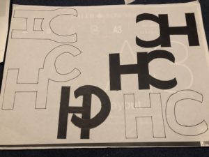
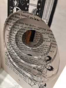
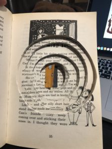
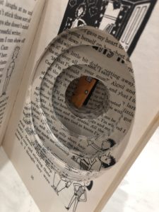
I first started by finding a template of a labyrinth and my initial plan was to cut out sentences of the book and place them around the labyrinth to create a 3D effect. As the labyrinth gets smaller the sentences get shorter which  represents their journey to find the front door. This however didn’t go to plan. Therefore I thought of a second plan which used the pages in the book to get deeper into the labyrinth.